“Typecasting” Revisited
It’s been nearly ten years since I last posted an item under the “typecasting” category here. (Although it’s not like I’ve been posting a lot here in any category recently, other than new font announcements.) To refresh your memory, these were articles and blogposts calling attention to anachronistic use of type and lettering in movies and TV shows.
Today I got an email from Steve Heller alerting me that I was mentioned in an interview he did with Eric Rosenberg, who made the typographic props for the recently released movie Babylon. In it, Eric mentions my criticisms of two movies he worked on, The Hudsucker Proxy and *Almost Famous,*and the email exchange we had about it in 2009.
The props Eric made for Babylon are amazing, and would get five stars if I covered it in a typecasting post. Getting a mention in this interview made me think: Why haven’t I posted a single typecasting item since 2013?
The first thing that comes to mind is that maybe I’ve lost interest in the subject. Maybe I’ve made my point and moved on to other concerns. There’s some truth to this.
But I think the real reason is that it just doesn’t happen as often as it used to. You just don’t see as much anachronistic type and lettering in movies as you did when I first wrote Typecasting: The Use (and Misuse) of Type in Movies in 2001 and later my “Son of Typecasting” blog posts.
I have a theory why that is—and I don’t think it’s because of my article. (Although, I like to think maybe it was, a little.)
The real reason came up in my email exchange with Eric back in 2009.
He pointed out that when prop makers had access to Macs and PCs that could set type in the ’90s, thanks to the desktop publishing revolution, it had detrimental effect on props. In those early days, the selection of fonts was small, especially for period-appropriate ones. You ended up using less appropriate fonts, if only because that’s all there was. The result was a wave of typographic anachronisms that got my attention and led to my article in 2001.
But it wasn’t permanent. Things improved. There are hundreds of times more fonts available now and it’s much easier to find period-appropriate typefaces. It’s not like anachronistic choices don’t happen anymore. It’s just become a lot less common. I happened to have noticed it during its peak in the early 2000s.
Nowadays, I don’t see anachronistic type in movies and TV shows anywhere nearly as much I used to. Which is why I haven’t felt a need to write about it for a while. I don’t think that’s a bad thing. Things just got better. A lot better.
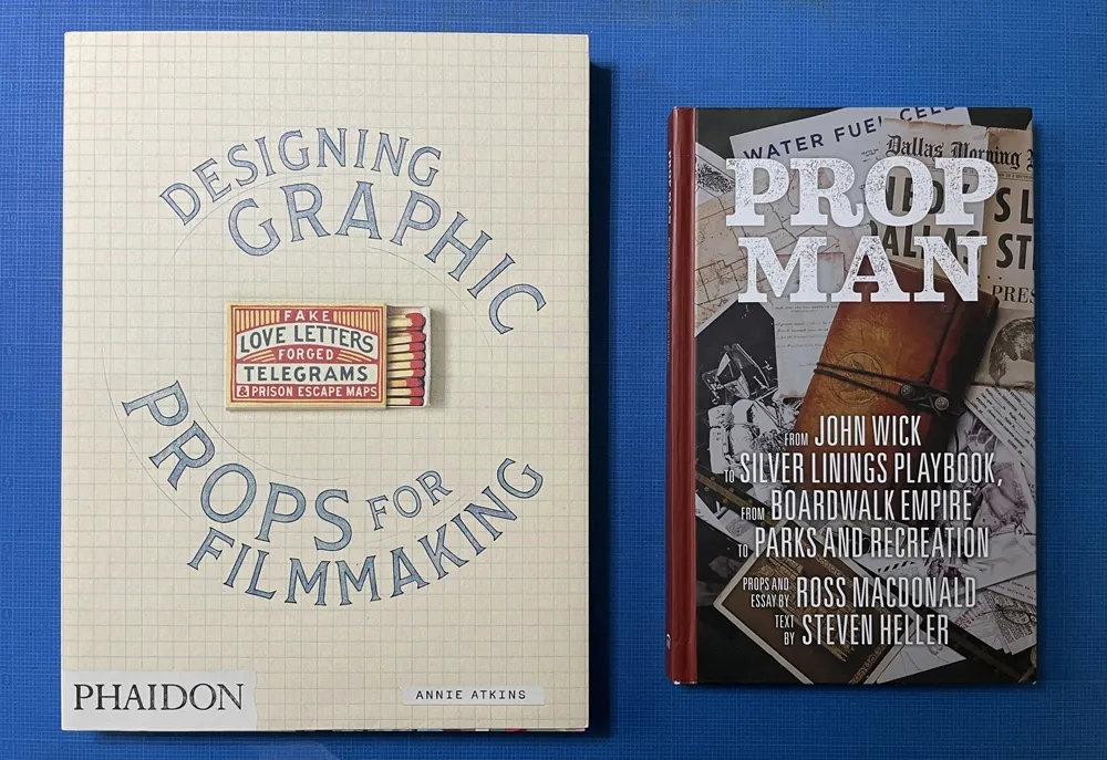
So much so that there are articles and books about people who do this for a living: Annie Atkins’ Fake Love Letters, Forged Telegrams and Prison Escape Maps, which covers in exhaustive and beautiful detail her work on Wes Anderson’s Grand Budapest Hotel, and Prop Man, an overview of the work of illustrator and designer Ross MacDonald with text by Steve Heller.
If anything, we’re witnessing the renaissance of a once overlooked specialty area in filmmaking, replete with superstars.
And anachronistic type in movies? It doesn’t seem to be much of a problem anymore.