Titanic Blunders
Not long after writing and posting Typecasting in December 2001, I learned from a reader that a similar article by Scott Stowell had been published earlier that year in Trace/AIGA Journal of Design, Vol. 1, No. 1, called “Accident Grotesk.” I sent for a back issue to check it out.
Had I seen it before I wrote my article, I might have had second thoughts. The premise — and even the tone — was similar. However, Stowell chose completely different examples: Titanic (1997), Topsy-Turvy (1999), Amistad (1997), Donnie Brasco (1997), Dazed and Confused (1993), The Perfect Storm (2000), and American Psycho (2000).
After reading it, I generally thought it was good, but I was a bit disappointed. In a few of the examples Stowell gives, I think the fonts are mis-identified. For example, he claims that the lettering on the gangway shown early in Titanic is set in ITC Officina (1990-1998):
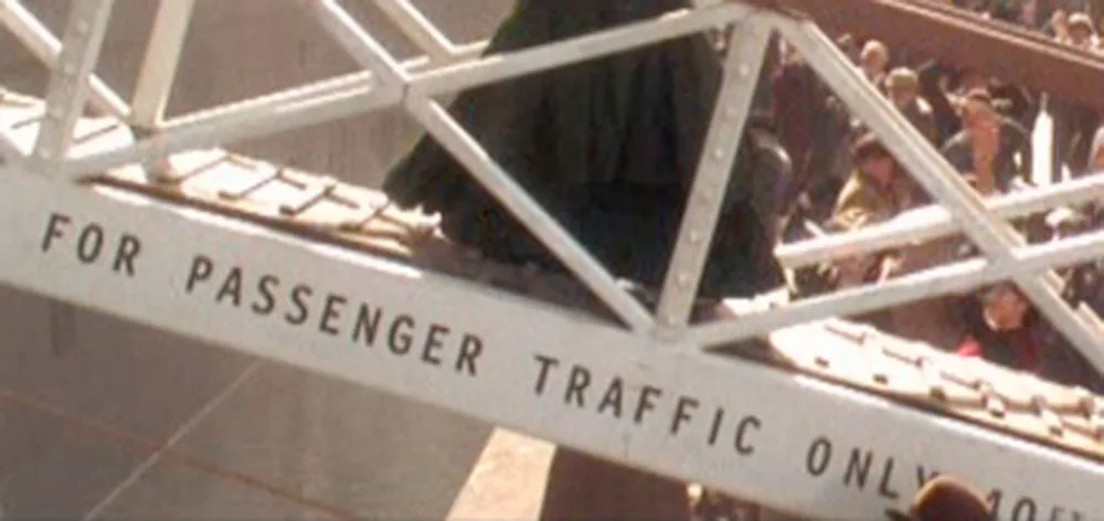
For one thing, the capital “I” in Officina has serifs. Other than that, it’s very close, but I don’t think it quite matches. Unfortunately, I haven’t been able to identify what it is, if it’s not Officina. I do agree that it does not look right for the era, whatever it is.
When I wrote my article, I wanted very badly to find type gaffes in Titanic but came up emptyhanded. After seeing Stowell’s find, I took another look and found an even better example:
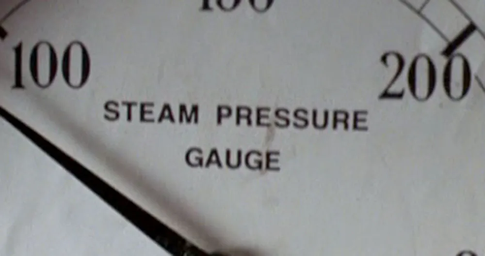
The steam pressure gauge label is set in Helvetica (1959).
(On a non-type-related note, there are also the famous Picasso and Braque paintings shown in one scene, but maybe they made it to the life boats.)
Anyway, I don’t want this to be a blow-by-blow critique of Stowell’s article. After all, it preceded mine by nearly a year, and I must give him credit for that.
Update: Just heard from Scott Stowell, the author of “Accident Grotesk.” He maintains that it really is Officina, with the serifs on the “I” lopped off. Given that I am unable to offer a more convincing alternative, I admit that it’s possible he’s right.
Scott also tells me that, ironically, it was the steam gauge gaffe that lead to his writing the article. When designer Michael Bierut mentioned it to him in 1998, it became the genesis of his article. He left it out because he didn’t want to take credit for it and thought the use of Officina was worse anyway.
Further Update: James Mosley, who writes about the history of type among other things, points out that Helvetica is not a completely anachronistic choice for the steam gauge. There did exist at the time of the Titanic ancestors of Helvetica that looked remarkably like it in some respects. So, technically, it’s not correct for the period—I think Akzidenz Grotesk would have been a better choice—but it’s not dissimilar to what might have been used.