Three New Heavyweights
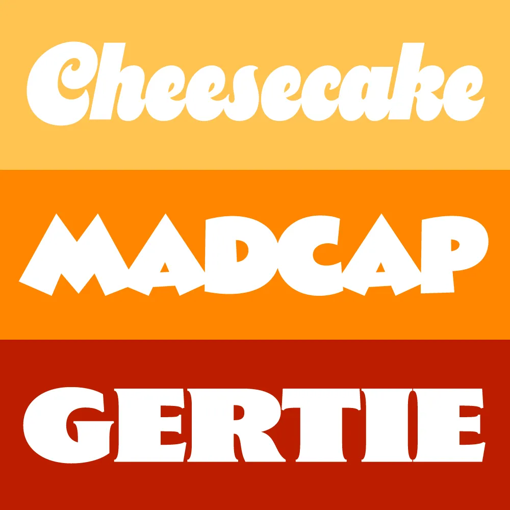
I took a break from my usual practice of working on larger families to create a trio of heavyweight display typefaces: Cheesecake, Madcap, and Gertie. They come from different historical periods—and different periods in my life.
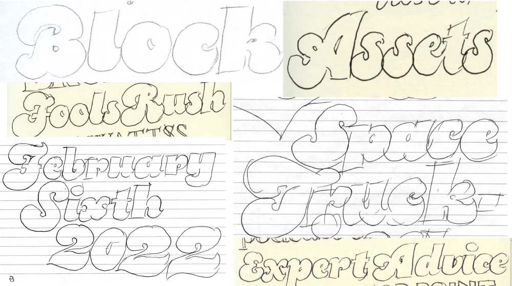
Cheesecake is the most recent design. It bubbled up from my subconscious over the last ten years while I was working on Dreamboat. Like Dreamboat, it’s a “bold script” style, but it has more in common with 1970s lettering and fonts, and is a simpler design without any need for fancy OpenType magic in order to set properly.

I tried to push the weight as far as I could without sacrificing legibility. It has an alternate lowercase “s” (in case you’re not into that old-school cursive form) and a set of matching dingbats and symbols.
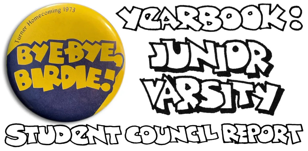
Madcap goes back to my high school years in the early seventies, before I was even thinking about type design. I worked on student publications and often did lettering in a cartoony, all-caps style, with overlapping letters. I was influenced by vintage MAD magazine and Hallmark and American Greetings’ psychedelic period.

Madcap has a few special features: An alternate lowercase-style E and a set of matching dingbats and symbols.
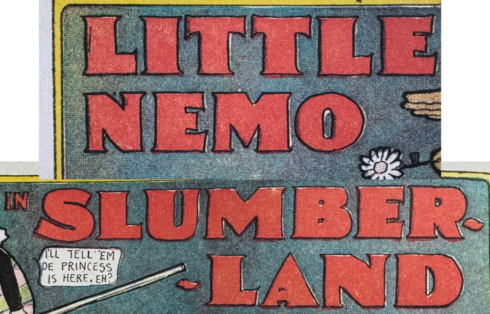
Gertie is a design that’s been in the back of my mind since the late nineties. The inspiration is Winsor McCay’s distinctive lettering in his iconic Little Nemo comic strips from the early twentieth century. Think of it as Copperplate Gothic on steroids. The name comes from McCay’s 1914 animated short Gertie the Dinosaur—the first fully-realized animated cartoon character.

As an all-caps design, it can be awkward to set words and abbreviations that normally contain lowercase like “McCAY” or “4th” or “Co.” So I’ve included a set of raised caps for those situations. And it works with more than one letter in a row. You can also use it for the cents part of prices. Like Cheesecake and Madcap, it includes a set of matching dingbats and symbols.
All three fonts are available now.