Sneak Preview: SketchFlow Print
I’ve recently been working on a font for Microsoft called SketchFlow Print. It will be bundled with the next version of Expression Blend, part of Microsoft’s Expression Studio suite. A new feature of the program, called SketchFlow, allows a designer to create a prototype of an application that looks like a sketch, and it comes with fonts to support that look. Christian Schormann, one of the brains behind the app, demoed SketchFlow at MIX09, and you can see SketchFlow Print in use throughout his presentation.
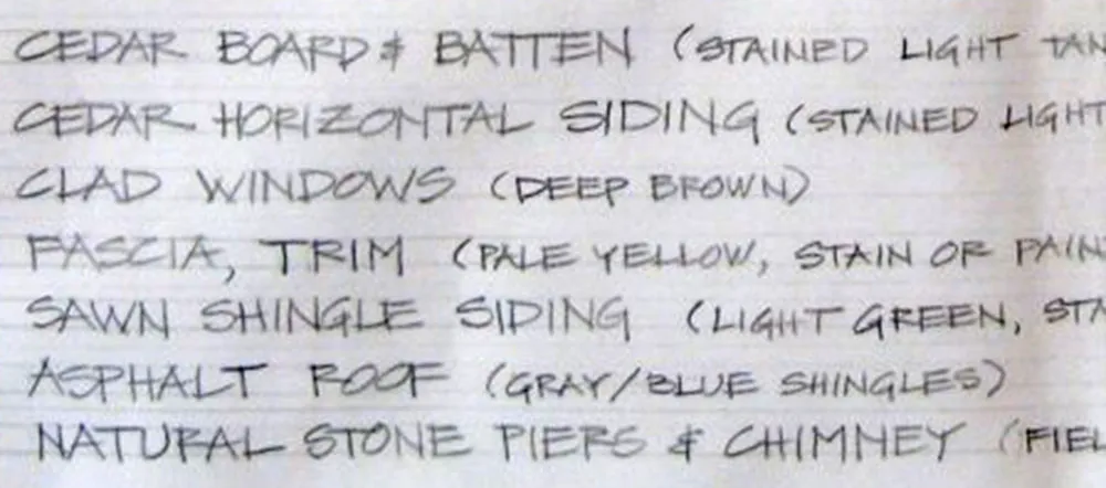
The idea for SketchFlow Print came from Doug Olson at Microsoft, who wanted a typeface in the style of lettering used by architects. There are already many “architect” fonts, but none of them had the natural, lively look he wanted. Doug had worked previously with talented residential architect Michaela Mahady of SALA Architects, Inc., and was taken by her lettering. She agreed to let it be the starting point for SketchFlow Print and provided samples for me to work from.
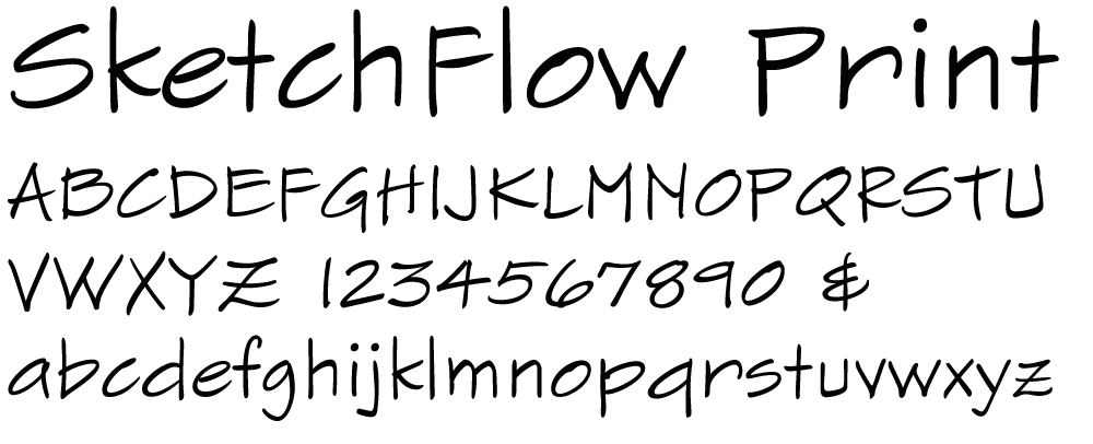
Typefaces based on handwriting can be tricky because typefaces are unnaturally consistent compared to real handwriting. This problem is sometimes overcome by using multiple variations of common letters, which can then be substituted automatically or manually to avoid obvious repetitions. Fortunately, Michaela’s handwriting is quite neat and consistent already, so we decided to keep it simple and just have one version of each letter. The challenge for me was to make subtle changes to minimize conspicuous patterns or disruptions in the overall texture, without resorting to alternates or draining the life out of it. All of us are pretty happy with the way it turned out.