Proxima Nova Turns 20
It was twenty years ago today that I released the first version of Proxima Nova. I’d spent the previous two and a half years working on it as a redesign of Proxima Sans, which I released through FontHaus in 1994.
For whatever reason, Proxima Sans never really became very popular. Part of it no doubt was that it was a small family of only three weights: Regular, Medium, and Black, plus italic for each. The character set was minimal, basically covering the default Mac and Windows, with a few rarely-used math characters replaced by dingbats and extra characters. This was before OpenType and Unicode were standard and there were a lot of questionable practices.
Sales of licenses were not great. It didn’t help that Proxima Sans was added to the FontHaus catalog before the font was available for purchase (my fault). I didn’t finish it until months later. I saw it used here and there, but it seems like a dud.
In 2002, two things happened.
First, Hoefler & Frere-Jones released Gotham to the general public. Previously, it was exclusive to GQ magazine, in use since 2000. I wasn’t a GQ reader, so this was the first I had become aware of it. It was very well designed, but weirdly similar to Proxima Sans, and getting a lot of attention in the design community.

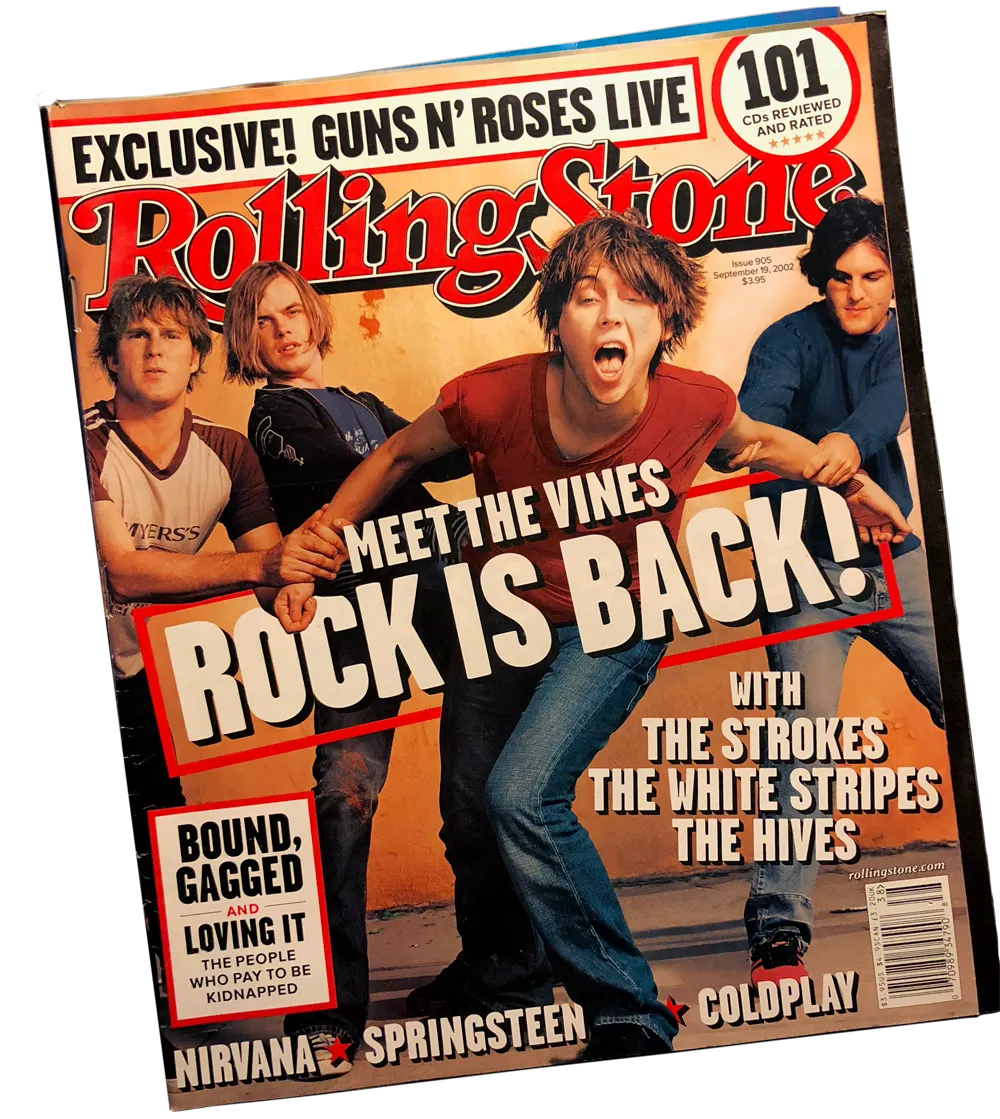
The first issue of Rolling Stone featuring Proxima Sans, from September 2002, seen in the small text on the cover.
Second, late in 2002, magazine designer Matthew Ball did a redesign of Rolling Stone and used Proxima Sans extensively for headlines, captions, subheads and small text, along side Frederic Goudy’s Kennerly for running text. This was the most prominent use of Proxima Sans.
I learned later in a conversation with Jonathan Hoefler that this was the first time they’d ever seen Proxima Sans, thinking it was Gotham at first and wondering how they were using it without a license.
These two things convinced me that there was indeed a market for something like Proxima Sans, and that I should take advantage of this to expand its range of weights and styles, and to take advantage of the OpenType format by adding better language support and other typographic niceties, like small caps and alternate characters.
In doing the redesign, I did more than add to what I’d done before in Proxima Sans. I redrew nearly all the characters and changed the weighting scheme, making the Regular a little lighter and pushing the range of weights further. I realized very quickly that it wouldn’t be backward-compatible with Proxima Sans at all, so I came up with a new name—Proxima Nova, taking a cue from Century Nova, the final addition to ATF’s Century family in 1964, and one of the last foundry typefaces to be released.
Flash animation announcing Proxima Nova from my site in 2005.
After two and a half years of intensive work, and the help of a small group of beta testers (including Stephen Coles, Tim Martens, and Dirk Benedict), I released Proxima Nova on June 30, 2005, initially through direct sales through my own website (with a discount if you were a Proxima Sans user), and followed by Veer (January 2006), FontShop (February 2006), and MyFonts (July 2007).
The first license was purchased by Addison Hall on July 1, 2005. It was a strong seller from the start compared to the other fonts I was selling at the time, and its popularity steadily grew. I also got an early boost from a little pamphlet that was produced by Yves Peters and distributed at TypeCon 2005 in New York City which included Proxima Nova in his reviews of favorite new typeface releases of 2005.

The original Typekit logo, pre-Adobe.
What really sent it to the top of the charts was Typekit in 2009. This was initially an independent startup, founded by Jeff Veen. Web designer Jason Santa Maria who was working with Typekit in the early days invited me to participate. It started out slowly and then shot up to become the most popular way to use custom webfonts. By the time Typekit was acquired by Adobe, Proxima Nova had become the most popular commercial font on the web. It’s still at the top.
Its popularity extended beyond the web—probably because of its popularity there. Here are some of my favorite examples:

Proxima Nova has grown well beyond my initial release, with a greatly expanded character set (including support for Greek and Cyrillic and, more recently, Arabic, Hebrew, Thai, Hangeul, Tamil, and Devanagari, thanks to my relationship with The Type Founders). From a family of 42 fonts (seven weights, three widths, plus italics), it’s grown to 80 (eight weights, five widths, plus italics).
The growth and popularity of Proxima Nova in the last twenty years is beyond my wildest, most optimistic expectations when I released it in 2005, much less when I released Proxima Sans in 1994. It’s the dream of every type designer but almost never happens. I feel incredibly lucky and grateful to everyone who has helped along the way, and especially to all the designers who decided that it was the best font for the job.
