Proxima Nova Font Pairing: Our Favorite Fonts
I designed Proxima Nova to be adaptable—something that could hold its own in everything from editorial layouts to brand systems to UI. It’s been exciting to see it used in all of those ways and more. Following up on my previous post exploring fonts similar to Proxima Nova, I wanted to dig a little deeper into how Proxima Nova works in combination with other typefaces—serif and otherwise. One of the most common questions I still get is: what pairs well with it?
If you haven’t yet explored Proxima Sera, it’s worth a look. I designed it specifically to work alongside Proxima Nova, it may be just what your next project needs. However, I don’t believe there’s a one-size-fits-all answer—it really depends on the tone you’re after. So, I thought it might be useful to share some more pairing ideas. I asked my colleagues at The Type Founders to pull together a selection of typefaces from their catalog that complement Proxima Nova’s structure, rhythm, and personality—whether they offer contrast, harmony, or just a fresh tone…
At The Type Founders, we work with many foundries and get to see how designers use Proxima Nova in real-world projects. The serif pairings below represent some of the strongest combinations we’ve seen and recommend—whether you’re setting long-form text, designing packaging, or building a brand system.
Fonts That Pair Well With Proxima Nova
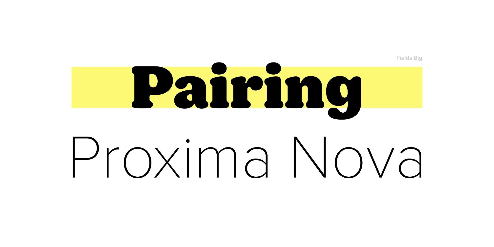
Fields (Adam Ladd Design)
Fields offers a gentle take on the soft serif, with rounded contours and open counters. It softens the clean geometry of Proxima Nova just enough to feel inviting—great for wellness brands, lifestyle publishing, or any tone that blends structure with friendliness.
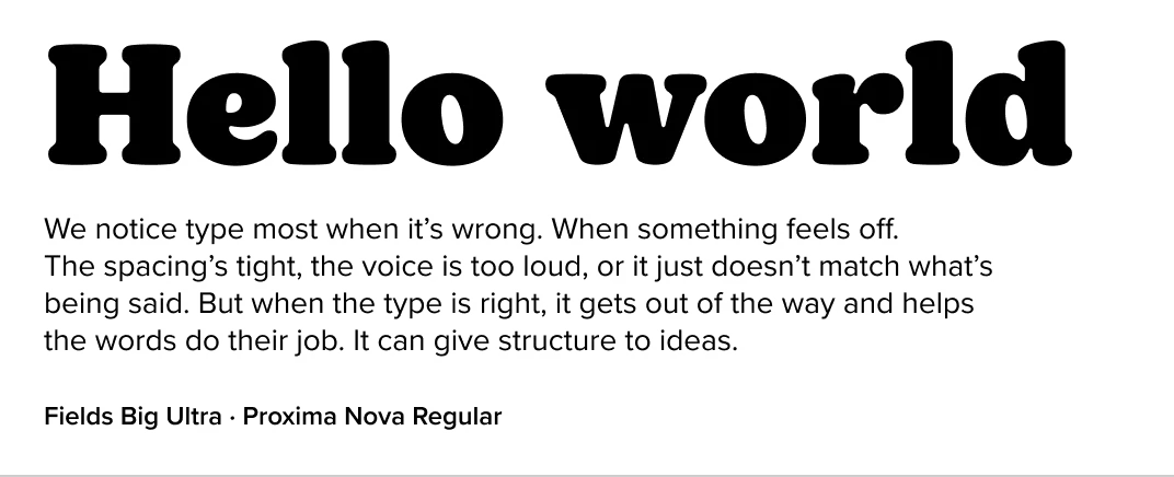
Fenway (Carter & Cone)
With its engraved roots and editorial polish, Fenway adds a historic tone to Proxima Nova’s modern baseline. A unique pairing that works well in branding or cultural publishing.
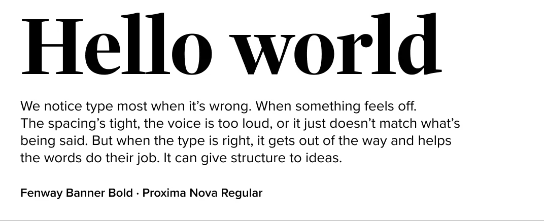
Georgia (Carter & Cone)
A web workhorse with classic proportions, Georgia’s friendliness and clarity make it an effective match for Proxima Nova. This is a utilitarian duo that feels familiar but reliable—especially in web-based applications.
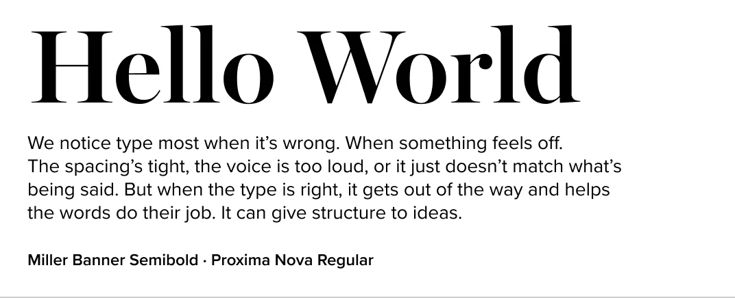
Miller (Carter & Cone)
A modern revival of the Scotch Roman, Miller brings contrast, elegance, and a literary tone that pairs beautifully with Proxima Nova’s clean, contemporary feel. Great for publications, branding, or anywhere you want a classic-modern mix.
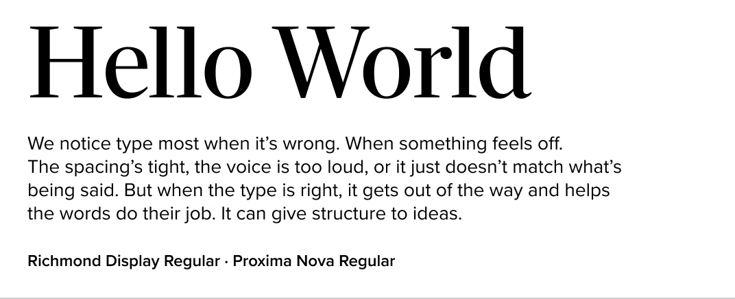
Richmond (Carter & Cone)
Designed for newspaper text, Richmond’s formal construction and consistent rhythm, contrasts nicely with Proxima Nova’s modern geometry. A great fit for institutions, tech companies, or minimalist editorial design.
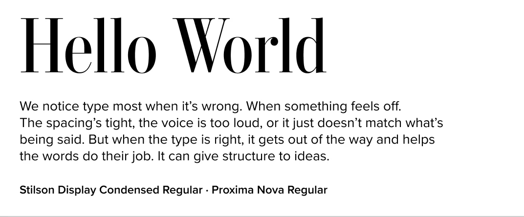
Stilson (Carter & Cone)
Stilson strikes a balance between traditional and modern. Its compact forms and crisp detailing echo Proxima Nova’s sense of control, while adding warmth and structure. Ideal for editorial or corporate communications.
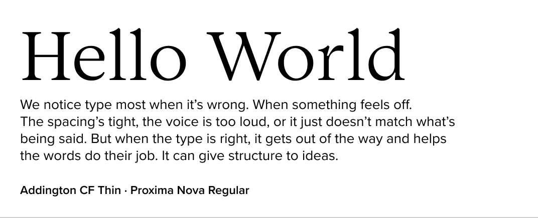
Addington (Connary Fagen Fonts)
Addington is a modern serif with a large x-height and open counters, which naturally complements Proxima Nova. The two share a readability and practicality that works well in professional settings—especially web and product UI.
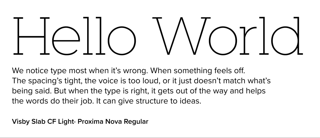
Visby Slab (Connary Fagen Fonts)
A slab serif with contemporary crispness, Visby Slab adds weight and confidence next to Proxima Nova. Use this pairing when you want to keep things modern but grounded—great for tech or product branding.
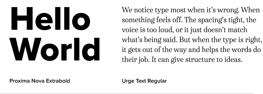
Urge Text (Dave Rowland Type)
Urge’s energetic brush-inspired forms contrast nicely with Proxima Nova’s restraint. This pairing is playful and attention-grabbing—great for headlines, posters, or branding with a pulse.
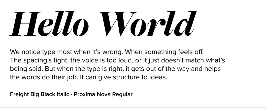
Freight Big (Freight Collection)
With a range of serif and sans styles, Freight offers expressive contrast to Proxima Nova’s clean precision. Whether you’re using Freight Big for dramatic headlines or Freight Text for elegant body copy, the pairing brings warmth and sophistication to editorial, branding, and content-rich design.
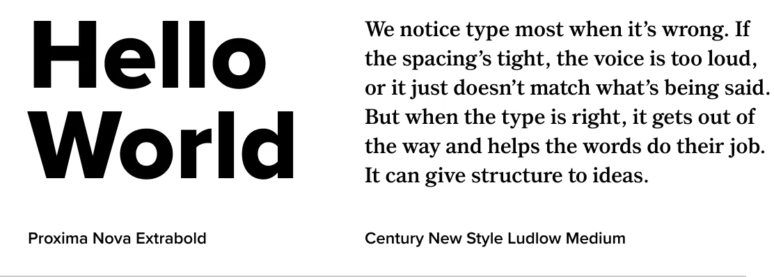
Century New Style (Ludlow)
This American transitional serif brings a sense of tradition and print-era authority to Proxima Nova’s modernism. Slightly narrower than Proxima Sera, it offers a timeless pairing with wide applications—from editorial to education to cultural institutions.
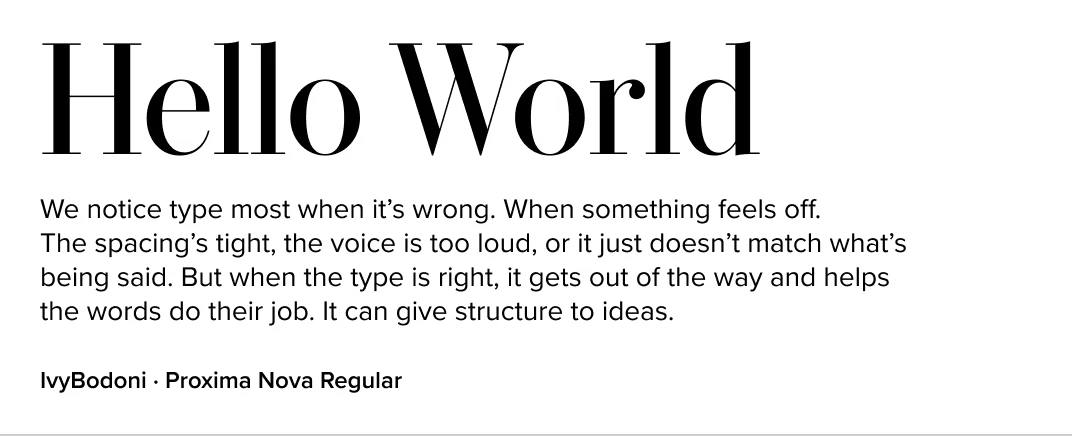
IvyBodoni (Ivy Foundry)
If you want high style and classic contrast, IvyBodoni delivers. It brings fashion-forward energy and elegance complementing the clean modernism of Proxima Nova. Use it in packaging, luxury branding, or magazine work.
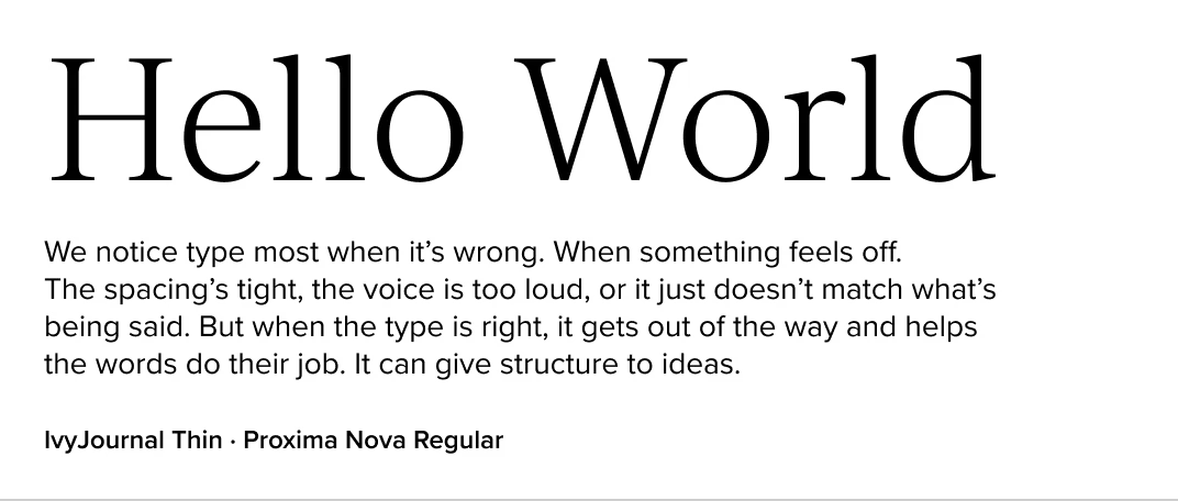
IvyJournal (Ivy Foundry)
Elegant and contemporary, IvyJournal brings sharpness and refinement beautifully playing off Proxima Nova’s approachable geometry. It’s especially effective in luxury branding or magazine layouts where tone and texture matter.
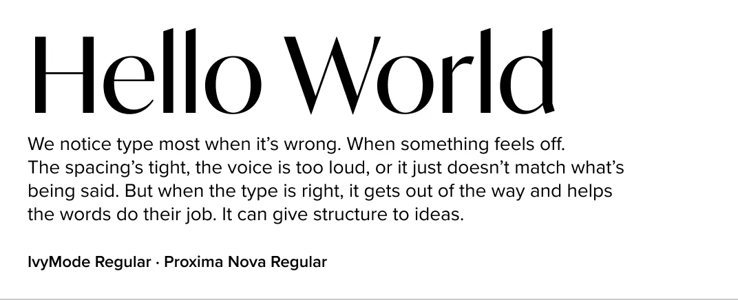
IvyMode (Ivy Foundry)
A modern sans with a stylized twist, IvyMode feels like a natural cousin to Proxima Nova. While Proxima Nova holds down the fort in text and UI settings, IvyMode shines in display—bringing expressive detailing and a layer of warmth that adds personality to headlines, packaging, or brand touchpoints.
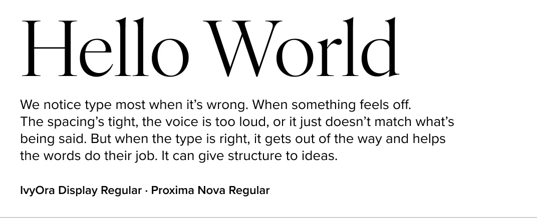
IvyOra (Ivy Foundry)
IvyOra’s delicate contrast and wide proportions offer a refined, editorial pairing to Proxima Nova. The two balance approachability with sophistication.
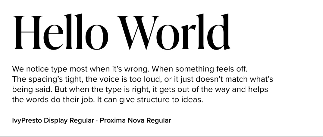
IvyPresto (Ivy Foundry)
Full of typographic flourish, IvyPresto contrasts Proxima Nova’s restraint with personality and sophistication. Use this combo when you want expressive display typography alongside clean body text.
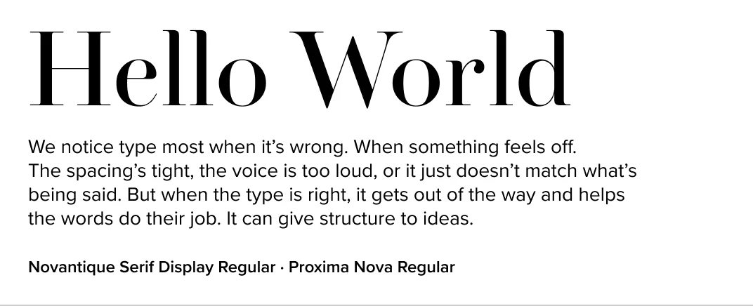
Novantique Serif (Laura Worthington Design)
Novantique’s mix of calligraphic angles and old style warmth brings character to Proxima Nova’s structured cool. This pairing adds tension and texture—great for artistic brands, book covers, or unconventional identity systems.
Meno (Lipton Letter Design)
Meno’s high-contrast forms and refined details add drama and sophistication to Proxima Nova’s clean neutrality. The pairing shines when Meno is used for headlines or pull quotes and Proxima Nova for body text—ideal for editorial, fashion, or luxury branding.
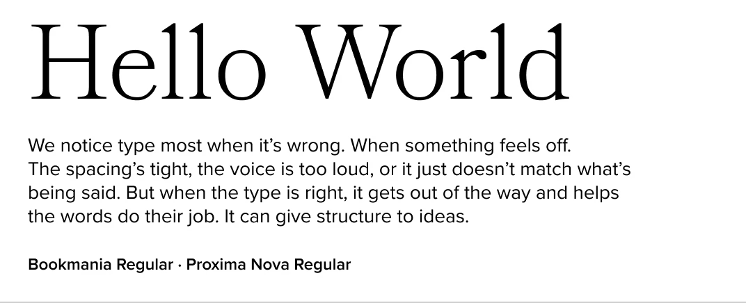
Bookmania (Mark Simonson Studio)
If you want a serif that feels classic but not stuffy, Bookmania is a great option. Its swashes and expressive curves bring contrast without clashing, and the spacing pairs well with Proxima Nova’s rhythm. Works well in publishing, packaging, or expressive identity systems.
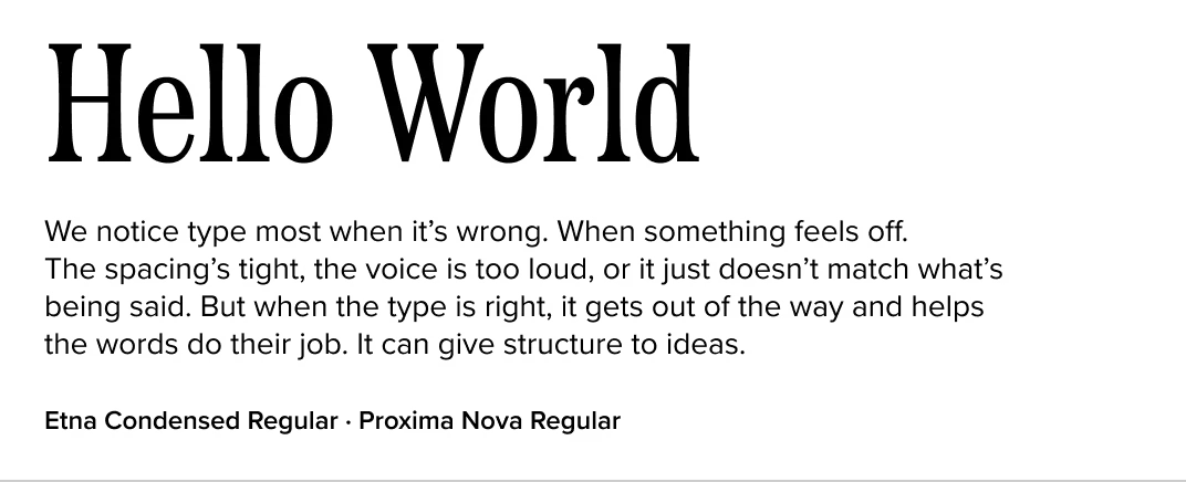
Etna (Mark Simonson Studio)
Etna offers a condensed, vintage-inspired voice that gives Proxima Nova a sturdy, utilitarian companion. This combination feels at home in Americana-flavored branding and editorial design.
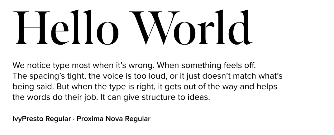
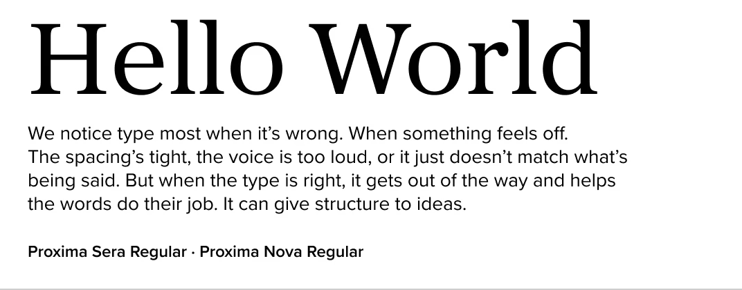
Proxima Sera (Mark Simonson Studio)
Designed as the natural serif companion to Proxima Nova, Proxima Sera mirrors its rhythm, spacing, and versatility—making it an ideal choice for harmonious pairings across brand systems, editorial, and UI. If you love the feel of Proxima Nova and want to extend it into serif territory, this is the most direct and refined way to do it.
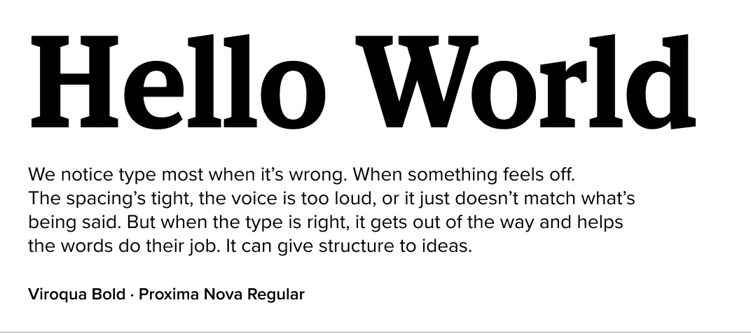
Viroqua (Mark Simonson Studio)
With its sturdy serifs and generous spacing, Viroqua pairs well with Proxima Nova in layouts that require legibility and structure. It’s a flexible choice for editorial and informational design.
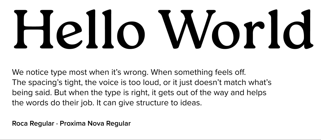
Roca (My Creative Land)
Roca’s curved serifs and soft details introduce an organic warmth to Proxima Nova’s precision. This pairing feels stylish without being loud, and works beautifully for boutique brands, editorial layouts, or packaging.
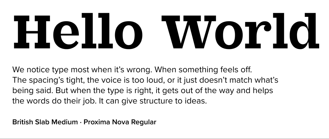
British Slab (Vintage Voyage Design)
British Slab combines retro charm with sturdy structure. Its blocky serifs and expressive design bring a friendly personality to Proxima Nova’s polish—ideal for quirky brands or creative agencies.
Choosing the Right Pairing
When pairing Proxima Nova with another typeface, consider:
- Tone: Do you want elegance, utility, or something expressive?
- Spacing & Proportions: Fonts with similar rhythm or contrast can help your layout feel more unified.
- Scale: The relative size of each typeface affects how well they complement each other. Too little difference can exaggerate conflict—while a clear contrast in scale can make even unlikely pairings work.
- Structural Contrast vs. Uniformity: Do you want a pairing that emphasizes contrast (e.g., serif vs. sans) or one that reinforces a consistent typographic voice?
- Use Case: Some pairings shine in display, others in long-form text. Choose based on the format you’re designing for.
And don’t forget—Proxima Nova itself includes alternate characters and stylistic sets that can subtly shift its tone. Try pairing those tweaks with a serif to find a fresh new voice.
FAQs: Fonts That Pair Well With Proxima Nova
What font pairs best with Proxima Nova?
Proxima Sera is the most direct companion, but others like Ivy Journal, Bookmania, and Stilson offer great contrast with complementary tone.
Can I pair Proxima Nova with a display serif?
Absolutely—try Ivy Presto, Meno Banner, or Freight Big for high-impact headings next to clean sans body copy.
Is Proxima Nova a good body font?
Yes. Its open shapes and wide range of weights make it highly legible, especially on screen.
Where can I get Proxima Nova and its recommended pairings?
You can license Proxima Nova and Proxima Sera directly from Mark Simonson Studio. Other fonts listed here are available from foundries within The Type Founders’ catalog.
Should I use the same size for both fonts?
Not necessarily. Different typefaces often need to be sized differently to look visually balanced, especially when combining a serif and a sans. The right size depends on the specific fonts you’re using and how they function within the hierarchy of your layout. Always test in context.
Final Thoughts
This list offers a strong starting point for pairing Proxima Nova with complementary or contrasting typefaces. Typography is as much about feel as it is about function—so test widely and trust your instincts.
Thanks for reading.
Want more on typography and design? Check out my posts on fonts similar to Proxima Nova and geometric sans serifs.