New Metallophile Sp8 Fonts Released

I released the Light and Light Italic styles of Metallophile Sp8 in 2003. The original plan was to add more weights later, but later never seemed to come. When I started getting requests from customers for more weights, I realized that had to change.

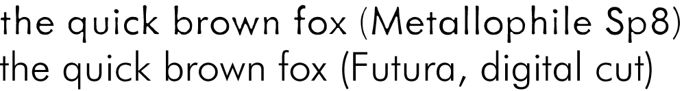
And now it has. Introducing Metallophile Sp8 Medium and Medium Italic. These, like the original Metallophile Sp8 fonts, are based on a classic sans serif hot metal face, Spartan, set at 8 points.
My concept was based on the observation that digital versions of classic typefaces look quite different from their counterparts in metal type. The metal faces, printed on plate-finish paper using letterpress printing, had a warmth and texture that was lost in the precise mathematical world of digital typography. It was not only the imperfections of ink on cast metal, it was also the proportions and spacing, which were particular to the size of type. In digital type (with some exceptions), one size fits all. In metal type, every size was custom tailored. 8 point digital Futura looks quite different than 8 point metal Futura, especially in print.
There have been some attempts in digital type at simulating the look of classic metal typefaces, such as ITC Founder’s Caslon, but rarely has it been tried with more modern sans serifs. Metallophile Sp8 Light was an attempt, but without more weights it was limited in its usefulness.
The original metal Spartan Light was paired (or “duplexed”) with Medium as a boldface on the old Linotype casting machines. With that in mind, I decided Metallophile Sp8 Medium would be the best boldface for Metalophile Sp8 Light.
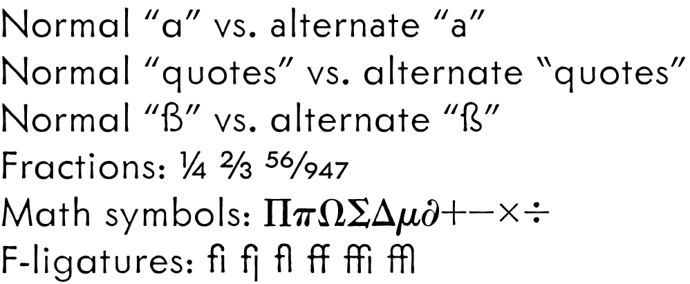
As part of this process, the entire family was moved to the OpenType format, with a greatly enlarged character set, including extensive language support, a full set of math characters (based on the standard “pi” sorts of the metal type days), f-ligatures, a large set of pre-built fractions as well as arbitrary fractions via OpenType. The new fonts also include and alternate two-story lowercase “a” and alternate left quote marks, just like the original metal face. I redesigned the “ß” to give it the more traditional form, but included the more contemporary version I did in the original Metallophile Sp8 fonts as an alternate.
More weights are already in the works, which I hope to release this Summer, but I wanted to get these out as soon as they were ready.