Mostra Nuova in Entertainment Weekly
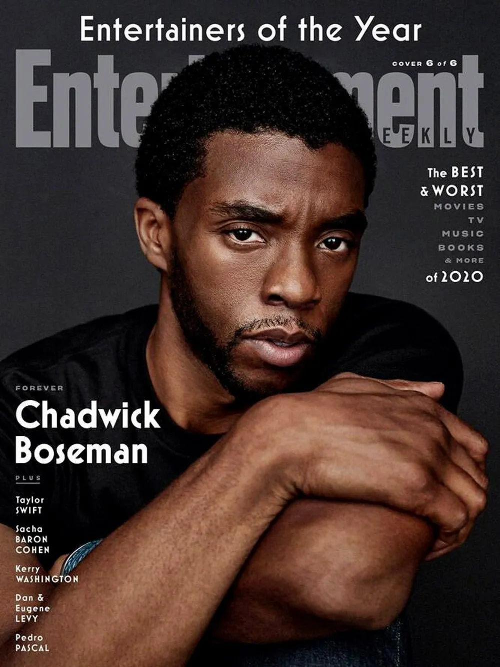
 Christmas came early for me this year when I received the latest issue of Entertainment Weekly and saw my Mostra Nuova all over the cover. It’s always a big deal as a type designer to see my fonts in use, but this was a special treat. Not only was it the primary font on the cover, they also used it extensively on the big feature section inside.
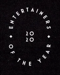
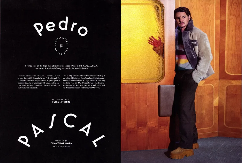
The feature section starts out with a full page that uses nothing but type. Mostra Nuova is used both large and small, and not just all-caps. The first version I released in 2001 had only caps and I added lowercase in 2009. It’s still mostly used all-caps, so it always makes me happy to see the lowercase get some play.
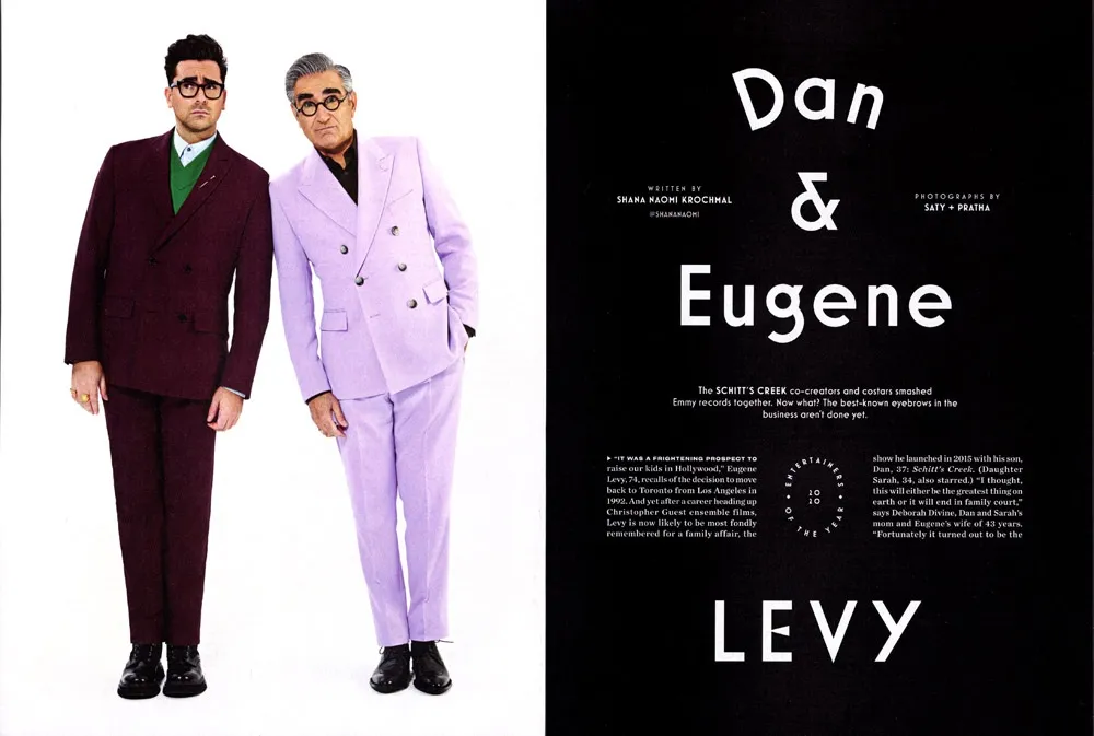
EW’s designers also made extensive use of Mostra Nuova’s alternate characters, sometimes even in the same block of text. They used the Regular, Semibold, Bold, and Extrabold weights. Adding Semibold and Extrabold earlier this year was a good move. If I hadn’t, I imagine that Mostra Nuova might not have been chosen here. (Thanks to Matt Smith at Louise Fili Ltd. for suggesting I add Semibold.)
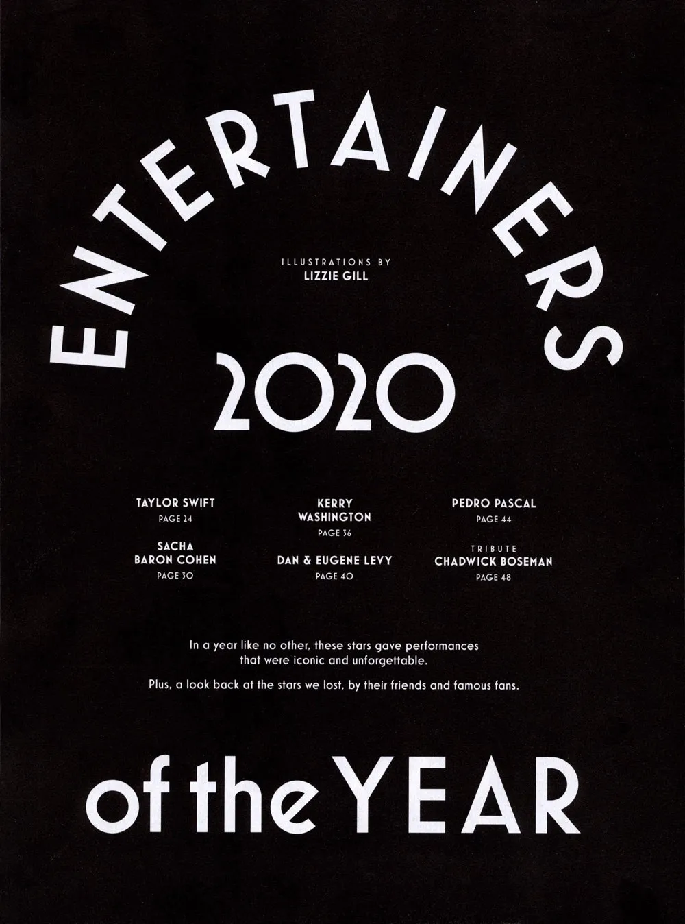
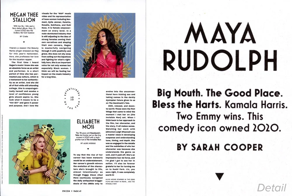
The section is comprised of spreads highlighting a particular entertainer (or entertainers) featuring a full-page photo and title page followed by a page of text. Sandwiched between these highlight articles are pages of shorter pieces featuring other individuals, two per page. (I’ve included a detail of the type treatment on the right.)
I thought it was really cool that they even used Mostra Nuova in the folios (page numbers).
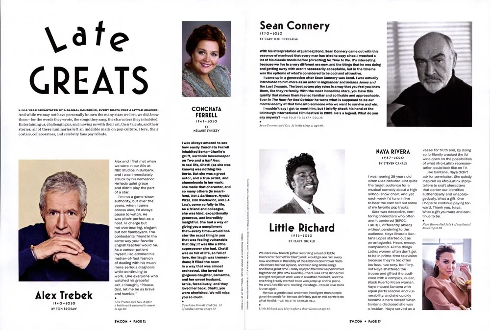
The section closes with several pages about entertainers who died in 2020.
All in all, this is one of the most extensive uses of Mostra Nuova I’ve seen in a magazine. Unfortunately, Entertainment Weekly doesn’t print a staff listing, so I don’t know who to credit with the design and art direction. To whomever you are, nice work!