Mad Men, Mad Props
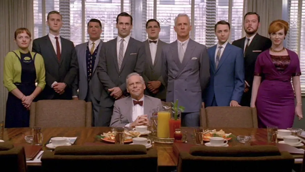
I started watching the critically-acclaimed series Mad Men on DVD over the summer, and I am enjoying it a lot. I was a little kid in the early 1960s. Watching it is like stepping back in time. People really did used to smoke and drink like that. Of course, the show is set in the early 1960s, so I had to write a “Typecasting” piece about it.
Considering that the show is about an advertising agency, there isn’t as much type on Mad Men as I would expect. When there is, it’s usually used they way it would have been in the early Sixties, except it seems the type choices are limited to whatever happens to be loaded onto the computer.
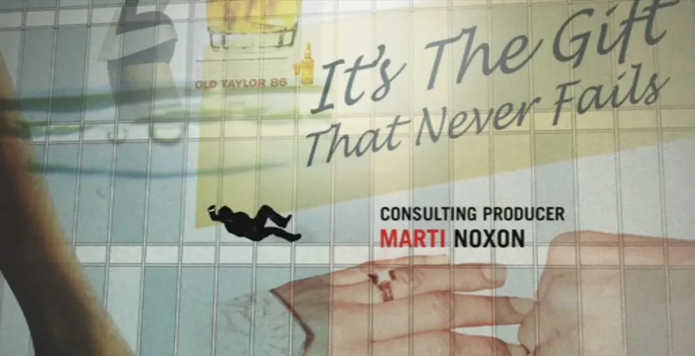
The show starts out with stylish opening titles featuring glimpses of real ads from the period—and a clinker: What’s Lucida Handwriting (1992) doing here? I usually consider the titles to be outside the world of the story, but considering all the period cues in these titles, this typeface, which was designed specifically for computer screens, is out of place.
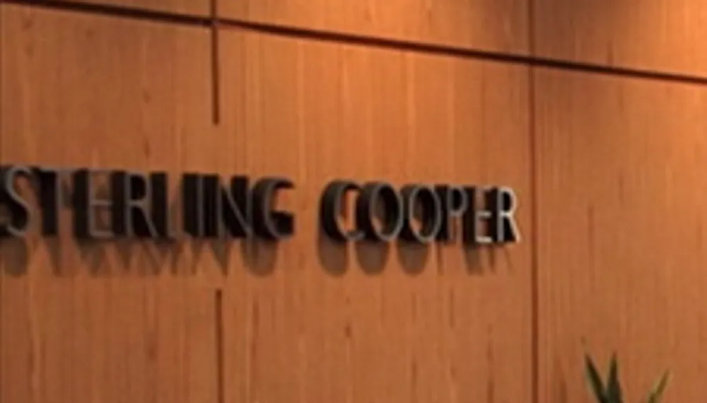
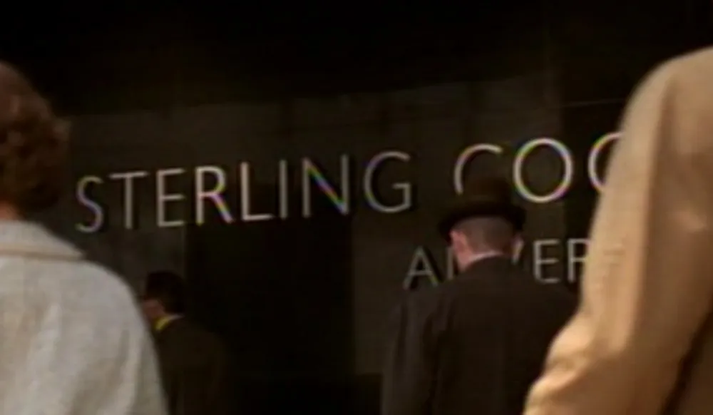
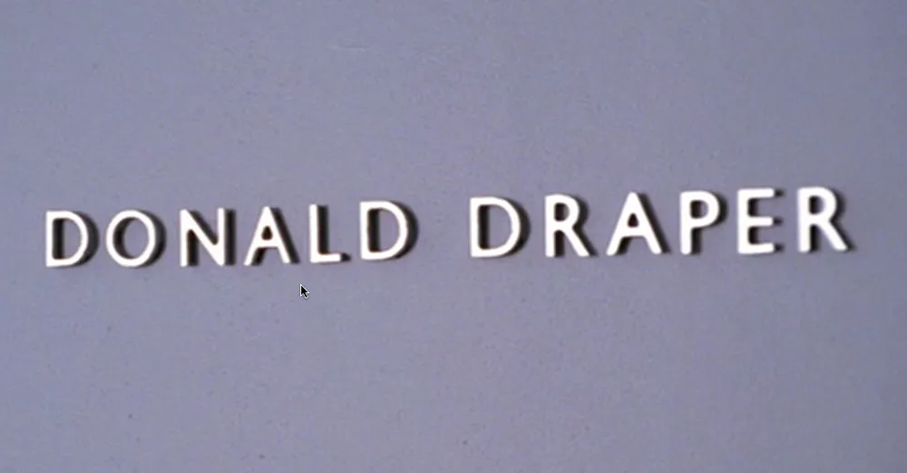
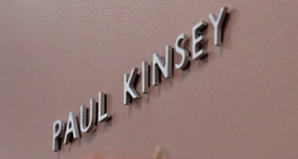
Then there is the Gill Sans (c. 1930) problem. Gill is used quite a lot in the series, mainly for Sterling Cooper Advertising’s logo and signage. Technically, this is not anachronistic. And the way the type is used—metal dimensional letters, generously spaced—looks right. The problem is that Gill was a British typeface not widely available or popular in the U.S. until the 1970s. It’s a decade ahead of its time in American type fashions.
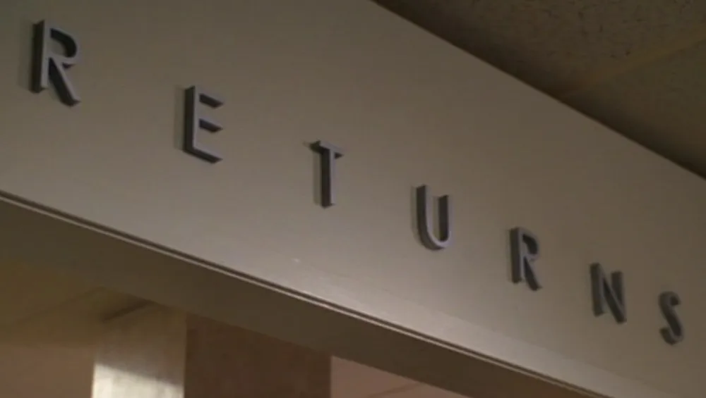
This is not to say that they never get it right. Here we see signage similar to what they have at the agency, but in this case using a more plausible Futura-like style.
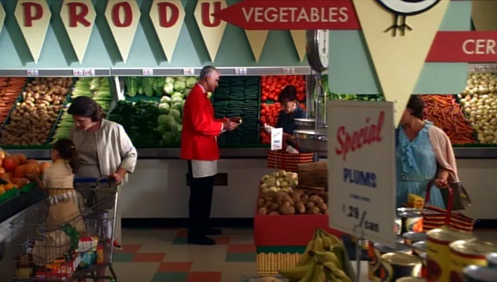
This grocery store interior is also quite good. Some casual brush style lettering and Futura again, not feeling out of place at all.
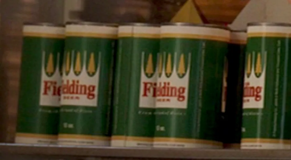
This beer label caught my eye: Was there really a Fielding beer brand that had labels exactly like Hamm’s beer, but with green instead of blue? (By the way, the beer cans in the show are opened with can openers. No pop-tops here. Nice detail.)
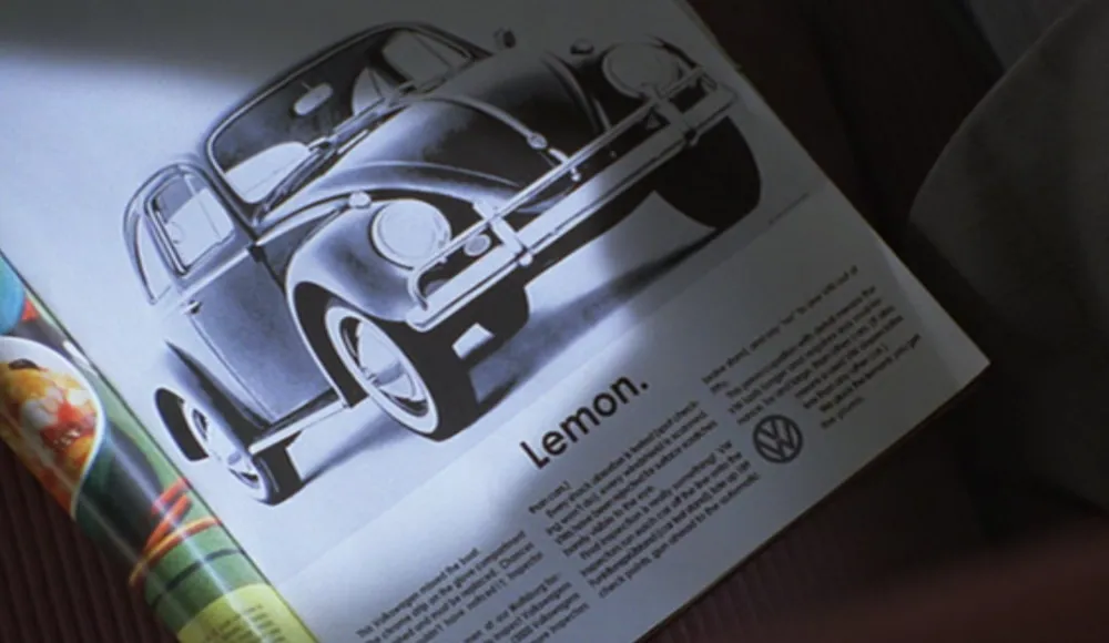
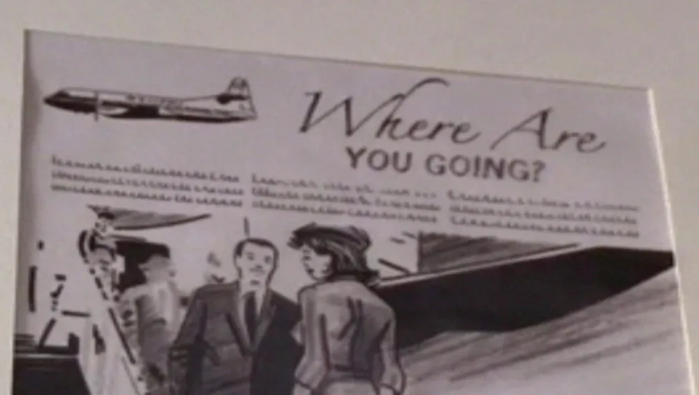
Then there are the ad layouts, supposedly produced by the art department at Sterling Cooper. You can tell the layouts are done with markers and pencils, as they would be, although they seem too sketchy. Perhaps this is to help them “read” as marker layouts on TV. The ad designs feel flat-footed and mediocre, but we also know that Sterling Cooper is not in the vanguard of advertising—they scoff at this clever and now-famous Doyle Dane Bernbach Volkwagen ad—so maybe that’s intentional. On the other hand, they are way ahead of their time when it comes to type, using faces that didn’t even exist yet.
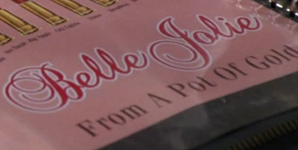
These lipstick ads feature Fenice (1980) with Balmoral (1978) for the script caps. Amazone (1958) for the script lowercase is fine here, but the outline looks too much like a modern computer graphics effect (which is what it is).
Here is some hand-drawn ITC Kabel (1975) and, I’m pretty sure, Bookman Old Style (1989), one of Monotype’s ITC stand-ins.
Whoops—Zapfino (1998). I guess they use Macs.
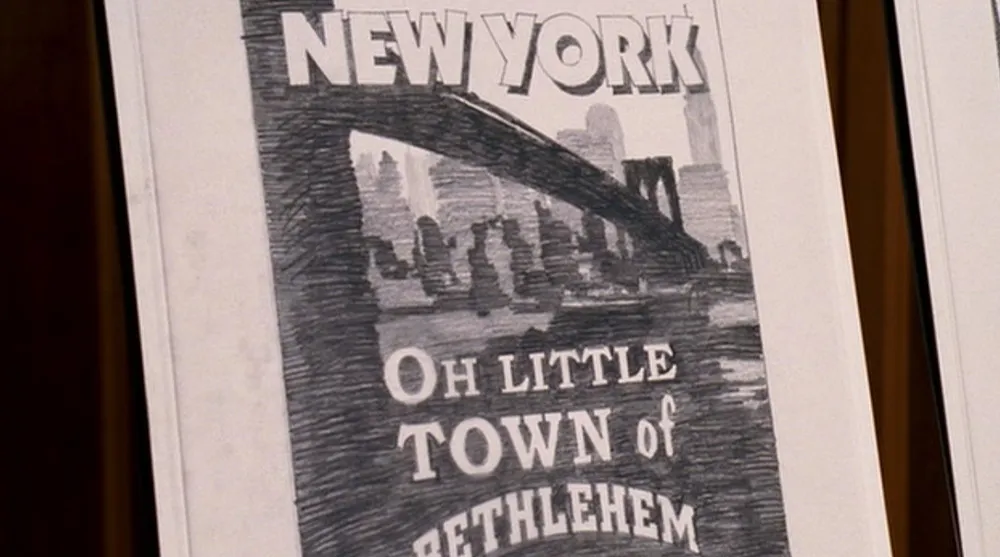
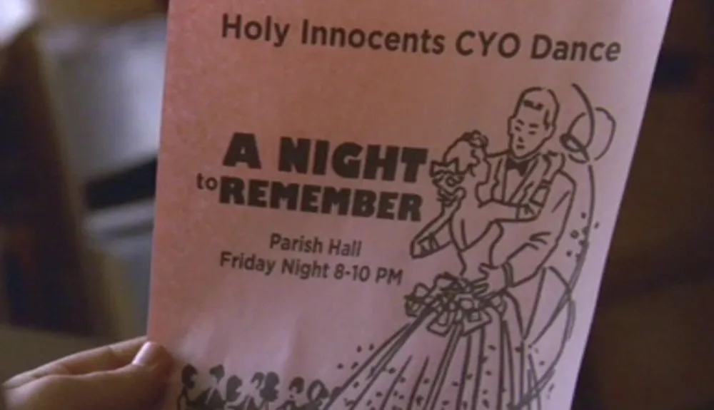
Gill Kayo did exist at the time, but wasn’t in style yet and feels out of place on this church flyer. Gotham (2002) is just wrong. The blown up vintage clip art seems odd here, too. The whole layout has a Kinko’s feel to it.
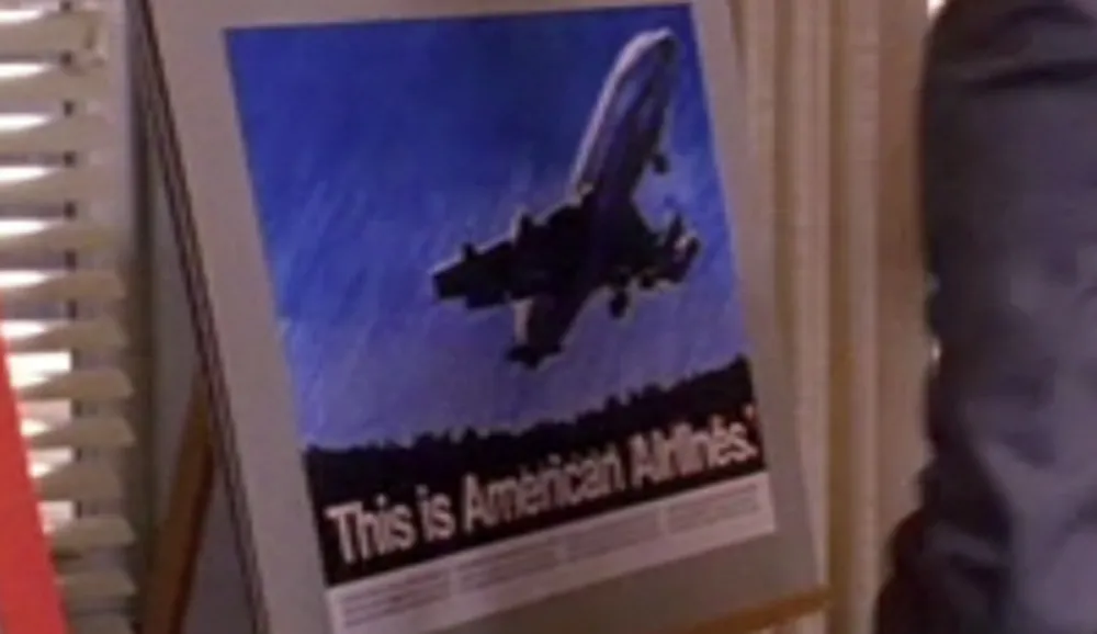
There is also this curious American Airlines ad featuring Helvetica several years before Massimo Vignelli famously redid their corporate identity using… Helvetica.
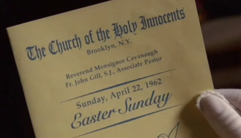
The church bulletins are a bit problematic, partly because they are typeset (the ones I remember were mimeographed). Palatino (1950) existed, but didn’t really catch on in popularity in the U.S. until around 1970. And Snell Roundhand (1966) is definitely premature. This feels more like desktop publishing than early Sixties ephemera.
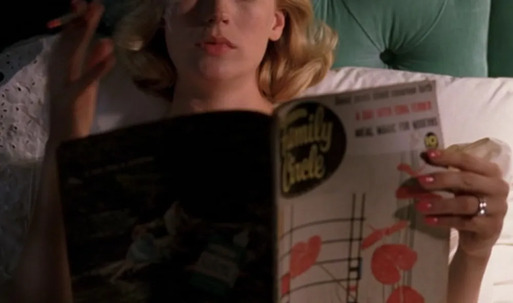
Speaking of which, the sets of Mad Men are filled with actual artifacts and ephemera from the early Sixties—magazines, books, packaged goods, furniture, art, record jackets, typewriters. This is great (and it must be a lot of fun to scrounge for props), except that sometimes you can tell this stuff is really old, especially anything made of paper. I can almost smell the mildew when Betty Draper is reading her yellowing copy of Family Circle.
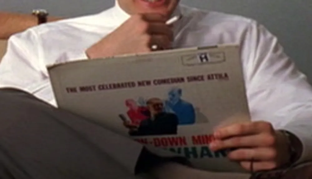
The ad writers listening to a then-new Bob Newhart comedy album was a nice touch, except that it looks like they got their copy at a Goodwill store.
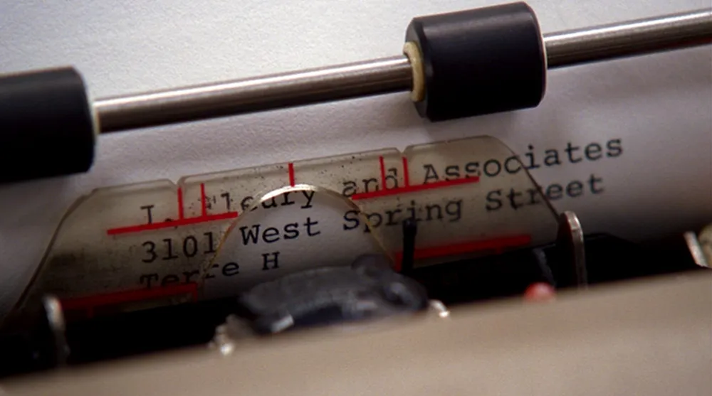
Alert fans have noted that Seventies-era IBM Selectric II typewriters are used on the show, but even these have visible signs of age, such as the yellowed plastic shield you can see in this shot. I wish they would figure out a way to make these props look less aged. I sometimes feel like these characters are living in a retro museum instead of 1960s New York.
I don’t mean to be so hard on Mad Men. I dearly love this show. If it were a two hour movie instead of a season and a half (so far) of one-hour TV shows, this would be a much shorter article. And the fact that the shows are broadcast in HD makes it all too easy to scrutinize the props. But, I have to admit, scrutinizing the props is part of the fun of watching Mad Men.
(Special thanks to reader Michelle U. for reminding me I needed to watch this series and look at the type.)
Update: I forgot to mention the (I hope) thoughtless choice of Arial for the closing credits. Happily, this territory was nicely covered recently by Andrew Hearst.