Introducing Proxima Vara
Well, this has been a long time coming.
Variable fonts (a.k.a., OT-VAR, or OpenType Variable) started to become a thing in late 2016, with backing by Apple, Microsoft, Adobe, and Google. The standard took a while to be worked out, but it’s fairly settled now.
The good news is that variable fonts work great in all the major web browsers, and the web is where variable fonts make the biggest difference. It lets you put an entire font family with unlimited styles into a single font file that is about the same size as a few traditional fonts. This gives the web designer a much larger typographic palette without the bandwidth penalty.
On the desktop, variable fonts are not as well-supported. Adobe Creative Cloud apps (Photoshop, Illustrator, and InDesign) have good support at this point. Others include Sketch and Corel Draw. You can see a current list here. I expect this will improve over time and, eventually, they will work everywhere.
I knew from the beginning that I would want to do a variable version of Proxima Nova. I started work on it in late 2017. This was when support was low and the standard was in flux, so it sat on the back burner after some initial tests.
In Spring of 2019, I enlisted the help of Rainer Erich Scheichelbauer and his team at Schriftlabor for technical and production assistance. Although I’m an old hand at making OpenType and other kinds of fonts, I felt a bit out of my depth with variable fonts. Given the amount of user stress that a variable version of a face as popular as Proxima Nova would need to withstand, I needed to bring in an expert. Rainer has been at the cutting edge of variable font technology, including being one of the developers of Glyphs (the app I use to make fonts), so it was in good hands.
Nearly two years later, I’m ready to introduce Proxima Vara. (You can try it out here.)
Proxima Vara is a completely new family, not an update to Proxima Nova, and there are some differences. One is that the default figure style is tabular rather than proportional. This was often requested by Proxima Nova users, but changing it would have affected existing users’ documents. There are also improvements to character shapes and spacing.
Proxima Vara, as a variable font, contains built-in weight and style “instances” that match Proxima Nova and can be selected in font menus, as if they were separate fonts. There are six new styles, in the new Extralight weight, making 54 styles, up from 48.
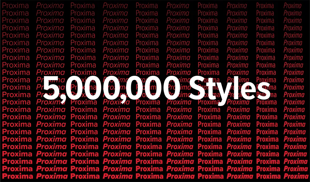
Unlike Proxima Nova, you are not limited to these built-in styles and can specify any arbitrary style along the weight, width, and slant axes using sliders or by specifying values, for example in CSS. In all, there are 5,000,000 possible styles, going from Thin Extra Condensed to Black Italic.
L**icenses for Proxima Vara start at US$99** for a basic desktop license and will be rolling out at most of my distributors starting today. (See “Buy” on this page.)
The one exception is Adobe Fonts (a.k.a., Typekit), which is unfortunately not yet ready to host variable fonts for web or desktop use.