Introducing Proxima Sera
Not long after I released Proxima Nova in 2005, people started asking me: “What serif font would work best with Proxima Nova?” It’s very common to combine serif and sans serif typefaces, usually a serif face for text and sans serif for larger sizes or for emphasis or change of tone in text. I usually suggested a modern, such as Century Schoolbook, or a slab serif, such as Rockwell. None of my suggestions felt like a satisfying answer to me, so I started thinking about designing a serif sibling to Proxima Nova.
After some false starts over many years, trying to add serifs to Proxima Nova somehow, I decided instead to create a serif companion—a face that is not simply a seriffed version of Proxima Nova, but a serif typeface designed to harmonize with Proxima Nova, while having its own structure and identity, similar to the way that Morris Fuller Benton’s Century faces harmonize with his Franklin Gothic and News Gothic.


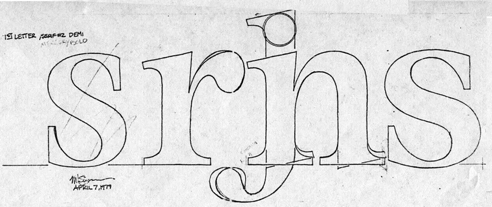
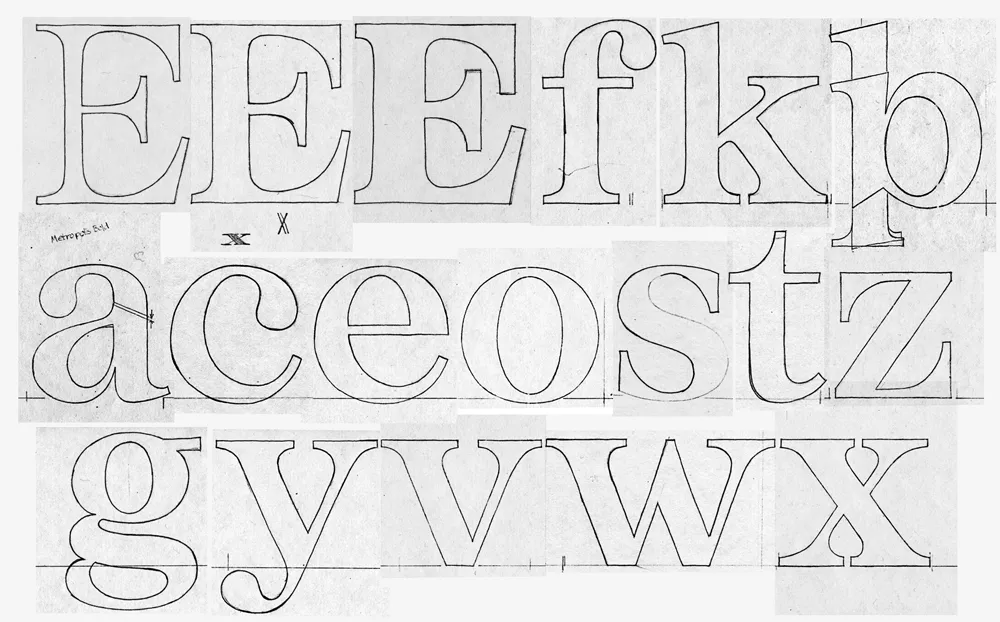
Back in 1979, when I was first dreaming about making typefaces, and around the same time I had the earliest ideas for what would become Proxima Nova, I did some sketches based on the concept of combining the characteristics of several popular serif typefaces—Times, Plantin, Century, and Baskerville—but with proportions similar to Helvetica. The working name was “Metropolis.” Proxima Nova was based on a similar hybrid concept, but with sans serif typefaces. The idea of using something that came out of the same period and the same thinking as my concept for Proxima Nova made sense.

In 2020, I went to work and adapted “Metropolis” as a companion to Proxima Nova, changing some of its details and proportions to harmonize better with its sans serif counterpart. The overall style falls more squarely in the modern category than my 1979 concept, but it retains some old style elements, such as the spurless serifs on the C, G, and S and the structure of the numerals.
The result is Proxima Sera.

Proxima Sera 1.0 contains a subset of the Proxima Nova character set (Greek and Cyrillic are still to come), but it has all the same features—small caps, old style figures, alternate characters, etc. There also is only the regular width. Condensed and Extra Condensed will come later. It has all the same weights, from Thin to Black, plus one more—Extralight.
Proxima Sera works beautifully with Proxima Nova. But, of course, like Proxima Nova, it can stand on its own or play nice with other fonts.
Proxima Sera is available immediately for licensing at most of the usual places.
