Introducing Neotype
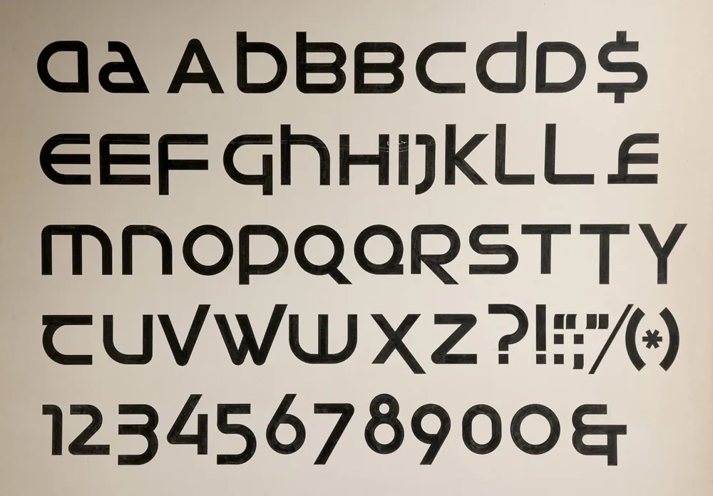
My first attempt at designing a typeface, from March 1976.
My interest in type design traces back to a type design project I did in college as an art student 50 years ago. I wrote about it here last March and shared it on social media. A commenter on Instagram asked if I was planning to release it, something I hadn’t seriously considered before.
One thing led to another, and I decided to do just that. The result is Neotype, a display font family based on that project.

My 2026 revision, fifty years later.
The design is a hybrid of uncial script—the basis for our modern lowercase alphabet—and modern, geometric sans serif, especially seventies designs such as ITC Avant Garde Gothic, Motter Textura, or Handel Gothic. The line between the upper and lowercase is gone, with both cases sharing the same height. The upper and lowercase forms may be mixed and matched for different effects.

Neotype combines upper and lowercase into a single case that can be mixed and matched for a variety of effects.
In a way, it’s a revival of an unreleased 1970s typeface.
Naturally, I applied my years of experience as a type designer to correct the flaws in the original—and there were a lot. It was my first attempt at designing a typeface, after all. I also added more alternate characters, to increase the design possibilities.
The original design was just a single style. That seemed too limiting, so I expanded it to six weights—Thin, Light, Regular, Semibold (the original weight), Bold, and Heavy.

The six weights of Neotype.
Expanding the character set was a lot of fun. It meant trying to imagine how my 20-year-old self would have done it if I’d had the necessary skills back then, using the same design logic.
The original project only had 62 characters—just letters, numbers, and some basic punctuation and currency symbols. To bring it up to modern standards, in terms of language support, standard punctuation, symbols, and more, the character set ballooned to 552.

The full character set.
Beyond the basics and all the alternate characters, I included a set of arrows and dingbats, something I’ve been doing for all my fonts starting with Etna in 2020.

Arrows and dingbats.
Neotype features automatic OpenType fractions. I designed small lining figures for that, rather than just scaling down the normal size figures, since the old style forms don’t really work for fractions.

Regular and small figures, with fraction support.
There are five OpenType Stylistic Sets—Extended Strokes, Uncial Forms, One-story a, Round Zero, and Alternate Index, which gives you the option to flip the pointing hand to show the back side.
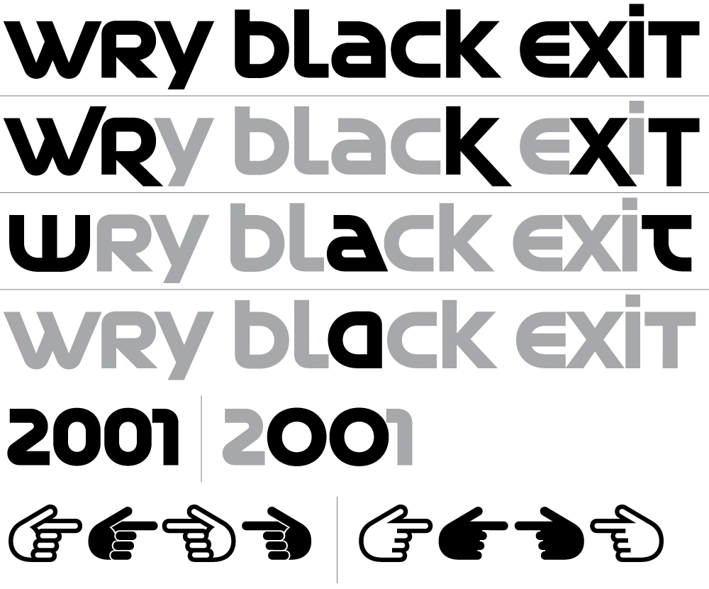
Five Stylistic Sets.
I never thought I would I would finish my first typeface fifty years later. But thanks to a comment by Tobi Herz on Instagram and the encouragment and support of The Type Founders, it actually happened. The result is a retro-futuristic seventies design that I think my younger self would have loved.
And it’s available now. More information here.