Introducing Lakeside
I haven’t been posting much to Notebook lately because I’ve been, well, busy. The thing I’ve been busy with is this:

Lakeside is a script face I’ve been working on for the past two years. It was initially commissioned by an independent filmmaker for use in some film titles. It’s based on the hand-lettered titles of the classic 1944 film noir classic “Laura.”
An unusual feature of Lakeside is that it has three styles of capital letters suited to different uses:
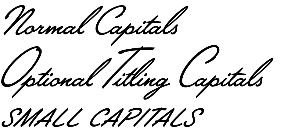
There are normal caps for, er, normal use; over-sized caps for a fancier appearance; and smaller, plainer caps for all-caps settings—something not normally possible with a script font like this.
Lakeside takes advantage of the OpenType format to put a virtual lettering artist at your fingertips. Here is the font with OpenType Contextual Alternates turned off and then on:
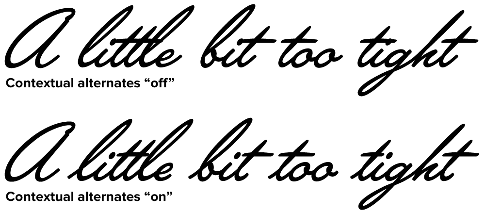
Notice how each letter tailors itself to its position within a word, using a different form depending on whether it comes at the beginning, middle or end. Notice also how the crossbar on the lowercase “t” seems to “know” about adjacent letters and adjusts its width appropriately. (It’s not actually “a little bit too tight,” it’s just that those words are good for showing how the magic works.)
For more information, see the Lakeside Specimen Sheet (496k PDF) and the Lakeside User Guide (1mb PDF).
Licenses for Lakeside can be purchased at Font Bros. Other venues will be added soon.
(Note: Last year I mentioned this font on Notebook when it was still under development. At that time, it was to be called “Launderette.” Unfortunately, that name was taken—twice—so I chose the name “Lakeside” instead.)