Introducing Heckle
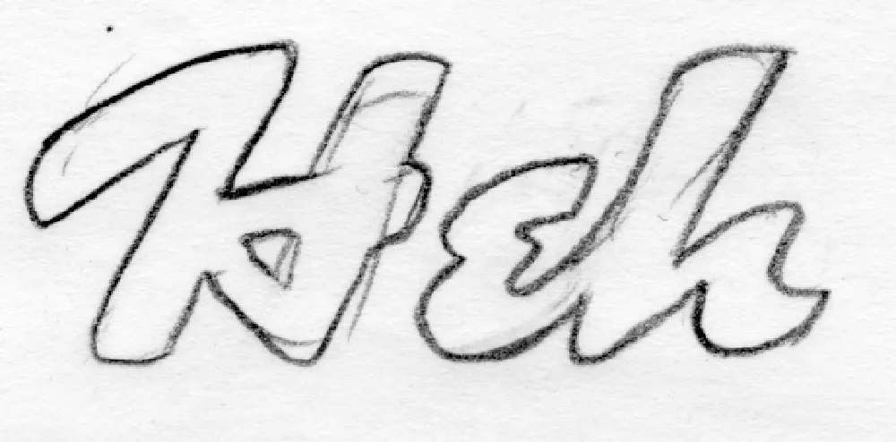
My 2005 t-shirt concept sketch.
Heckle is a family of display fonts that began as a tiny sketch on a notepad in 2005. I had this big idea to try to make money selling lettering-based t-shirts at CafePress.com (remember that?). One of the designs I came up with was the word “Heh” in a brush script with a 1940s/1950s feel. It was one of those styles that came out of the subconscious inventory of lettering styles I’d soaked up like a sponge in my youth. It wasn’t based on any particular piece of lettering or typeface.
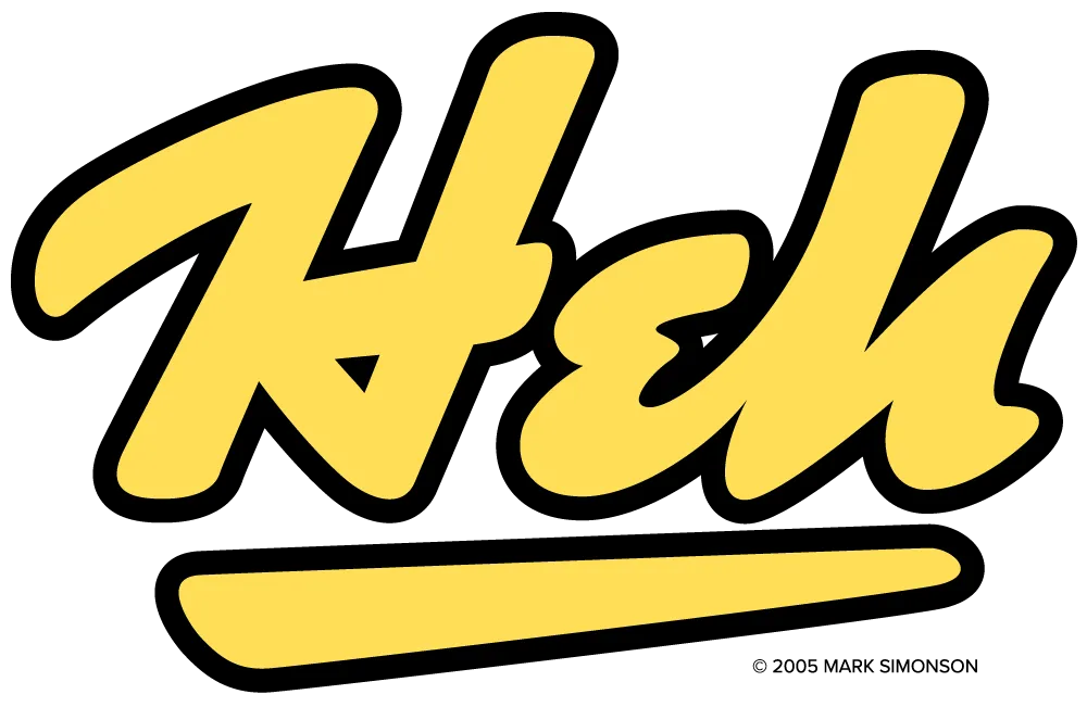
The final t-shirt design, drawn in Adobe Illustrator and sold on CafePress.com.
I didn’t sell many t-shirts, but I did end up with some neat lettering designs that could potentially be expanded into typefaces. Such was the case with the “Heh” shirt design. In 2017, I did a draft of the caps and lowercase in my font editor. It looked promising, but I didn’t get back to work on it until October 2025.

“Heh Script” draft from 2017 vs. Heckle’s final 2026 design.
Over the next five months, I expanded it to a family of six weights, from Light to Black. Refinements from the original lettering included tilting the stroke endings forward and using sharp corners on the insides of curved strokes, giving the design a crisp, energetic appearance. I honestly am not skilled at doing brush lettering. My method is to build letters by abstracting what I see, creating shapes that could be made with a brush, if that makes sense. That said, it’s a completely intuitive process. I stop when it looks right.

Alternate “e” and simplified caps for all-caps settings.
Once I got the basic design worked out, I filled out the rest of the character set, adding an alternate lowercase “e,” contextual alternates for all-caps settings (intended more for acronyms and abbreviations rather than extended text), my usual set of dingbats (featuring a manicule inspired by cartoonist Preston Blair), and—even though they may not get much use—the standard math and symbol characters, which are all but required in digital fonts. Heckle supports most Western and Central European Latin-based languages.

Heckle dingbats, including a Preston Blair-inspired manicule.
I never imagined back in 2005 that this silly t-shirt design would turn into a complete font family, but I’m really happy with how it turned out.

The basic Heckle character set (Extrabold style).
Heckle is suitable for any kind of display use—book covers, packaging, signage, advertising, magazines, websites, branding—where a lively, vintage hand-lettered look is desired.

The complete Heckle family.
Heckle is available today. More information here.