Introducing Hardcover
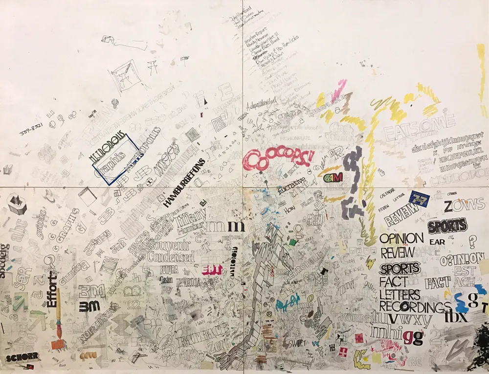
The “desk protector” from my first job in 1976. I was a bit obsessed about type.
In 1976, I dropped out of college to take a job at a small advertising art studio in Minneapolis. I was there only five months. I quit to take another job, this time as production manager and designer at Metropolis, a weekly newspaper in Minneapolis. Until it went out of business nine months later. My third job was another small advertising art studio started by two people who had left the place where I’d worked my first job.
Thanks to a project I did in college, I’d become hooked on the idea of designing typefaces. In idle moments at these jobs, you would often find me sketching and doodling ideas for typefaces. They were mostly not very good, but the more I did it, the better they got.
In 2016–2017, I scanned and catalogued all the type idea sketches I’ve made (and saved) over four decades. Most of the early stuff was not great, but a few ideas were promising. One was a very minimal idea from about 1978, drawn in felt pen on a sheet of layout paper, where I (incorrectly) spelled out the word “Tarifs.” (I ran out of space, plus, why draw the same letter twice?)
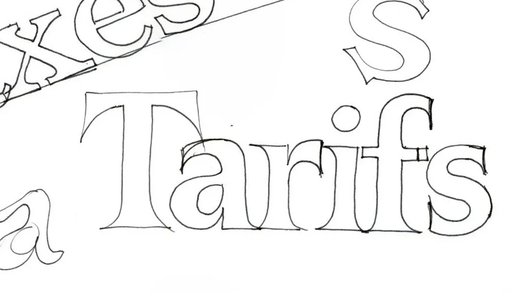
My sketch from 1978.
I don’t recall exactly what I was thinking when I drew it. I was probably bored, avoiding whatever it was I was supposed to be working on. When I’m doodling letters, I don’t usually have any conscious plan. Things just spill out from my brain, which collects things I’ve seen like a magpie in my subconscious. Looking at it now, it most likely came from the kind of slick lettering you would see on book covers in the seventies. I often spent my lunch breaks hanging out in bookstores, so, it could be. I think there are bits of Times New Roman and Arrow there, too.
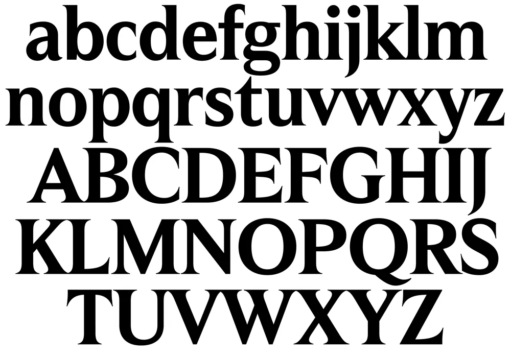
My draft of caps and lowercase from 2017, interpreting my nearly 40-year-old sketch.
I did a draft of it in 2017, extrapolating from these six letters. Of the roughly 30 “backburner” ideas I did drafts of back then, this “Tarifs” idea got a lot of positive reactions when I showed it to people.
In February this year, I decided to do it for real. This meant expanding the range of weights and then expanding the character set (the draft was just the basic alphabet in caps and lowercase).

Expanded range of weights from the Semibold starting point.
As I did this, the design became more disciplined than my original sketch. I dropped the cupped serifs (a case of naive excess), but tried to preserve the basic idea, with its sharp, deeply bracketed serifs and graceful curves.
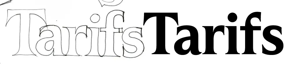
The 1978 sketch vs. the final design.
Unlike similar faces like Times or Arrow, it features head serifs that are flat rather than angled, and generally mirror the construction of the capitals as much as possible, avoiding things like ball terminals.
Initial figures concept and final.
When it came to the figures, my first inclination was to give them an angled stress (just because I like that style), but I quickly realized they needed to have the same vertical stress as the caps and lowercase.
The original concept didn’t include an italic, but I didn’t like the idea of releasing it without one. By April, I was already working on one. Leaving out elements like ball terminals made the design of the italic more challenging, but I think my solution works well.

The matching italics.
One of the trickier parts was coming up with a name. It was never going to be “Tarifs” (the working name, after the original sketch). After trying out a few different ideas, I settled on Hardcover, which is a nod to my likely inspiration back in 1978. It also indicates how this face is intended to be used: Large, like on the cover of a 1970s bestseller. (It does also work for text, but I wouldn’t set a book in it.)

Hardcover comes in seven weights, from Extralight to Black, in both roman and italic. All styles include small caps, tabular and proportional figures in both lining and old style, support for Western and Eastern European languages, and a set of matching dingbats.

Hardcover is available now. More information here.