Interview: Douglas F. Jones, Designer of Skin & Bones
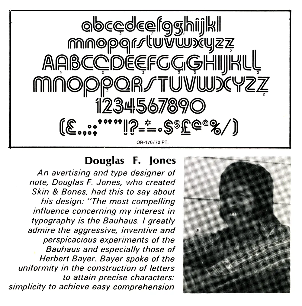
Jones with his creation, Skin & Bones, in Industrial Art Methods magazine, 1972.
In 2013, I posted an item here about a magazine article I saw as a teenager back in 1972, which helped spark my interest in type design. It was about some recent typefaces released by Visual Graphic Corporation. VGC made the Photo Typositor, a machine for setting headline type. It included photos and short bios of the designers. One of them was Douglas F. Jones, designer of the typeface Skin & Bones.
A few years later, in 2017, someone who knows Doug emailed me with his contact info and said he might like to hear from me. I emailed Doug and asked if he would like to do an interview as a follow-up to my 2013 blog post.
I meant to publish the interview sooner, but in our exchange, I noted that there was no official digitization of Skin & Bones, just some crappy free versions, and that I would be willing to do a high-quality, official digitization of his design. I decided to hold off publishing the interview until it was finished.
That task is now completed, and the font will soon be available at Mark Simonson Studio (and Adobe Fonts). Of course, the royalties will be shared with Doug.
In the meantime, here’s the interview….
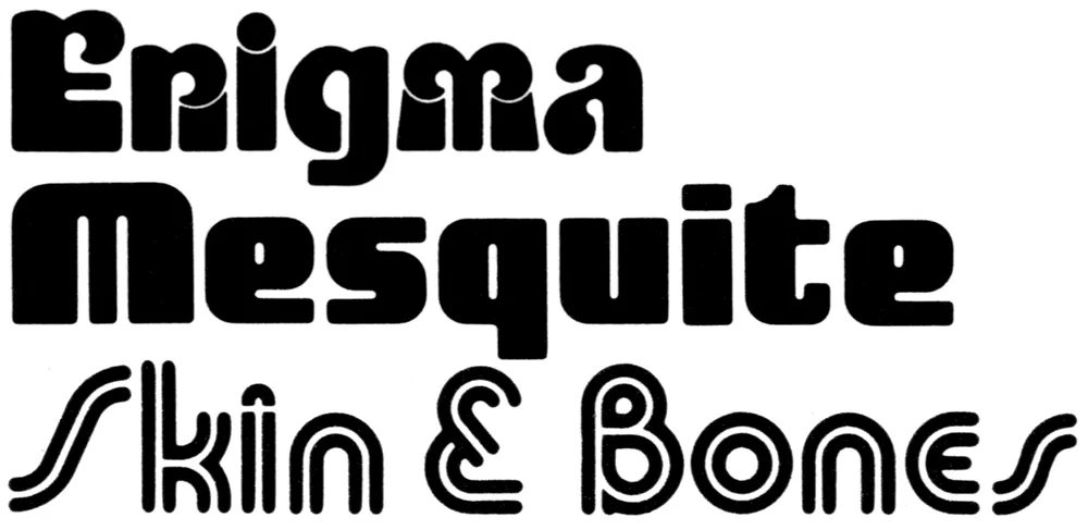
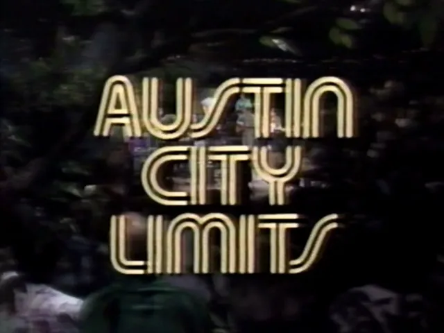
Doug: I designed three fonts for VGC, all published between 1972 and 1976: Skin & Bones, Mesquite, and Enigma. Fonts In Use notes that Skin & Bones has been used by the music program “Austin City Limits” since 1974 and that it was used on the VGC Typositor, one of which is in the printing museum at the Romano Library & Museum in Haverhill, MA.
I became interested in calligraphy and paper sculpture after designing fonts.
Mark: How did you get into designing typefaces? What made you want to do it?
Doug: I graduated in 1962 with a BFA from California College of Arts and Crafts (CCAC) in Oakland, CA (now CCA). Charles Eames, of chair fame, was the keynote speaker at the graduation. He said that we graduates had learned our ABCs at CCAC, and now it is time to go out and learn the rest of the alphabet. Boy, was he right—and I’m still learning! Haha.
After graduating, I got a job designing signs for an electric sign company in Las Vegas. In those pre-computer days, all lettering had to be hand-drawn (including menu boards, ouch!). Just by repetition, one begins to have a feel for letters.
Soon, I began designing my own letters for signs. Then, while working in Las Vegas, I embarked on a project to design a complete alphabet called Skin & Bones, unaware of the amount of work it would entail.
Mark: What was the concept or inspiration for Skin & Bones?
Doug: I was very interested in the Bauhaus and the simplicity of their designs, but don’t be fooled. Simplicity is very difficult! When I was experimenting with Skin & Bones, I was impressed by the fact that a letter with an inline attracts the eye.
Now, the real work began. It is easy to design one letter, but an entirely different matter to formulate 52 letters and have them relate seamlessly one to the other.
Mark: How did you find out about VGC, and what was the process for producing a typeface with them?
Doug: I had submitted some font designs to other companies to no avail. Although some gave me encouragement. I even won a contest from LetterGraphics with an alphabet called “Gnome.” It was only a lower-case font, so they told me in the future to design both upper- and lowercase.
It was about this time that I had heard of VGC, after seeing it in a graphics book. So I decided to submit Skin & Bones as an unsolicited font. They were interested.
They had a system for judging fonts. The designer is required to submit certain letters: Caps - A E G M O R S and lowercase - a e f g p t y. Then a panel of VGC staff members would evaluate the samples and, if accepted, tell you to proceed. And it was.
The characters had to be inked at a 2” cap height on individual cards (3” x 5”) with 1/4” punched holes in cards to align with register posts. A metal plate with registration posts and cards were supplied to complete the project. As it turned out, I needed 115 separate cards. Foreign accents and ligatures were required for distribution in other countries. When inking was finished, the cards would be sent to VGC to be photographed and duplicated on film to be used in their Photo Typositor machines.
Skin & Bones took six months from concept to final inking. All of the inking was done with a Rapid-o-Graph technical pen. When the entire font was completed, each letter, accent, and punctuation mark had to be “letter perfect.” VGC demanded this!
Mark: Once the font was released, what kind of response did you get? Were you involved in marketing it? Was creating Skin & Bones financially rewarding?
Doug: VGC did all the marketing and agreed to give designers 25% of the gross sales. There was a bumpy start at first and it took a while before I got my first royalty check. But it didn’t last long before things went south.
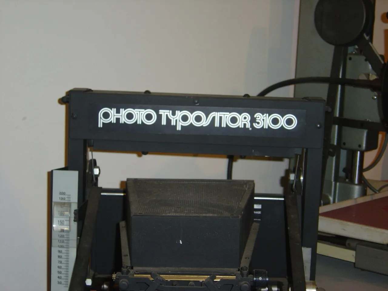
Skin & Bones in use on the VGC Photo Typositor. (Source: www.flickr.com Tamye Riggs. License: All Rights Reserved.)
When I was working in Phoenix, I saw a ripoff of Skin & Bones in Chartpak rub-down lettering. When I notified VGC, they were aware of it and told them to “cease & desist,” which they did. It was an awful reproduction—rough. This was about 1974. I didn’t receive any royalties from Chartpak.
About this time I saw S&B showing up in magazines and newspapers. I have clippings from Time and Newsweek, Spalding basketballs—even Kobe Bryant used it. No royalties. Lucas Samaras (artist) used it for title pages in his book. And, of course, Austin City Limits. No royalties. I even saw it two weeks ago in an ad in a paper in Berkeley, CA.
In all, I received $240 in royalties. VGC had problems securing sales with the advent of computers. Ultimately, VGC went out of business and the fonts all fell into public domain. All the designers, including myself, were deprived of any future royalties from the sales of our fonts.
Mark: Well, now that I’ve agreed to digitize Skin & Bones, maybe that will change.
Doug: As it stands right now, nothing has happened or will happen concerning any royalties, so we have nothing to lose by re-releasing Skin & Bones and seeing what comes of it.
* * *
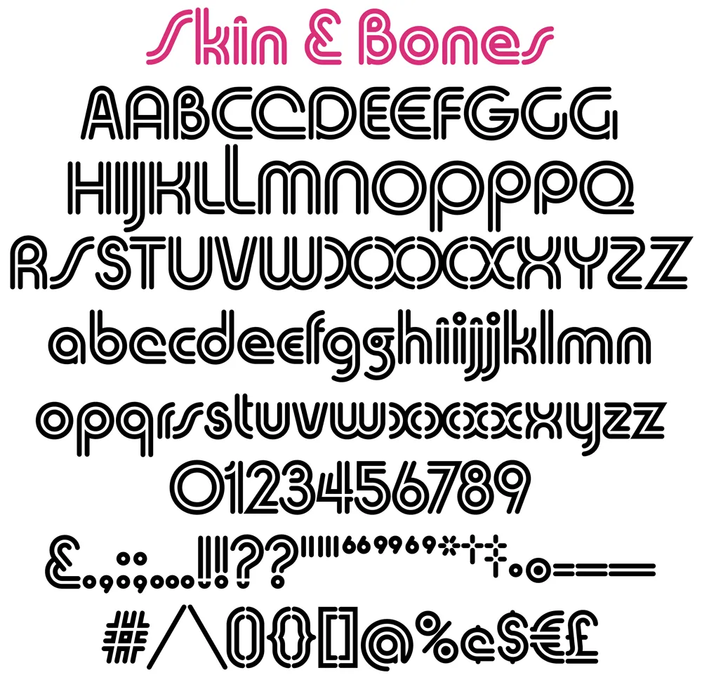
Here’s a sneak peek at the newly digitized Skin & Bones:
Stay tuned….