Grad Nearing Completion
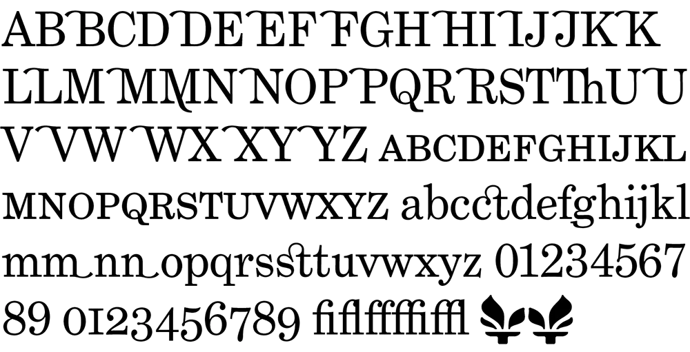
In case anyone’s wondering why I’ve been posting items less frequently lately, it’s because I’ve been working on fonts. The family closest to completion is Phil Martin’s Grad. It consists of just three fonts (plain, italic, bold), but I’ve been getting a little carried away and have added small caps, ligatures, old style figures, swash characters, and even a few dingbats (see above). All of these existed in Phil’s original private version of this face which he used for a couple of newsletters he published in the 1990s. If one had a mind to, one could recreate Re:Language, Millenium Memorandum, or even Phil’s personal stationery. Yes, some of the characters in Grad are…unusual. But that’s Phil for you. Ever the iconoclast.

Some might say that Grad is nothing but Century Schoolbook in drag. There is some truth to that. And I think Phil would even agree. But looking over Phil’s output from the late sixties through the eighties, this is the kind of thing he does best. I have come to the conclusion that Phil is the George Barris of type designers. Phil’s best-known faces were redesigns, customizations, or hybrids of existing—often classic—faces. In the type world, such an approach to type design is sometimes looked down upon. Yet Phil is very good at it. He considers Grad one of his best.
Grad is an unusual font for me to develop. It’s not a design I would have conceived myself. Nevertheless, it’s turning out very nicely. I’m putting everything I know into making it a well-tuned machine that works as well for text as for headlines. In order to accommodate all the extra characters Phil designed, I’m planning to release it in OpenType format. This will mean that things like the real small caps and alternate characters will be accessible from a single font in each style. I plan to also do Grad Condensed at a later date, completing the family.
In the mean time, I have other fonts in the works, including a re-release of Proxima Sans. The new version will have more weights (lighter, bolder, and more in-between) as well as condensed and semi-condensed styles. Plus small caps and other typographic niceties. More information on this as it develops.
For more about Phil Martin, see my interview with him on Typographica or visit his personal website. [Update: Phil died in 2005 and his original site is long gone, but I’ve linked to an archived version on archive.org.]