Dumbest Thing I Ever Did as a Designer
I suppose I had an excuse: I had no formal training yet, but I was possessed by the romance of graphic design.
In my senior year of high school, I was the editor of the yearbook. I’d been on staff in previous years, but now I was in charge. Even at 17, I knew what good graphic design looked like. My uncle was a graphic designer in Chicago, where he worked at one point for Container Corporation of America, designing stuff like the original Tab soft drink can and the Keebler Rich ‘n Chips cookie package. His aesthetic and way of looking at the world rubbed off on me at an early age.
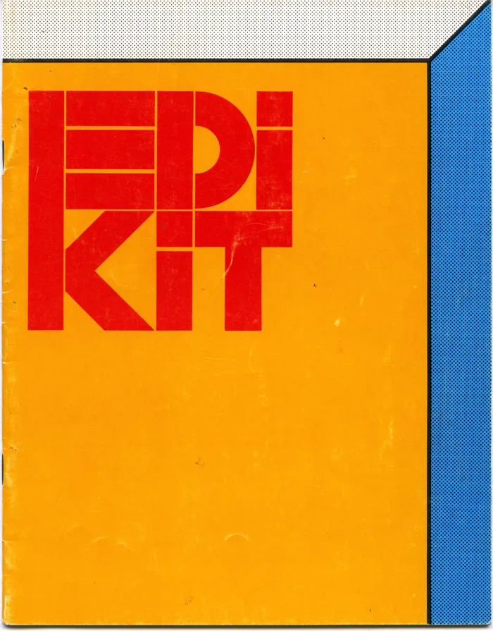
American Yearbook Company sent us a large, beautifully designed yearbook production kit that they cheekily called an “Edikit”. Clearly, they had some talented people working on it, hoping to impart some sense of good design on hapless teenagers. I could see what they were doing and took it to heart.
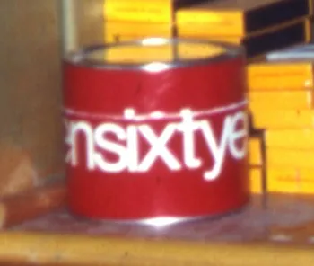
One of the things that influenced my budding sense of graphic design were the calendars that CCA did every year, which my uncle would send to me. There was one in particular for the year 1968 that came inside a large, bright red paperboard can with “nineteensixtyeight” wrapped around it in large, white Helvetica letters. Here’s the only photo I could find of it:
So, in my 12-year-old mind, I associated spelling out numbers (all lowercase) with cool, sophisticated graphic design.
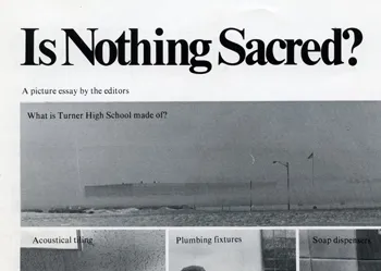
Fast forward to 1973, and I had my first big design project, my high school yearbook. And I wanted to use every design trick I’d learned so far. I was not so much into Helvetica. It already seemed a little passé. My favorite typeface at the time was Times New Roman, which had been used to great effect in National Lampoon magazine. The NatLamp design influence is pretty obvious on some of the pages:
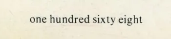
So, as I was developing the format for the yearbook, one of my “clever” design choices was to have all the page numbers spelled out (in lowercase, of course):


So far, so good. But it does this on every page, all the way to the end:
They must have thought I was insane. Keep in mind that this was back when typesetting machines, as far as I know, had only rudimentary ways to store keystrokes. At best, some sort of paper tape system. It horrifies me now to think how much work I made them do, just so I could have my fancy page numbers. Yet, I don’t recall the American Yearbook Company rep objecting to it.
Today, you could easily write some sort of script to get numbering spelled out like this, but back then it probably meant that some poor typesetter had to type it all in manually. And proofread it. I’d like to think that they somehow captured the keystrokes in case some other idiot had the same idea. Or maybe some other idiot already had and so it was really no trouble for them to run the job again for me.
All that aside, it was not a very good design idea anyway. Sure, it looked cool, but page numbers are meant to be read at a glance, not seen. I just shake my head, now. What a dumb idea.