Coquette Sighting - The Letter O
As a type designer, it’s hard to anticipate how the fonts you make will be used. When I designed Coquette, I had only vague use scenarios in mind. I was thinking about traditional French scripts and Art Deco sensibilities primarily in terms of formal qualities. Coquette is not a connecting script, but it has many characteristics of connecting scripts. One of these details is the little blob on the inside of the lowercase “o”. It is an extreme simplification of a looping stroke that leads to the next character.
To me, things like this are purely formal when I’m making the font. I’m only thinking about how it looks. But once a font is in the hands of a graphic designer, other aspects may emerge.
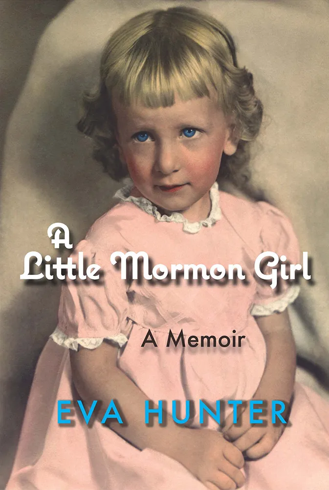
Book designer Margot Boland sent me a cover she designed featuring Coquette with this story:
A Little Mormon Girl by Eva Hunter is autobiographical and deals with delicate subject matter of sexual abuse in the family. When I set up the word ‘Mormon’, the two o’s were designed to flutter coquettishly, and I had to advise the author of this. At first, she was against using the font, then suddenly came around, and said that it fully expressed some hard to get at nuances in the book.
I could claim that I meant for those o’s to look like coquettish eyes and, thus the name of the font, but I can’t. I honestly never really thought of those o’s that way. It’s almost too perfect. Like they say, hindsight is 20/20.