Avant Garde Swash?
While I was visiting Omaha this past summer (I spoke and did a workshop for AIGA Nebraska), I spotted this curious bit of typographic design:
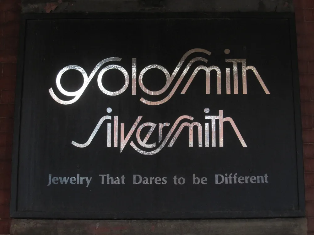
Looks like the artist was going for a Lubalin-style solution—Avant Garde with Swashes. It’s attractive, but not very easy to read, especially the “g”.
I wonder how long it’s been in use? I can’t decide if this is a design from the seventies or eighties, or if it’s a recent design imitating that period. I’m leaning toward the former, mainly because of the use of Optima in the tag line.
Filed under: Type & Lettering Sightings