One of the ideas on my back burner for a long time has been to add wide styles to Proxima Nova. Condensed and Extra Condensed have been there since the very beginning, but it was missing styles wider than the normal width. It was an obvious thing to add and would make the family even more versatile.
I did some rough preliminary work in 2012 and 2015, but didn’t put serious effort into it until last September, after I finished Dreamboat. The good thing about setting a typeface aside is that, when you come back to it, you can see the problems much more clearly. One of the things I learned when I was a graphic design student is that it’s easier to redesign something than to design something, and that was definitely the case with Proxima Nova Wide.
One of the things I changed was to make it even wider so that I could add two wider widths—Wide and Extra Wide, just as there are two narrower widths. Including the italics, this adds 32 new styles to Proxima Nova (16 for each width).

Naturally, the new styles include all the features and characters of the existing styles of Proxima Nova. I’ve also made a few improvements and tweaks to the existing styles. All of this amounts to a major release: Proxima Nova 4.0. It’s currently available for sale here or for activation in Adobe Fonts.
You can find more info, test and license the fonts, and download PDF specimens on the Proxima Nova page.

I’ve been interested in the classic script style of the early 20th century for as long as I’ve been drawing letters. It was commonly used in logos and trademarks, meant to convey the idea of a signature. Think: Ford. Coca-Cola. Coors. Blatz. Schlitz. Rainier. Campbells soup. Any number of baseball clubs. The style was revived in the 1960s, sometimes evolving into psychedelic or pop-art forms.
There have been fonts from time to time based on this script style, but quite often they have more of a sixties or seventies look. I decided to try my hand, hoping to get closer to the early 1900s feel.
In 2004, I pitched the concept to House Industries. They liked idea, and we made a deal to develop the script, along with a sans and a serif, all with a “sports” theme.
Working with Ken Barber, I was impressed with his commitment to quality and detail. I thought I was an okay type designer at the time, but my experience with Ken significantly raised my standards on all the fonts I’ve done since then. Unfortunately, the project languished due to other priorities at House and was eventually put on hold.
Around 2012, I decided to resume work on the script on my own. At that point, only the lowercase and a few caps had really been drawn, and I was really itching to design the rest of the caps.
In 2017, I showed Ken what I’d been up to with the script. I asked if he thought House was ever going to get the project going again, and, if not, could we amend the agreement to allow me to release it myself? Long story short, House agreed.

With the script fully in my hands, I stepped up the pace to finish it. Five years later, the result is Dreamboat.

Back when I was working on it with House, there was only a single bold weight. To provide more flexibility for designers, I expanded this to six—Light, Regular, Semibold, Bold, Extrabold, and Black. (Dreamboat might be the only script in its genre with such a wide weight range.)

One of the things that bug me about a lot of script typefaces is lack of a solution to situations where you need to set something in all caps, such as roman numerals or acronyms. For that I added small caps.

There is also a stylistic set which raises the cross-bar of the lowercase “t” and extends it for more of a custom look.

To top it off, Dreamboat includes three styles of tails—an element quite often used with bold scripts.
Check out the User Guide to see how it all works. Tip: Many of my vendors have type testers where you can type your own text and see how it looks. The tails work by typing one or more underscores at the end of a word. Just make sure that ligatures are enabled on the site (sometimes they are not).
I never dreamed when I started that it would take nearly 20 years to finish Dreamboat. But, to be honest, I’m glad it did because it was really beyond my skills when I first started working on it. It’s been one of the most enjoyable typefaces to design, and I’m excited to see what people will do with it.
Dreamboat is available at all the usual places for desktop, web, and other uses.
Have you ever wondered what serif font would work best with Proxima Nova? I’ve often been asked this question, and I never really had a good answer.
That’s about to change.
I’ve been working on something new and I’m going to be talking about it for I Love Typography’s inaugural Font Fashion Week which celebrates the latest trends in type design today. I will be giving a 30 minute online talk on April 5, 2022 to showcase what I’ve been working on and the process that went into its creation, and I invite you to attend (click here to attend). The talk is free and you may share this link with friends and colleagues if you think they would be interested.
Hope to see you there!
Update: It’s Proxima Sera. You can watch the talk on Youtube now or read it alongside my slides.
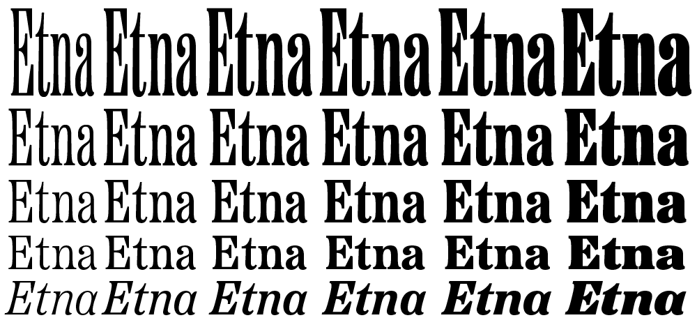
I’m very excited to introduce a brand new typeface family that’s been on my back burner for decades: Etna.
It was inspired mainly by the Aetna style of wood type from the 1880s. Etna tames this quirky Victorian design transforming it into a complete family suitable for modern use, adding a full range of six weights and italics, allowing it to work equally well for both text and display.
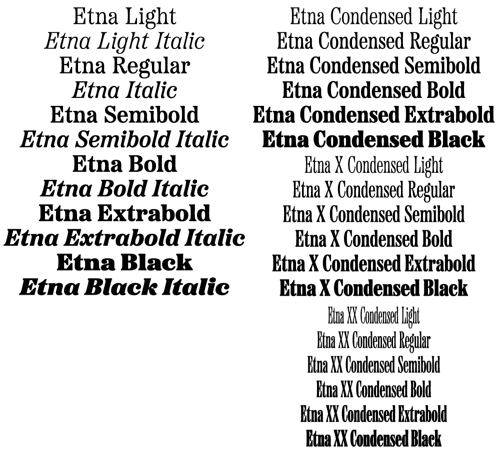
The Etna family also includes three different condensed widths in all six weights intended for display use. These are meant to be used LARGE.
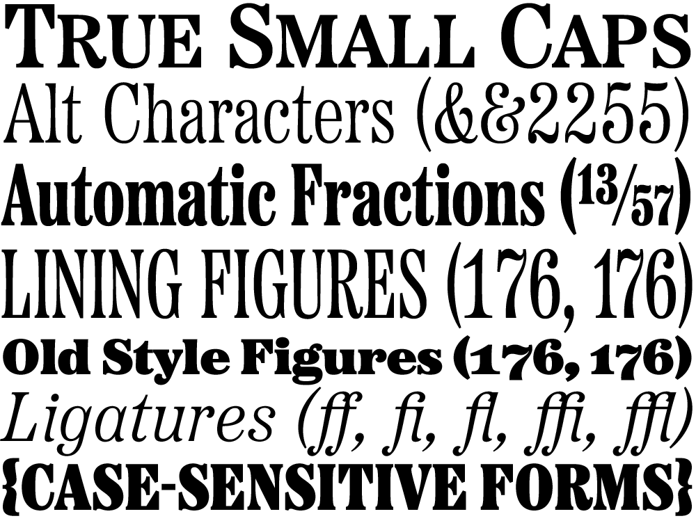
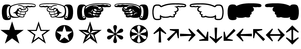
All 30 styles include four different figure styles, alternate characters, true small caps, and a selection of dingbats, including arrows, stars, asterisks, and manicules (pointing hands).
Etna is just rolling out starting today. You’ll find a list of places where you can buy a desktop, web, app, or ebook license on the main Etna page on my site. There is also a nice Etna mini-site that tells the complete story of Etna and the history of the Aetna genre.
Thanks to Nick Sherman for designing and coding the mini-site and to David Shields for writing the history section. Also thanks to Nick for suggesting that I add the manicules and many other features. Finally, thanks to Schriftlabor for technical assistance in developing the fonts.
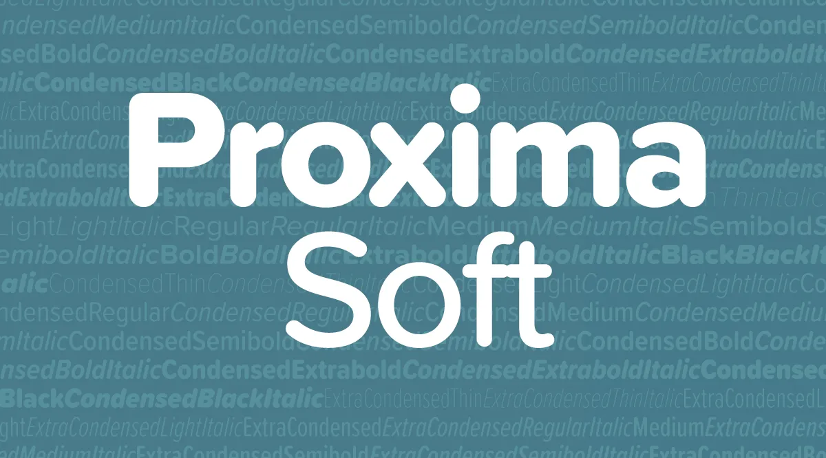
Proxima Soft is an expanded and remastered version of Proxima Nova Soft (2011). Both are rounded versions of my Proxima Nova (2005).

Proxima Nova Soft was originally commissioned by MyFonts in 2010 for use on its website. The following year, after numerous requests, I released it to the general font market. Because MyFonts needed only a few styles (Regular, Medium, Semibold, and Bold), that’s all I did at the time.
Soon, I got requests to do a full family. This was easier said than done. I began work on the full family in 2013. After several false starts, over three years later, it’s finished.
Although the old and new families look similar, there are many small improvements in the design, not just a wider range of styles and more features.

Proxima Soft has the same 48 weights and styles as Proxima Nova—eight weights (Thin to Black), three widths (Normal, Condensed, and Extra Condensed), and both roman and italic for all weights and widths. There is one small difference—no small caps or old style figures. I included these in Proxima Nova, but I’ve never seen them used, so I decided not to put them into Proxima Soft. (I may add them later if people actually do want them.)

A Proxima Nova feature I do see used a lot is the set of alternate characters—a, l, y, and G. Proxima Soft includes them, as well as other Proxima Nova features such as arbitrary fractions, ordinals, and both proportional and tabular figures.

Proxima Soft also contains the same wide language coverage, including support for most Latin-based writing systems as well as Cyrillic, and Greek.
I would have preferred to keep the name Proxima Nova Soft, but there were some problems with that idea. First, there are limits to how long a font name can be. Proxima Nova already pushes the limits in the Condensed and Extra Condensed ranges, and adding the word Soft to every style and weight was not going to work. By calling the new family Proxima Soft, the font names will be exactly the same lengths as in Proxima Nova. Problem solved.
The other perhaps more important reason is that the shared styles—Regular, Medium, Semibold, and Bold—are not identical in design and spacing between the new and old version, which means that documents created with Proxima Nova Soft would have reflow issues if the new fonts were installed in its place, not to mention differences in appearance, especially at larger sizes.
If you liked Proxima Nova Soft, you’ll love Proxima Soft. It’s got more of everything and makes a great companion to Proxima Nova.
Proxima Soft is available at all of my distributors. See the Proxima Soft page for a complete list.
I was interviewed a couple of months ago for a podcast called Cedar Cathedral, which focusses on “artistry, craftsmanship, and the creative life in the Great Lakes” region. Somehow, I missed that they posted it in mid-July.
Steve and Claire Hendershot, the hosts, did a wonderful job. Total pros, not slackers. They actually came all the way from Chicago to my house with a digital audio recorder, professional mic, and everything—none of this Skype nonsense. I think it’s one of the best interviews I’ve done. Definitely the best sounding.
Update: Unfortunately, this podcast is no longer available.