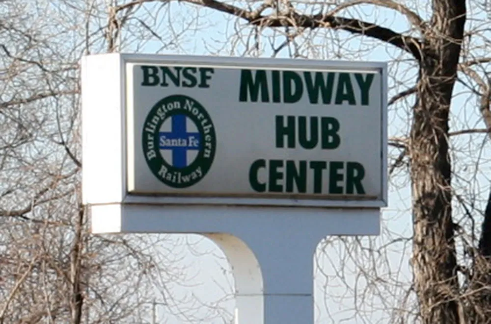
After driving past it for years, I suddenly realized what an absurd sign this is. Photo taken February 2, 2006, in the, uh, Midway area of Saint Paul, Minnesota.
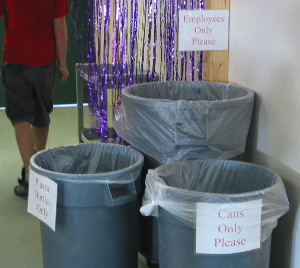
My sharp-eyed daughter noticed this when we were doing our yearly apple-picking this morning. Photographed at Afton Apple Orchard, Afton, Minnesota, October 9, 2005.

Close-up of some dimensional letters on a government building in Roseville, Minnesota, January 23, 2005.
I’ve seen typefaces like this, but this is the real thing.
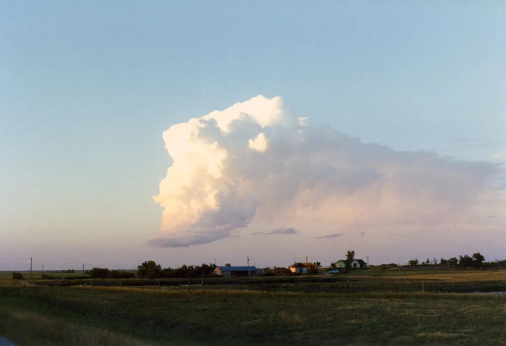
While traveling east through South Dakota in the summer of 1990, I stopped to snap a picture of this strange looking cloud. The flatness of the landscape and the emptiness of the sky gave it an eerie prominence.
Not long after this, we ran into a swarm of insects so thick we had to turn on the windshield wipers.
That evening, as we continued to drive, a cluster of lights zipped unnaturally fast across the sky just after dusk. It was the only time I’ve ever seen anything I would describe as a UFO. By a strange coincidence, we had just visited Devil’s Tower in Wyoming that morning. I don’t believe in such things as flying saucers and alien visitors, but the effect was unnerving.
We stopped at Chamberlain and checked into a motel. In the middle of the night, my partner woke up screaming that there were green and yellow bugs boiling out of the ceiling. As I fumbled to turn on the light (it was pitch black in the room), I happened to put my hand on her face, which she took to be a fox and screamed all the more. I finally found the light and, after a little while, we managed to get some sleep.
It turned out that the UFO we saw was a Russian rocket body breaking up and burning in the upper atmosphere. It was visible all over North America. No explanation for the bugs, except that they clearly fueled my partner’s hallucination. In fact, she had been overdosing on aspirin, which she was taking in massive quantities to overcome the pain of a toothache which started during our trip. Too much aspirin, it turns out, can cause hallucinations, especially of bugs.
And the cloud? They just look like that sometimes.
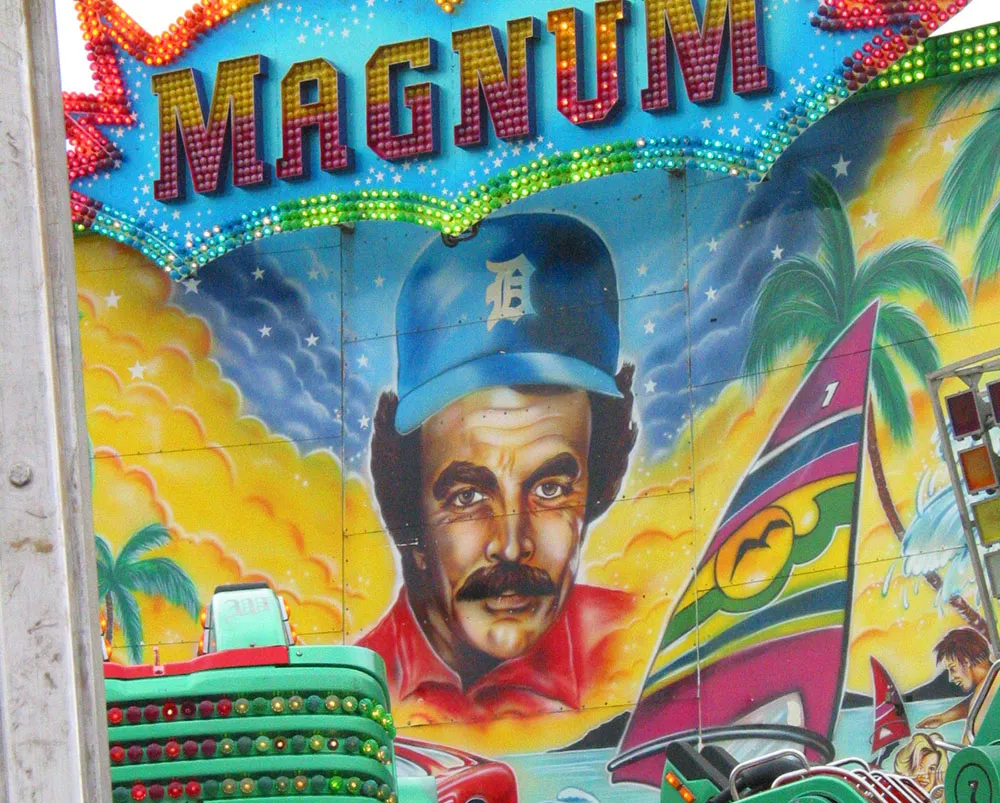
A brainy looking portrait of Tom Selleck seen on a carnival ride at the Minnesota State Fair on August 26, 2004.
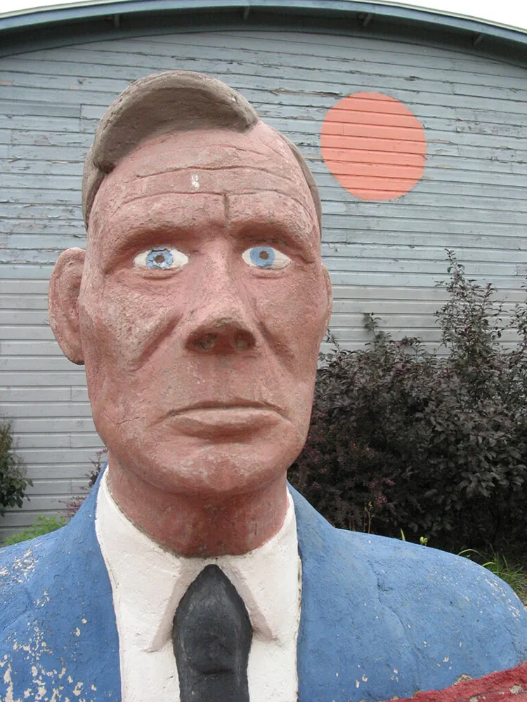
Bust of artist Herman Rusch. Photographed at the Prairie Moon Sculpture Garden and Museum, Cochran, Wisconsin, on August 3, 2003.
