It didn’t start out as a digital type foundry.
Back in the nineties, I worked as senior designer for Rivertown Trading Company, a sister company to Minnesota Public Radio that sold public radio and public TV-related merchandise through the Wireless and Signals mail order catalogs. I’d worked there full-time since 1993 after having freelanced for them since 1985. I had a long history with both Rivertown and MPR.
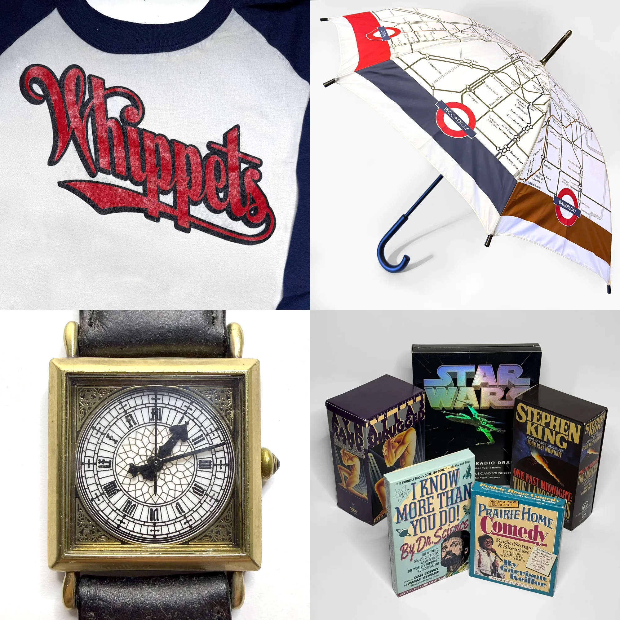
A few of the things I designed at Rivertown: Lake Wobegon Whippets jersey (lettering), London Underground umbrella, wristwatch based on the Big Ben tower clock, and a few of my audiobook packages.
While at Rivertown, I mainly designed audiobook packages (over 200 of them) and products (t-shirts, mugs, even things like watch faces and umbrellas). By 1998, I was feeling like I was in a rut as a designer. So for the next couple of years, I shifted into web design at the company, designing sites and animated GIFs for Wireless and Signals in Macromedia Fireworks and trying to get the “e-commerce” people to implement my designs faithfully in the days before CSS and web standards.
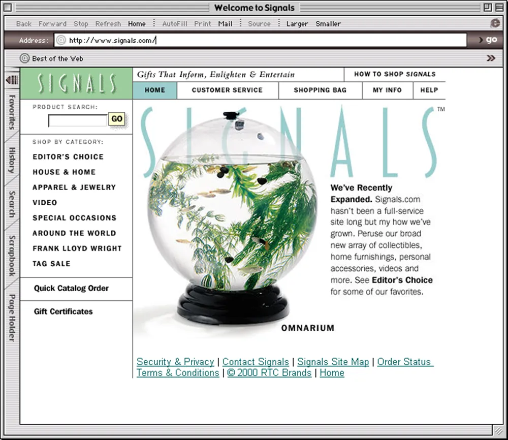
Homepage of the Signals website I designed, as it appeared in early 2000. And, yes, that’s an early version of my Blakely typeface, which was originally created for Signals.
Around the same time, Rivertown was sold to Target Corporation, mainly because of its experience with online sales and its giant distribution center in Woodbury, Minnesota. After the transition, Rivertown Trading Company was renamed target.direct, and the old company culture, which felt almost like a family, disappeared overnight.
The web design thing wasn’t quite what I thought it would be, and Rivertown wasn’t the company I knew and loved anymore, so I quit in June 2000, at the age of 44, to resume my freelance career.
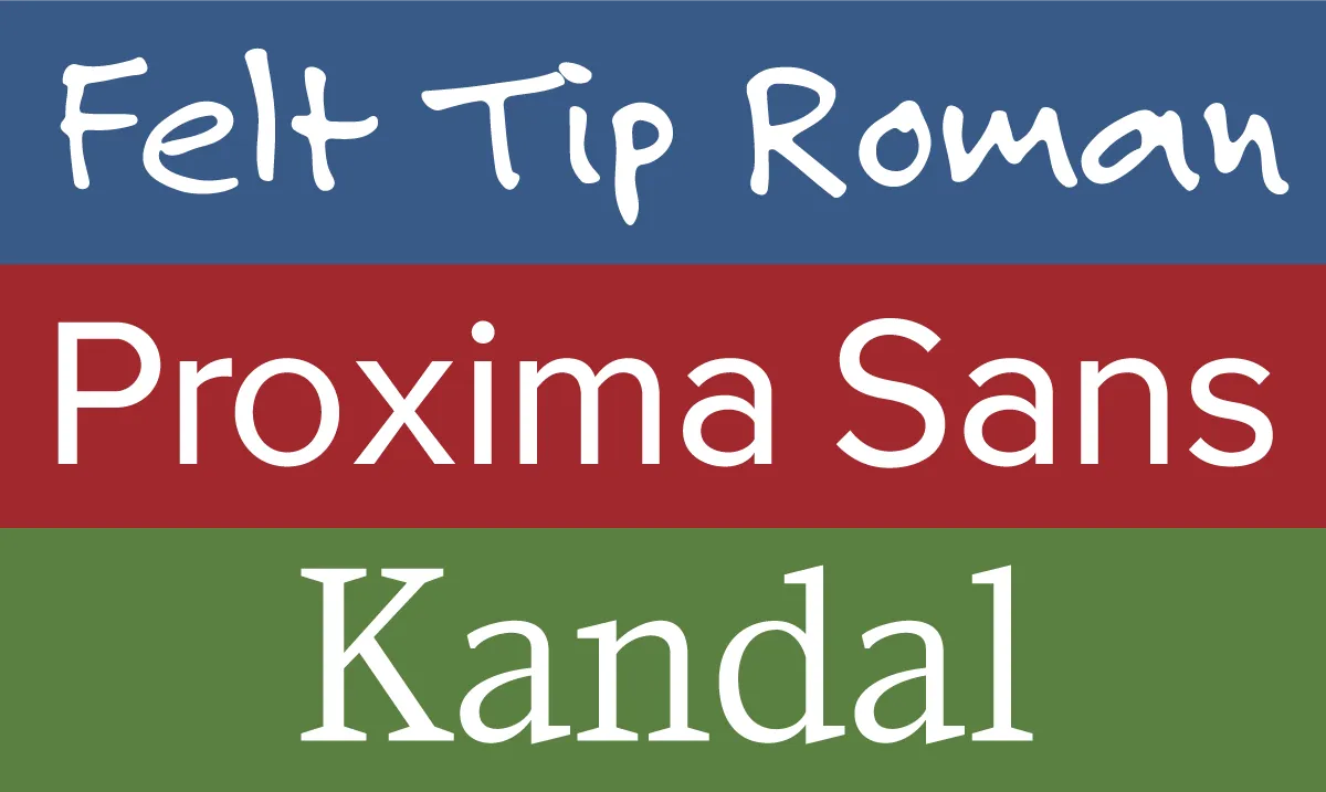
My first published fonts, released in 1992-94 through FontHaus.
I’d previously freelanced under the name Blue Sky Graphics—the name I used when I published my first fonts, Felt Tip Roman, Proxima Sans, and Kandal, through FontHaus in the early nineties. But I wanted a fresh start, so I picked a less generic name: Mark Simonson Studio.
![]()
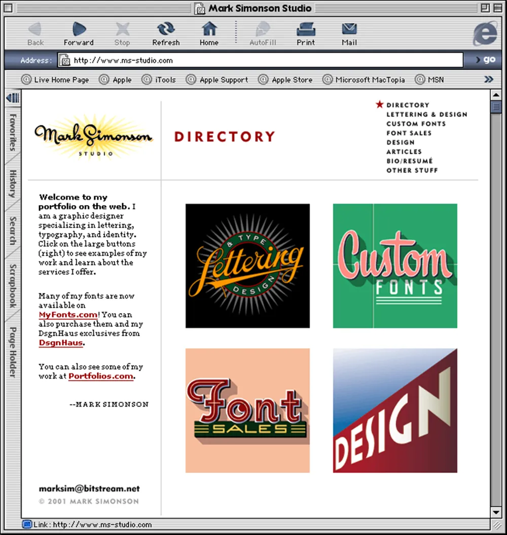
Although I’d published a few fonts, I wasn’t making much money from it. And Mark Simonson Studio wasn’t really a font foundry yet. I did offer type design, but it was alongside other services such as graphic design, web design, illustration, and lettering, which I’d hoped would be the basis of a solid freelance career. So I created a website, got a domain (ms-studio.com because marksimonson.com was unavailable at the time) and hoped for the best.
But Mark Simonson Studio struggled. I was very bad at finding new clients and mostly just worked for people I’d known or worked with for years, taking whatever projects they happened to have.
Meanwhile, I noticed people starting to sell fonts on the web. I got an account at Makambo.com, a sort of web-based consignment store that was home to some type designers I’d heard of, like Jim Parkinson and Nick Shinn. Unfortunately, I had an exclusive arrangement with FontHaus, so I couldn’t sell the fonts I’d published there. But I had a few others in the works—Refrigerator, Blakely, Sharktooth, and Felt Tip Senior—which I started selling on Makambo. Sadly, Makambo closed after a few months, and with very few sales. Everyone seemed to be moving to a new platform—MyFonts.com—so I did the same.
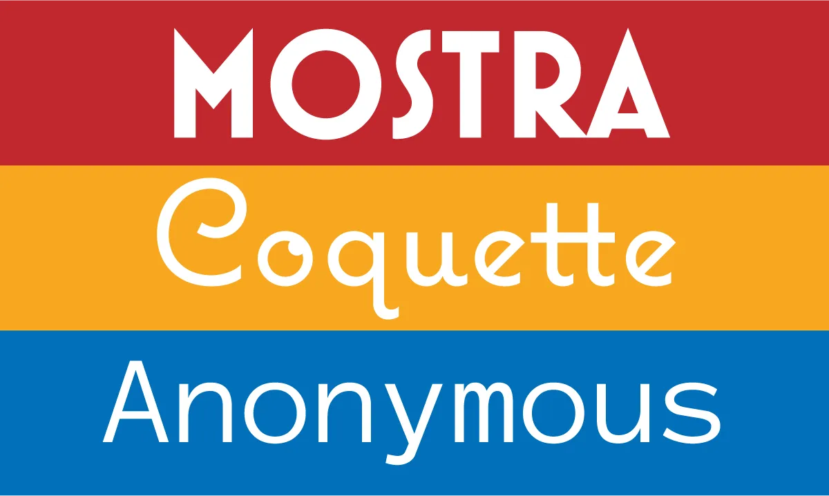
Right around this time, in Fall of 2000, my partner Pat landed a spot as a contestant on Who Want’s to Be a Millionaire? She did very well—well enough that I was able to take six months off from my freelance work to make and release some new fonts—Mostra, Coquette, and Anonymous.
I was soon making more from selling fonts through MyFonts than I ever did from FontHaus, who were late in moving to the web, and also had a much lower royalty rate. But I still relied on other work to pay the bills. Despite that, I kept making new fonts, including 35 new ones in 2003, and started working with other resellers, such as FontShop and Veer.
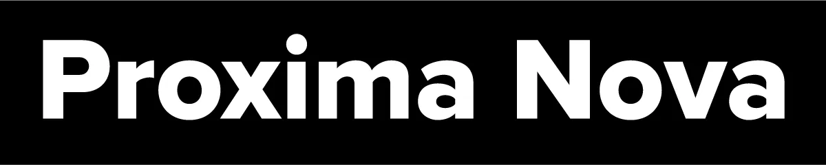
By 2005, when I released Proxima Nova, I was making enough from selling fonts that I was able to drop all my other work and design type full-time. Mark Simonson Studio became solely a digital type foundry.
Looking back, it’s clear that my calling was type design. It’s the thing I’ve been most successful at, and it fits my skills and sensibilities better than anything else I’ve done. I didn’t know it at the time, but opening Mark Simonson Studio in June 2000 was what put me on that path.