.Cb2VS0P8_Z1wBaBM.webp)
MyFonts has been doing interviews of typeface designers for the last year or two in their Creative Characters series. Yesterday, they posted one featuring yours truly.

I happened to be looking at Reuben Miller’s blog today and stopped when I got to the item “Introducing Illustrator 88” in which he embedded a link to a YouTube video showing a portion of the VHS tape that shipped with Illustrator 88. I have that tape and also the one that came with Illustrator 1.0. (And the disks, and the packaging. I know. It’s a disease.) I’d been toying with the idea of digitizing these videos and posting them online, but someone saved me the trouble. (It appears that John Nack of Adobe posted the 1.0 video.)
I particularly remember the tape that was included with 1.0, which featured John Warnock, the CEO and founder of Adobe himself, doing the demos. I’ll never forget the way he exclaimed “Isn’t that neat?” after showing how the pen tool works. And it was neat. The YouTube clip only shows about the first ten minutes of the tape, so it’s missing that little gem.
It’s amazing how good the program was right from the start. It had a long way to go (no color, no layers, no drawing in preview mode, no composite paths, only one font in a text block, no converting text to outlines, no pathfinder tools, etc., etc.), but the foundation was solid. It sure looks slow running on that tiny Mac Plus screen, though.
Almost forgot to mention: I did an interview with LetterCult, the new website devoted to the art and culture of making letters. It just went up today. Link.
The site’s been up less than a week, but there’s already a ton of great stuff on it about lettering and type design.
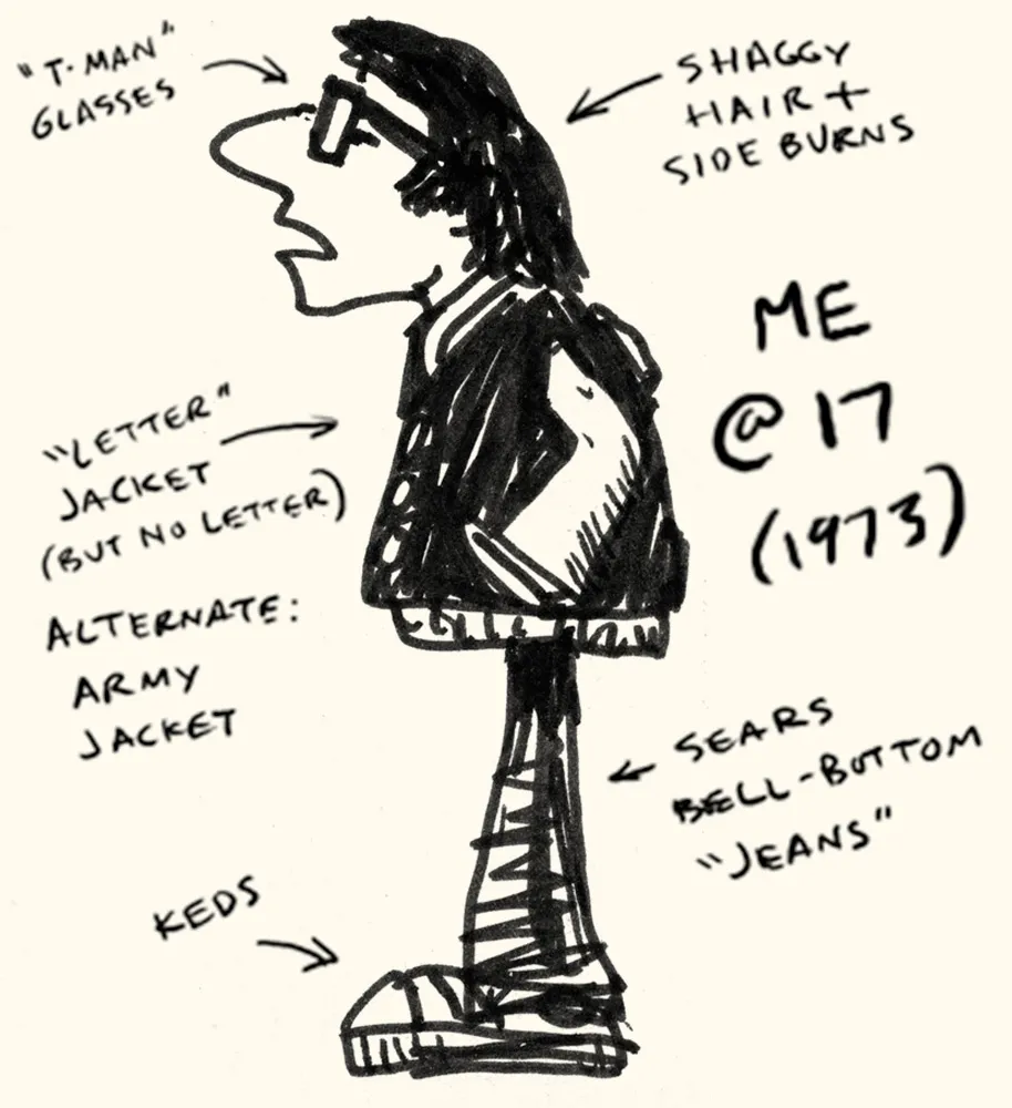
drawn.ca had an item the other day about a meme that’s going around: draw yourself as a teenager. I decided to cheat and post a drawing of myself as a teenager that I drew when I was a teenager. I’ve added explanatory notes.
At the time (about 1973) I had this idea to draw a comic that featured me and my friends and teachers. It never got beyond a few sketches.
Looking through the list where the meme started makes me feel very old. People in their early twenties laughing at how dumb they were as teenagers only a few years ago. A few years ago, I was pretty much the same as I am now, but I remember the feeling.
Would it surprise you to learn that I am a pack rat? When it comes to things like books and printed material about type, this can be a good thing, as it gives me a rich resource library I can tap whenever the need arises (and it frequently does). When it comes to other things, like old computer software, it is a complete waste of time and space.
It’s not hard to see how it happens. When it is new, software is not cheap (it didn’t used to be, anyway). So, even if you are not actively using it, it feels like it still has value. And how can you tell exactly when a piece of software is no longer useful and the chances of ever running it again are nil? It’s easier to just put it on a shelf and forget about it.
Well, time passes and it becomes much easier to see how little it’s worth to you. But then the question becomes: What to do with it all? I couldn’t bear to chuck it all in the trash (it’s a sickness, I know). Surely there must be somebody somewhere who would be happy to take it off my hands? And so there is: Dan’s 20th Century Abandonware (a.k.a., D2CA). Update: That site is gone now, but the collection can now be seen at Daniel’s Legacy Computer Collections. Same guy.
A few weeks ago, I shipped eight cartons of old Mac software to Dan as a donation. Some of it dates back to the first year of the Mac’s existence (Andrew Tobias’ Managing Your Money). Some of it I bought with high hopes, but never really used (Think Pascal). But most of it simply went obsolete (TOPS networking software).
As he promised, Dan posted a formal thank you on his home page—complete with photos and a listing of everything I sent. Now, if I ever feel a pang of regret, I can go to Dan’s site and still see all my old stuff, comforted that it has found a loving home, instead of an existence of guilty, dusty neglect in my basement. My hat (if I had one) is off to Dan for graciously and willingly accepting my donation.
Of course, this was just the stuff I don’t need any more.
Just for fun, I’ve decided to share my first published writing on the subject of typography. It appeared in the April 19, 1977, issue of Metropolis, the Weekly Newspaper of Minneapolis. Metropolis unfortunately folded about six months later, but it was an incredible place to work. I may write more about it sometime.
As its production manager, I didn’t get much chance to write, but this was one exception. After four months there, I had a reputation as someone who knew something about type. Metropolis had a page in the back called “Final Draft.” It was a page where anything might appear, from short stories to comics to photo essays. I can’t remember anymore if the editor, Scott Kaufer, asked me to write something or if I suggested it myself. Some of it makes me cringe to read again. Some of it is not quite correct. There are things in it that I wouldn’t necessarily agree with anymore, and I am surprised at how jaded I sound. Keep in mind, though, that I was only 21 years old when I wrote it, and, as everyone knows, a 21-year-old knows all there is to know.
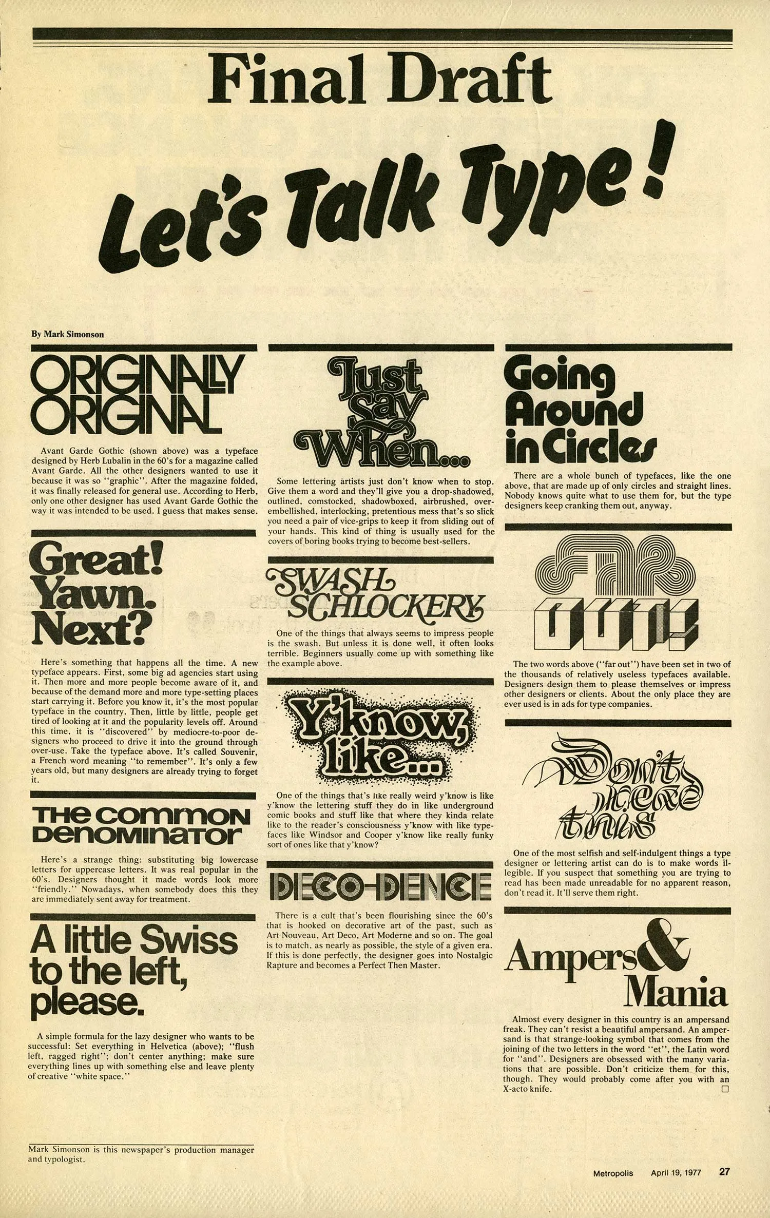
(Originally published in Metropolis, the Weekly Newspaper of Minneapolis, April 19, 1977.)