I don’t have any more MST3K stories to share, but I thought it would be fun to do “remastered” versions of my mock “redesign” covers that I sent to Best Brains. Without too much trouble (yeah, right), I was able to find all but one of the freeze-frames I shot with my Polaroid camera back in 1991 on the DVD collections of the show. (Yes, I have most of them. Are you surprised?) I had to work with my original Polaroid for the “Byte” cover. As a final touch, I added typical color schemes for each magazine. Maybe things would have turned out differently if they’d seen these in color…
Nah.
For those of you who could care less about Mystery Science Whatever It Is, and wish I would post more design-related things, I apologize. Back to regular programming tomorrow.
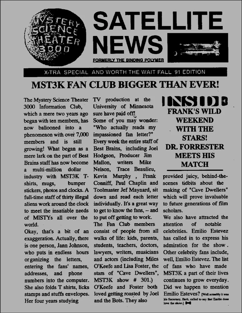
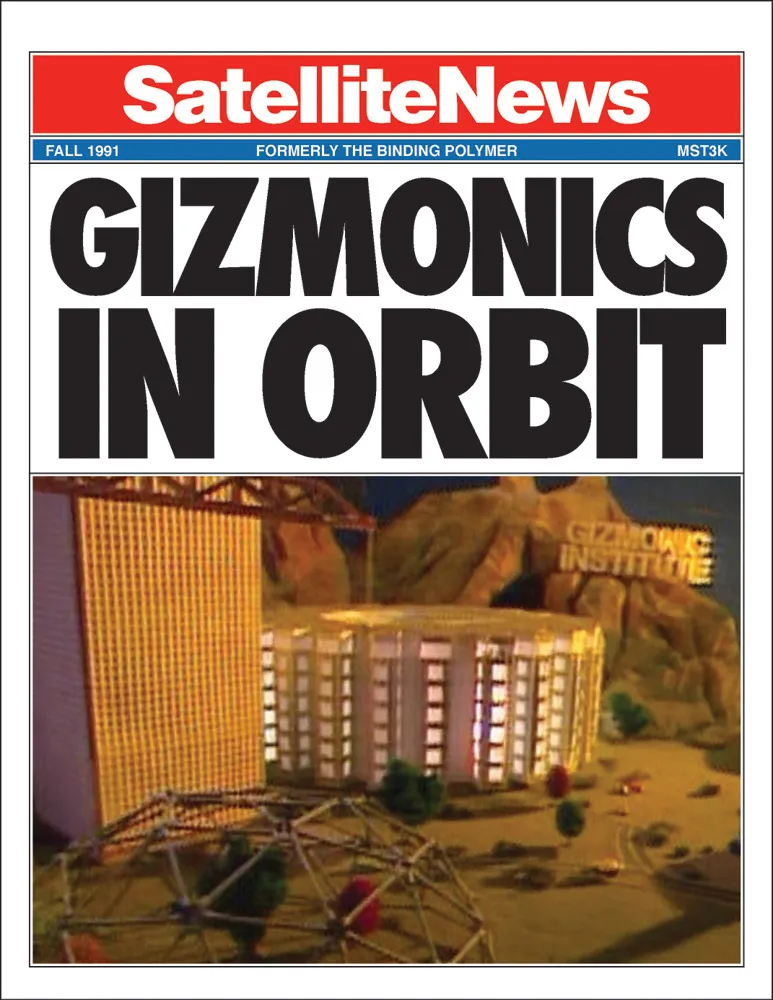
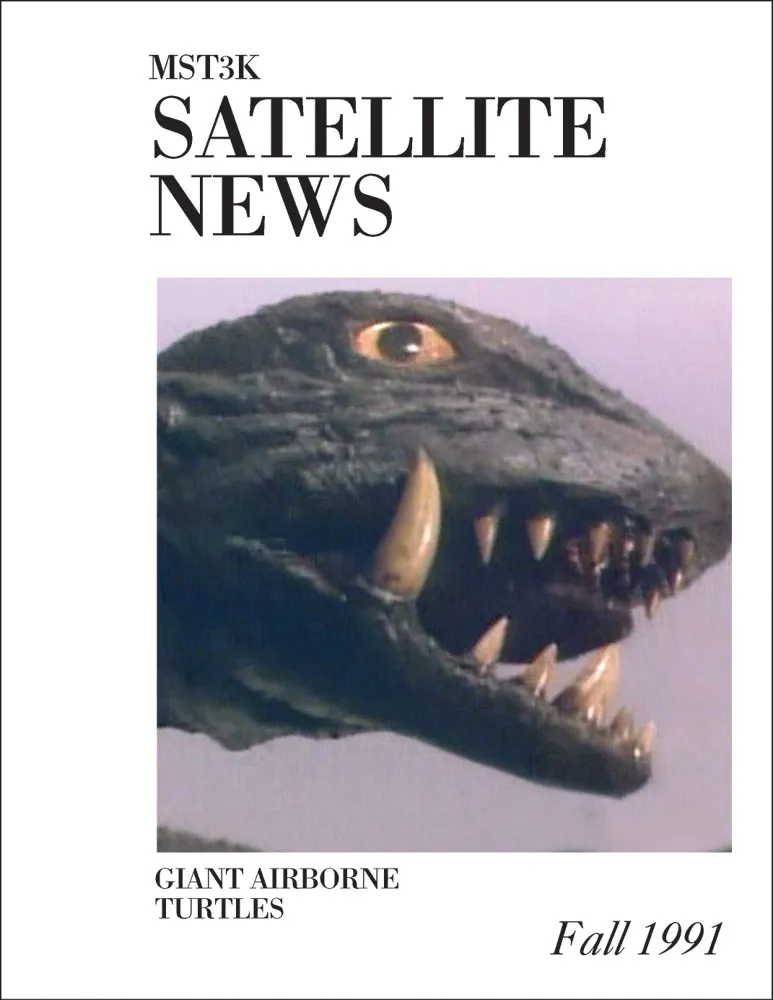
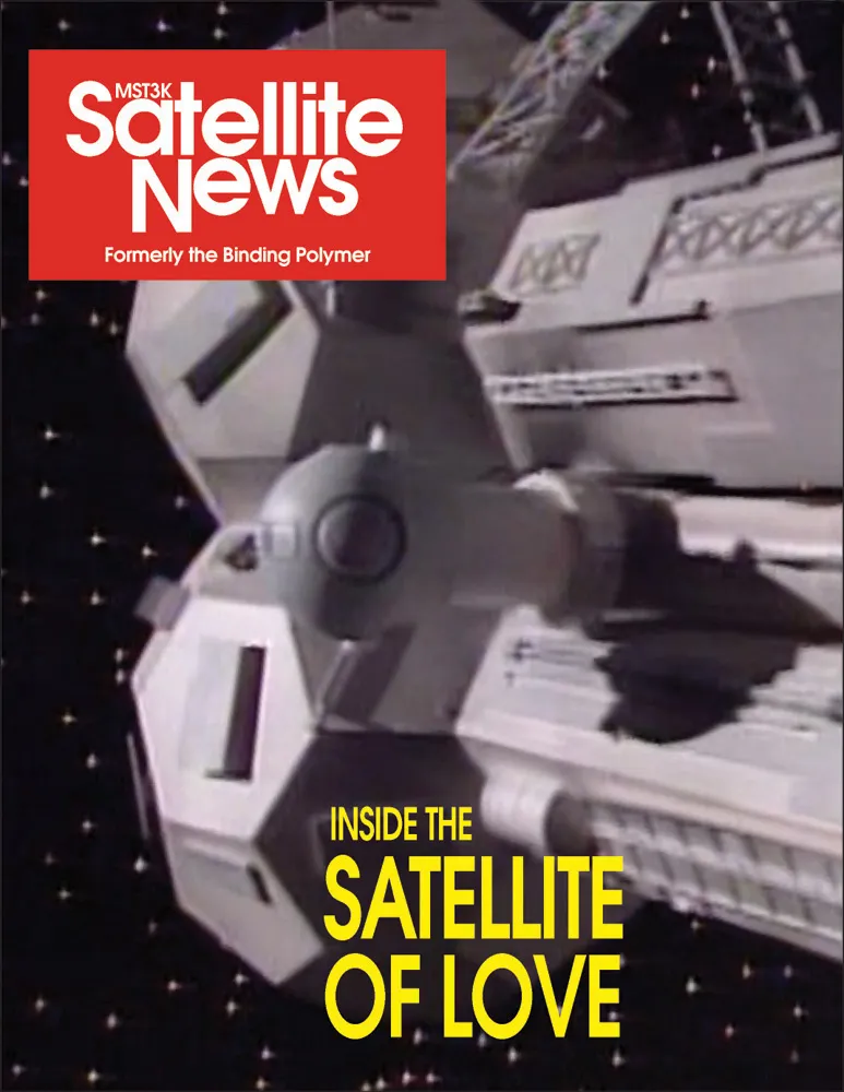
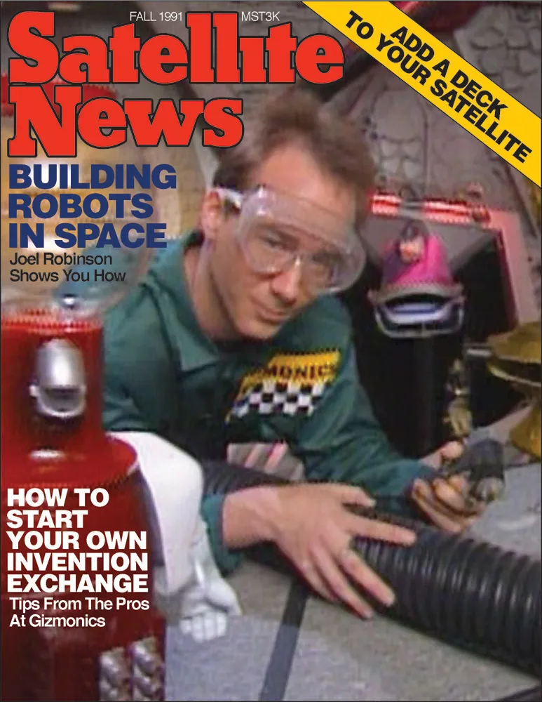
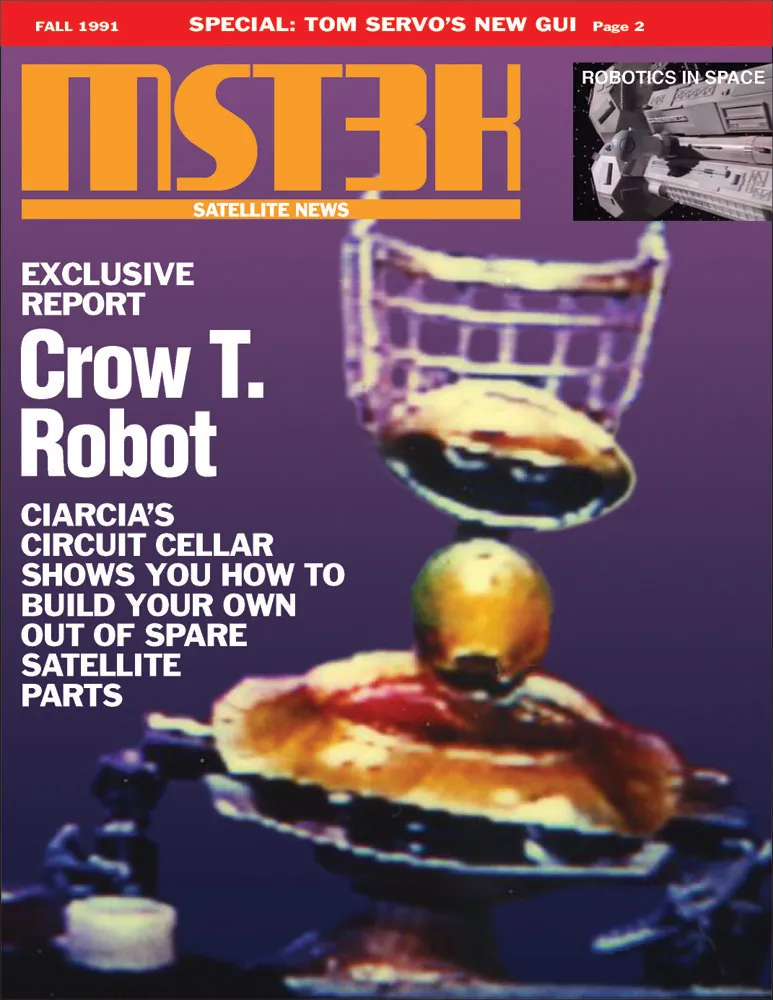
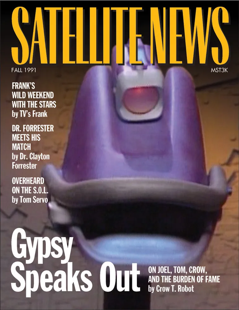
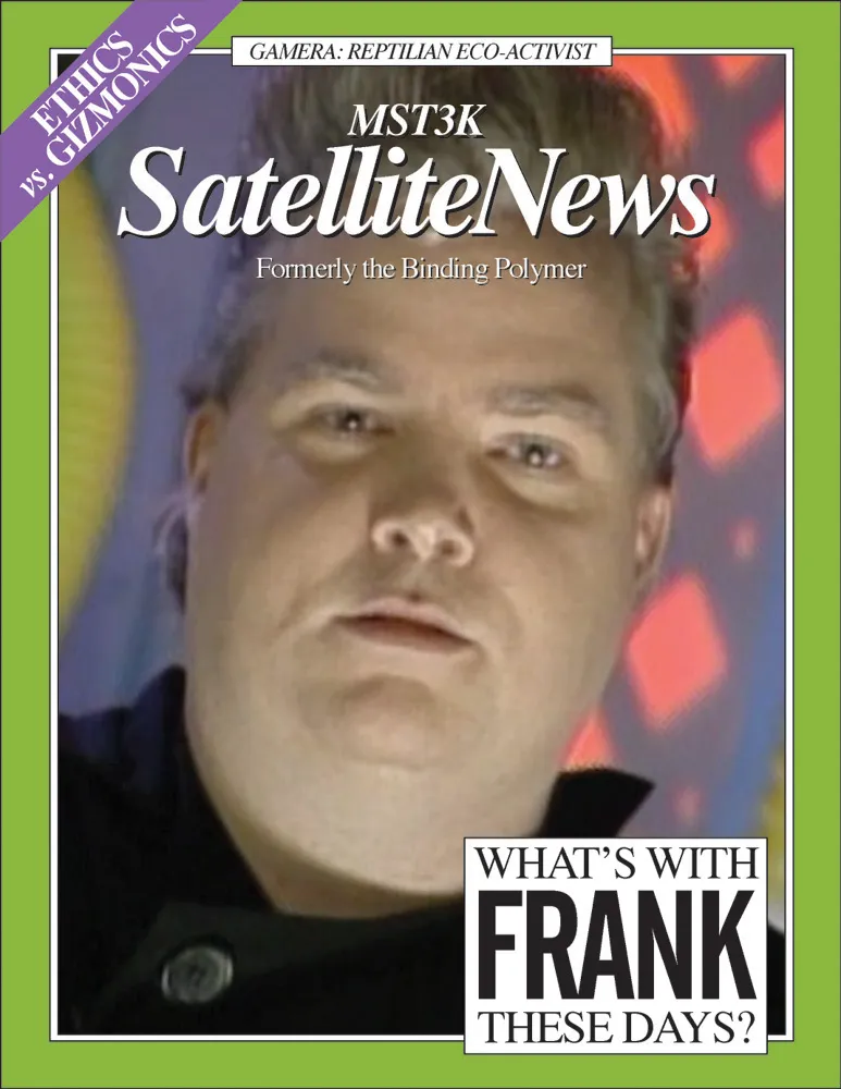
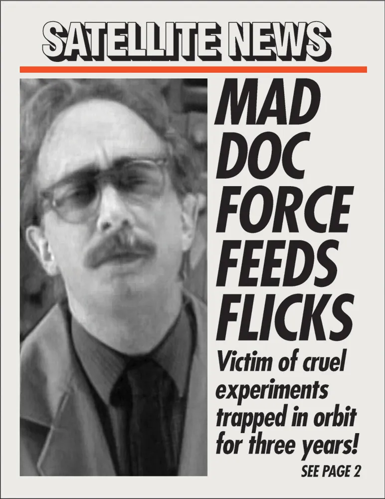
My mock “redesigns” of MST’s fan newsletter, Satellite News (Formerly The Binding Polymer), left to right, top to bottom: The original, as Business Week, as Scientific American, as Popular Science, as Popular Mechanics, as Byte, as Vanity Fair, as Utne Reader, and as The New York Post.

Joel Hodgson and the bots on KTMA in 1988
I accidentally discovered Mystery Science Theater 3000 during its initial run on local Twin Cities channel KTMA-23 in 1988. It was very strange—and very funny. Some guys seemed to be talking—cracking jokes—during some awful movie. You could see their silhouettes at the bottom of the screen.
This was in the early days of my relationship with my partner, Pat. We were the kind of couple who went to a Rocky & Bullwinkle film festival on our first date. This show was made for us. We were soon tuning in every Sunday night to watch it. It was the funniest thing we’d ever seen. We became members of the fan club.
But it didn’t last long. Before we knew it, the show was cancelled. As a thank-you to the fans, they put on a live show in 1989 at the Comedy Gallery in Minneapolis.
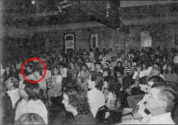
A photo of the audience at the Comedy Gallery event that appeared in the MST 3000 Satellite News, Vol. 1, No. 2. You can see me and Pat on the left.
The show was great and featured clips from the show’s pilot, plus cast members/writers Joel Hodgson, Trace Beaulieu, and Josh Weinstein performing their comedy acts. During a question and answer session near the end, Pat got to ask a silly question about the Tom Servo puppet. She wanted to know how the mouth (beak?) worked. It was kind of complicated. When it was over, we got to meet and shake hands with everyone on the show, and that was that—so it seemed.
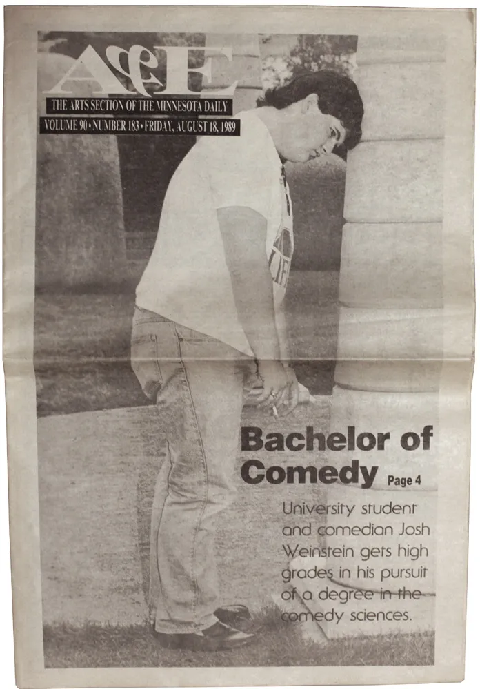
Josh Weinstein, on the cover of the Minnesota Daily’s arts section, around the time he performed at the U of M’s student union.
Later that year, we saw Josh Weinstein do his stand-up act at the University of Minnesota student union (he was still an undergrad there), and at the end of it, he revealed that talks were ongoing with HBO to bring Mystery Science Theater to cable TV. Our hopes to see the show again were dashed, however. Our cable company carried HA!, but MST’s new home was on The Comedy Channel, which they didn’t carry.
We missed the first season, but by the second season, the two rival comedy channels merged to become Comedy Central, and—more importantly—we got to see our favorite show again. By this time, Josh was off the show, replaced by a new guy, Frank “TV’s Frank” Conniff. And this is were things get a little weird.
At the time, we were living in the Whittier neighborhood in South Minneapolis. MST was a national show, but it was produced out in a Minneapolis suburb, Eden Prairie. But some of the guys on the show must have lived in our neighborhood because we started seeing them. One day, while driving down Hennepin Avenue, we both did a double take—TV’s Frank was walking down the street. Maybe a week later, we saw him come out of our neighborhood convenience store. Another time, I went to my usual coffee shop, and Trace Beaulieu was behind me in line. This encounter was stranger still when I think about it: The woman who served us coffee was someone Pat and I knew, Kristen Pfaff, who would later become the bass player in Hole (Courtney Love’s band) and die of a drug overdose.
The most awkward encounter happened sometime around 1991 at Calhoun Square, a shopping mall in Minneapolis’s Uptown area. I spotted Joel Hodgson (wearing sunglasses) seated outside a restaurant near the bookstore we were headed for. I whispered to Pat, “It’s Joel.” She didn’t see him, and said aloud, “What? Where?” By now we had passed him and I whispered, “He’s right behind us.” He must have heard us, because when we looked he was looking back at us. We walked quickly into the bookstore. I pretended to look at some books. When I looked up, Hodgson was standing near the entrance, peering around the corner over his sunglasses, like he was spying on us. Pat had disappeared. I was so embarrassed, I didn’t look up again for a while. The whole thing was very weird and silly.
In 1992, we saw them all again, but this time as part of a live performance of Mystery Science Theater at the Uptown Theater. It was one thing to see it on television, but seeing it performed live with 600 other people was incredible. I don’t think I’ve ever laughed so hard in my life. My face was so sore.
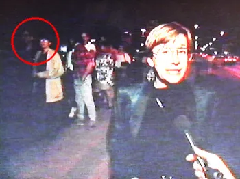
Me and Pat, visible in the background during a Comedy Central video interview outside the Uptown Theater in Minneapolis, waiting in line to see Mystery Science Theater Alive!
Tomorrow: How I almost became a designer for Mystery Science Theater.
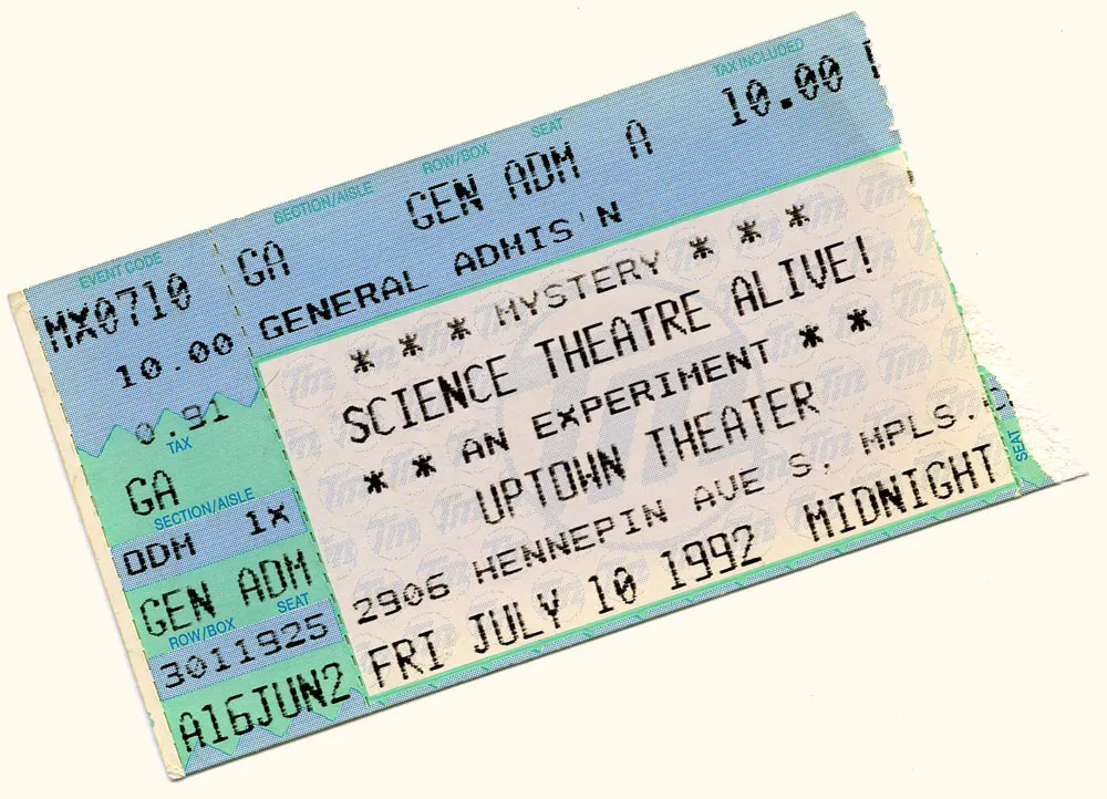
After last night’s geeky Star Trek post, fellow type designer Jackson Cavanaugh suggested on Twitter that I share some of my stories about Mystery Science Theater 3000, the cult comedy TV show from the nineties (and slightly earlier). Great suggestion, Jackson!
I was going to start tonight, but I was busy attending a Type Tuesday event this evening. (Type Tuesday is a monthly get-together of type aficionados in the Minneapolis/St. Paul area.)
In the mean time, above is something from my scrapbook: A ticket stub from the first MST3K live show, performed at the Uptown Theater in Minneapolis in 1992. All I will say about it is, my face ached from laughing.
More tomorrow.
Warning: If you don’t like or care about Star Trek, I understand. Feel free to skip this.
It all started about two months ago, when the J.J. Abrams Star Trek movie (2009) rose to the top of my NetFlix queue. (I wrote about this movie for using one of my fonts back when it was in theaters.) I’ve become somewhat of a Blu Ray fan and thought this would be a fun movie to watch in that format. I was right. I think I like it even more now than when I first saw it.
One thing led to another and before I knew it, I had purchased the two sets of Star Trek movies on Blu Ray. For some reason, I was never really that interested in watching these on DVD. I tried watching the first one (Star Trek: The Motion Picture) once, but couldn’t get through the first 20 minutes. The picture and sound were just horrible. I think it must have been an early DVD release, the kind where it’s not optimized for wide screen viewing.
I’d seen both Star Trek II: The Wrath of Khan and Star Trek IV: The Voyage Home more than once (both considered among the best of the series). The rest I only saw in the theater, except for Star Trek: Nemesis, which I’d never seen at all.
So, with some trepidation, I subjected myself to a Star Trek movie marathon over the last couple of weeks. It was interesting. The movies were both better and worse than I remembered.
Star Trek: The Motion Picture. This is my least favorite of the entire series. It was a disappointment when I saw it in the theater in 1979. Slow, overblown, ridiculous and terrible in so many ways. You get the feeling that the special “V’GER” effects were expected to carry the movie by themselves, but it just looks like self-indulgent nonsense, and adds little to the story. If anything, this movie was worse than I remembered. The titles are dull and feature that goofy Star Trek Movie font. I didn’t like then, and I don’t like now.
Star Trek II: The Wrath of Khan. Considered by most to be the best Star Trek movie ever. I don’t really disagree with that, but I don’t think it has aged well. It was one of the earliest movies to feature computer graphics, and it looks it. The whole production feels kind of like a disco nightmare, but the chemistry of the characters and the story make it really entertaining.
Star Trek III: The Search for Spock. Better then I remembered. Very cheesy special effects and preposterous story. Worth watching just to see Kirk and friends blow up the Enterprise and steal a Klingon ship.
Star Trek IV: The Voyage Home. Cool because they still have the Klingon ship and—even better—take it back in time to the 1986 San Francisco. Funniest of all the Star Trek movies, but, again, the story is a little preposterous. Getting a little repetitious: Big mysterious thing threatens Earth, just like the first movie.
Star Trek V: The Final Frontier. On second thought, maybe this is my least favorite. Most preposterous story of all, but it looks better than any of the previous films. The center of the galaxy is much smaller than I expected. Silliest and most forgettable of the series.
Star Trek VI: The Undiscovered Country. Better than I remembered. The story is not bad: The incident that leads to peace with the Klingons. Some nice zero-gravity effects. A little too much Shakespeare from the Klingon played by Christopher Plummer.
Star Trek: Generations. This is not considered one of the best, but I like it. The production values are higher than the earlier films. I also think the Next Generation cast are, on average better, actors than the earlier cast. At least Stewart is. I love the scene in which, after narrowly winning a battle with a Klingon ship, they are forced to crash land the Enterprise. And then the planet blows up, killing everyone. This can only mean another time travel plot. This one also has the most tastefully-done titles in the series, in spite of being set in ITC Benguiat.
Star Trek: First Contact. This is generally considered to be the best of the Next Generation movies, but it was not as good as I remembered. Good: It has The Borg. Bad: More time travel, and James Cromwell as the guy who invents “warp drive”. I usually like Cromwell, but he seems mis-cast in this. Titles use Benguiat again, but look terrible.
Star Trek: Insurrection. Last one I saw in the theaters before the re-boot. I couldn’t have told you what it was about until seeing it again. Not very good, but not really terrible either. Would have made a good two-part episode on the TV show. Worst titles of the series—very cheap looking.
Star Trek: Nemesis. This is the one I’d never seen before. It is supposed to be one of the worst of the series, so I expected not to like it. But I actually kind of liked it. Some of it is goofy, but that’s par for the course in the Star Trek universe. The battle at the end was pretty good. The dune buggy scenes were inexplicable, but fun. The titles were set in Exocet, I think. Seemed very dated.
1976: One hour by bus from Osseo (an outer-ring suburb) into downtown Minneapolis.
1977: Half hour by car from Osseo into downtown Minneapolis.
1977: Twenty minutes by bus from Saint Louis Park (an inner-ring suburb) into downtown Minneapolis.
1979: Fifteen minutes by car from Saint Louis Park to Saint Paul.
1981: Twelve minutes by car from South Minneapolis to downtown Saint Paul.
1985: Ten minutes by car from South Minneapolis to South Minneapolis.
1992: Five minutes by car from Saint Paul to Saint Paul.
2000–Present: Under one minute on foot (working at home).
I don’t understand why people put up with long commutes.
This entry is probably going to date me quite a bit. What I consider to be my first real computer was the Atari 400, which I bought in 1982. Around a year later, I got an Atari 800, mainly so I could type on a real keyboard. (The 400 had a cheaper “membrane” keyboard, which gave little tactile feedback. To make up for this, you would hear an audible “click” from the speaker. Not very different from modern touch-screen keyboards, now that I think of it.)
I still had both of them until about a year ago when I donated them to a local Atari dealer. Yes—they still exist! Not only that, one of the local Atari user groups that was around back in the early eighties (S.P.A.C.E.: Saint Paul Atari Computer Enthusiasts) still meets once a month less than a mile from my home!
Anyway, before I unloaded them, I took some photos. Here is the 400, with its membrane keyboard:
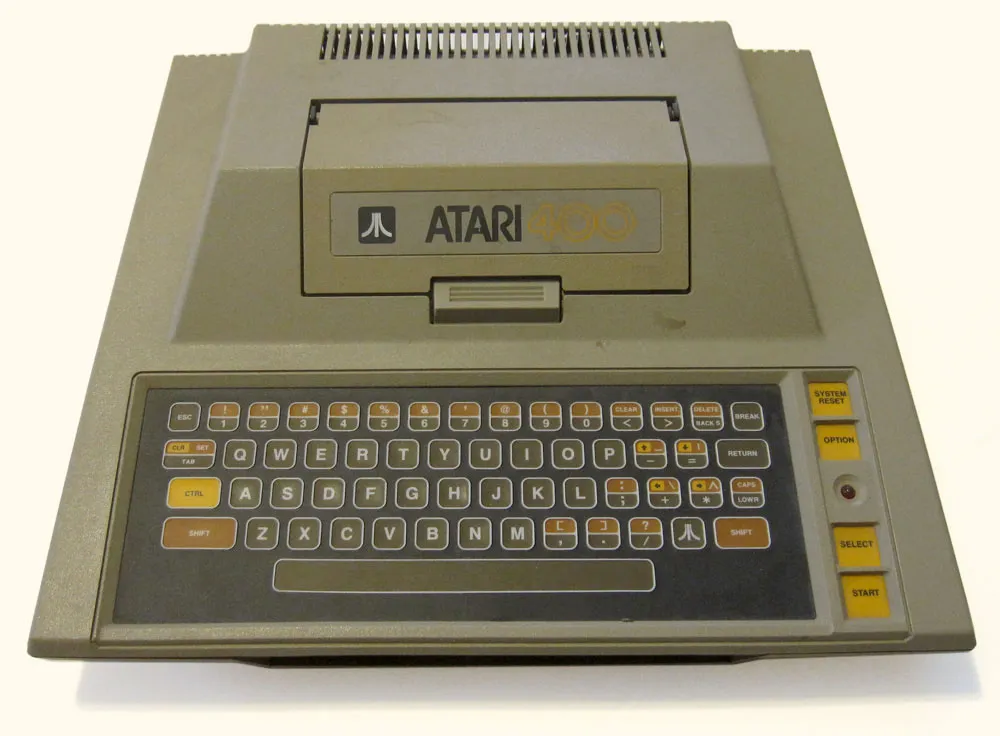
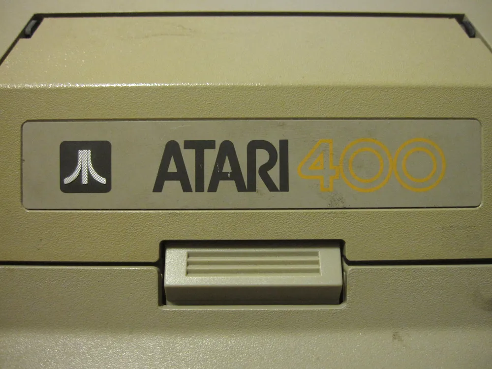
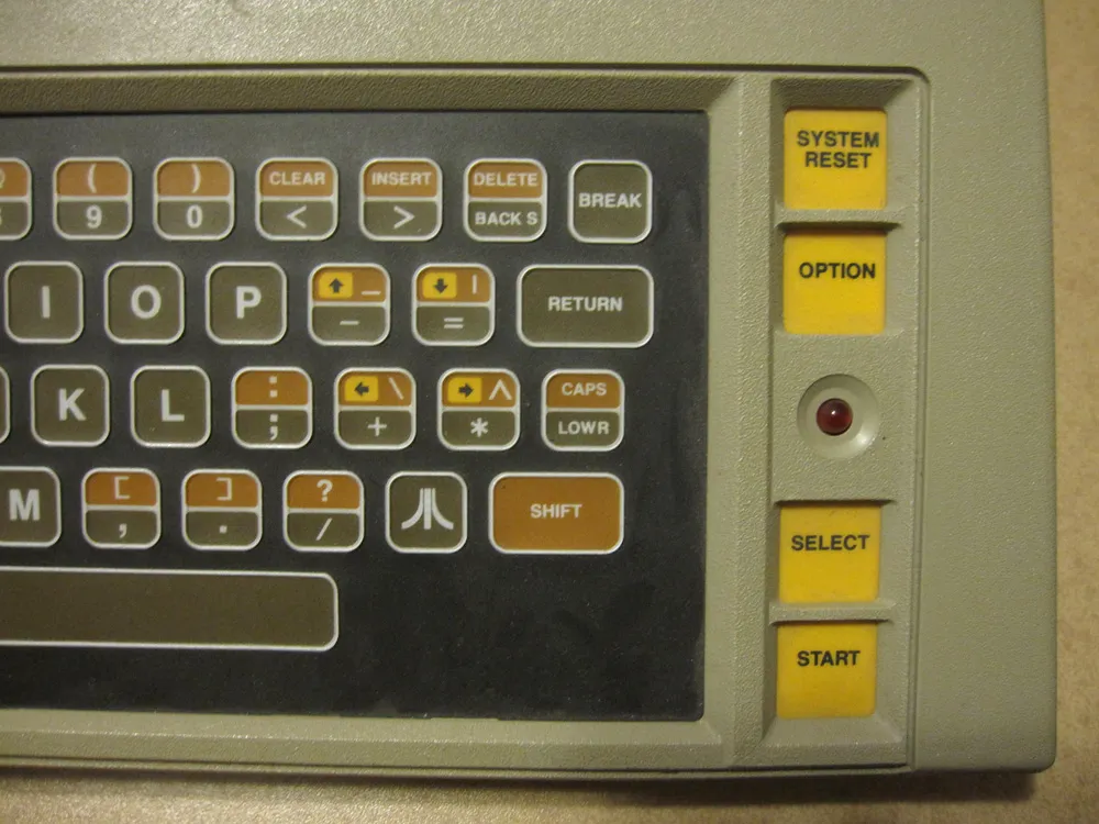
It sported a 1.79 Mhz 6502 processor, the same kind that was in the Apple II. Unlike the Apple II, it had a dedicated graphics processor and built-in sound chip, and four joystick ports, so it was a lot better for games. (A few years later, the guy who designed these computers designed the Amiga, which had a similar hardware concept.) Many programs (especially games) came on cartridges that you inserted into a slot under the access door on top. It had 16k of RAM, but I upgraded mine to 48k.
I also got a cassette “program recorder” so I could save and load files. I got the home computer bug really bad, so it wasn’t long before I upgraded to a floppy disk drive and then the Atari 800 model, which had a real keyboard, a composite video output for better picture, and a mostly useless second cartridge slot:
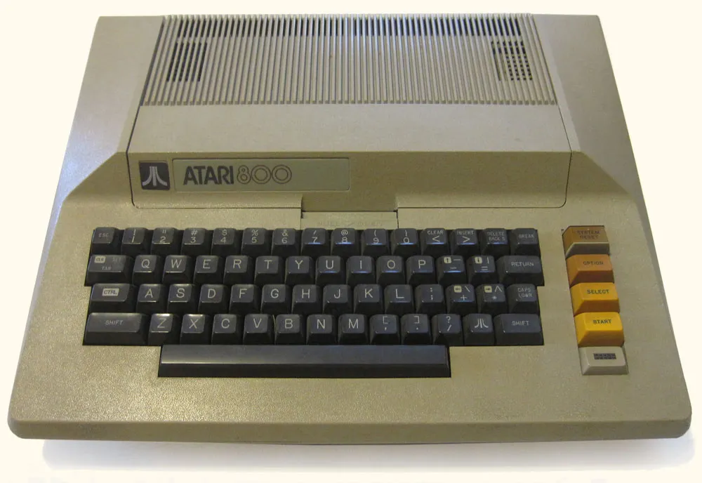
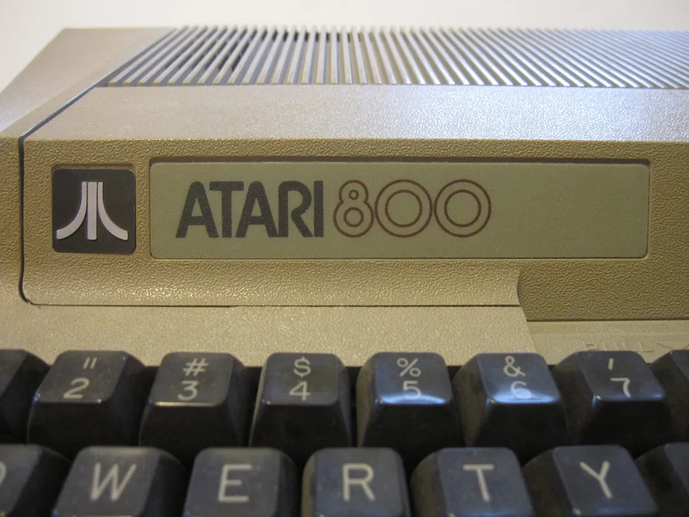
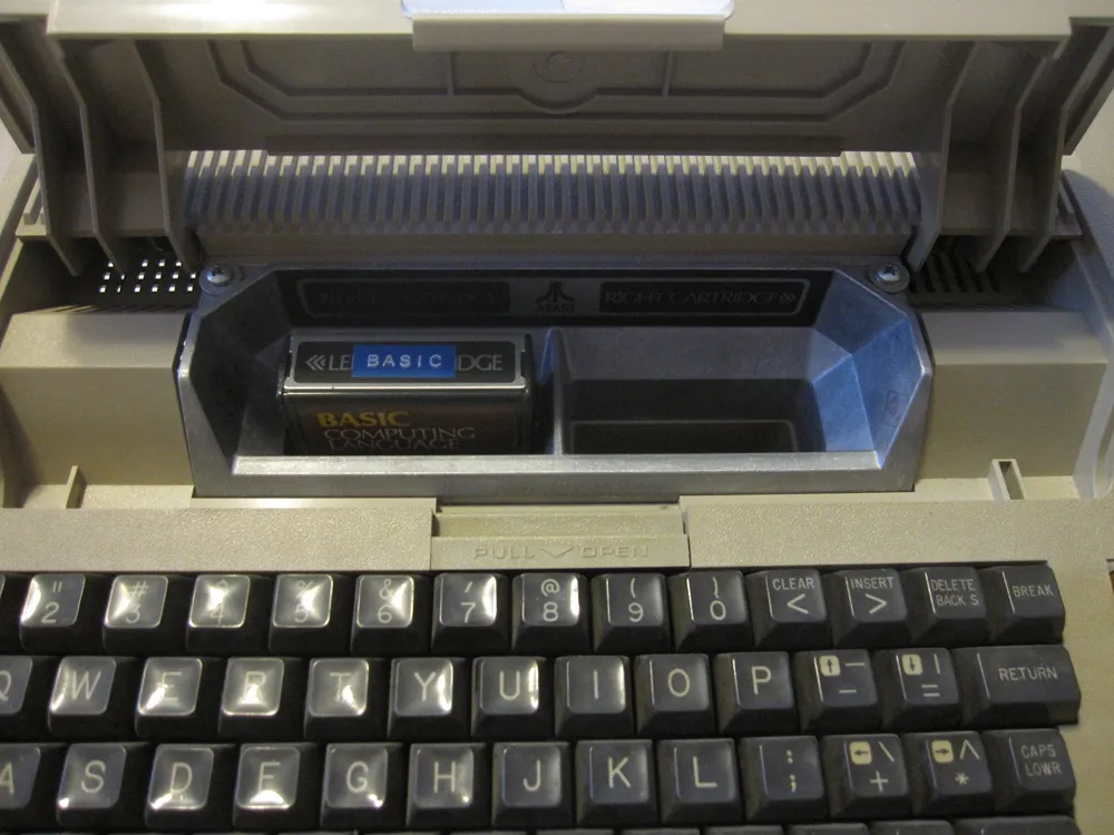
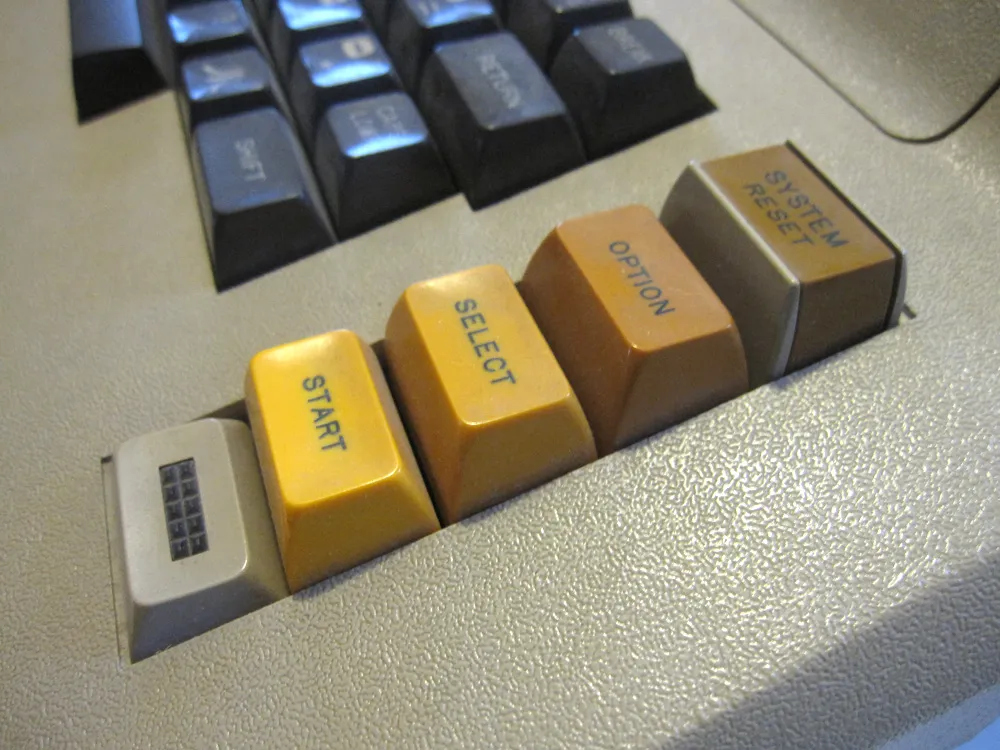
In spite of the fact that it had a real keyboard, it still did the fake “click” sound like the 400 from the speaker when you typed. This lead me to do my one and only hardware hack on it: I added a small switch underneath which cut out the speaker. If it got too annoying, I could switch off the sound.

These were the days before the internet and—really—almost everything we use computers for now. So, what did I use my Atari for? Mostly, I played games (Star Raiders was amazing, but also a lot of Defender, Joust, and some of the early Lucasfilm games) and typed in BASIC programs from computer magazines. I also wrote an article for a magazine on it once and did some “computer” illustrations that were published in real magazines. Learning about programming was the most useful thing about it in the long run—a very good thing to know when making fonts.
Just for fun, I took a photo of one of my current computers, a MacBook Air, next to the Atari 800:
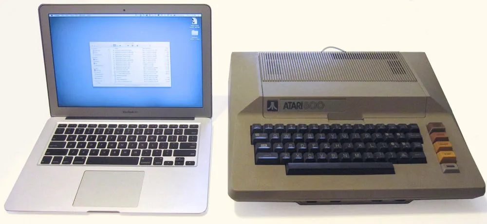
The Air is about 1000 times as fast, has about 100,000 times as much RAM, can store as much data as 1.3 million Atari 88K disks, a built-in flat display with 21 times the pixel density, can display a million times as many colors, has high-speed wireless networking connected to millions of other computers around the world, can run for 10 hours on its built-in rechargeable battery, and is a tiny fraction of the 800’s size and weight, including the display. Not bad for 30 years progress. On the other hand, the Air is conceptually not very different from the first Mac I bought in 1984, a little over two years after I bought my Atari 400.
