Well, here it is the beginning of March and those three new fonts I wrote about in December are still not out. A few people have written me about this, so I should explain.
Basically, I keep getting sidetracked by client work, taking time away from finishing the new fonts. Client work has real deadlines—deadlines I have no control over. My self-imposed deadline for finishing the fonts was, by comparison, more flexible. So when push came to shove, you can imagine what happened.
The good news is that I’m on the case again and it shouldn’t be much longer. I hesitate to give a date except: soon.
Update: Kinescope and Snicker have now been released (April 30, 2007).
As you may be able to tell by my sporadic Notebook postings of late, I’ve been a very busy guy. Some of the things I’ve been working on I can’t talk about (yet).
One of the things I can talk about is three new fonts I will be releasing in the near future. All three were inspired by hand lettered titles in 1940s films.

Kinescope and Snicker are loosely based on title lettering in Fleischer Studio’s animated Superman films from the forties.

In both fonts I’ve ended up with something a bit different than the source of my inspiration, but I think you can see the resemblance.

Kinescope will include context-sensitive characters. For example, when a letter falls at the end of a word, the connecting stroke is clipped off. This gives settings a more natural hand-lettered look. Stylistically, Kinescope falls somewhere between Brush Script and Kaufmann Script, but more elegant than either.

Snicker is a cartoony block letter style. One of the design challenges with Snicker was to come up with a suitable lowercase—the lettering in the Fleischer titles that inspired me only used capitals. Although it is intended for display sizes, it works pretty well for text. Consequently, I’m toying with the idea of adding a lighter weight and italics. It could perhaps become a typographically interesting alternative to Comic Sans…

The third font, Launderette, is based closely on lettering used in the titles of the 1944 Otto Preminger film, Laura:

This font was originally commissioned by a filmmaker who wanted to use the same “font” in the titles of his own film. As with most films of that time, the titles were hand-lettered by an artist, not typeset.

The challenge with this font was that there were very few characters in the source lettering. Most of the characters had to be created from scratch to match the style of the existing ones. Launderette, like Kinescope, will have context-sensitive characters to give it a custom, hand-lettered look.
I hope to release these new fonts by the end of the year.
Update: Kinescope and Snicker have now been released (April 30, 2007). Unfortunately, the name Landerette was already in use (twice!), so I changed it to Lakeside. Lakeside has also been released (February 7, 2008).
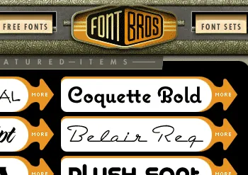
Fellow font guy Stuart Sandler and his partner, Mike Ibach, have launched a new online font venue called Font Bros. The site has some of the same retro look as Stuart’s older Font Diner site, but unlike Font Diner, it offers a hand-picked selection of display faces from a dozen or so independent foundries (including Mark Simonson Studio).
The range of styles covers the whole gamut of type and lettering genres, not just retro. Some of the fonts (like Michael Doret’s amazing Metroscript) are brand new. They are also in the process of remastering the formerly freeware Fontalicious library, bringing it up to professional quality standards.
So, go check it out. It’s pretty cool. www.fontbros.com
The new release of Proxima Nova features a couple of compatibility fixes and more flexible access to alternate characters.
As a side benefit of one of the fixes, the Normal, Condensed, and Extra Condensed styles appear in their own font submenus. This turns out to be a better arrangement than having the whole family all in one submenu. I should have done it this way in the first place.
Alternate characters will now be much easier to deal with. I’ve set up seven “Stylistic Sets” so that alternate characters may be substituted globally in any combination. The new sets are also smarter the the original two in the way they handle the two-story and one-story lowercase “a” in the roman and italic. Again, I should have done it this way in the first place.
The update is free to customers who purchased before December 14, 2005. Customers who purchased after December 14, 2005 already have the new version.
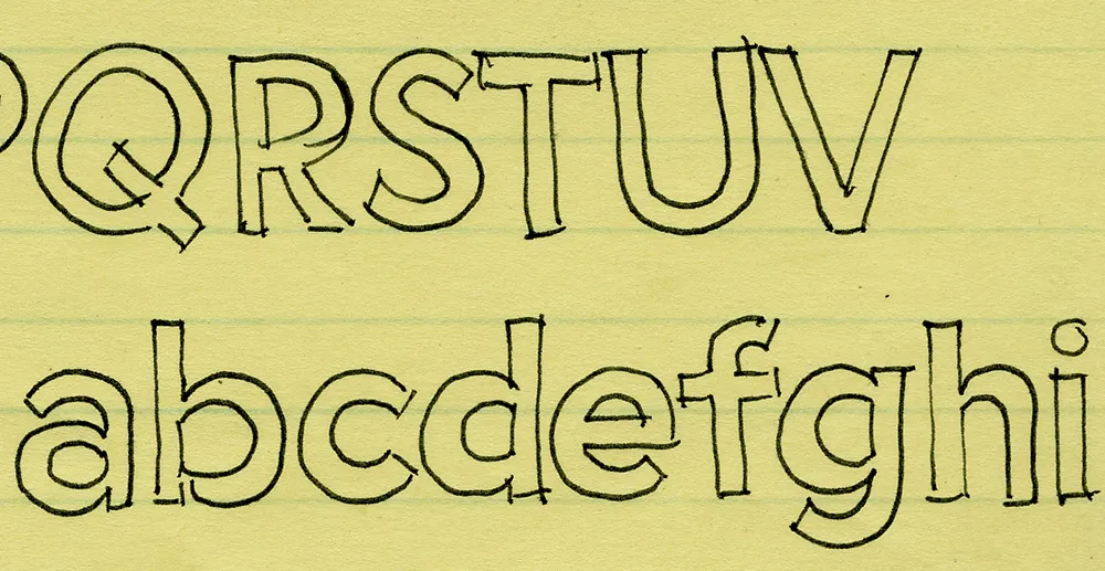
I’ve been working on this font family for almost 25 years. Here’s an early sketch (possibly the first one) from 1981:
Here’s Proxima Nova Bold for comparison:
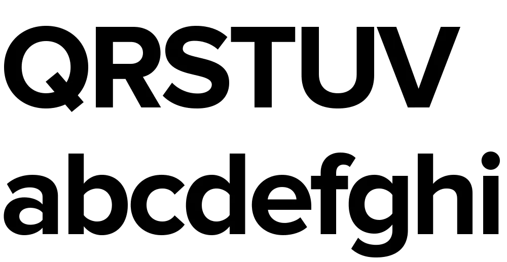
The caps are a bit different from the early concept sketch (they started out with proportions more like Futura), but my concept for the lowercase has remained virtually the same all these years.
Proxima Sans (released in 1994) was my first attempt to realize that concept, and one of the first major fonts I developed. Proxima Nova, just released today, has ten years more thinking and experience behind it. It also fulfills many of the plans and ideas I had for Proxima Sans—small caps, wider range of weights and styles (including Condensed and Extra Condensed), and things I never dreamed of, like extended language support and UniCode.
If you want to know more about this new family of fonts, here are some links:
There is also a comprehensive 93-page PDF sample book. I split it into two parts in case you just want to look at the overview (the first part):
Proxima Nova Overview This nine-page introduction has complete information about the fonts with one-line display samples and a page of text samples. (420k PDF)
Proxima Nova Full Specimen This 84-page comprehensive specimen devotes two pages to each of the 42 Proxima Nova fonts—one with display showings and one with text samples and complete character set. You might want to make sure your printer has enough paper before printing this out. (2.2mb PDF)
Yes, I know. I haven’t been posting a lot on Notebook lately. There’s a good reason for this: Proxima Nova. That’s what I’m tentatively calling the new improved version of my ten-year-old Proxima Sans, one of the most ambitious font projects I’ve ever undertaken. Here’s how it looks so far:

Ever since I released it in 1994, I’ve had in the back of my mind larger plans for Proxima Sans. Small caps. More weights. Condensed styles. After some potential customers asked about such possibilities early last year, I decided it was time.
The new version will have more than new weights and features. I went over every character, refining and retooling the design, adjusting, perfecting, cleaning up. In short, this is completely new set of fonts.
Proxima Sans
Released: 1994
3 weights, 2 styles
6 fonts total
PostScript Type 1, TrueType
Basic Western Latin
245 characters
Proxima Nova
To be released: Soon
7 weights, 2 styles, 3 widths
42 fonts total
OpenType
Extended Latin (including CE)
699 characters
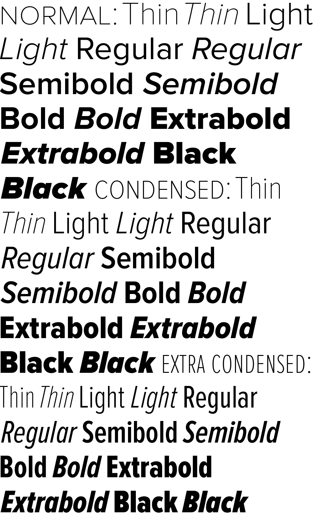
699 characters? You read that right. Take a look:
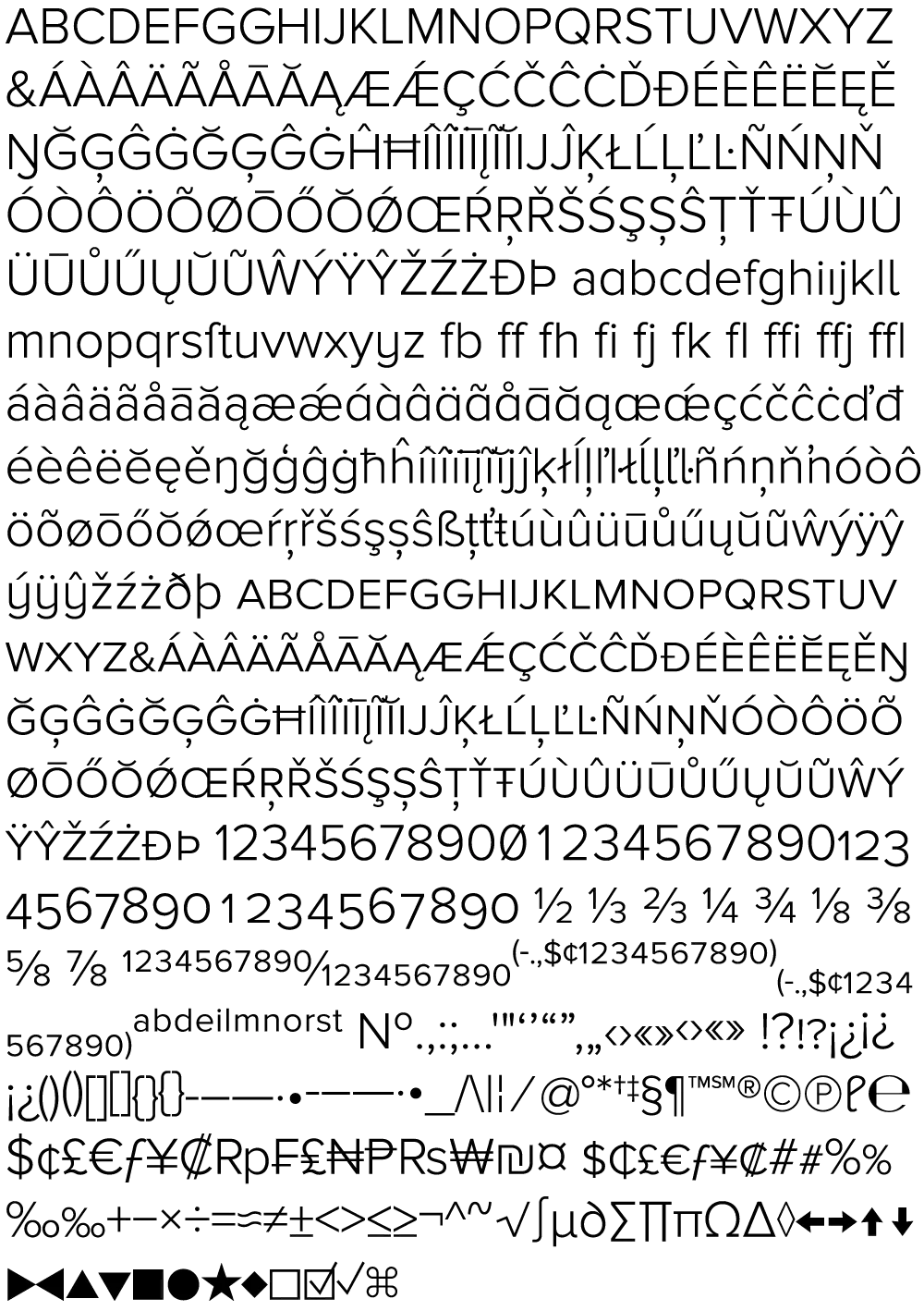
All the characters from Proxima Sans are still there (even the dingbats). But there’s loads of new stuff, and every weight has all this in it, all in one font. No separate “expert” fonts needed.
In order to keep these hundreds of characters under control, Proxima Nova will be released in OpenType format. Using popular graphics software like Adobe’s Creative Suite and (real soon now) QuarkXPress, you will be able to tap into sophisticated typographic effects such as:
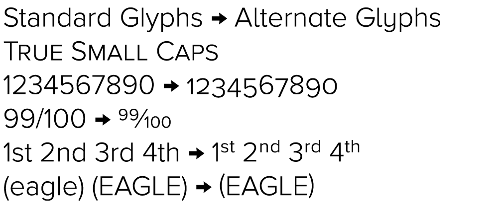
- True small caps
- Lining and old style numbers
- Proportional and tabular numbers
- Automatic “f” ligatures
- Alternate character designs for some characters
- Automatic fraction creation
- True superscript and subscript characters
- Automatic ordinal formatting (e.g., 1st, 2nd, etc.)
- Case-sensitive alternate forms for parentheses, brackets, etc.
- Alternate forms of certain characters to match small caps and old style numbers
- Cross-platform compatibility
As to how soon Proxima Nova will be available, it’s difficult to say. The roman styles shown here are in the final stages of completion. It mostly depends on how long it takes for me to finish the italics. Sure, I could just hit the “slant” button and be done with it. But, it’s not so simple to do it right. Best guess: Spring 2005.
6/24/05 Update: If all goes as planned, Proxima Nova will be released by the end of June 2005. I’ve updated the graphic above showing the various weights and styles to include the italics. Also, the weight and style names are slightly different than what I originally announced here in March.
6/30/05 Update: It’s available now.