Mark’s Notebook - Page 46
Reader Dan Madden is a fan of my Pangrammer Helper, a little Flash application I made that helps in the creation of pangrams. (A pangram is a sentence or phrase which contains every letter of the alphabet.) He and his family had so much fun with it that it prompted his brother, an english professor at BYU in Utah, to hold a “Pangram Haiku Contest” with his students. Here are some of the results:
Lost in flight, quiet.
Yellow jacket reproves me.
Vexed, I buzz away.
Mosquito buzzes
around jackal’s furry paw.
So vexing, that bug!
Read ye my haiku!
Strong, living words dazzle. Jump
back, quietly fixed.
Haiku verses flow
like a bad, exacting quiz.
Too jumpy, yet fun.
The ax swerves, tree dies:
Quite a lop job, so crazy.
Man kills for nothing.
Wise raven in tree
Spies sly fox dozing. Gives him
Loud quack. Bejeezus!
Your quick wit doesn’t
Faze me. I can’t help your jive!
Go back to de-tox!
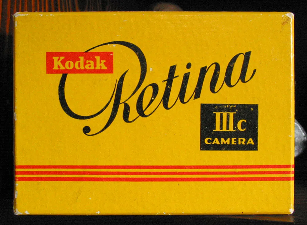
A Kodak package design from the early 1950s, from the collection of Knut Simonson. Photo taken January 1, 2005, Cranberry Township, Ohio.
My uncle Knut worked as a graphic designer for Kodak during the 70s and 80s. I visited him recently and discovered he had acquired some really cool old Kodak packages while he was there. This one is my favorite.
Kristian Walker interviewed me last Friday for his blog. You can read it here.
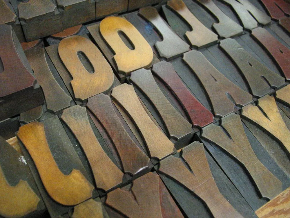
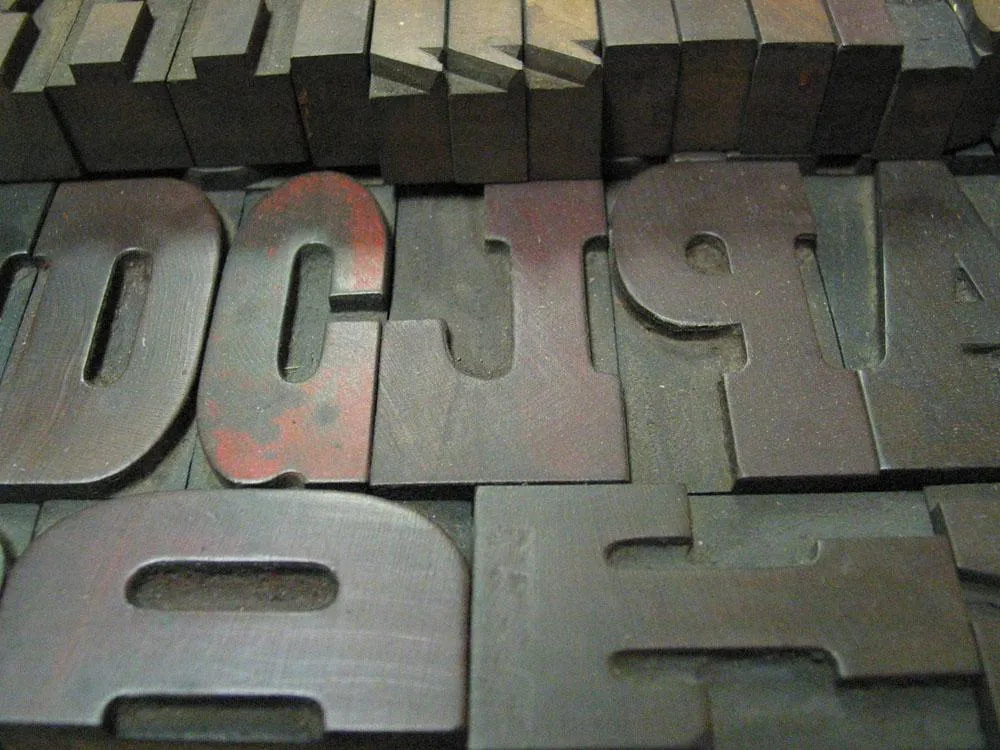
A week ago, my family and I paid a visit to the Hamilton Wood Type & Printing Museum in Two Rivers, Wisconsin. We spent about an hour or so there with Norb Brylski as our guide. Norb was one of the last people to be employed making wood type at Hamilton. He’s retired now, but volunteers at the museum and still makes new wood type for commissions brought to the museum, such as the recent wood typeface designed by Matthew Carter.
Hamilton was one of the largest wood type foundries in the U.S. and had a virtual monopoly by about 1900. It stopped making wood type in the 1980s. The museum opened in 1999 and houses the largest collection of wood type in the world, with 1.5 million pieces. They also have all the equipment to make the stuff (it all still works) and a small print shop which visiting artists (for example) can use.
Anyway, it was pretty cool, especially if you like type.
December 8, 2020 Update: Back in 2005 when I first posted this entry, I posted a little Flash-based slide show. Flash is obsolete now, so I unpacked all the photos and captions it contained and have presented them below.
A lot has happened with the museum since 2005. The original building no longer exists, having been demolished in 2015. The museum moved a few blocks away to another former factory building, in many ways a better home for it. Also, sadly, Norb Brylski, long-time and beloved museum volunteer seen in several of the photos below, passed away in 2018.
I’d also like to point out that when I posted this in 2005, it had been my first visit to the museum. I’ve been back quite a few times since then. Every November since 2009, they’ve held what they call The Hamilton Wayzgoose, and I’ve attended all of them (virtually this year, due to COVID). I’ve also helped support the museum financially since 2012 and am a member of its artistic board.
I highly recommend visiting The Hamilton Wood Type & Printing Museum if you ever get a chance. Other than the building and Norb, everything you see in these photos and more is still there.
Without further ado, step back in time with me to 2005…
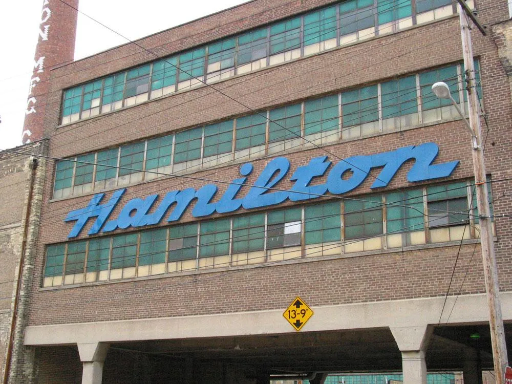
The main sign for Hamilton Manufacturing in Two Rivers, Wisconsin. The company is still one of the largest employers in the area, although it ceased making wood type in the 1980s. Nowadays, it makes cabinets for dentists and other professions.
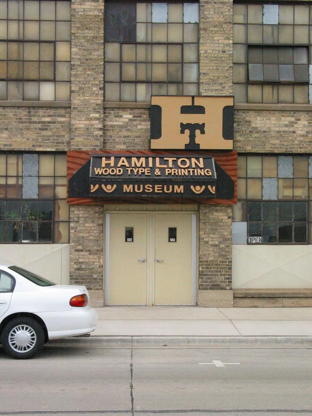
About a half a block down from the big blue sign is the entrance to the Hamilton Wood Type Museum. The sign is made to look like the handle on a drawer of type. The drawer motif continued to the right and left with faux wood like the front of a large wooden drawer, but I guess they decided it was better not to cover the windows.
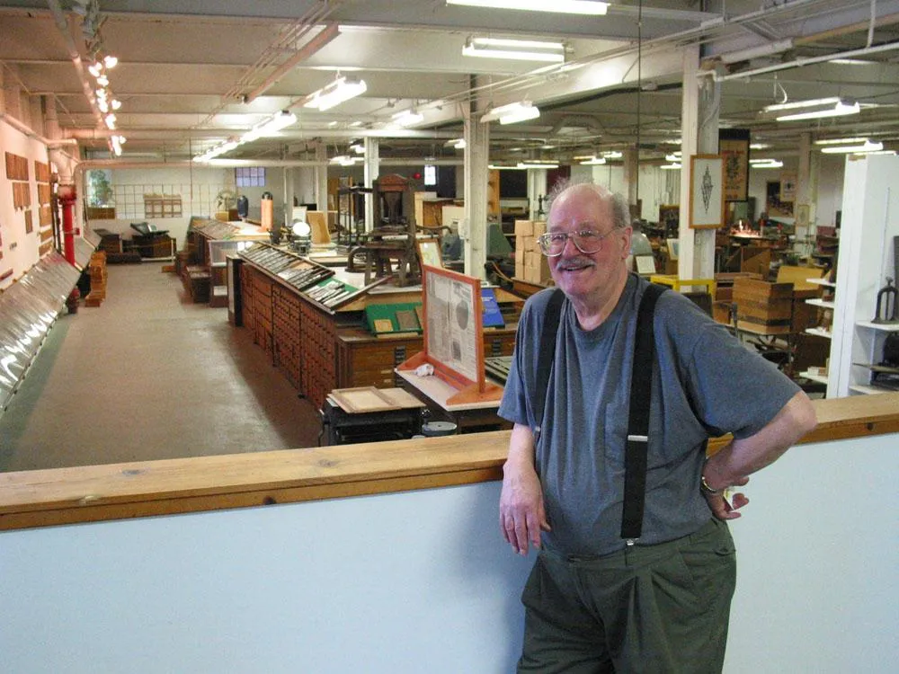
Our tour guide was Norb Brylski, a retired Hamilton employee who volunteers at the musem. Norb was one of the last people to be employed making wood type. He and a few others are still doing some commissioned work at the museum.
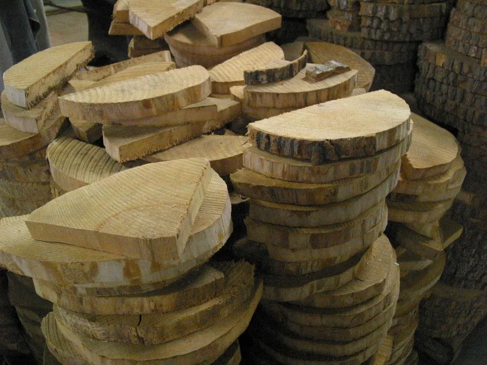
Half round slabs of rock maple like these are the raw material for what will become wood type. This is the way the wood arrived from the lumber company.
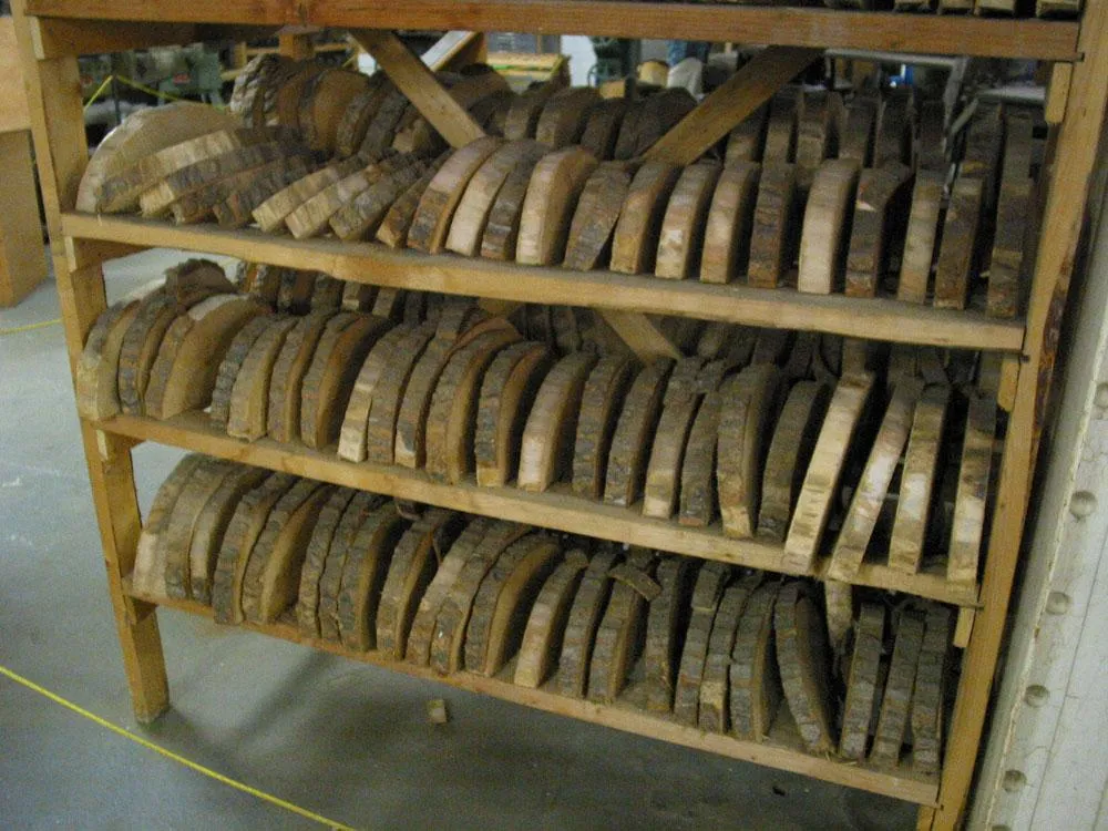
The wood needed to dry for several months before it could be used.
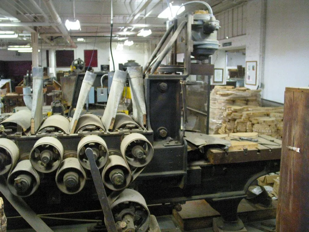
The slabs were planed smooth and to a precise thickness on this machine. After this, they were shellacked and polished to give the wood a smooth hard surface.
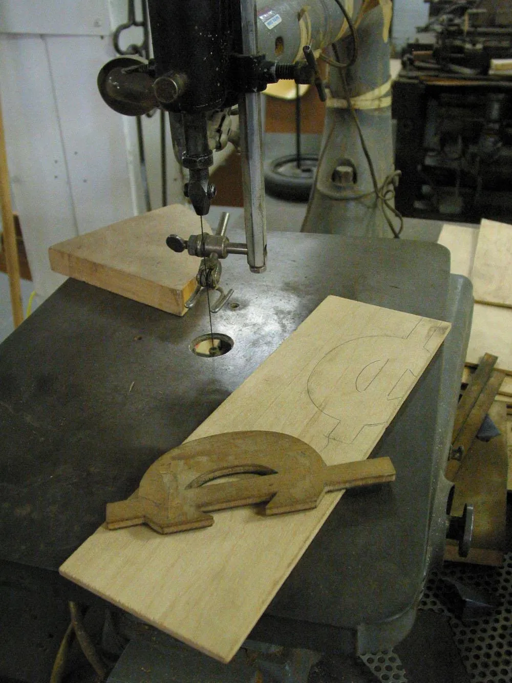
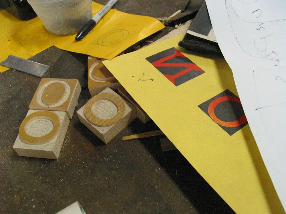
For each character, large patterns, many times larger than the final type, were cut out of thin wood on a jigsaw like this.
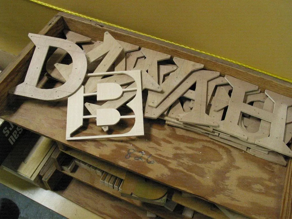
Some unfinished patterns after they have been cut out. These patterns happen to be for a wood typeface called Carter Latin designed recently by Matthew Carter for the museum.
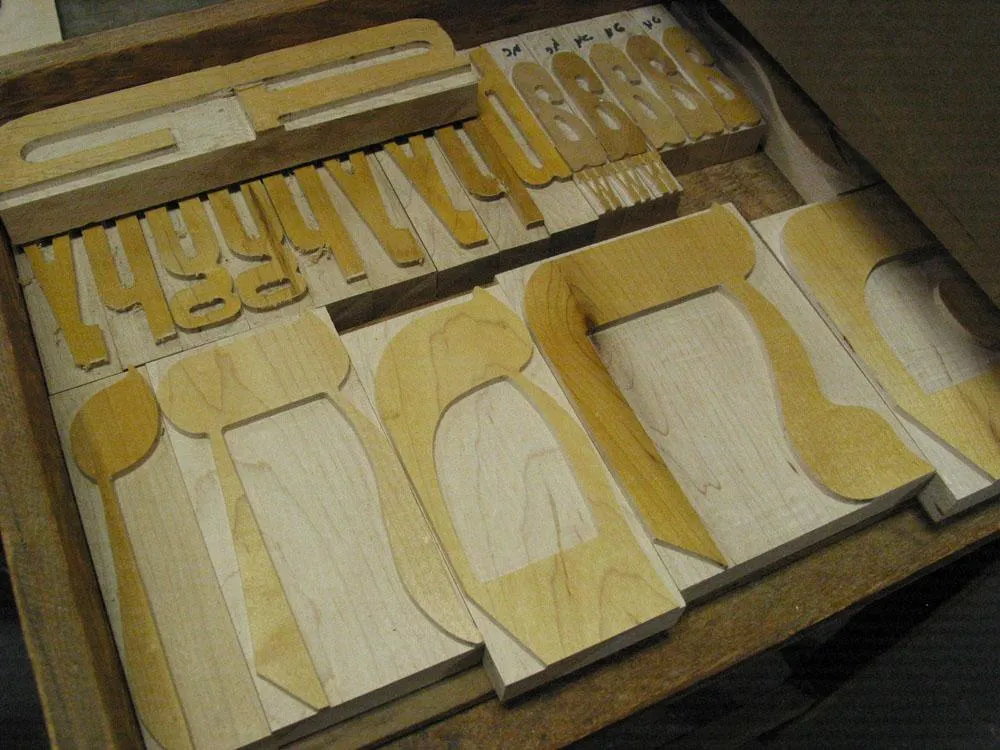
To complete the process, the patterns are mounted on a block of wood using small nails. These are Hebrew characters from another recent commission.
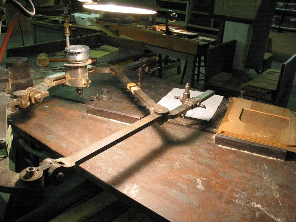
The actual wood type is cut on a pantographic cutter. The cutting blade spins like a router saw. It’s pneumatic and very loud.
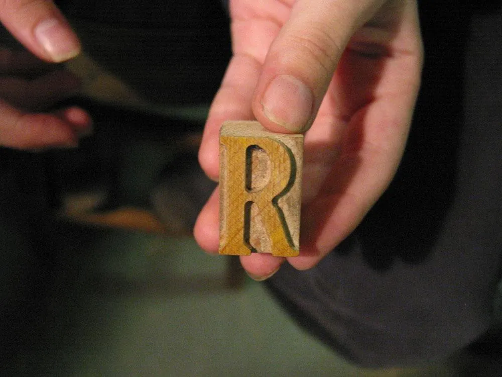
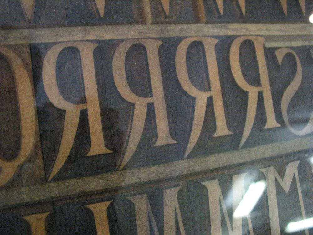
Here is a patter for a capital R mounted on the pantographic cutter.
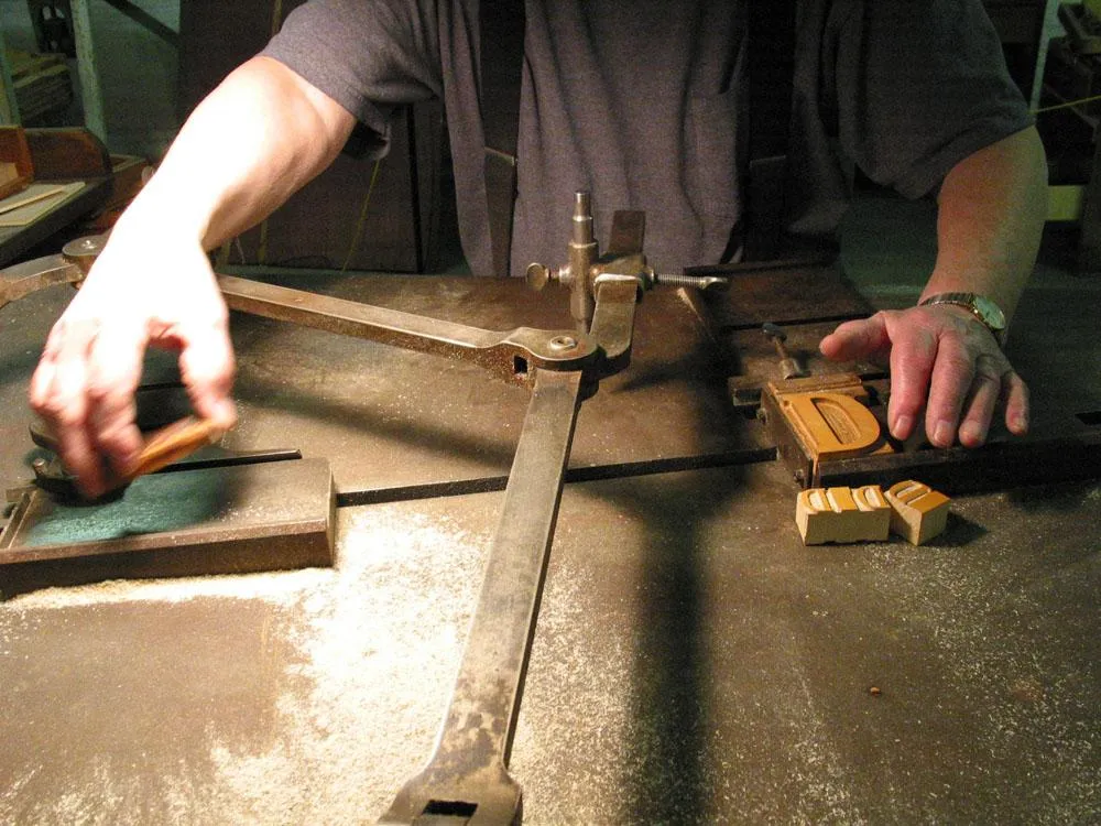
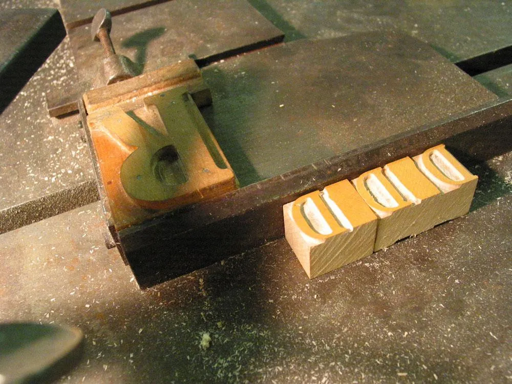
Here Norb is mounting a wood blank to be cut into a piece of type. (Unfortunately, my camera memory card ran out right after this and I missed getting a shot of the actual cutting. Sorry.)
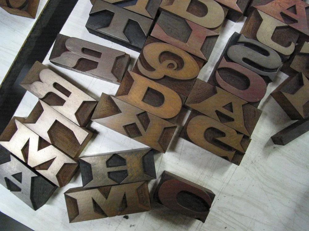
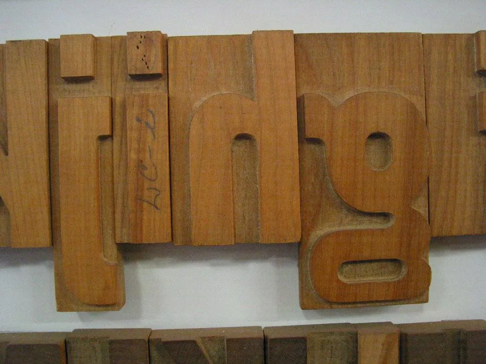
A finished piece of wood type, about an inch tall. Eagle-eyed type nerds may wonder why it’s not backwards. This is a special right-reading font for making souvenir nameplates and such. Also, this piece is not quite finished. Normally, they would go in with a finer cutting blade to make the inside corners sharper.
Latin Extended.
Gothic Condensed.
A beveled style.
DeVinne.
Some very large (almost a foot tall) Gothic Condensed.
Modified Gothic Condensed.
Coronet (probably a much later addition to the library).
More Coronet.
Aldine Extended.
More Gothic Condensed.
A Clarendon.
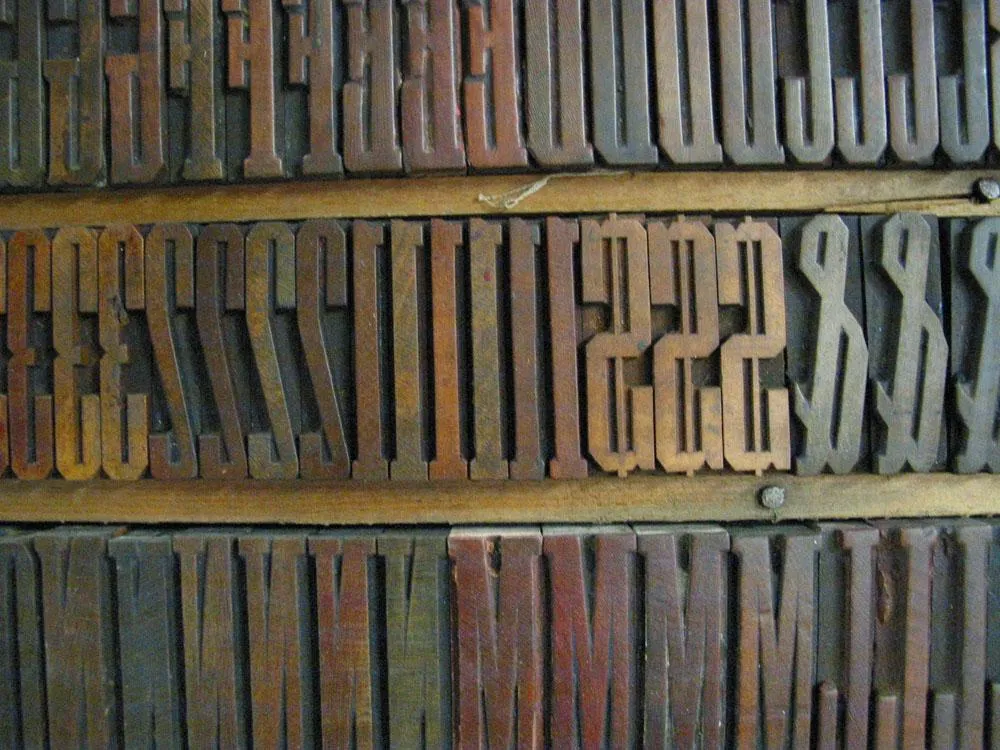
Grecian XX Condensed
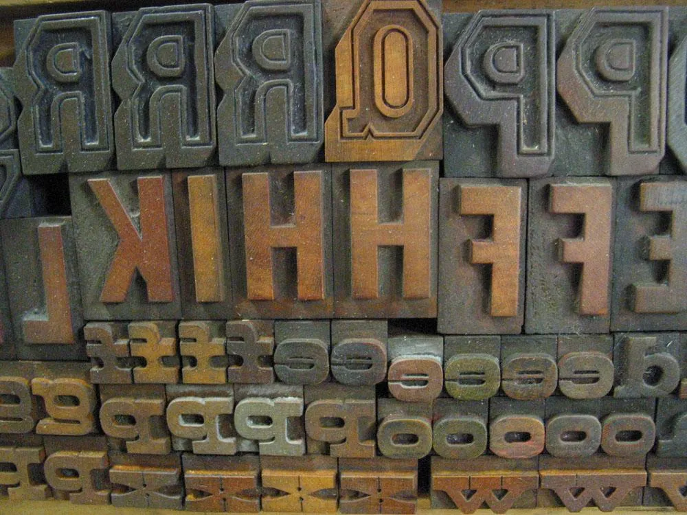
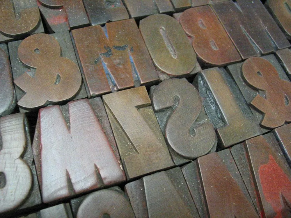
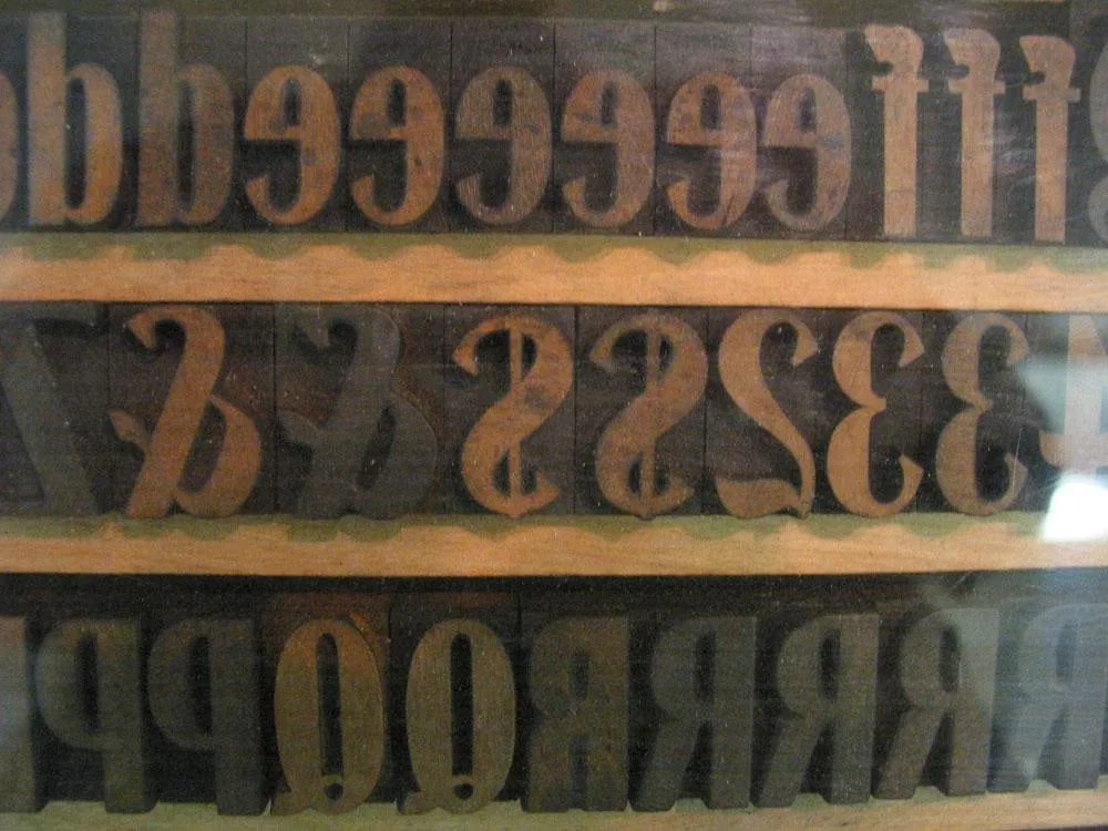
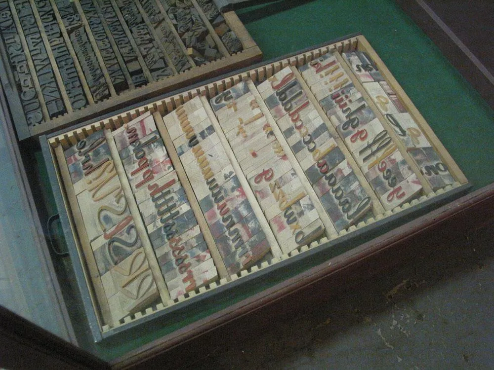
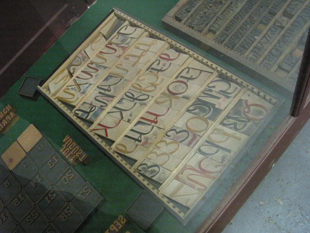
Various styles.
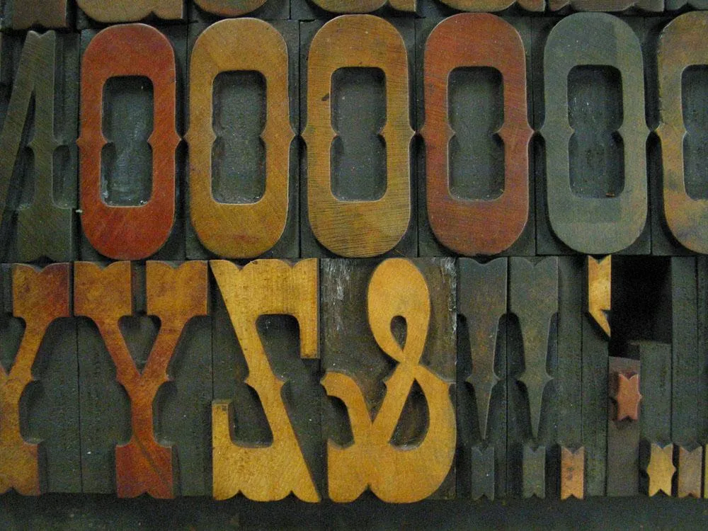
Egyptian Ornamented.
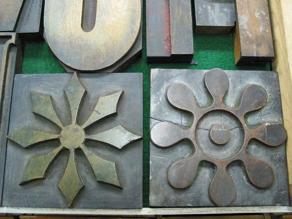
Some very large ornaments, about six inches tall.
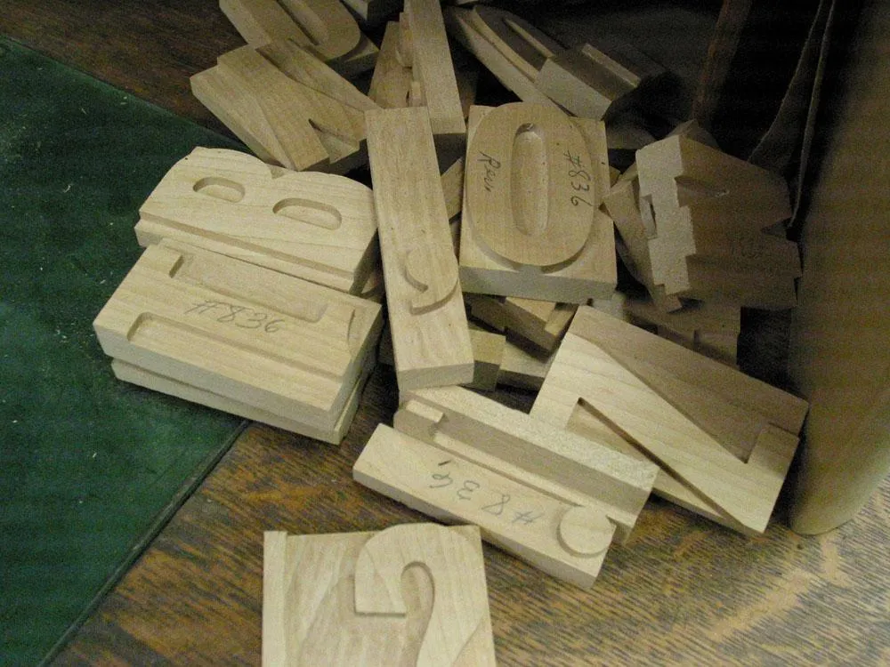
These cut but unfinished pieces of wood type were off in a corner.
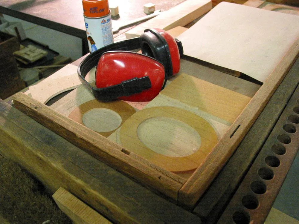
As I mentioned, the type cutter is very loud. Ear protection is recommended. Some more of Matthew Carter’s font patterns visible here.
Some big beautiful patterns for a Hebrew font.
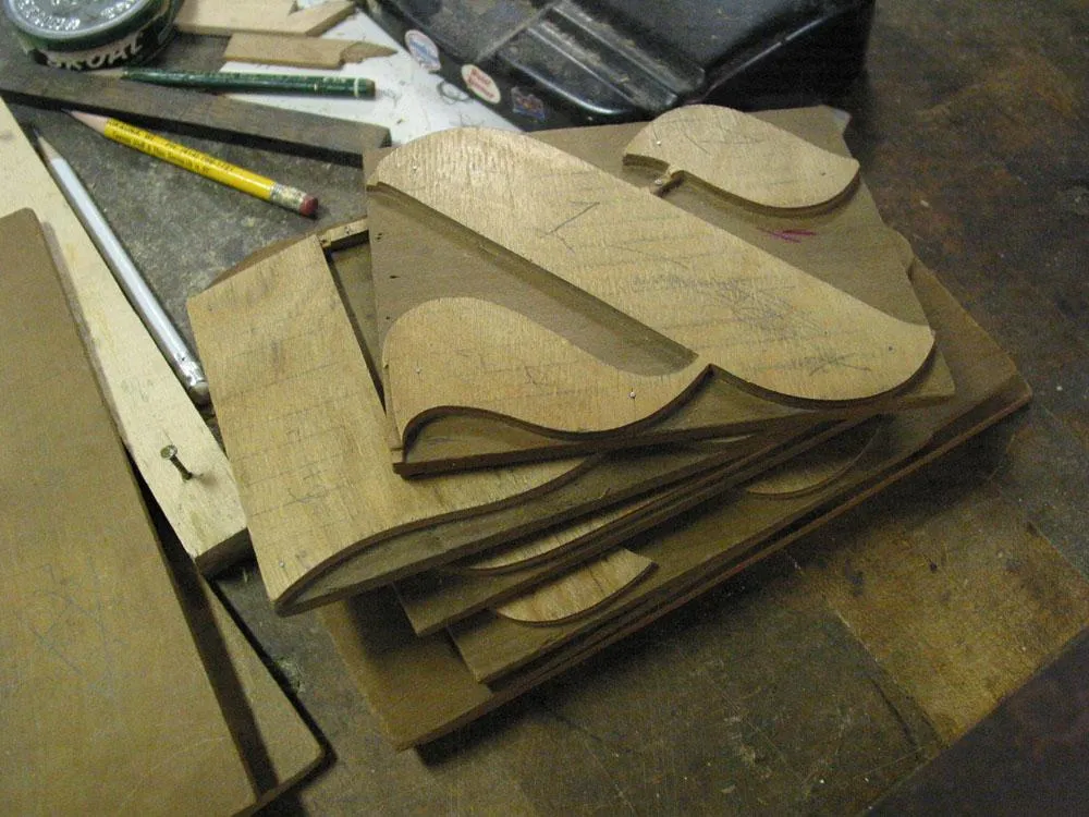
A few pieces of Carter Latin and some proofs.
A close up of a flong, a kind of flexible paper mold used in the stereotype process by newspapers to copy a full page of type in order to make curved plates for letterpress printing. (Now you know where the word “stereotype” comes from.)
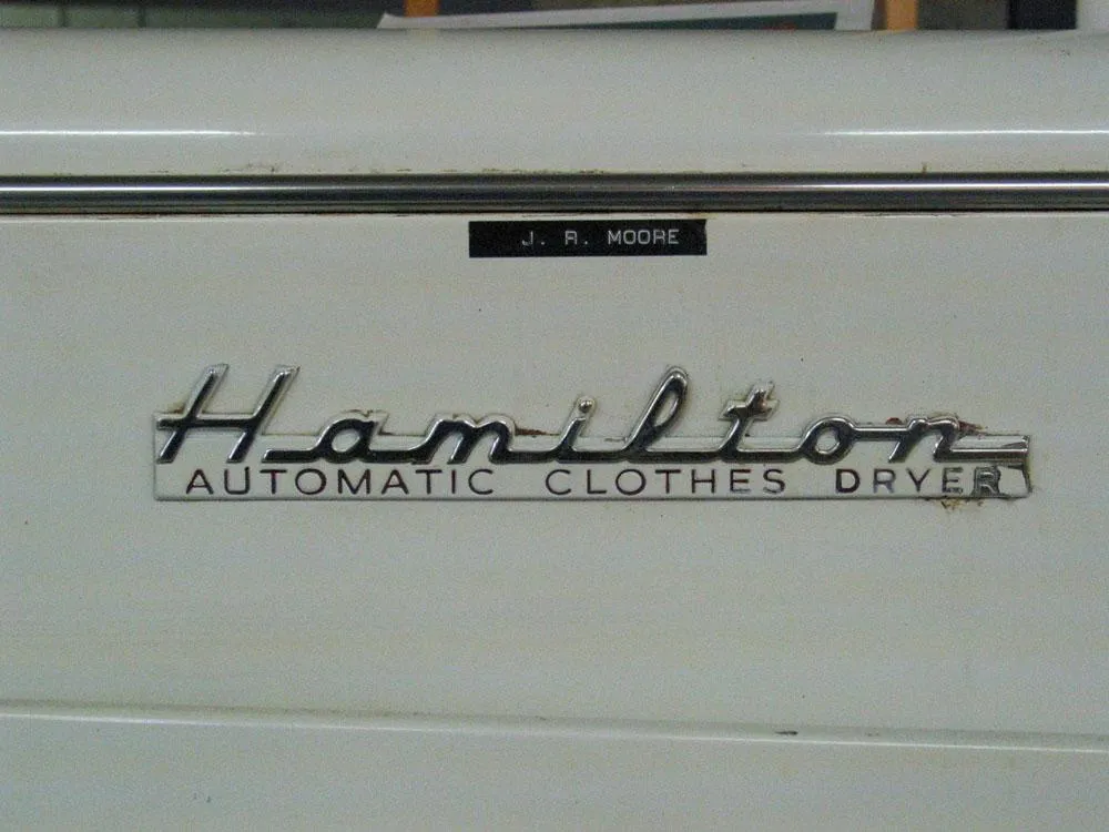
Hamilton also made the first automatic clothes dryer in the 1950s.
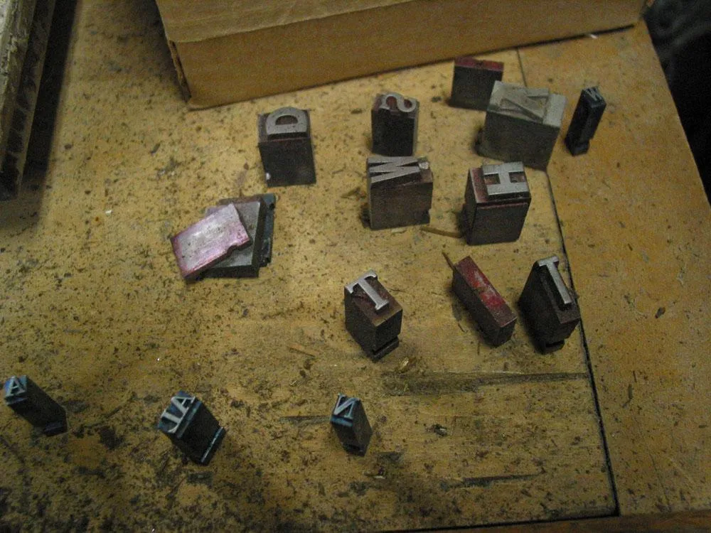
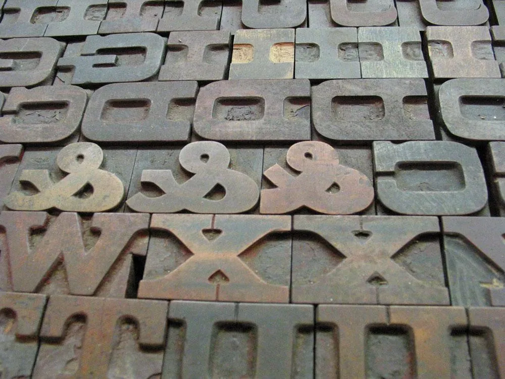
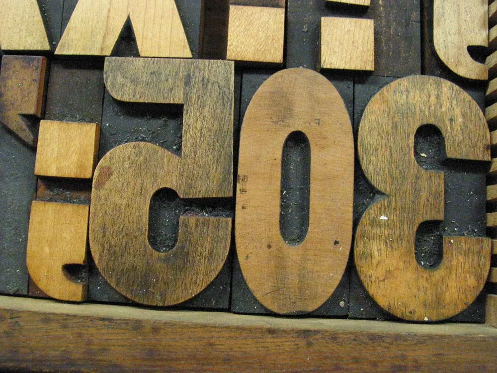
Lying here and there in the museum were pieces of metal type.
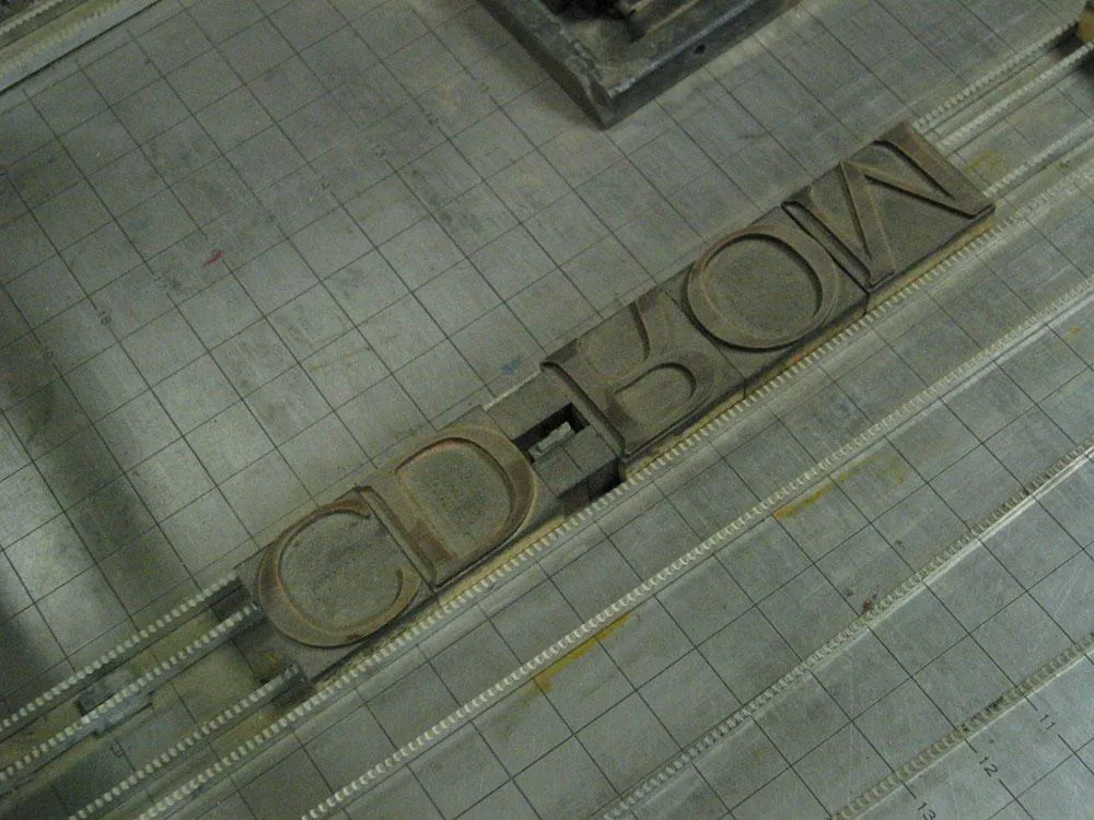
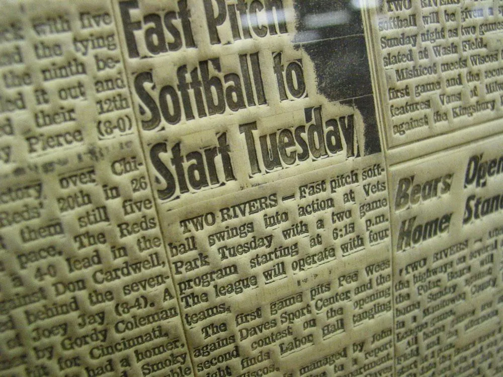
Here is the word “CD-ROM” set up in wood type on a proofing press. I thought this was a bit ironic.
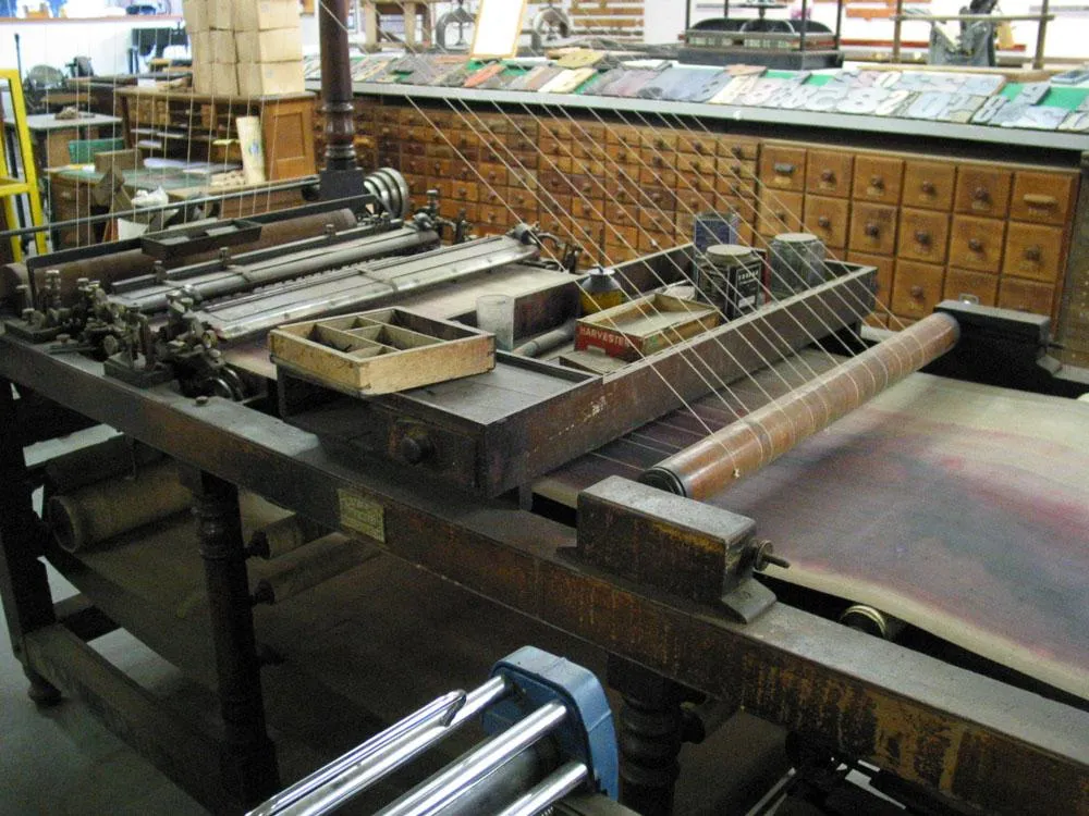
If you ever wondered how they made ruled paper in the old days, this is the contraption that was invented to do it.
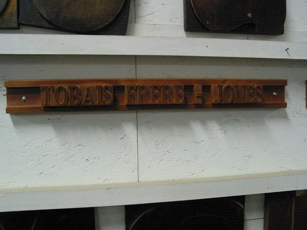
Along one wall in the museum were the names of benefactors set up in wood type. Tobias Frere-Jones, of Hoefler Frere-Jones Type Foundry, was among them. Unfortunately, they spelled his name wrong.
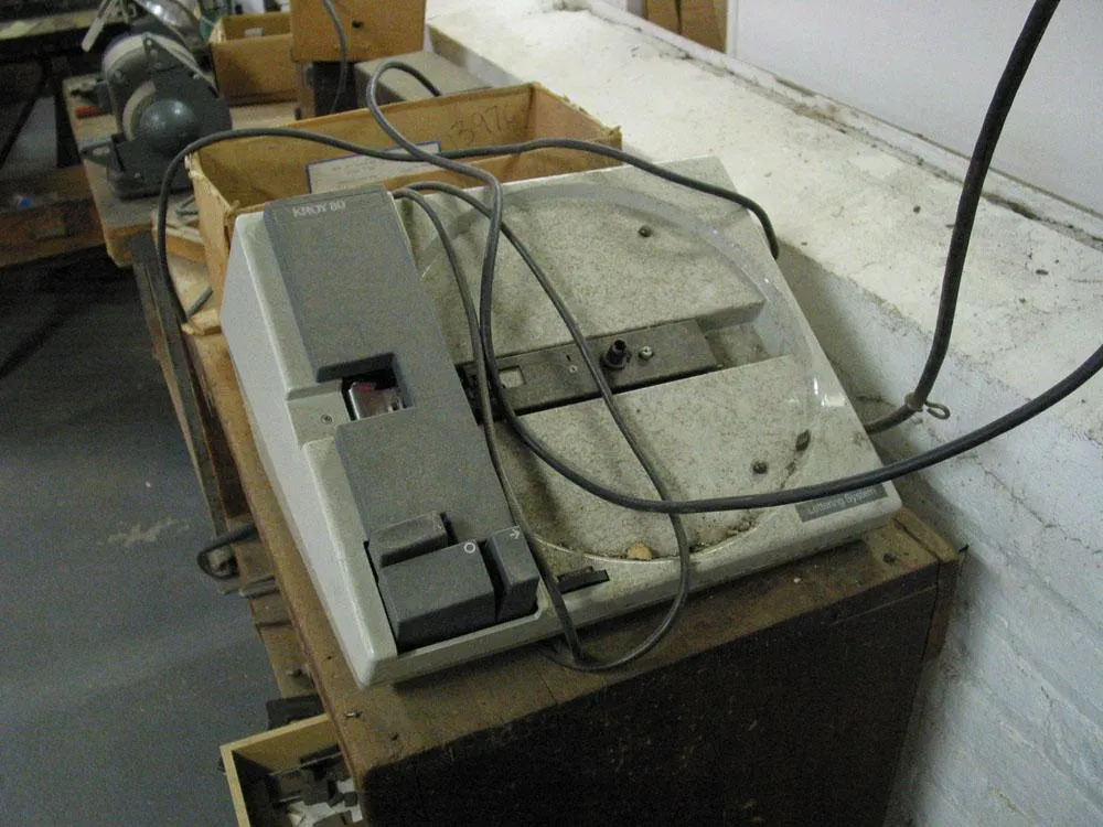
A dusty Kroy lettering machine from the 1970s sat in a corner. Probably they just used it for making labels on drawers.
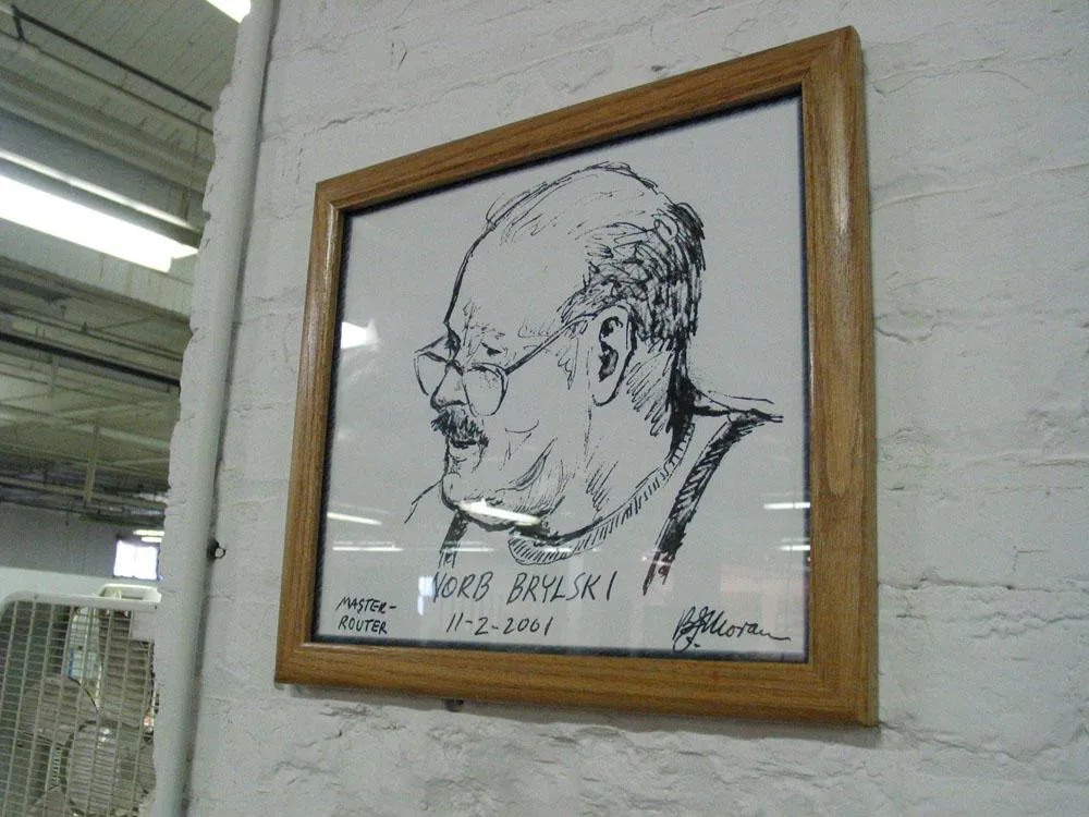
Norb Brylski, our tour guide was honored with a hand-drawn portrait.
As a long time fan of the books, radio show, TV series, computer game, etc., I am looking forward to April 29 when The Hitchhiker’s Guide to the Galaxy finally makes it to the medium of motion pictures. It looks to be very different visually from the TV series (not necessarily a bad thing) but true to the spirit of the stories in all their incarnations.
I’m still sad about author Douglas Adams’ death in 2001, but, according to everything I’ve read, the movie is based entirely on the screenplay he was working on when he died. Whatever is different from the earlier works will be either thanks to or the fault of Adams. (Not that there was ever a definitive version of any of the Hitchhiker stories anyway.)
Website here. Towels here. [Update: The links that used to be here are dead.]
In other quirky British franchise news, Aardman Studios is working on a Wallace and Gromit movie to be released next Fall. (Yippee!)

Eagle-eyed type nerds watching a recent broadcast of the Jeopardy game show will have fallen off their chairs at this font faux pas.
The correct response to this clue was “What is a font?” but note that the font used for the word ARIAL is in fact Helvetica. Oops. And it was such a clever idea to set the clues in the named fonts.