Mark’s Notebook - Page 45
It’s been two days since I left New York City and TypeCon2005. I thought I would be writing reports from the conference, but I found NYC and the conference itself more stimulating than sitting at my computer keyboard. But, now that I’m back and well rested…
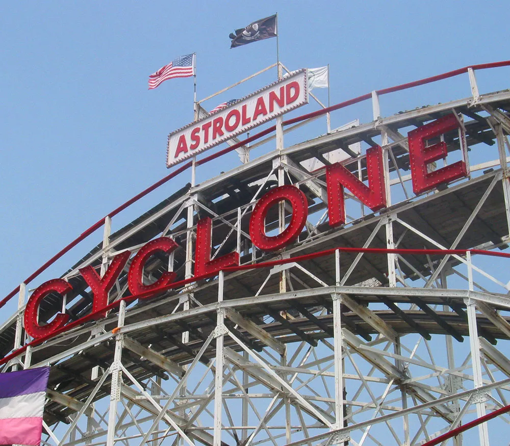
As I mentioned in my previous report, I brought my family with me. We spent a blisteringly hot Monday in Brooklyn, getting there by crossing the Brooklyn Bridge on foot. By afternoon, we made our way to Coney Island and spent some time there. My mother visited Coney Island when she was young and risked her life on the famous parachute ride they used to have there. They no longer have that ride, but I did accompany my daughter on the next best thing, the Cyclone. It’s nearly 80 years old, which made me all the more apprehensive about taking a ride on it, but I survived as I knew I would.
The pre-conference workshops started on Wednesday and I helped conduct an all-day one for FontLab with Ted Harrison (of FontLab), Adam Twardoch (also of FontLab), and Brian Sooy (a fellow type designer). This was the first workshop like this I’d ever participated in so I wasn’t sure what to expect. It turned out that I was the only one of us actually in NYC before Tuesday evening, so it was up to me to see if FontLab had been or could be installed on the Macs at Parsons School of Design where the workshop would be held. The folks I talked to at Parsons didn’t seem to know anything about TypeCon or the workshop and informed me that nothing could be installed on their computers without 30 days prior notice. Oops. We got it straightened out and the workshop went very well.
I’ve just arrived this evening at the Roosevelt Hotel in New York City for TypeCon2005 which starts in a few days.
 My partner and I spent last evening with our daughter (who dyed her hair red and dressed as Ginny Weasely) at a bookstore in Minneapolis until after midnight to get hold of two (!) copies of the latest Harry Potter book.
We decided to combine a family vacation with TypeCon this year. They’ve both been reading their Harry Potter books all day at the airport and inflight (including a three-hour weather delay), while I’ve sat around being bored and making them feel guilty for not letting me have a turn. Actually, they did let me read a little. I’m up to about the middle of Chapter 2.
But, I didn’t fly all the way out to New York City to read Harry Potter (come to think of it, neither did they) and write about it here. So if you’re expecting to find out what happens in the book, forget it. If on the other hand you want to find out what happens when type geeks get together, watch this space.
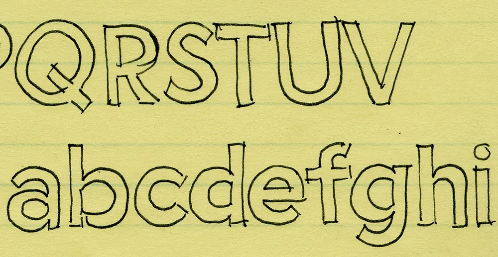
I’ve been working on this font family for almost 25 years. Here’s an early sketch (possibly the first one) from 1981:
Here’s Proxima Nova Bold for comparison:
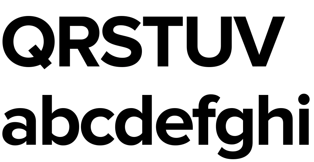
The caps are a bit different from the early concept sketch (they started out with proportions more like Futura), but my concept for the lowercase has remained virtually the same all these years.
Proxima Sans (released in 1994) was my first attempt to realize that concept, and one of the first major fonts I developed. Proxima Nova, just released today, has ten years more thinking and experience behind it. It also fulfills many of the plans and ideas I had for Proxima Sans—small caps, wider range of weights and styles (including Condensed and Extra Condensed), and things I never dreamed of, like extended language support and UniCode.
If you want to know more about this new family of fonts, here are some links:
There is also a comprehensive 93-page PDF sample book. I split it into two parts in case you just want to look at the overview (the first part):
Proxima Nova Overview This nine-page introduction has complete information about the fonts with one-line display samples and a page of text samples. (420k PDF)
Proxima Nova Full Specimen This 84-page comprehensive specimen devotes two pages to each of the 42 Proxima Nova fonts—one with display showings and one with text samples and complete character set. You might want to make sure your printer has enough paper before printing this out. (2.2mb PDF)
Back in March, I mentioned that I was in the final stages of developing a new font family, Proxima Nova. It’s now about three months later and most of that time was taken up by doing the italic.
“What took so long?” you might wonder, “Isn’t it just a matter of slanting the roman version and saving it? That couldn’t take more than an minute or two.” As you may have guessed, it’s not that simple, especially if one wants to do it right. Allow me to illustrate.
Here is a sample set in Proxima Nova Bold:

Here it is simply slanted:

Notice how the curves have become distorted. The subtle modulation of the stroke weight is thrown completely out of whack, getting thinner in some places and thicker in others. This is especially noticeable with the S, O and P. Notice how the O looks kind of squashed. The A is also affected, but the difference is less obvious: the left stroke has become slightly thinner while the right stroke has become slightly thicker.
Characters like E and H, with only vertical and horizontal strokes, are virtually unaffected by slanting. However, any characters which are composed of curves or angled strokes must be optically corrected in a high quality font.
Here is the same sample set in Proxima Nova Bold Italic:

Much better, isn’t it? It takes a lot longer to make all those optical corrections, but the result—a font that simply looks right—is definitely worth it.
I expect to release Proxima Nova by the end of June. It’s available now.
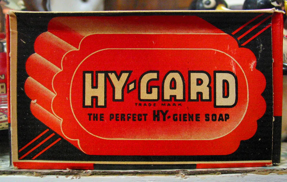
Vintage soap package seen in an antique store in Hopkins, Minnesota, December 18, 2004.
I’ve been invited by Addison Hall to participate in this “musical baton” thing that’s being passed from blog to blog. I’m a good sport, so here goes:
Total volume of music on my computer: 10.09GB, 2,572 songs, 6.5 days worth.
The last CD I bought was: Escondida, by Jolie Holland. Already among my favorite albums.
Song playing right now: None. I actually don’t usually listen to music while I work (this is working?). On the other hand, I do like to listen to stuff from the Fresh Air archives while I work.
Five songs I listen to a lot, or that mean a lot to me:
Well, these don’t all necessarilly mean a lot to me, but they are a few of my favorites…
Cheminant A La Ville, by Kate & Anna McGarrigle. I know some french so I can almost understand this song. Plus, it’s beautiful.
Communication Breakdown, by Led Zeppelin. Best played very loud.
Jealous Guy, by John Lennon. My favorite Lennon song.
Free Money, by Patti Smith. I love her early stuff.
You’re Gonna Make Me Lonesome When You Go, by Madeleine Peyroux. Great cover of an old Bob Dylan song.
Five People to Whom I am Passing the Baton:
Typographica (either Stephen or Josh)
Mark Friesen