Mark’s Notebook - Page 38
Not a font sighting. Seen in Cambridge, Massachusetts, on August 8, 2006.
 This is something I’ve been meaning to post for a while.
Last summer, at TypeCon in Boston, Adrian Frutiger was honored with SOTA’s 2006 Typography Award. Mr. Frutiger couldn’t attend, but several SOTA board members travelled to his home in Switzerland to present the award to him. I was among the people who gave a presentation during the ceremony in Boston. The others were Akira Kobayashi, Bruno Steinert (both of Linotype) and Mike Parker (formerly of Linotype), who each shared personal anecdotes; and Tiffany Wardle and Jon Coltz, who shared the stage in a deeply philosophical rhapsody.
I was asked by SOTA to say some words about Mr. Frutiger, even though, unlike Akira, Bruno, or Mike, I had never worked with him, and in fact I’ve never even met him. Even worse, I had never given a talk at a conference before. But Tamye Riggs (from SOTA) pointed out that it only needed to last about ten minutes and that it would be nice to get a perspective from somebody who was not an “insider.” So, I said “okay” and jumped into the deep end.
In spite of my nervousness and minor technical nightmares (“sorry, we can’t change the screen set up to a dual display just so you can read your notes off the laptop on the podium while the presentation plays on the big screen”) it went fine and was well-received.
If you missed it, or want to see it again, I’ve made a PDF from the Keynote document, which can be found here:
Adrian Frutiger: A Personal Perspective
If you have a slow internet connection, please note: The PDF is pretty image-heavy and weighs in at 17.6MB.
About the formatting: The text you see at the bottom of the screens is my actual script—the words I was saying while the image above them was being shown. I formatted it to make it easy for me to read and not mess up the phrasing. I know that some people recommend against using a script when giving presentations, but, having never done it before, I couldn’t take the chance.
Jean-Christophe Loubet del Bayle has just posted an interview with me on the French typography webzine, Planet Typography. (Si vous préférez le lire en français, voici l’interview et le webzine.) (I had no idea I could speak French so well.)

I’m proud to announce the release of two new display fonts: Kinescope and Snicker. Both fonts were inspired by hand-lettered titles in the old Fleischer Brothers’ animated Superman cartoons from the 1940s.
Kinescope uses advanced OpenType magic to choose the most pleasing character shapes as you type and features extended language support. (An application with advanced OpenType support required for the magic stuff.) To find out more, check out the Kinescope User Guide (1.6mb PDF).
Advanced OpenType support is not required by Snicker, but it has some tricks up its sleeve, including case-sensitive punctuation, automatic fractions, and extended language support. To find out more, check out the Snicker User Guide (1.2mb PDF).
For the first month, Kinescope and Snicker will be available as low as $29 each exclusively from Font Bros. Follow these links for more details:
June 1 Update: Kinescope and Snicker are now available here at Mark Simonson Studio as well.
I’ve been seeing more of these two typefaces lately. Here are some sightings I found in the last few days.
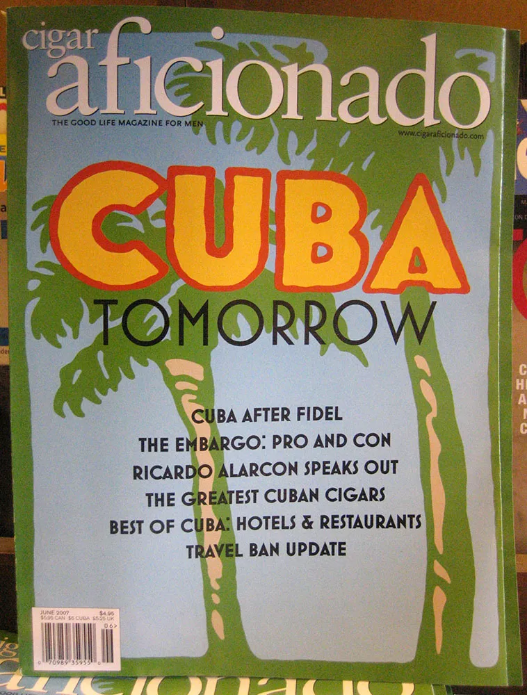
The first is Mostra all over the cover of Cigar Aficionado magazine:
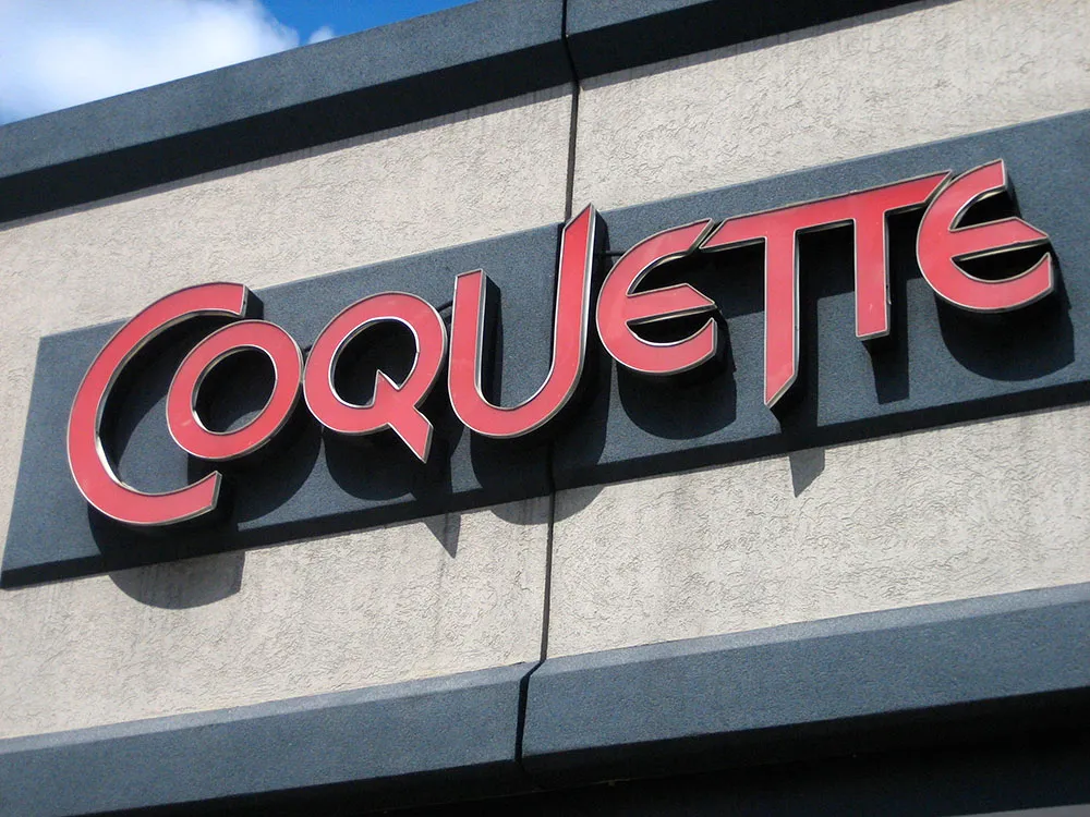
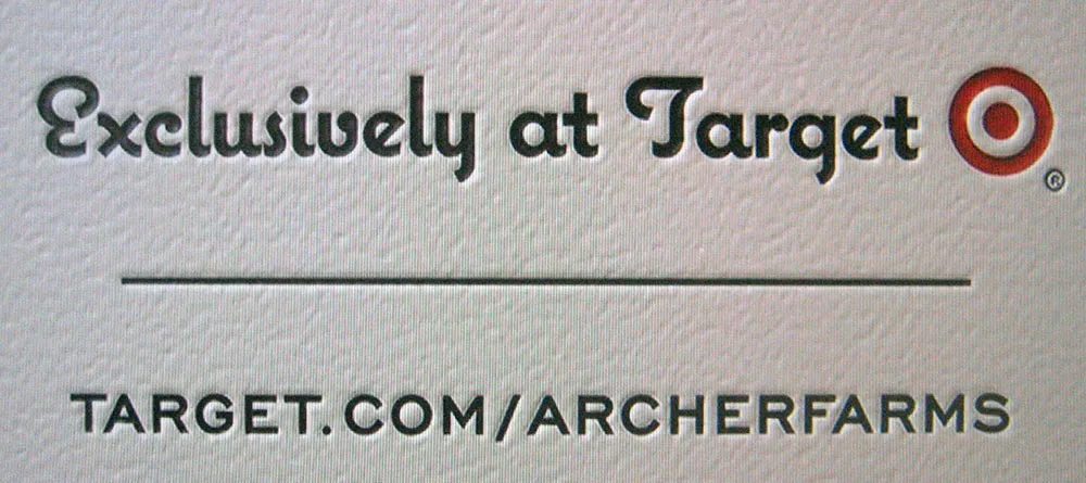
And here are two recent sightings of Coquette, the first on a television commercial for Archer Farms (Target), where they have used a neat letterpress effect:
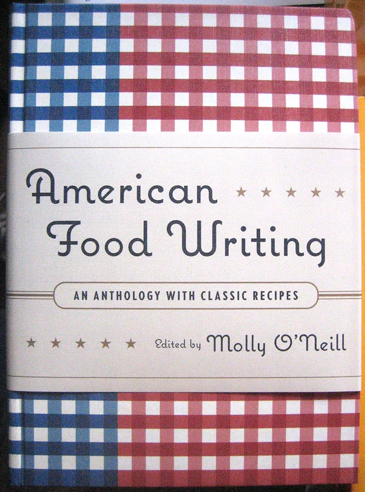
The last is another use of Coquette on the beautifully designed cover of the new book American Food Writing: