Mark’s Notebook - Page 36
My partner, Pat, has been heavily involved with the annual fund-raising plant sale at Friends School of Minnesota ever since our daughter started kindergarten there nearly ten years ago. For the 2007 sale, she wondered if it would be possible to do a time-lapse video of the event to help promote it.
After investigating a number of possibilities, I decided that the simplest way would be to use the iSight camera built into my MacBook Pro along with Boinx Software’s iStopMotion.
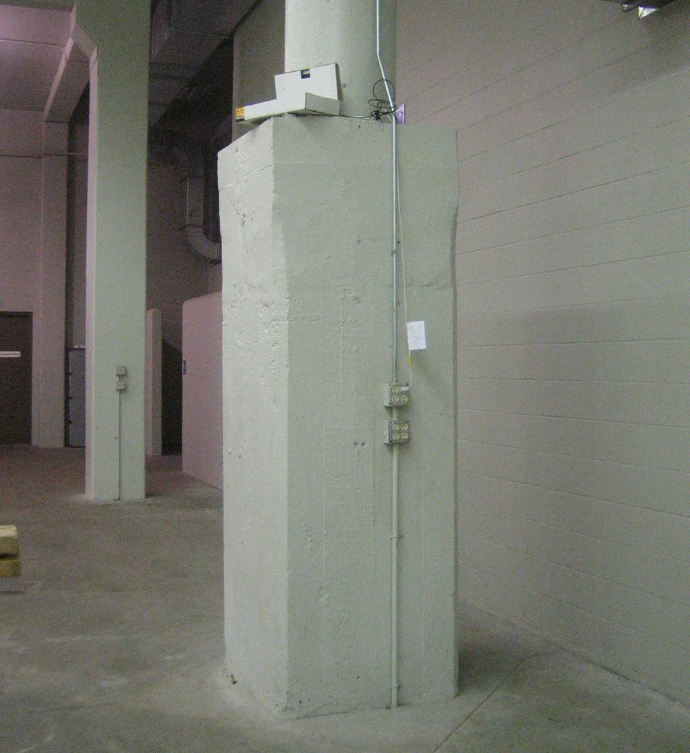
The venue for the sale was the Grandstand at the Minnesota State Fairgrounds, a cavernous space filled with concrete support columns every twenty or thirty feet. I was a bit concerned about leaving my laptop unattended for the week it would take to capture the video, but fortunately we found a well-placed column that had a flat “shelf” about ten feet off the ground. It had just enough space to hold the laptop. There was also a conduit that could be used to attach a security cable.
I still thought it might be a little conspicuous (and tempting) for my not-exactly-cheap MacBook Pro to be visible up there, so I covered it in a make-shift cardboard “disguise” to make it a bit less obvious what it was.
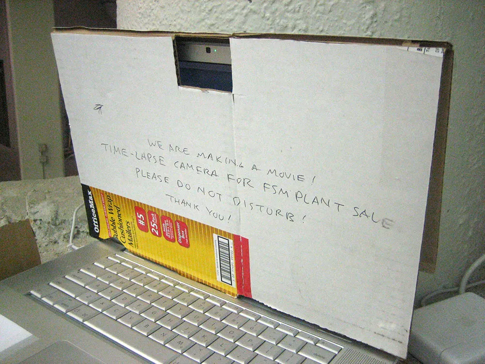
We alerted the fairgrounds security to its presence, but just in case an over-zealous and uninformed security guard happened upon it and thought it was a bomb or something, I added notes and stickers to the outside to explain what it was. And, of course, I completely backed up my hard drive, removed all personal files, logged out of my personal account and set up a temporary user account, in case all else failed and it got stolen or damaged.
Happily, none of that happened. It sat undisturbed for the whole week, shooting one frame every two minutes. I stopped by at least once a day to check on its progress (and to hit command-S to save the footage captured so far), hauling a ladder to and from the site in order to get at it. Unfortunately, some time during the last day of the sale, iStopMotion seems to have crashed, so any video it captured after I hit “save” that morning was lost. (Neither I or the helpful people at Boinx could figure out what happened.)
Nevertheless, the captured video was amazing. I added titles and music, and, well, here is the finished video:
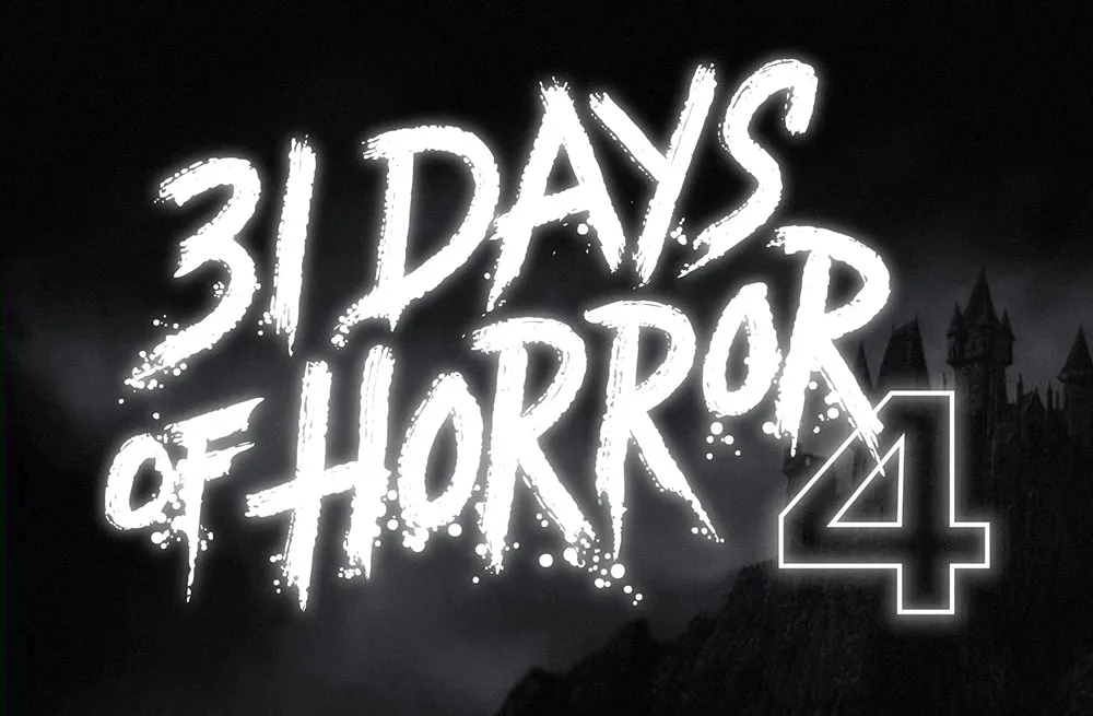
This was a fun one. Rumsey Taylor of Not Coming to a Theater Near You asked me to create lettering for a splash page graphic for the site’s fourth annual horror film festival.
The idea was to emulate classic horror film title screens. Thanks to Steven Hill’s Movie Title Screens Page I was able to find loads of reference. At first I was thinking I would use some kind of blackletter style, but it turns out almost no horror films use that style, unless they involve Dracula or Frankenstein. (More often it’s used for pirate movies.)
In the end I decided to go with the classic scrawled-in-blood look. To get the effect, I wrote out the letters freehand using a Wacom Cintiq and Corel Painter. It took a lot of experimentation and “takes” to get the right look. Once I had the basic lettering, I enhanced it in Illustrator and Photoshop to get the look of an old black and white movie title, complete with light-spill on the brightest areas.
I Rotis for Typophile a few years back…
I Meta man once. I said, “Avenir seen you somewhere before?”
He replied, “I was elected Centaur once. Joanna know what happened? Italia what happened. The Air Force took a Janson me. They put me in charge of Arial maneuvers. But the DIN was terrible. I lost my Tempo and stormed out Didot. I shouted, ‘Avant Gardes posted Ronda clock! To Helvetica Mandarin chief! Peignot attention to him!’
“They said, ‘This Stymie went too far.’ Well, no more Beton Ronda bush. I admit I made some Eras. It cost me my Courier. Univers see it until it’s too late.
“Bodoni hurts when I laugh. Now, I spend my Times Roman the streets.” He walked away singing Myriad a Little Lamb.
I wondered Weidemann was saying all these crazy things.
Franklin, I don’t give a Dom.
(My sincerest apologies. Please don’t bother to Melior complaints to me.)
Seen at the Mill City Museum in Minneapolis, Minnesota on May 28, 2007.

You could say I’m a Tim Burton fan. I’ve written elsewhere about some of the typographic anachronisms in his film Ed Wood, but I also think the titles in that film are wonderfully, typographically evocative—pitch perfect for the period in which the film is set. For a long time, though, I couldn’t figure out what the bold, condensed sans serif typeface was that they used in the titles.
I’m not easily stumped identifying typefaces, but this was one of only two times I’ve posted a query to the Typophile Type ID Board. In the end, I found it myself: Glenlake. (After I found it, I wondered if the Ed Wood title designers chose it because of the name—as in Ed Wood’s film Glen or Glenda… Could be.)

Still, Glenlake was something of a mystery. It popped up here and there in old film font catalogs, sometimes with a different name, but where did it come from? The more I looked at it, the more distinctive it seemed… a kind of Fifties precursor of Compacta or Helvetica Compressed (both Sixties designs).
So last year, when Stuart Sandler invited me to help digitize the classic Filmotype library, and I saw Glenlake was part of the library, I had to say yes. There are more of these funky/cool Filmotype faces to come—perhaps even more weights of Glenlake (it had only one)—including some really cool scripts that I’m working on.
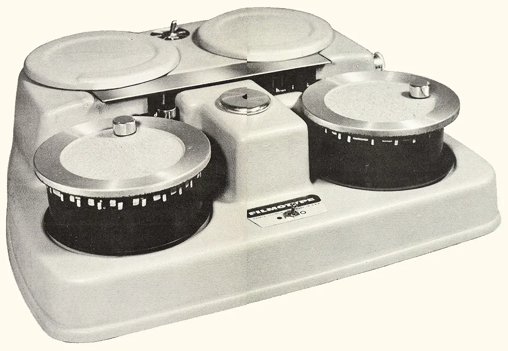
Above: One of the original Filmotype film font machines.
Of course, the old Filmotype fonts were made mostly in the Fifties, and they pretty much only did the basic character set—caps, lowercase, numbers, and some punctuation. The digital version is being released in the oh-so-modern OpenType format and includes a complete, modern character complement, suitable for setting type in most Latin-based languages. I even threw in alternate designs for the “a” and “y”—something that didn’t exist in the original Glenlake design, but was common in Filmotype’s other sans serif fonts.

So, there you have it. Filmotype Glenlake, a digital revival of a classic Filmotype font from the Fifties, available for online purchase from Font Bros. I think it’s a heck of a font, and one that I’m proud to have helped bring back from obscurity. (Be sure to check out the other new release, Filmotype MacBeth, a bouncy, casual serif design.)
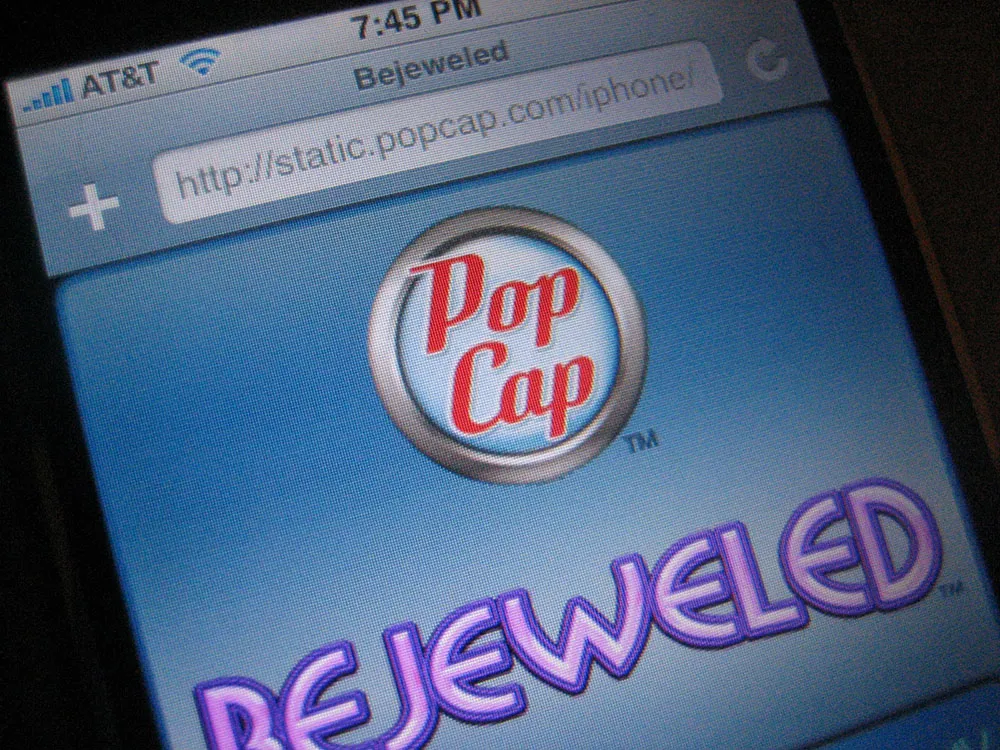
Okay, so I admit it. I bought an iPhone about three hours after they went on sale a month ago. I didn’t have to wait in line or anything. I walked in, bought it, and walked out. Like nearly everyone else who has one, I’m very happy with it.
So, I was a bit tickled today when I unexpectedly saw some of my recent work on it: the new PopCap Games logo, which appears on Bejeweled, the first game designed specifically for the iPhone.
I did the job last spring. Here is a comparison of the old version and the new version:

The idea was to make the logo cleaner and smarter without making it noticeably different to PopCap’s customers. Except for the background emblem, practically every detail of the lettering was changed. It would have been fun to completely redo it, but I’m happy with how it turned out.
If you have an iPhone and want to play Bejeweled, fire up Safari and head over the PopCap website. The game will automatically load when you visit the site using an iPhone.