Mark’s Notebook - Page 24
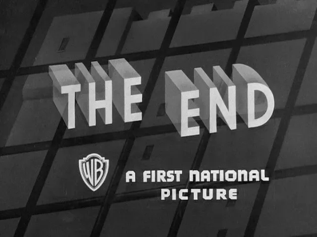
Appropriately enough for the end of the year, the Movie Title Stills Collection now has a set of “The End” titles from Warner Bros. movies, from 1925 (the earliest available on DVD) to 1967 (when the practice ended). As usual, these are nearly all hand lettered. There is some consistency to the designs, almost as if it were treated as logos. This may have been done on purpose, as a way of branding the pictures, but it seems more likely that is was simple expediency, reusing the same artwork to save time and money, with variations reflecting the shifting tastes over time of the artists involved.
I was quoted and my site was mentioned in an article by Alice Rawsthorn in today’s New York Times. If you’ve come here looking for my Mad Men piece, it’s here:
Titanic was also mentioned:
For more obsessive nitpicking about type in movies and television (more fun than it sounds), see Son of Typecasting.

Seen in an antique store in Osseo, Wisconsin, on August 14, 2009.
Chris Foresman, at Ars Technica, has written a nice, informative piece about WOFF (Web Open Font Format).
Mozilla announced today that it is going to include support for WOFF fonts, a font format designed for use on the Web, in Firefox version 3.6. I support this format and plan to allow my distributors to license WOFF fonts to customers.
At this point, Firefox is the only browser to support this format, so it’s not quite ready for prime-time yet. But there is a lot of support for this in the font industry, and hopefully the other major browser makers, Apple and Microsoft, will join in soon.
I’m pleased to announce the release of Anonymous Pro Version 1.001. This version contains mostly user-requested tweaks and fixes, including:
- The comma and the comma part of the semicolon have been moved down about a pixel (depending on the size) to improve clarity.
- The design of the “quotesinglbase” and “quotedblbase” match the look of the “straight” quotes (the earlier designs didn’t match anything).
- The periods and other “dot” punctuation elements are a bit bigger in some bitmap sizes/styles.
- Fixed the hinting problem that caused the tops of the caps to vary in height a certain sizes on Windows (hard to figure out the reason, but easy to fix once I knew).
- Corrected the 13ppem bitmap glyph for the Greek character “omicrontonos” (which, embarrassingly, sported an umlaut).
And last, but not least:
- I dropped my old DIY license and switched to the SIL Open Font License, which should make a lot of users in the open source community happy.
Small note to Windows users: I haven’t updated the sample that shows what Anonymous Pro looks like in text sizes on Windows with ClearType enabled. It looks better than that now. I’ll update it soon.