Mark’s Notebook - Page 14
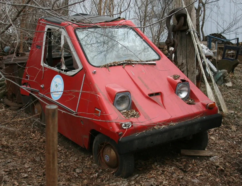
Spotted this curious little car in an amazing place called M. Schettl outside of Oshkosh, Wisconsin, back in 2009. It’s a Citicar, an all-electric vehicle made back in the seventies.
Not long after I saw this relic, I happened to be watching the television movie adaptation of Ursula LeGuin’s science fiction novel, The Lathe of Heaven, starring Bruce Davidson. It was made in 1980 and was set in the (then) near future. Of course, they needed some futuristic looking cars, and I guess the Citicar fit the bill. They used several of them for the film. I wouldn’t have known what they were if I hadn’t just seen this one in Oshkosh.
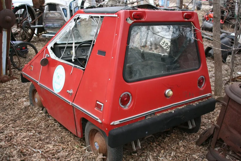
There’s something forlorn about seeing this little car rusting away among the other antiques they had there. The future is never quite what people think it will be.
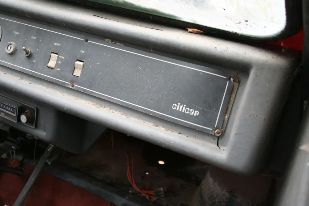
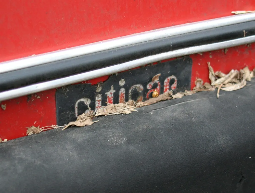
Check out the logo on the dashboard and over the rear bumber: Amelia—the erstwhile number-one choice when you wanted to say “future” with a font.
1976: One hour by bus from Osseo (an outer-ring suburb) into downtown Minneapolis.
1977: Half hour by car from Osseo into downtown Minneapolis.
1977: Twenty minutes by bus from Saint Louis Park (an inner-ring suburb) into downtown Minneapolis.
1979: Fifteen minutes by car from Saint Louis Park to Saint Paul.
1981: Twelve minutes by car from South Minneapolis to downtown Saint Paul.
1985: Ten minutes by car from South Minneapolis to South Minneapolis.
1992: Five minutes by car from Saint Paul to Saint Paul.
2000–Present: Under one minute on foot (working at home).
I don’t understand why people put up with long commutes.
Seen on the floor of an elevator in Madison, Wisconsin, on March 21, 2011.
This entry is probably going to date me quite a bit. What I consider to be my first real computer was the Atari 400, which I bought in 1982. Around a year later, I got an Atari 800, mainly so I could type on a real keyboard. (The 400 had a cheaper “membrane” keyboard, which gave little tactile feedback. To make up for this, you would hear an audible “click” from the speaker. Not very different from modern touch-screen keyboards, now that I think of it.)
I still had both of them until about a year ago when I donated them to a local Atari dealer. Yes—they still exist! Not only that, one of the local Atari user groups that was around back in the early eighties (S.P.A.C.E.: Saint Paul Atari Computer Enthusiasts) still meets once a month less than a mile from my home!
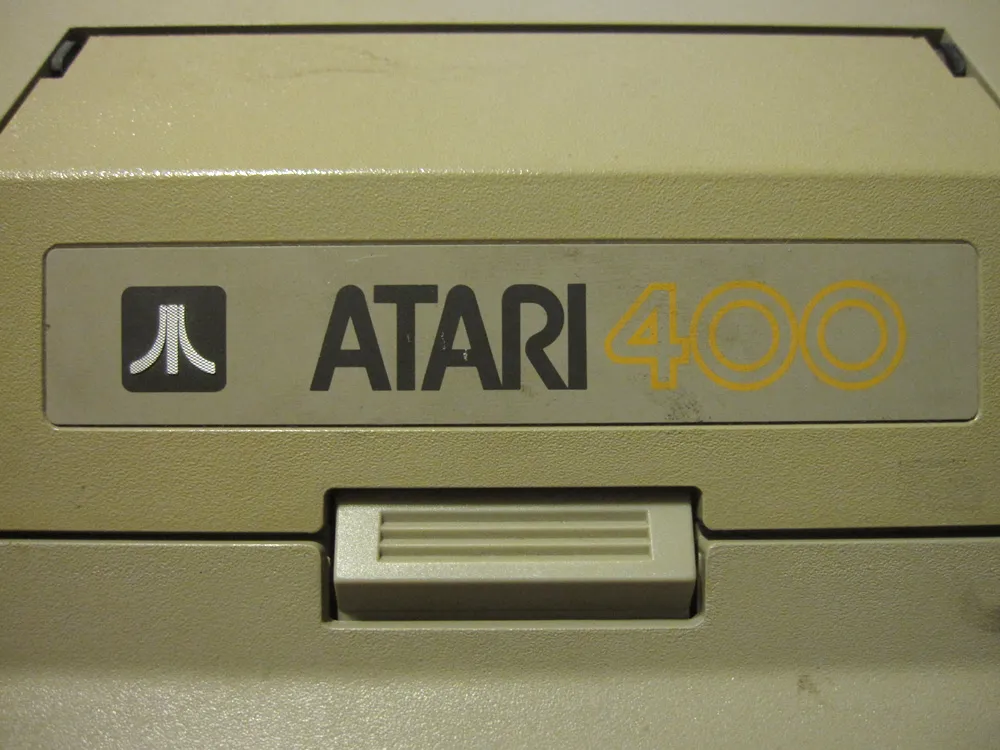
Anyway, before I unloaded them, I took some photos. Here is the 400, with its membrane keyboard:
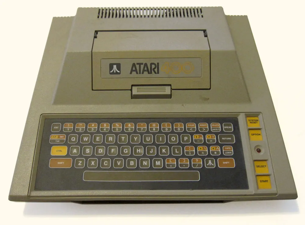
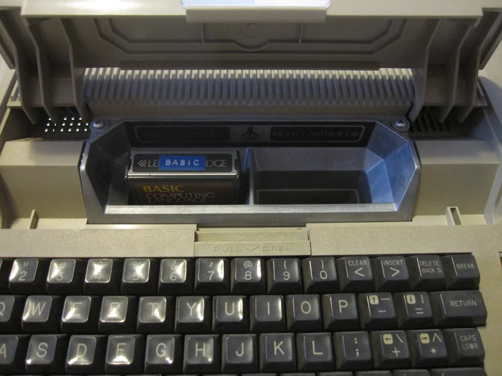
It sported a 1.79 Mhz 6502 processor, the same kind that was in the Apple II. Unlike the Apple II, it had a dedicated graphics processor and built-in sound chip, and four joystick ports, so it was a lot better for games. (A few years later, the guy who designed these computers designed the Amiga, which had a similar hardware concept.) Many programs (especially games) came on cartridges that you inserted into a slot under the access door on top. It had 16k of RAM, but I upgraded mine to 48k.
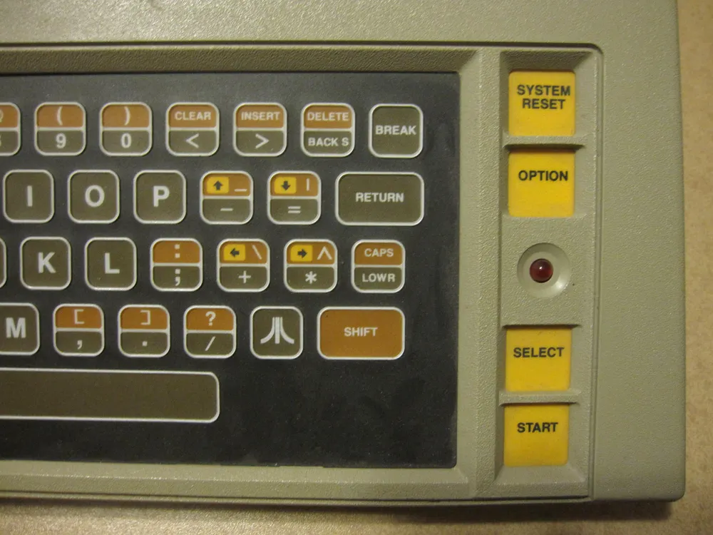
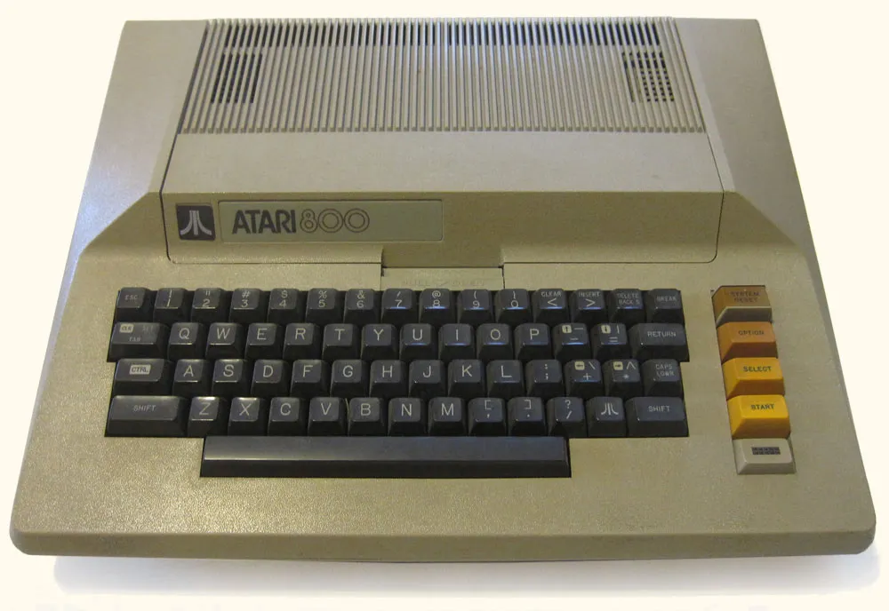
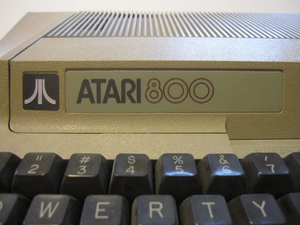
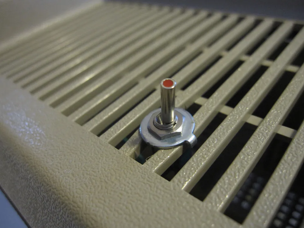
I also got a cassette “program recorder” so I could save and load files. I got the home computer bug really bad, so it wasn’t long before I upgraded to a floppy disk drive and then the Atari 800 model, which had a real keyboard, a composite video output for better picture, and a mostly useless second cartridge slot:
In spite of the fact that it had a real keyboard, it still did the fake “click” sound like the 400 from the speaker when you typed. This lead me to do my one and only hardware hack on it: I added a small switch underneath which cut out the speaker. If it got too annoying, I could switch off the sound.
These were the days before the internet and—really—almost everything we use computers for now. So, what did I use my Atari for? Mostly, I played games (Star Raiders was amazing, but also a lot of Defender, Joust, and some of the early Lucasfilm games) and typed in BASIC programs from computer magazines. I also wrote an article for a magazine on it once and did some “computer” illustrations that were published in real magazines. Learning about programming was the most useful thing about it in the long run—a very good thing to know when making fonts.
Just for fun, I took a photo of one of my current computers, a MacBook Air, next to the Atari 800:
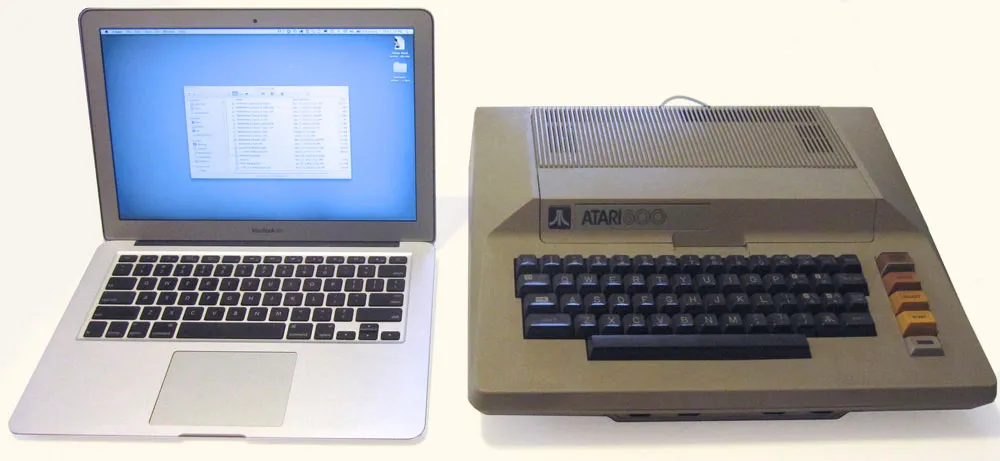
The Air is about 1000 times as fast, has about 100,000 times as much RAM, can store as much data as 1.3 million Atari 88K disks, a built-in flat display with 21 times the pixel density, can display a million times as many colors, has high-speed wireless networking connected to millions of other computers around the world, can run for 10 hours on its built-in rechargeable battery, and is a tiny fraction of the 800’s size and weight, including the display. Not bad for 30 years progress. On the other hand, the Air is conceptually not very different from the first Mac I bought in 1984, a little over two years after I bought my Atari 400.
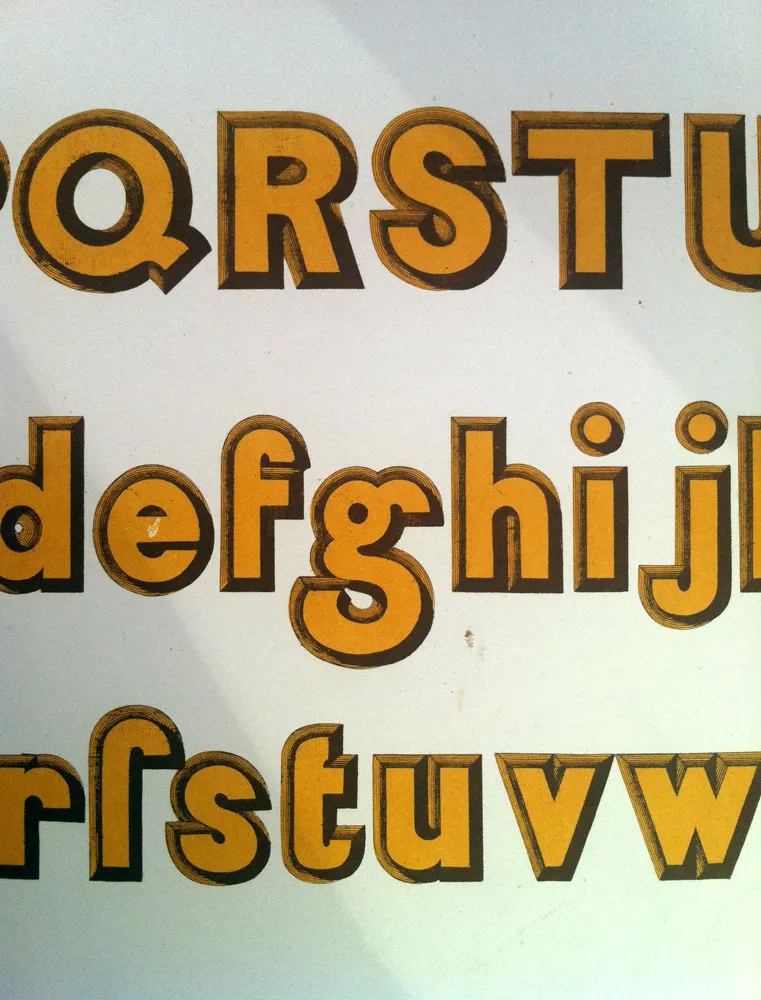
Saw this at Mystic Blue Signs in New Orleans last summer during TypeCon. It was in a big old French book about lettering and engraving. I wish I’d written down some information about it. I think it was from around 1880. Heard from someone that it is from 1859.
The alphabet on this particular page was very unexpected. It looks almost like Avant Garde in some ways. And dig that crazy “g”! Way ahead of its time.