During the nineties, I worked at Rivertown Trading Company, sister company of Minnesota Public Radio. Rivertown published mail order catalogs, including Wireless (“for fans of public radio”) and Signals (“for fans of public television”). My job was designing products like t-shirts, mugs, umbrellas and stuff, and designing boxes for audio cassettes and videotapes, which were sold in these catalogs. Sometimes I got involved in catalog design. In late 1993, I was assigned to redesign the Signals catalog.
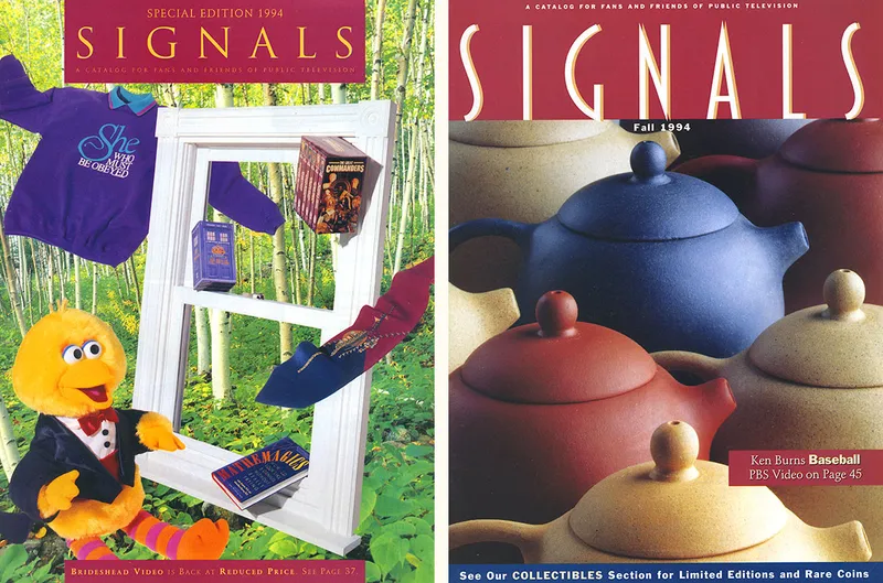
The old design is on the left. The cover on the right, art directed by Carla Scholz, shows how the redesign turned out. For the logo, I created a narrow art deco-inspired sans serif that would eventually become one of my other fonts, Blakely.
One of the unused logos I did was in a script style, a sort of mid-century European look, like a logo you might see on a vintage camera or radio. The old Rolleiflex logo and similar things were probably in the back of my mind. It was a bit like a cross between Typo Upright and Kabel. Something about it caught my imagination, and I started making sketches of it in idle moments.
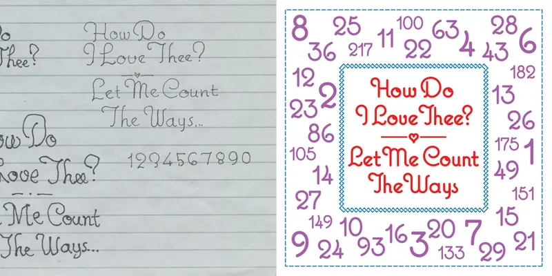
Around this time, I was asked to design a product—a pillow displaying the words “How Do I Love Thee? Let Me Count the Ways” (I know, very corny). The script idea was still on my mind and I decided to use it. I did only the characters you can see here. It wasn’t really a font yet. Sadly, the pillow was never produced.
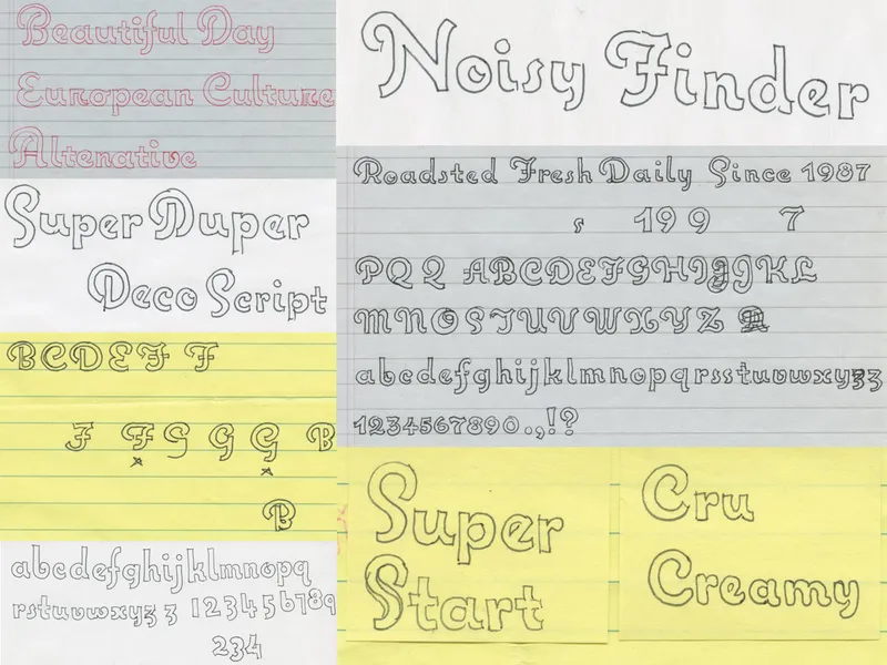
I continued to be preoccupied with the idea. Pretty quickly I had the basic design worked out. But I had other commitments: I was trying to finish my earliest font releases for Font Haus, Proxima Sans and Kandal. Plus, my daughter Ruby was born that fall. With a full-time job and all these other things going on in my life, Deco Script, as I called it at the time, got put on the shelf.
In 1995, I made an attempt to turn it into a font. I decided to call it Ruby Script, after my daughter, since they were both born around the same time. Working in Adobe illustrator, I built it from simple geometric shapes. But I made it too stiff and mechanical and failed to capture the spirit of the design. Frustrated, I set it aside.
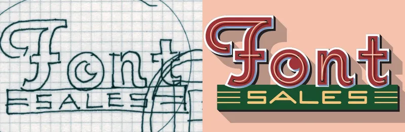
I left Rivertown in 2000 to start my own design business, Mark Simonson Studio, and put up a website. You can see further development of the idea in the lettering for the “Font Sales” icon I designed for the site (above). I wanted to start making fonts again. I hadn’t released anything since 1994. After finishing and releasing some fonts I’d been working on during the ’90s—Refrigerator, Sharktooth, Blakely, and Felt Tip Senior—I knew I had to get going again on Ruby Script.
In March 2001, I decided to start fresh and try a different approach. By this time, I knew exactly how I wanted it to look. I started sketching the boldest weight on velum in pencil. Part of my strategy was to make the drawings fairly small—about a half inch tall, close to a size they might be used. I’d found that working too big can lead to letter designs that don’t work as well when they are set smaller. I also didn’t attempt to make the drawings super precise. The idea was to get the general idea down, with the right look and proportions. They were more like notes to myself than working drawings.
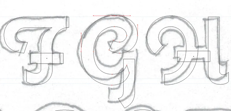
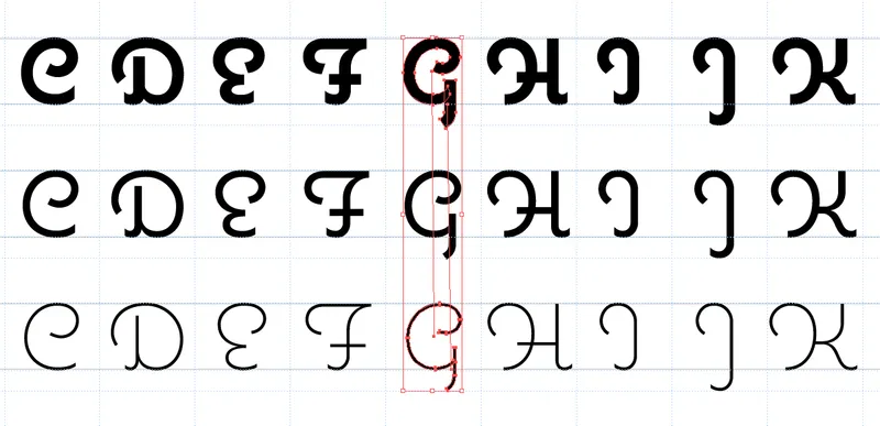
The next step was to scan the sketch and bring it into Illustrator. This was were the real drawing happened. I used the sketch as a reminder of what I was thinking, not something to be traced blindly. The sketches were fairly small, preventing the kind of distortions that can happen when working so large on a computer monitor. I was also careful not to rely too much on the circle tool, the mistake I’d made in my earlier failed attempt. And I tried not to be too rigid with measuring every little thing, trusting my eye instead. I was surprised at how well this worked, and I’ve worked this way ever since.
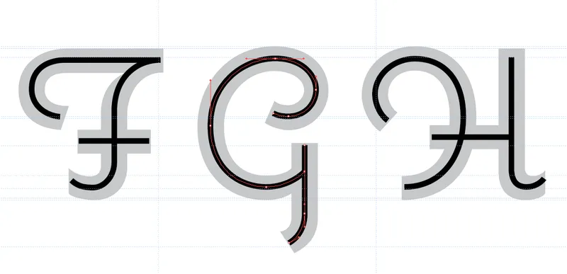
Once I finished drawing the bold weight, I moved on to the light weight. For this weight, I used a different method. There was no pencil sketch. Using the bold weight as a template, I drew a simple line through the middle of each stroke. Once I had that, I expanded the line to an outlined shape and cleaned it up, fixing all the little optical issues and stroke endings, and adjusting the height of the characters to match the bold weight.
For the regular weight, no drawings were necessary. Instead, I used the blend tool in Illustrator to create drawings that were exactly halfway between the two existing weights. In all, it took about two weeks to do the drawings. After the basic character set was finished in Illustrator, I moved everything into Fontographer to do the spacing and kerning, and generated the finished fonts in early June. (Note: I wouldn’t recommend designing fonts in Illustrator. It creates a lot of extra work. I didn’t know that back then. Now I do my drawing in a proper font editor, a much better way to work if you’re serious about making fonts.)
Just as I was about to release it, I discovered that the name I had selected, Ruby Script, was also the name of an up-and-coming scripting language from Japan. This would be problematic in the age of search engines. So I had to come up with a something different.
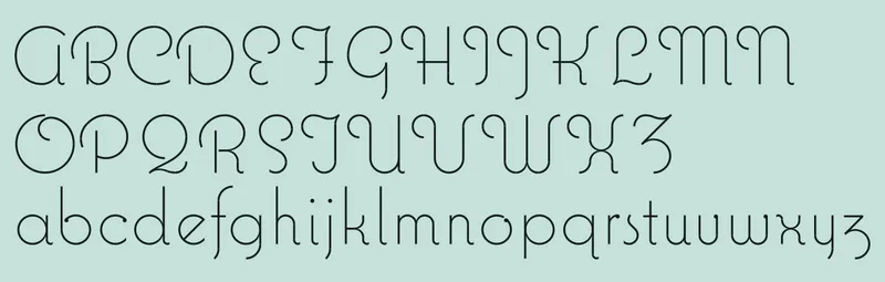
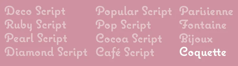
The design loosely follows the French script model, so I started looking through my old French/English dictionary from high school. Of all the names I came up with, Coquette was the clear winner. As typefaces go, it does look kind of flirtatious, doesn’t it?
For information about licensing, see the Coquette font page elsewhere on this site.