You might wonder: Where does a type designer like me spend his days? Do I have a fancy office in a skyscraper in downtown Saint Paul? Do I have a receptionist? An H.R. department? Interns? An espresso bar?
None of that. I work by myself out of a repurposed back bedroom in a modest 1920s-era bungalow in the quiet residential Saint Paul neighborhood of Saint Anthony Park. Let me show you around.
My studio is not always as neat and tidy as it looks in these photos, but I do try to keep it that way when I can. When I’m deep into a project, it gets very messy very quickly. One thing I really like about the room is the light. It’s in the corner of the house with windows facing east and south. The light in the morning is beautiful. It’s also one of the most climate-controlled rooms in the house—nice and toasty in the winter and reasonably cool in the summer.
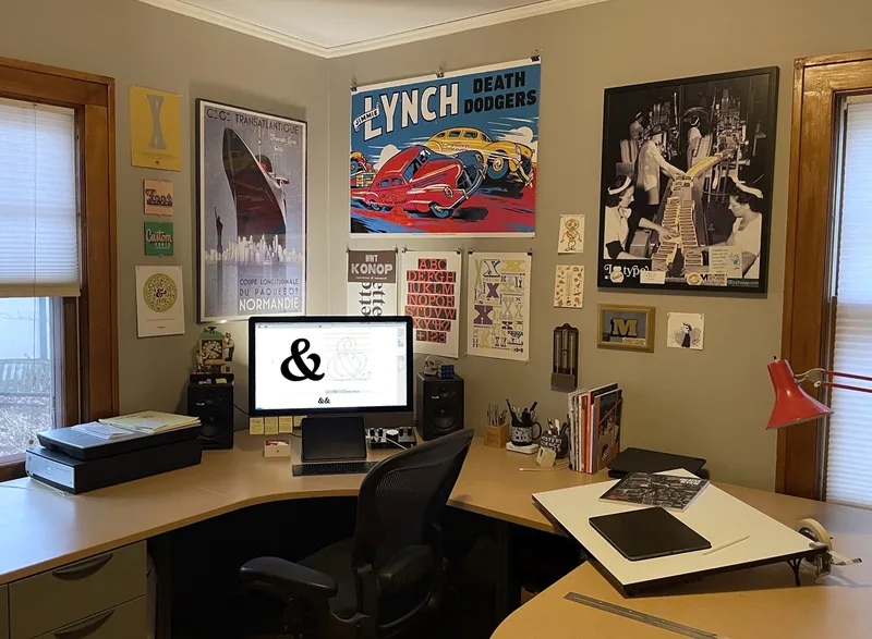
Here’s the desk where I do most of my work. Right in the middle is my computer, an iMac Pro. I prefer working in a quiet environment, and this model is not only quiet but also very fast, thanks to its completely solid state design. The 27-inch Retina display is ideal for working on fonts.
I mostly work in Glyphs, a font editor for the Mac. Adobe Creative Suite (Photoshop, Illustrator, and InDesign) come in handy a lot. For writing, I generally use TextEdit. For coding (Python, OpenType features), I use BBEdit. For the internet, I mostly use Apple Mail and Safari. Lastly, for testing things on Windows and running the occasional Windows app, I use VMWare.
You might also notice a couple of iPad Pros. The smaller one (below the computer screen) I mainly use for reading and watching videos. The larger one (on the drawing board at the right) I use more for drawing. Having both sizes seems like one too many, but the big one is no good for reading in bed and the smaller one is too small for drawing. That said, the smaller one gets used the most. (If Glyphs ever comes to the iPad, that may change.)
To the left of the computer is an Epson V700 flat-bed scanner, which I’ve had for over a decade and use for getting pencil sketches, signed legal documents, and so on into the computer.
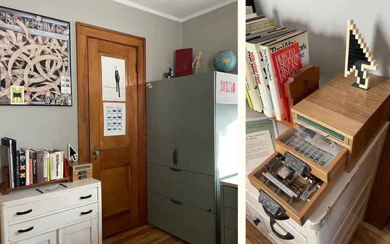
To the left of my work area is a large storage cabinet where I keep all my drawing materials, files, and a complete set of back issues of U&lc. magazine. The closet is used for more long-term storage, including things like font sightings torn out of magazines and my photo archive. The poster above the white cabinet is a reproduction of an old Fortune magazine cover, and the poster on the closet door is the one Cyrus Highsmith did in 2010 commemorating Matthew Carter, one of my type design heroes.
The small white cabinet to the left contains mostly office supplies and junk like 3D glasses and batteries. Sitting on top of it is The Tiny Type Museum & Time Capsule, an amazing artifact created in a limited edition by Glenn Fleishman in 2019-2020. On top of that is a Lego model of the classic Mac mouse cursor I made back when I was launching Mark Simonson Studio. I was going to use it on my website somehow, but it didn’t make the cut. Instead it’s become a permanent fixture in my office.
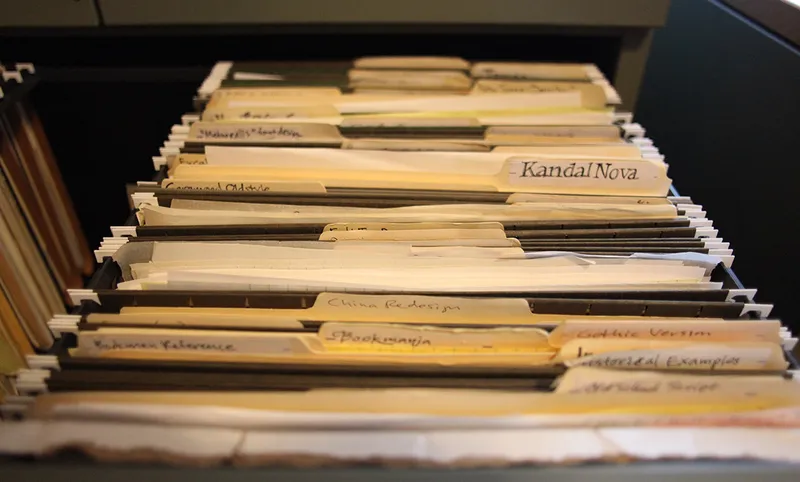
Here are some of the files in that big green cabinet: Every typeface design I’ve started, not all of them finished. These folders contain things like sketches, reference material, and test prints. I’ve also got decades worth of “font ideas” in another drawer—anything from random doodles to deliberate concepts. The most promising ones end up released as fonts.
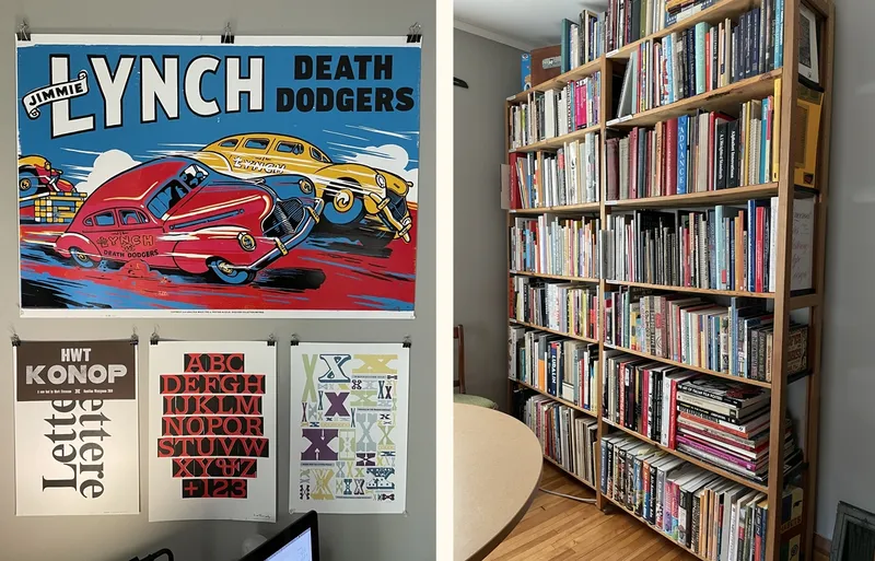
The photo on the left shows some letterpress posters I currently have over my desk. The Jimmie Lynch Death Dodgers is a recent acquisition from The Hamilton Wood Type & Printing Museum of Two Rivers, Wisconsin. It’s a “restrike” of a hand-cut advertising poster block from the Enquirer Collection. Below that, from left to right, are a small proof of my HWT Konop font from the first finished wood type pieces; a print I made from huge Times Bold wood type at the Tipo Teca Italiana in Cornudo, Italy; a print I made at Hamilton showing Matthew Carter’s Van Lanen wood type face (the first in the same Type Legacy Project as Konop); and finally Stephanie Carpenter’s beautiful wood type print celebrating the 20th anniversary of The Hamilton in 2018.
The photo on the right shows my main “library” which includes most of the books about type and typography I own, plus type specimen books, designer and artist monographs, style reference, lettering books, and even a few drawing and computer programming books. This book case is on the opposite side of the room from my computer desk.
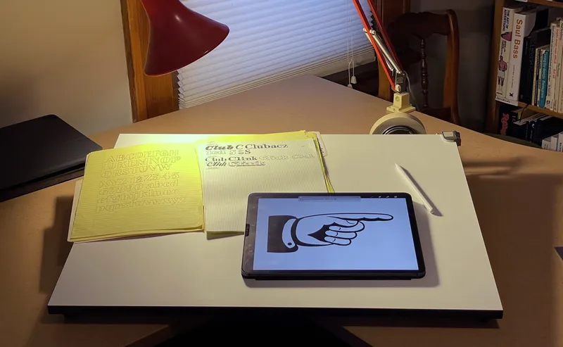
In the middle of my studio is this drawing table. Useful for doing analog work, like drawing and lettering. It’s also handy for making sketches on my iPad or looking at large-format books.
That’s about it. Thanks for visiting!
