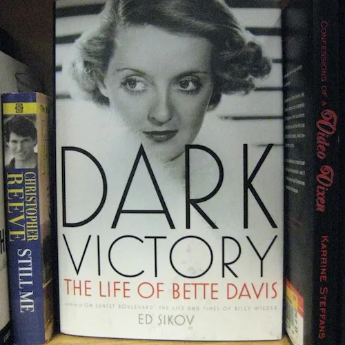
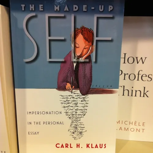
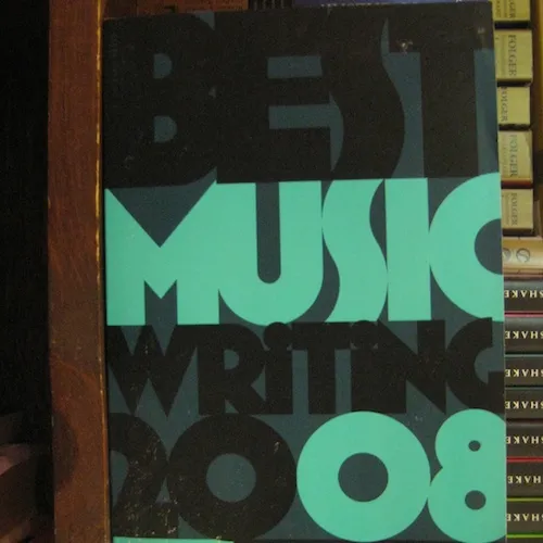
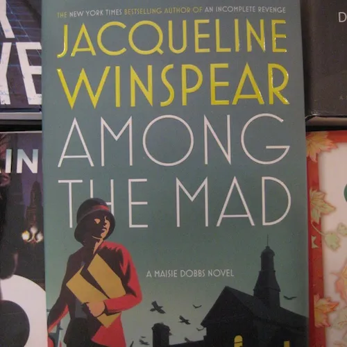
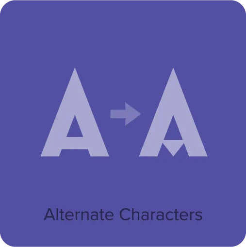
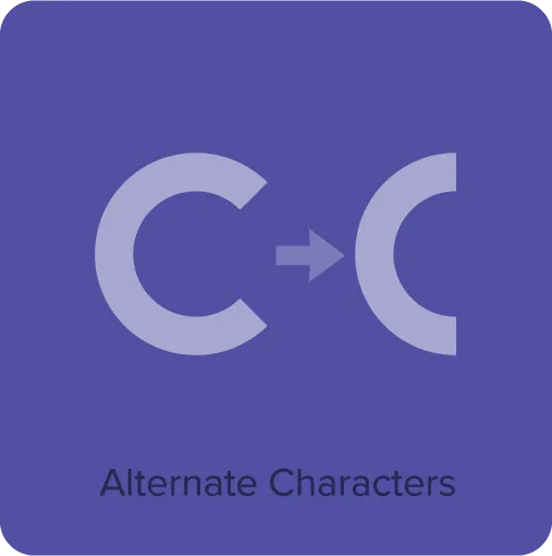
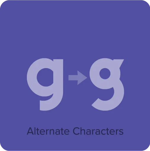
Mostra Nuova (2009) is based on a style of lettering seen on Italian Art Deco posters and advertising of the 1930s. Although it’s very geometric, I made subtle optical adjustments to keep it from looking too severely mechanical. I first released it in 2001 as Mostra, a caps-only design. Mostra Nuova has more weights, better language support, and lowercase letters. It features dozens of alternate characters providing endless stylistic possibilities within the basic design, from fairly plain to quite stylized.
Buy Mostra Nuova
1. Select styles
| Mostra Nuova Family 9 styles $154.99
Save 31% | |
|---|---|
| Black $24.99 | Bold $24.99 |
| Extra Bold $24.99 | Extra Heavy $24.99 |
| Heavy $24.99 | Light $24.99 |
| Regular $24.99 | Semi Bold $24.99 |
| Thin $24.99 | |
2. Select licenses
Interested in an extended or enterprise license? Please send an email to info@marksimonson.com.
Name
Mostra Nuova Font Styles
Mostra Nuova Features
- Nine weights: Thin, Light, Regular, Semibold, Bold, Extrabold, Heavy, Extraheavy, and Black.
- Alternate characters, representing commonly-found variations in Italian Art Deco lettering.
- 20 stylistic sets for enhanced access to the many alternate characters.
- Case sensitive forms.
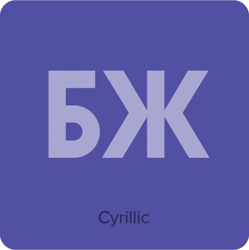
- Extended language support for most Latin-based Western and Central European languages, as well as Cyrillic.
*Requires an application or operating system with support for OpenType advanced typography, such as Adobe Creative Cloud, Affinity Designer/Photo/Publisher, or QuarkXPress. Check your application’s user guide. OpenType advanced typography is also supported by most modern web browsers through the use of Cascading Style Sheets (CSS).
Specimens & User Guides
Mostra Nuova Specimen: The story of Mostra Nuova, feature descriptions, complete showings of all the fonts, and usage examples. 20 pages. 362 KB PDF.
Mostra Nuova User Guide: Complete information on getting the most out of the OpenType features of Mostra Nuova. 4 pages. 214 KB PDF.
Additional Information
Mostra Nuova on “Fonts In Use” “Fonts In Use” is a collaborative website where interesting or notable examples of fonts in use are shared.
?86b1)
?31ba)
?c0d0)
?266f)
