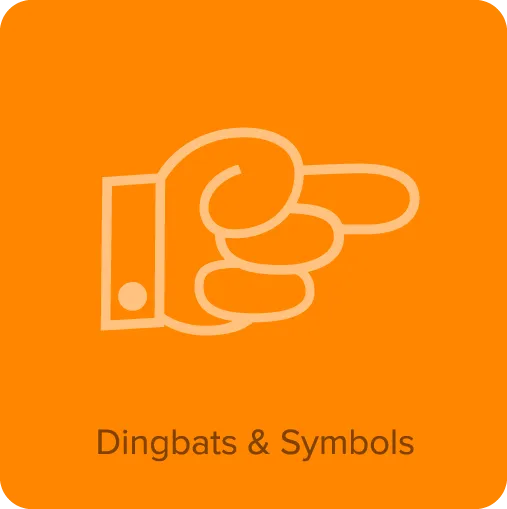
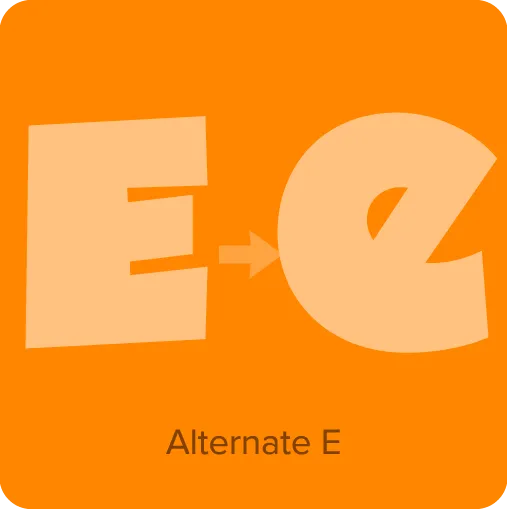
Madcap (2024) has its roots in a style of lettering that its designer, Mark Simonson, used frequently when he was in high school in the early seventies. He was inspired by comic book and greeting card lettering from the sixties. Madcap’s lively appearance comes from its skewed geometry, which avoids anything aligning to a square axis or grid, yet does so with a rhythmic and consistent logic. It’s an all-caps design, and features an alternate lowercase-style “E” and a full set of dingbats.
Buy Madcap
1. Select styles
| Madcap Family Styles included • Black $24.99 |
|---|
2. Select licenses
Interested in an extended or enterprise license? Please send an email to info@marksimonson.com.
Name
Description
$0.00
Madcap Font Styles
A wisecracking jackalope on a freight vexed by Moz’s bequest.
Madcap Features
- Dingbats & symbols.
- Alternate E (lowercase form).
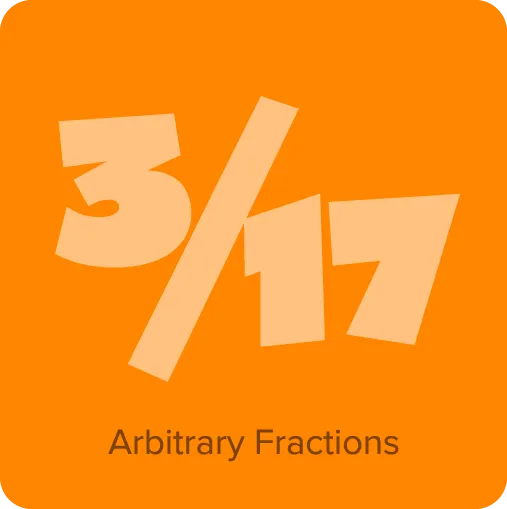
- Arbitrary fractions.
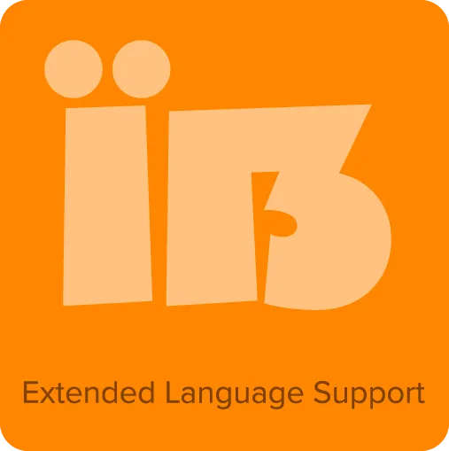
- Extended language support for most Latin-based Western and Central European languages.
?bc36)
?2b9b)
?ebba)
?4ec1)