Type selection is key
Typography sets the tone before you say a word. It shapes how your message comes across — how it feels, how it’s read, and how it’s remembered.
We notice type most when it’s wrong. When something feels off. The spacing’s tight, the voice is too loud, or it just doesn’t match what’s being said. But when the type is right, it gets out of the way — and helps the words do their job. It can give structure to ideas. It makes space for meaning. Typography isn’t just about style. It’s about the way we take in information. It adds rhythm to the reading experience. It tells us where to look first and what matters most. It makes content easier to follow, and in some cases, easier to trust. The tone comes through in the details — the shape of the letters, how they’re spaced, the way one form leads to the next. Some typefaces feel quiet and careful. Others have energy. Some pull you in. Some stay out of the way. Choosing the right one is less about picking a look and more about finding a voice that fits what you want to say.That’s why trying type in context matters. It’s one thing to see a beautiful letter or a well-set specimen — but it’s another thing to see how it handles your content. How it behaves when it’s small. How it reads when it’s big. How it feels with your own words.That’s what this space is for. Try a headline. Paste a paragraph. Adjust the size, change the weight, type something unexpected. Some typefaces are built to be expressive. Others are made to stay flexible. The best ones hold up in all kinds of situations. They do the job without losing their character. Take a minute to experiment. You’ll know when it feels right.
About Dreamboat Bold
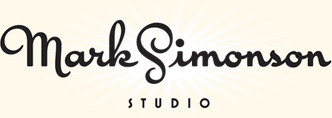
Dreamboat Bold is the original cut that started it all—the weight the family grew from. Its strokes are full and assured, with enough contrast to feel lively without losing solidity. The rhythm leans into that classic ballpark and soda‑script energy, echoing hand‑painted signs and mid‑century trademarks. Compared to the lighter styles, Bold carries more visual punch and anchors a layout with ease, while still pairing smoothly with Black for emphasis or Light for contrast. Details like small caps, expressive tails, and the alternate high‑crossbar t give it room to flex across identity systems and custom wordmarks.
Language Support
Language Support
- Catalan
- Croatian
- Czech
- Danish
- Dutch
- English
- Filipino
- Finnish
- French
- Fula
- German
- Hungarian
- Indonesian
- Italian
- Latvian
- Malay
- Maltese
- Norwegian
- Polish
- Portuguese
- Romanian
- Slovak
- Slovenian
- Spanish
- Swedish
- Turkish
Features
OpenType Features
- Common Ligatures
- Fractions
- Ordinal Numerals
- Small Capitals
- Small Capitals for Capitals
- Stylistic Alternates
- Stylistic Sets
- Subscript
- Superscript
Dreamboat Character Set
latin capital letter a U+0041
A
