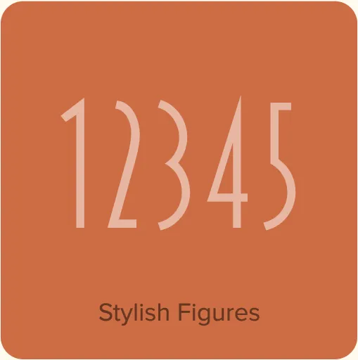
Blakely (2000, 2003) was originally developed as a custom font based on a logo I designed in the early ’90s for the Signals mail order gift catalog. It’s a condensed, sans serif Art Deco design, similar in some ways to Kabel Condensed and Newport, both from around 1930. It’s a caps-only design, and the spacing is optimized for all-caps settings, nearly letter-spaced in the Light weight. I added the Bold and Black weights in 2003, which were in the back of my mind from the beginning.
Buy Blakely
1. Select styles
| Blakely Family Styles included • Light • Bold • Black $64.99 |
|---|
2. Select licenses
Interested in an extended or enterprise license? Please send an email to info@marksimonson.com.
Name
Description
$0.00
Blakely Font Styles
A wisecracking jackalope on a freight vexed by Moz’s bequest.
A wisecracking jackalope on a freight vexed by Moz’s bequest.
A wisecracking jackalope on a freight vexed by Moz’s bequest.


Blakely Features
- Three weights: Light, Bold, and Black.
- All caps design.
- Extended language support for most Latin-based Western and Central European languages.
Specimens
Blakely Specimen. Complete showing of all the fonts with usage examples. 7 pages. 90 KB PDF.

?8ff9)
?618d)
?607a)
?78aa)