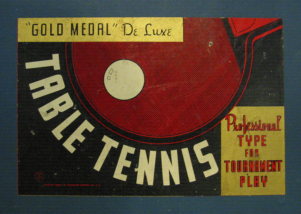
Packaging label seen in an antique store in Hixton, Wisconsin on July 29, 2004.
Packaging label seen in an antique store in Hixton, Wisconsin on July 29, 2004.
Cheshire Dave’s Mastication Is Normal is home of the famous Behind the Typeface: Cooper Black, a clever spoof of VH1’s Behind the Music series. Cheshire’s latest production, Etched In Stone, is a murder mystery revolving around the typeface Trajan. It was premiered at TypeCon 2004 in San Francisco and, hopefully, will be viewable online soon. Update: Chesh called it quits on his site, but Etched In Stone can be seen on Vimeo.
Jon Coltz is a statistics guy who discovered type at some point and has been writing about it on daidala. [Update: The site no longer exists.] Jon has absorbed a massive amount of knowledge about the subject for someone who is not in the design profession (he won the type trivia contest at TypeCon this year). He is also a very entertaining and engaging writer. Be sure to check out the interviews.
David Earl’s UK-based Typographer.org has gone through several incarnations over the years. When I first discovered it, it was an online magazine with articles about type and featured several writers. Then it changed into a type news blog for a while. A couple of years ago, it changed again and David has scaled back to posting an in-depth article every now and then.

Bizarre ceramic flower pot seen in an antique store in Wisconsin Dells, July 31, 2004.

A rather badly maintained vintage sign seen in Bemidji, Minnesota, June 25, 2002.
1. Felt Tip Roman
2. Mostra
3. Coquette
4. Changeling
5. Proxima Sans
6. Refrigerator
7. Goldenbook
8. Kandal
9. Metallophile Sp 8
10. Blakely
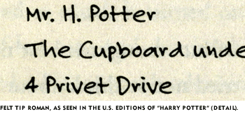
As noted on the sample page, Felt Tip Roman has been used in the U.S. editions of the Harry Potter books to represent the handwriting of the character Hagrid. I’ve always thought this was kind of cool, and it makes a nice example when trying to talk about type design with people who have never thought about where fonts come from.
Over the weekend, I was shocked to learn that there is a free font, distributed by many of the Harry Potter fan sites, purporting to be “Hagrid’s handwriting.” After checking it out, I was relieved to discover that it is not a pirated copy of my Felt Tip Roman, but a rather poor imitation.
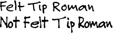
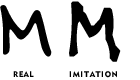
As you can see, it looks more or less similar, but is clearly not Felt Tip Roman. Looking at it more closely, it appears that the person who did it must have copied the letters with a pen by eye (making up the ones she didn’t have samples of), scanned them in and had the computer autotrace them. (Felt Tip Roman was hand digitized, not autotraced.)
I guess I don’t mind fans using this imitation font. At least they are not passing around bootleg copies of the real thing. But if you do want the real thing, remember: It’s not a free font, and never has been.
Page 50 of 61