I meant to take more photos than this at the conference, but here are a few. Sorry, no drunken typophiles or attention to white balance.
-
TypeCon 2004 Report #4
-
TypeCon 2004 Report #3
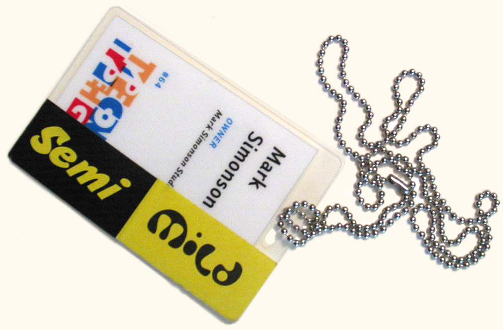
The tag shown above is what I wore around my neck the last four days at TypeCon2004. The black and yellow stickers were provided by FontShop—sort of Magnetic Poetry™ meets FontShop logo. Of course everyone had to try to out-do each other sticking funny or bizarre combinations on themselves, turning the whole conference into an ad for FontShop. Very clever.
Rather than try to continue the blow-by-blow commentary I started the other day, I’ll just share a few random thoughts:
In Roger Black’s talk on custom typefaces for magazines and newspapers Friday morning, I wished that he was speaking to a room full of publication art directors instead of type industry insiders.
Armin Vit proved that people say the darnedest things about type.
Richard Lipton’s Bickham Script and House Industry’s Ed Interlock made me even more excited than I already was about the possibilities of OpenType.
I’ve never flown on Sun Country Airlines before, and I’m not sure I want to do it again. They’re cheap and efficient, but it’s the first time I’ve thought seriously about upgrading to first class. Both ways. Enough said.
As I left one of the sessions, I had to laugh at myself as I wondered if there was a Starbuck’s nearby. Just like the comic cliché, I found one almost immediately by picking a direction at random.
It never occurred to me that the Black Panther Party used Letraset and cheap Compugraphic typesetting machines. Duh. That’s what everyone without a budget (including me) used to use.
Ken Barber and Ed Benguiat make a great comedy team, but Ed could easily take his act solo. Seriously, the tribute to Ed was the highlight of the event for me. I can’t describe how great it felt to be part of the crowd giving Ed not one but two standing ovations before it was over.
Christian Schwartz is not only a very talented young type designer, he can also do a pitch-perfect impression of Erik Spiekermann.
The Underware guys are freakishly talented at drawing letters and know how to put on a good show. Their presentation about TypeRadio started with a brilliant animated movie they made at the conference—apparently in their room on hotel stationery—that very neatly set the tone for the rest of their presentation. I’d love to get hold of a copy of it.
Akira Kobayashi made a surprise announcement that there is a Palatino Sans in our future (along with a completely new and improved Palatino). Even more surpising is that it looks pretty nice.
The Font Bureau’s Dyana Weissman knocked everyone off the dance floor at the party on Saturday night. In some cases, literally, so I heard. I missed a lot of this because I and five or six others learned how to get up to the roof away from the noise of the party. It was very pleasant up there. I had a nice conversation with Frank Jonen about, among other things, what it’s like to work with Herman Zapf. We must have been up there for quite a while because a lot of people were gone by the time we came back down.
The party also featured a type trivia quiz. I tied for third with Stephen Coles and somebody else with 36 out of 50 possible points. Stephen won the tie breaker with the correct answer of Nick Shinn as the designer of Fontesque. (I knew it too, but Stephen buzzed in first.) Not surprisingly, Jon Coltz won (over 40 correct, I think.)
In what is becoming a TypeCon tradition, John Downer removed and sold the shirt off his back.
The conference sessions ended on a poignant note with Dan X. Solo’s moving eulogy to metal type—pegging the American Type Founders auction in 1993 as the day Gutenburg really truly died.
After that, a lot of people said their goodbyes. Many left or got on one of the buses up to Sumner Stone’s farm for a picnic. A few of us stayed behind at the hotel for various reasons (I had to catch a plane home before the bus would be back). I ended up spending a pleasant afternoon and dinner with Ray Cruz and Gary Munch. (I’ll be curious to hear how the picnic went.)
I barely slept on the flight home to St. Paul and got in early morning. I saw my family off for the day, posted a new “sponsor” letter on Notebook, and crashed on the couch.
Can’t wait until next year.
-
TypeCon 2004 Report #2
I’m having too much fun actually doing the conference, so writing about it will have to wait. Sorry.
-
TypeCon 2004 Report #1
I arrived in San Francisco late yesterday, just in time to register and catch the first presentations.
First off was Linotype’s presentation of the winners of its annual type design competition. Its pace was a bit too leisurely—good for the recipients, giving them plenty of time to talk about their work, but a little hard on the audience. The highlight was Tony and Caio de Marco’s acceptance for the third place award in the display font category, which shook the audience out of its stupor, thanks to Tony’s energetic presence.
Next up, Erik Spiekermann presented “Sex, Type & Rock & Roll,” an overview of the fonts he’s designed over the last 25 years, putting them into historical context, along with lots of witty and insightful observations about type in general. His presentation featured several bits of music, including the title song recorded by his son and a ditty accompanying a visual count-off of the 229 years that will pass before we get another year like 1999 (which has three descenders when set in old style figures).
Last up was the Typophile Film Festival, presented by Joe Pemberton and Jared Benson. By this time, it was nearly midnight, and a lot of people (especially those from the East coast) had faded out of the auditorium to head off to bed. Those who stayed enjoyed a series of short films related in one way or another to type. Some were animated type, others were films about type, and some, like the new Flash film by Cheshire Dave (of Behind the Typeface fame) are a little harder to categorize. My favorite was Helvetica Hurts (not sure about the title), a hypnotic silent symphony of dancing Helvetica characters. Not to diminish the creativity it undoubtedly took to create it, but it would make a great iTunes visualizer module.
Out in the lobby, people were chatting via video link with FontLab’s Adam Twardoch in Berlin,
who was unable to attend because the US government would not give him (or Yuri Yarmola, FontLab’s lead developer) a visa. I don’t know what is wrong with people sometimes. I was looking forward to meeting Adam and seeing Yuri again.Turns out this was not the case exactly, but I still would have liked to have seen them. -
Prelude to TypeCon 2004
Tomorrow I’ll be flying out to San Francisco for TypeCon2004, an annual gathering of people involved in or interested in the making of fonts. Although I’m not going to any of the workshops this year, I expect to be enjoying numerous panel discussions and talks, and generally getting to talk to wall-to-wall type people. I had a blast last year and expect the same this year. I have not spent much time in San Francisco (less than a day!), so I’m looking forward to that too.
I’ll have a camera and internet access, so I hope to post a few stories and photos while I’m at the conference.
Stay tuned…
-
How To Spot Arial
Many of the characters in Helvetica and Arial are very similar to each other, although none are quite identical. Other characters are quite a bit different, and they are the key to telling which is which. Here are some of the most obvious ones (Grotesque 215, Arial’s ancestor, has also been included for comparison):
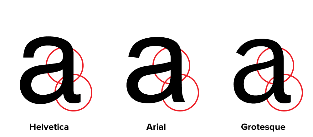
The “a” in Helvetica has a tail; Arial does not. Also, the bowl of the “a” flows into the stem like a backwards “s”; the bowl of Arial’s “a” simply intersects the stem with a slight curve. (Interestingly, the Grotesque “a” has a tail, just like Helvetica. The bolder weights of Helvetica have no tails, an inconsistency that bothers some people. Maybe it bothered Monotype, too.) Arial’s “a” has always seemed a little badly drawn to me, but maybe it’s just me.

The top of the Arial “t” is cut off at an angle; the Helvetica “t” is cut off straight. You can see clearly here how the x-height of Arial matches Helvetica’s. This is one of the main things that make Arial look like Helvetica at first glance, even though the details are different.
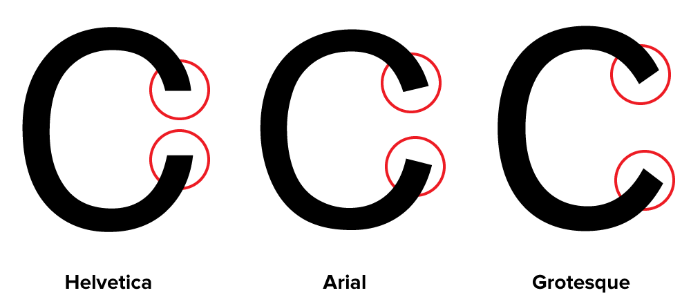
The ends of the strokes of letters like “S” and “C” are perfectly horizontal in Helvetica; in Arial and Grotesque they are cut off at a slight angle.
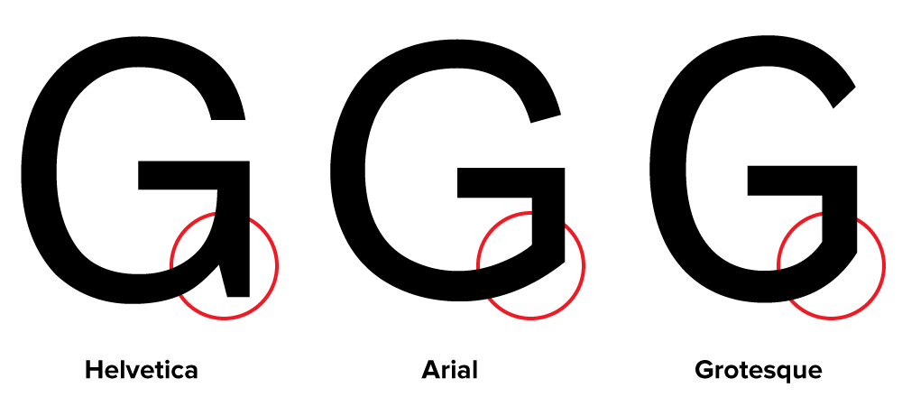
The “G” in Helvetica has a spur at the bottom of the stem on the right side and the curve at the bottom of the “G” flows into the stem; in Arial and Grotesque the “G” has no spur and the curve at the bottom meets the stem at an angle.

The tail of the “R” in Helvetica flows out from the bowl and curves straight down, ending in a slight curve to the right. In Arial, the tail flows down and to the right from near the center of the horizontal bar and straightens out at an angle to the end. It appears to be a compromise between the Helvetica “R” and the Grotesque “R.” This feature is very unusual for a “grotesque” design, and is more typical of “humanist” sans serifs. It feels out of place here and is one of the more awkward design features of Arial.
Here is the same word set in all three typefaces:


In both fonts, the characteristics described here apply to all weights (except, of course, the tail on the Helvetica “a,” which is dropped on the bolder weights).
Page 3 of 4