Proxima Nova Hebrew
- Design Connary Fagan, Liron Lavi Turkenich
- Project management and production support
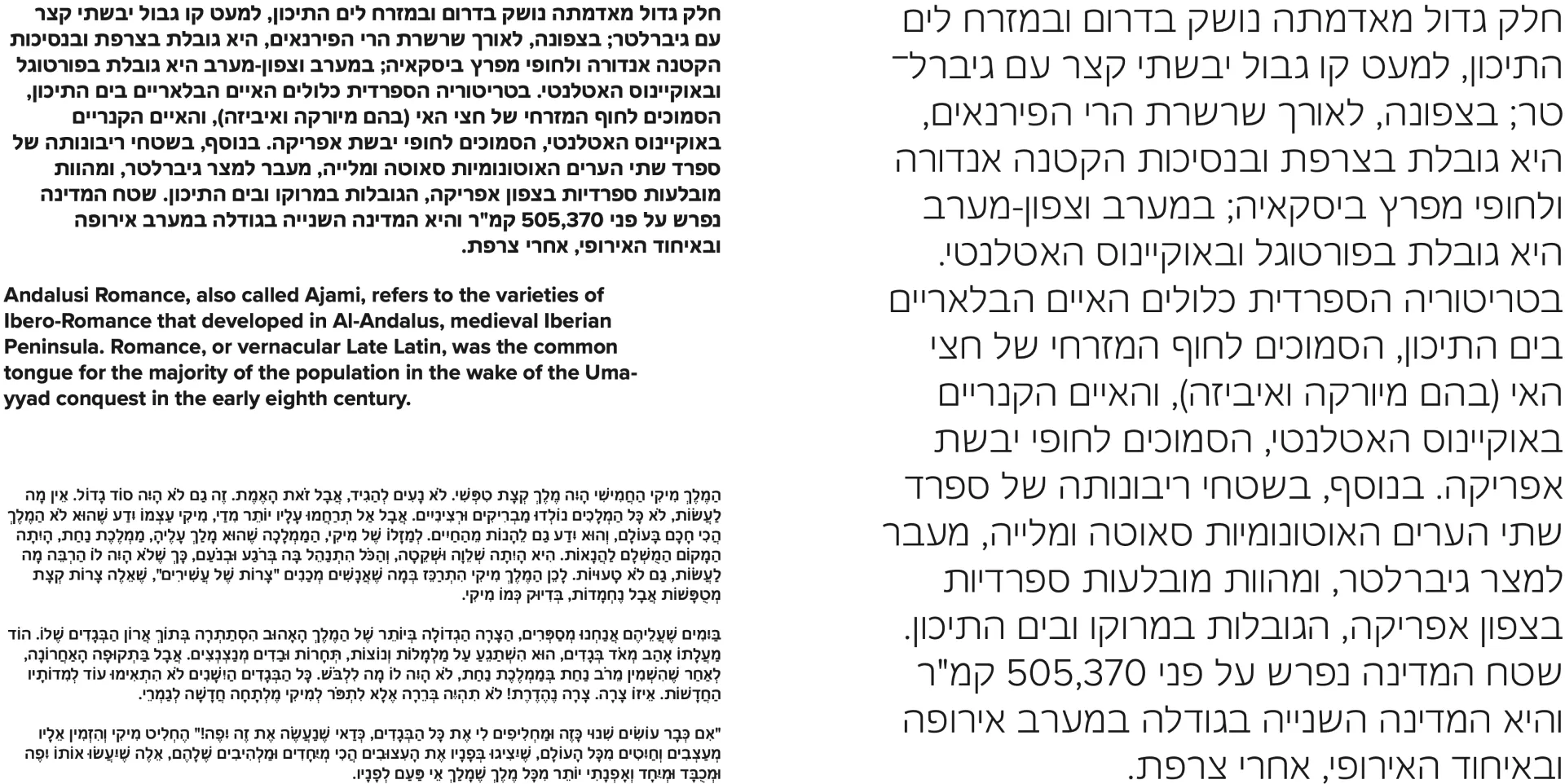
The Hebrew expansion for Proxima Nova was designed by Connary Fagen, with Liron Lavi Turkenich consulting on the project to bring the additional expertise of a native Hebrew reader.
In many ways, Fagen explains, Hebrew is “one of the more straightforward scripts to design for.” For instance, there are no interconnecting glyphs to consider; the overall shape of the letterforms is relatively uniform and doesn’t vary drastically in width resulting in similar side bearings; and the actual number of characters is relatively small, in part due to the script having only one case. And, because of the uniformity of the shapes, where sometimes only a subtle change differentiates one character from another, Fagen says that “even just a small number of glyphs can quickly inform the rest of the Hebrew design. This is true of other scripts I’ve worked on, like Arabic and Cyrillic, but there is a pronounced uniformity to the Hebrew script’s visual forms.”
Fagen explains that he studied various Hebrew examples to inform his design. “I looked at handwriting and old printed books, and also newer things like signage and magazine covers,” taking cues where necessary. To further his understanding of the script, he also looked at handwritten or informal versions of Hebrew letters to see how they are used in everyday life, seeking inspiration for what might make sense stylistically for Proxima Nova.
Turkenich explains that when designers who aren’t familiar with the script come to work on a Hebrew expansion, “there’s often a tendency to try and make the Hebrew more round, because the Latin is rounder than the Hebrew in its nature,” but the squareness of the Hebrew script has been maintained by Fagen, despite the Latin version of Proxima Nova featuring so many rounded shapes.
In terms of overall letterform construction, perhaps the most immediate difference between Latin and Hebrew is where Latin’s heavy strokes are typically vertical, Hebrew’s are horizontal — a construction that evolved from the brush being held at a different angle to that commonly found in Latin-based languages.
But with the angle of contrast adjusted, the biggest challenge for Proxima Nova Hebrew was adjusting the overall stroke weight. Hebrew is a lot more open than the Latin script and therefore contains much more whitespace. This means that the text’s overall typographic color on the page usually appears much lighter in Hebrew. To counter this, the stroke thickness usually needs to be slightly thicker in Hebrew versions.
“What was less expected,” Fagen recalls, “was how unnatural it felt for me to have to keep pushing the the thickest designs even thicker,” but this was some specific feedback that came from Turkenich. “It’s something I say to designers all the time,” she says, and she’s also keen to stress that “following the technically correct way of constructing an alphabet in a different script doesn’t always lead to results that feel right.” This is where her expertise as a native reader and type designer was so beneficial in providing feedback to Fagen. There are many cultural implications that can be hard to grasp without being fully immersed in the script.
“That was something that The Type Founders’ team helped me try and work back into the Hebrew version a little bit,” Fagen says, “to make it look and feel more like Proxima Nova, even if it didn’t come to me naturally at first.” And, with Hebrew being a unicase script — the overall character height sits somewhere in between the x-height and cap-height of Latin in this typeface — this height also affects typographic color and its harmonious pairing with other writing systems.
As with all script expansions, the designer’s primary challenge was respecting the conventions of the script while also retaining the unique personality of what makes the typeface that typeface. During the course of the project, Fagen explains that “making Hebrew look like Proxima Nova took precedence over making Proxima Nova look like Hebrew,” but notes that when it came down to an equally weighted decision, he and the TTF team ended up erring on the side of Proxima Nova.
Turkenich explains that the Latin version of Proxima Nova has a lot of closed shapes, like the lowercase e, especially in the heavier weights. “There was an attempt to do that for an early version of the Hebrew as well, which wasn’t quite legible enough,” she says. “The eye completed the form to appear as a different letter,” and this needed reworking to avoid any potential confusion. Legibility is always an important consideration, of course, but in Hebrew, in particular, there are many similar shapes in different letters, and sometimes just a small stroke is what differentiates the two.
Similarly, after reviewing an early version of the design, Turkenich suggested that Fagen adjust the positions of the diacritics. Hebrew, like Arabic, doesn’t have written vowels — they’re implied by the diacritics. “So if the position is even just a little bit off,” she explains, “it’ll just be a different sound.”
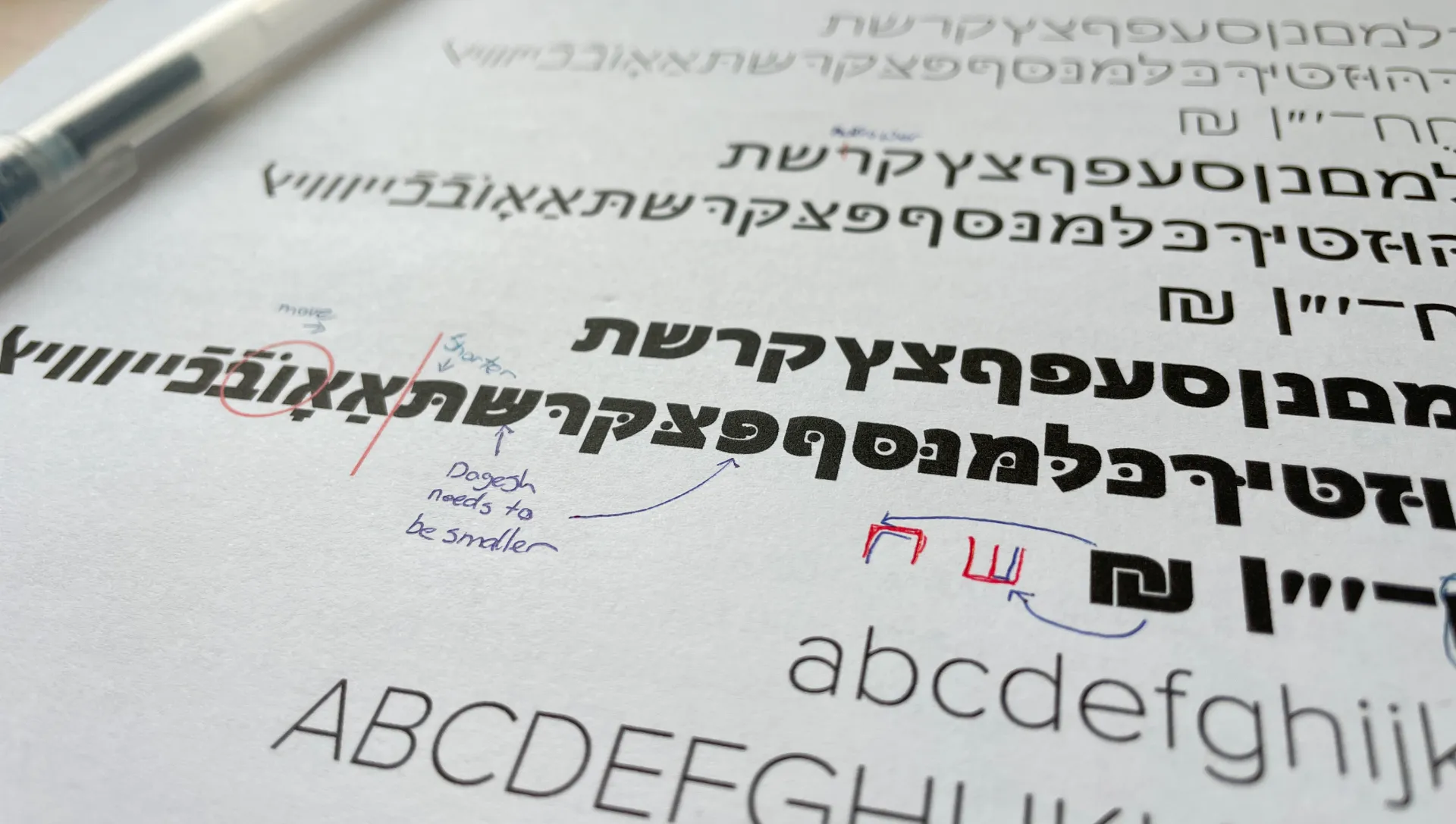
Feedback from Turkenich on an early proof of Proxima Nova Hebrew.
Fagen is keen to stress that the main point of Proxima Nova’s new scripts “isn’t to have a large number of individual expansions — they all need to look great together,“ he explains. “And so the Hebrew needs to look like the Latin needs to look like the Arabic, etc. Every single one of these expansions is being done by someone who is paying attention and who cares.”