Mark’s Notebook
New Site Design
Welcome to the first major redesign of my website since 2013.
The site was long overdue for a refresh, so earlier this year the team of Scott Kellum (design director), Kelsey Scherer (designer), and Roel Nieskens (developer) set about to redesign and rebuild it from the ground up.
Paraphrasing Scott, “The aesthetics felt dated. I also really wanted the new site to highlight the typographic range of Mark’s work instead of leaning on Proxima Nova.”
I met with them in April to discuss directions and suggested bringing back some of the pre-2013 aesthetic, back to something closer to the spirit of my original site design.
In spite of the fact that I was only involved in a few brief early meetings, they managed to pull it off. It feels like something I might have designed myself, and picks up a lot of my early branding—including the black/pale yellow/white color scheme and the spinning starburst on the logo. And yet it feels thoroughly modern. I’m incredibly pleased with the results.
How Did We Get Here?
In 2000, when I launched the website for Mark Simonson Studio, I designed everything myself.
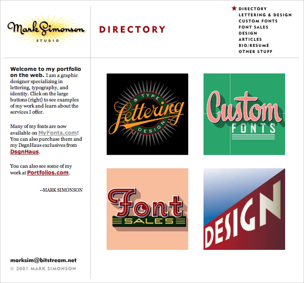
The inaugural design of my site, which I used from 2000 to 2004. Fonts were not yet a full time business for me. Archive.
In the early days, I used a website design app called Freeway. It worked like QuarkXPress or InDesign, but for websites. You could create an entire site with no coding. It was easy to use, but didn’t much give control over the code that it generated, and sometimes you needed that.
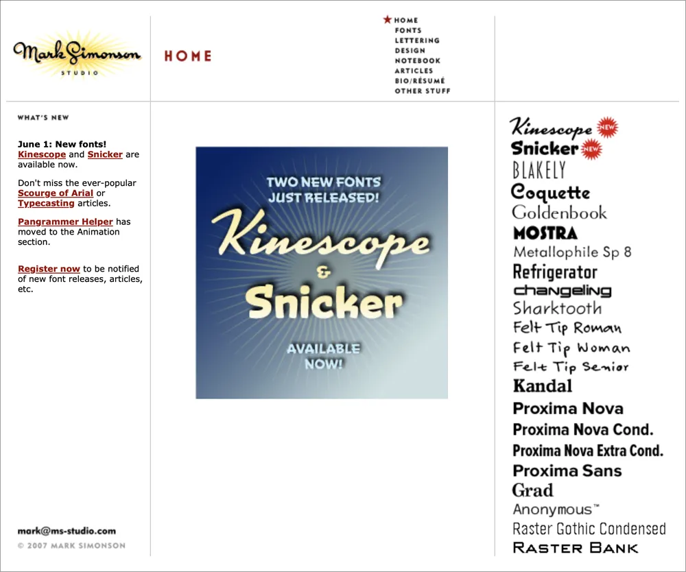
The site design I used from 2004 to 2007. The biggest change was the addition of the font index on the right. Also, I had started Notebook—my blog. Archive.
Nevertheless, I was using CSS and Javascript on the site by 2003 and integrated a cool free content management system (CMS) called TextPattern that I used for Notebook, while continuing to use Freeway for the rest of the site.
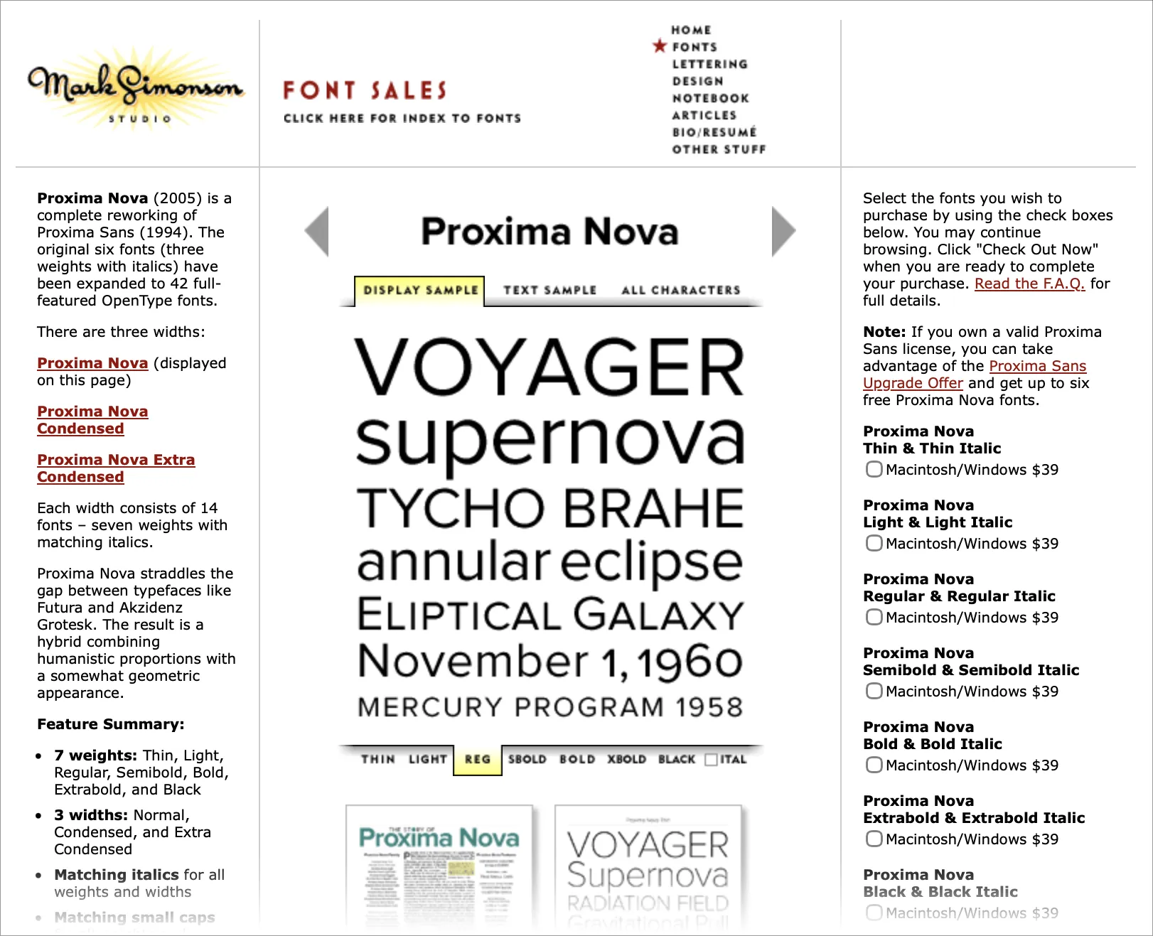
A font page from 2007. The tabbed section in the middle was interactive, letting you easily see different samples and styles, albeit as low-res GIFs. Archive.
In 2007, I redesigned and rebuilt the entire site in BBEdit—hand editing HTML, CSS, and Javascript—after fully embracing the Web Standards movement, popularized by Jeffrey Zeldman’s book Designing With Web Standards, and leaving the ignorant bliss of Freeway behind.
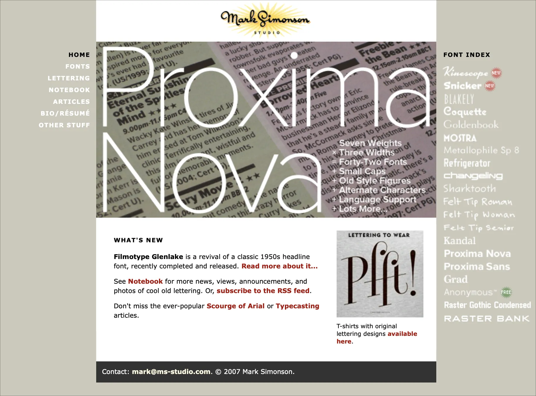
The redesign, which I used from 2007 to 2013. Archive.
But by 2012, I was having trouble finding the time to keep up with the latest web development techniques—things like responsive design and (embarrassingly) web fonts.
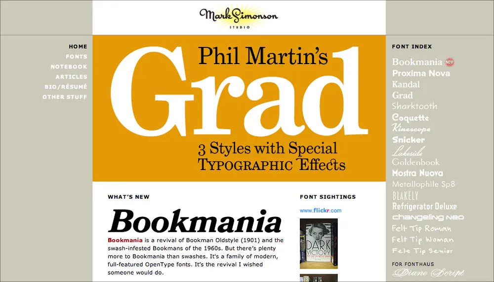
My site in early 2013—the last version I designed and coded myself. Archive.
I realized that coding and maintaining the site was becoming a burden, and taking too much time away from my main activity—making fonts. So I hired the web design firm of Paravel (Reagan Ray, Dave Rupert, and Trent Walton) to completely redesign and rebuild the site to modern standards.
It launched in March 2013.
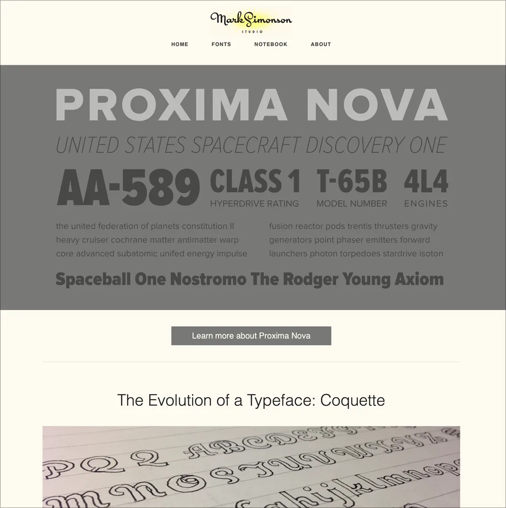
The 2013 redesign by Paravel. Archive.
It looked and worked great, although I felt that some of the spirit and personality of my earlier design was lost. Plus, while Paravel were top-tier web designers, the font banners they created lacked typographic pizzazz.
In 2015, I replaced the original banners with new and improved ones designed by Aesthetic Apparatus in Minneapolis. They added the element of whimsey and playfulness I wanted, while doing a better job of showing off the fonts. A few of them even made it into a Communication Arts design annual.
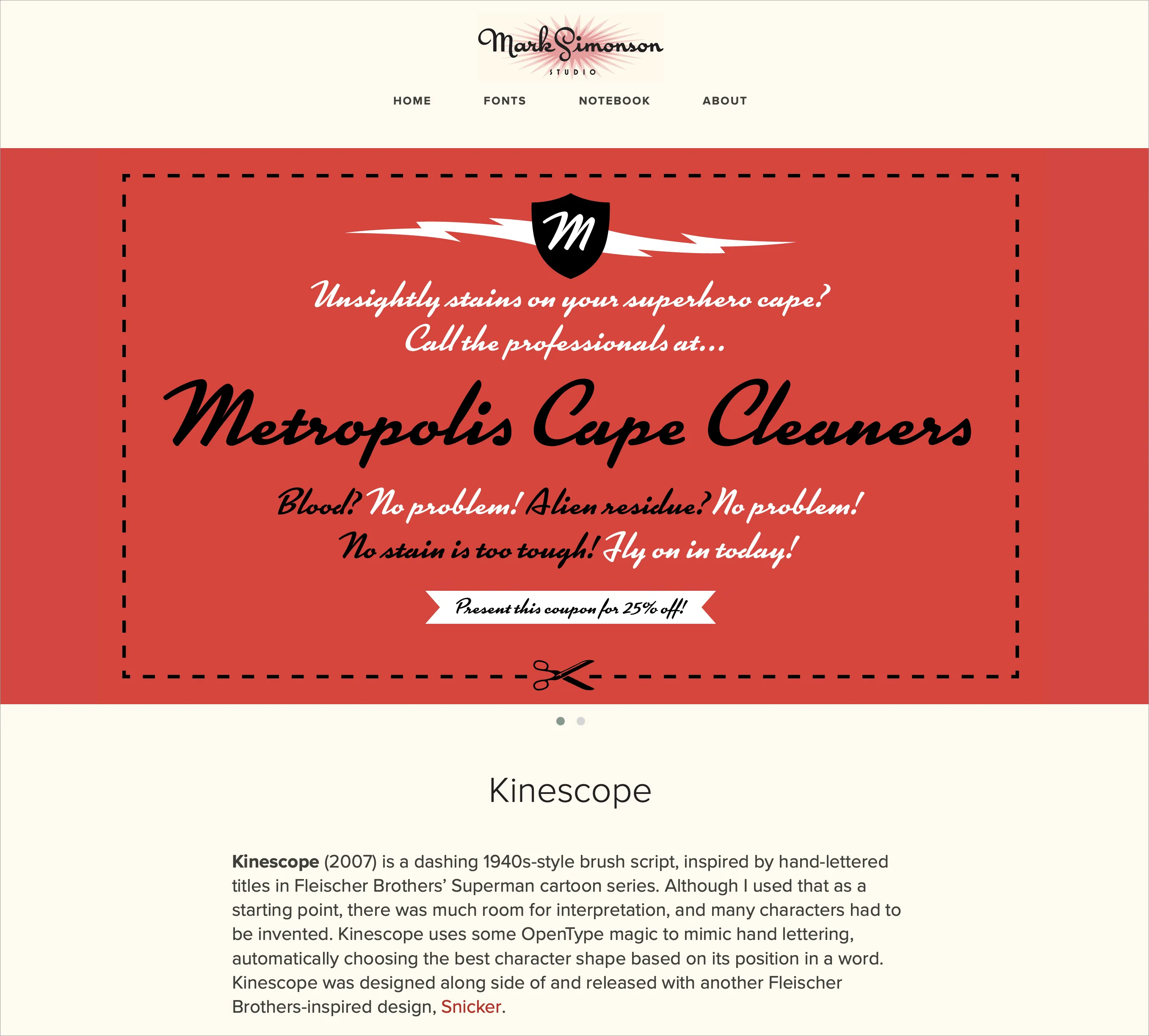
One of the new font banners in 2015. Archive.
The site got small updates and improvements here and there, and cool things like the Etna minisite, designed by Nick Sherman in 2020. He also designed some of the banners and an e-newsletter that, unfortunately, only got sent out a few times.
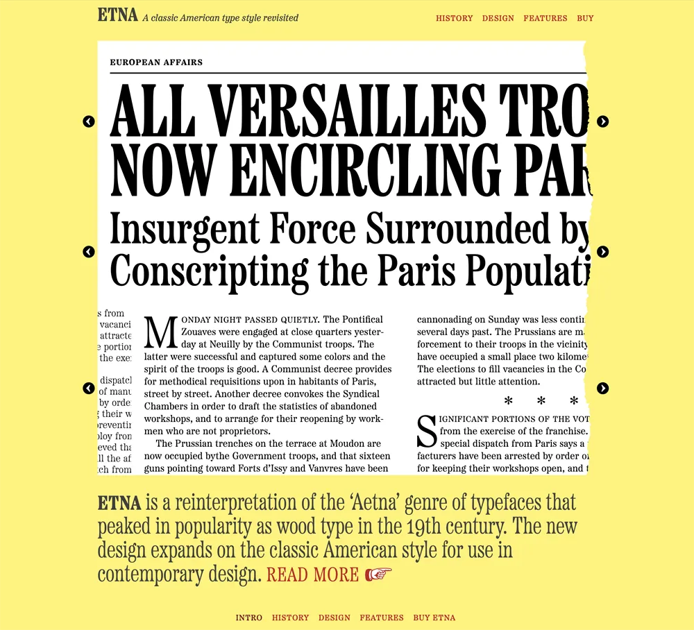
The Etna minisite is the reason Etna and all my fonts since have dingbats.
After I sold my font business to The Type Founders in 2021, they started rebuilding things under the hood, adding the ability for customers to purchase fonts directly (something I had dropped around 2007), providing live, editable previews of all the fonts, and making the site load faster and be easier to find on search engines.
And now I’ve caught up to the present, with the launch of this new look for Mark Simonson Studio on the internet.
I couldn’t be happier with the new design. It feels like home to me already.
 Permalink
Introducing Neotype
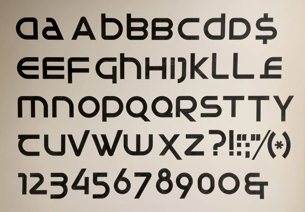
My first attempt at designing a typeface, from March 1976.
My interest in type design traces back to a type design project I did in college as an art student 50 years ago. I wrote about it here last March and shared it on social media. A commenter on Instagram asked if I was planning to release it, something I hadn’t seriously considered before.
One thing led to another, and I decided to do just that. The result is Neotype, a display font family based on that project.

My 2026 revision, fifty years later.
The design is a hybrid of uncial script—the basis for our modern lowercase alphabet—and modern, geometric sans serif, especially seventies designs such as ITC Avant Garde Gothic, Motter Textura, or Handel Gothic. The line between the upper and lowercase is gone, with both cases sharing the same height. The upper and lowercase forms may be mixed and matched for different effects.

Neotype combines upper and lowercase into a single case that can be mixed and matched for a variety of effects.
In a way, it’s a revival of an unreleased 1970s typeface.
Naturally, I applied my years of experience as a type designer to correct the flaws in the original—and there were a lot. It was my first attempt at designing a typeface, after all. I also added more alternate characters, to increase the design possibilities.
The original design was just a single style. That seemed too limiting, so I expanded it to six weights—Thin, Light, Regular, Semibold (the original weight), Bold, and Heavy.

The six weights of Neotype.
Expanding the character set was a lot of fun. It meant trying to imagine how my 20-year-old self would have done it if I’d had the necessary skills back then, using the same design logic.
The original project only had 62 characters—just letters, numbers, and some basic punctuation and currency symbols. To bring it up to modern standards, in terms of language support, standard punctuation, symbols, and more, the character set ballooned to 552.

The full character set.
Beyond the basics and all the alternate characters, I included a set of arrows and dingbats, something I’ve been doing for all my fonts starting with Etna in 2020.

Arrows and dingbats.
Neotype features automatic OpenType fractions. I designed small lining figures for that, rather than just scaling down the normal size figures, since the old style forms don’t really work for fractions.

Regular and small figures, with fraction support.
There are five OpenType Stylistic Sets—Extended Strokes, Uncial Forms, One-story a, Round Zero, and Alternate Index, which gives you the option to flip the pointing hand to show the back side.
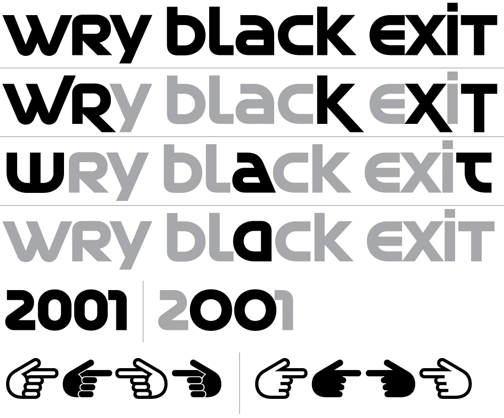
Five Stylistic Sets.
I never thought I would I would finish my first typeface fifty years later. But thanks to a comment by Tobi Herz on Instagram and the encouragment and support of The Type Founders, it actually happened. The result is a retro-futuristic seventies design that I think my younger self would have loved.
And it’s available now. More information here.
Introducing Heckle

My 2005 t-shirt concept sketch.
Heckle is a family of display fonts that began as a tiny sketch on a notepad in 2005. I had this big idea to try to make money selling lettering-based t-shirts at CafePress.com (remember that?). One of the designs I came up with was the word “Heh” in a brush script with a 1940s/1950s feel. It was one of those styles that came out of the subconscious inventory of lettering styles I’d soaked up like a sponge in my youth. It wasn’t based on any particular piece of lettering or typeface.

The final t-shirt design, drawn in Adobe Illustrator and sold on CafePress.com.
I didn’t sell many t-shirts, but I did end up with some neat lettering designs that could potentially be expanded into typefaces. Such was the case with the “Heh” shirt design. In 2017, I did a draft of the caps and lowercase in my font editor. It looked promising, but I didn’t get back to work on it until October 2025.

“Heh Script” draft from 2017 vs. Heckle’s final 2026 design.
Over the next five months, I expanded it to a family of six weights, from Light to Black. Refinements from the original lettering included tilting the stroke endings forward and using sharp corners on the insides of curved strokes, giving the design a crisp, energetic appearance. I honestly am not skilled at doing brush lettering. My method is to build letters by abstracting what I see, creating shapes that could be made with a brush, if that makes sense. That said, it’s a completely intuitive process. I stop when it looks right.

Alternate “e” and simplified caps for all-caps settings.
Once I got the basic design worked out, I filled out the rest of the character set, adding an alternate lowercase “e,” contextual alternates for all-caps settings (intended more for acronyms and abbreviations rather than extended text), my usual set of dingbats (featuring a manicule inspired by cartoonist Preston Blair), and—even though they may not get much use—the standard math and symbol characters, which are all but required in digital fonts. Heckle supports most Western and Central European Latin-based languages.

Heckle dingbats, including a Preston Blair-inspired manicule.
I never imagined back in 2005 that this silly t-shirt design would turn into a complete font family, but I’m really happy with how it turned out.

The basic Heckle character set (Extrabold style).
Heckle is suitable for any kind of display use—book covers, packaging, signage, advertising, magazines, websites, branding—where a lively, vintage hand-lettered look is desired.

The complete Heckle family.
Heckle is available today. More information here.
The Day I Discovered Type Design
Fifty years ago this month, March 1976, at 20 years old, is when my interest in type design began.

Me, in spring of 1976, about the time I discovered type design, standing outside the art department at NHCC. (Photo by Dan Bagaus)
I was in my second year of a two-year commercial art program at North Hennepin Community College, in a northern suburb of Minneapolis.
At first I was thinking of pursuing a career as an illustrator, but I was also interested in graphic design. In addition to these, I studied art history, drawing and painting, lettering, printmaking, as well as writing and other liberal arts classes.

Me again, working on a project for a painting class in the graphics classroom at NHCC c. 1976. (Photo by Dan Bagaus)
What sparked my interest in type design was a project in the advanced lettering class. The instructor was Lance Kiland, with whom I kept in touch until his untimely passing in 2015. We mostly learned to do lettering with brushes and Speedball pens. At the time, lettering was considered a basic skill for a graphic designer. At the very least, you’d need it to do marker layouts, in order to sell a design to a client before it was set in actual type, which was very expensive. It was a decade before desktop publishing would allow anyone to set their own type on a personal computer and turn the business of typesetting upside down.

Lettering design I did for my high school yearbook in 1974.
I‘d been working with type and doing lettering since high school, as editor and designer of the school newspaper and yearbook. Frustrated with the limited methods we had to set headlines, I started purchasing rubdown type on my own. I fell in love with type from looking at Chartpak and Letraset catalogs, and started developing a taste for typography under the influence of my uncle Knut, who was a graphic designer in Chicago.
The final project in my college lettering class was to design a complete, original alphabet—a typeface.

The issue of U&lc I discovered in the graphics classroom: Volume Two, Number Three, Sept. 1975.
Just by coincidence, I discovered a copy of U&lc magazine in the graphics classroom. U&lc was published by ITC, the International Typeface Corporation, a typeface publisher, and the designer and editor was the legendary Herb Lubalin. I’d never seen such beautiful typography and design. It was a motherlode for an aspiring typophile like me.

ITC’s call for typeface design submissions.
You could get ITC typefaces on virtually every typesetting machine and alphabet product, such as Letraset. In U&lc, I spotted a call for typeface submissions. If accepted, ITC would pay an advance plus royalties. Lance told me he’d heard of a designer in Minneapolis who’d made over $50,000 on a typeface design that got published (almost $290K in 2026 dollars).

The concept sketch for my typeface design project, which I called Uncial Sans.
All of this was on my mind as I worked on the assignment. I came up with the idea of doing a very modern, geometric sans serif design based on the underlying forms of uncial calligraphy. I drafted the artwork on a large sheet of illustration board, with 2.5”-tall letters drawn by hand in ink with Rapid-o-Graph technical pens, T-square, circle templates, and other drawing tools.

A close up of the finished artwork for Uncial Sans, showing some of the tools I used: circle templates, French curve, Rapid-O-Graph pen, brush, and compass.
Designing a typeface was very exciting. The idea of coming up with an original alphabet design fired my imagination. And learning that it was possible to design type professionally was a revelation. I decided right then that someday, somehow, I wanted to design typefaces. From that day on, even though I was doing other kinds of work in the coming decades (graphic design, art direction, some illustration), it was always in the back of my mind, and I found myself frequently sketching ideas for typefaces.

The finished artwork for Uncial Sans. Each letter is 4 inches tall, drawn by hand. Looking at it 50 years later, it’s got some design issues, but I got an encouraging A+ on the project.
It wasn’t until almost twenty years later, in the mid nineties, that I finally got a typeface published. But looking back, that lettering assignment in 1976 was where it all started.
Introducing Hardcover

The “desk protector” from my first job in 1976. I was a bit obsessed about type.
In 1976, I dropped out of college to take a job at a small advertising art studio in Minneapolis. I was there only five months. I quit to take another job, this time as production manager and designer at Metropolis, a weekly newspaper in Minneapolis. Until it went out of business nine months later. My third job was another small advertising art studio started by two people who had left the place where I’d worked my first job.
Thanks to a project I did in college, I’d become hooked on the idea of designing typefaces. In idle moments at these jobs, you would often find me sketching and doodling ideas for typefaces. They were mostly not very good, but the more I did it, the better they got.
In 2016–2017, I scanned and catalogued all the type idea sketches I’ve made (and saved) over four decades. Most of the early stuff was not great, but a few ideas were promising. One was a very minimal idea from about 1978, drawn in felt pen on a sheet of layout paper, where I (incorrectly) spelled out the word “Tarifs.” (I ran out of space, plus, why draw the same letter twice?)

My sketch from 1978.
I don’t recall exactly what I was thinking when I drew it. I was probably bored, avoiding whatever it was I was supposed to be working on. When I’m doodling letters, I don’t usually have any conscious plan. Things just spill out from my brain, which collects things I’ve seen like a magpie in my subconscious. Looking at it now, it most likely came from the kind of slick lettering you would see on book covers in the seventies. I often spent my lunch breaks hanging out in bookstores, so, it could be. I think there are bits of Times New Roman and Arrow there, too.

My draft of caps and lowercase from 2017, interpreting my nearly 40-year-old sketch.
I did a draft of it in 2017, extrapolating from these six letters. Of the roughly 30 “backburner” ideas I did drafts of back then, this “Tarifs” idea got a lot of positive reactions when I showed it to people.
In February this year, I decided to do it for real. This meant expanding the range of weights and then expanding the character set (the draft was just the basic alphabet in caps and lowercase).

Expanded range of weights from the Semibold starting point.
As I did this, the design became more disciplined than my original sketch. I dropped the cupped serifs (a case of naive excess), but tried to preserve the basic idea, with its sharp, deeply bracketed serifs and graceful curves.

The 1978 sketch vs. the final design.
Unlike similar faces like Times or Arrow, it features head serifs that are flat rather than angled, and generally mirror the construction of the capitals as much as possible, avoiding things like ball terminals.

Initial figures concept and final.
When it came to the figures, my first inclination was to give them an angled stress (just because I like that style), but I quickly realized they needed to have the same vertical stress as the caps and lowercase.
The original concept didn’t include an italic, but I didn’t like the idea of releasing it without one. By April, I was already working on one. Leaving out elements like ball terminals made the design of the italic more challenging, but I think my solution works well.

The matching italics.
One of the trickier parts was coming up with a name. It was never going to be “Tarifs” (the working name, after the original sketch). After trying out a few different ideas, I settled on Hardcover, which is a nod to my likely inspiration back in 1978. It also indicates how this face is intended to be used: Large, like on the cover of a 1970s bestseller. (It does also work for text, but I wouldn’t set a book in it.)

Hardcover comes in seven weights, from Extralight to Black, in both roman and italic. All styles include small caps, tabular and proportional figures in both lining and old style, support for Western and Eastern European languages, and a set of matching dingbats.

Hardcover is available now. More information here.
Mark Simonson Studio at 25
It didn’t start out as a digital type foundry.
Back in the nineties, I worked as senior designer for Rivertown Trading Company, a sister company to Minnesota Public Radio that sold public radio and public TV-related merchandise through the Wireless and Signals mail order catalogs. I’d worked there full-time since 1993 after having freelanced for them since 1985. I had a long history with both Rivertown and MPR.

A few of the things I designed at Rivertown: Lake Wobegon Whippets jersey (lettering), London Underground umbrella, wristwatch based on the Big Ben tower clock, and a few of my audiobook packages.
While at Rivertown, I mainly designed audiobook packages (over 200 of them) and products (t-shirts, mugs, even things like watch faces and umbrellas). By 1998, I was feeling like I was in a rut as a designer. So for the next couple of years, I shifted into web design at the company, designing sites and animated GIFs for Wireless and Signals in Macromedia Fireworks and trying to get the “e-commerce” people to implement my designs faithfully in the days before CSS and web standards.

Homepage of the Signals website I designed, as it appeared in early 2000. And, yes, that’s an early version of my Blakely typeface, which was originally created for Signals.
Around the same time, Rivertown was sold to Target Corporation, mainly because of its experience with online sales and its giant distribution center in Woodbury, Minnesota. After the transition, Rivertown Trading Company was renamed target.direct, and the old company culture, which felt almost like a family, disappeared overnight.
The web design thing wasn’t quite what I thought it would be, and Rivertown wasn’t the company I knew and loved anymore, so I quit in June 2000, at the age of 44, to resume my freelance career.

My first published fonts, released in 1992-94 through FontHaus.
I’d previously freelanced under the name Blue Sky Graphics—the name I used when I published my first fonts, Felt Tip Roman, Proxima Sans, and Kandal, through FontHaus in the early nineties. But I wanted a fresh start, so I picked a less generic name: Mark Simonson Studio.

Although I’d published a few fonts, I wasn’t making much money from it. And Mark Simonson Studio wasn’t really a font foundry yet. I did offer type design, but it was alongside other services such as graphic design, web design, illustration, and lettering, which I’d hoped would be the basis of a solid freelance career. So I created a website, got a domain (ms-studio.com because marksimonson.com was unavailable at the time) and hoped for the best.

But Mark Simonson Studio struggled. I was very bad at finding new clients and mostly just worked for people I’d known or worked with for years, taking whatever projects they happened to have.
Meanwhile, I noticed people starting to sell fonts on the web. I got an account at Makambo.com, a sort of web-based consignment store that was home to some type designers I’d heard of, like Jim Parkinson and Nick Shinn. Unfortunately, I had an exclusive arrangement with FontHaus, so I couldn’t sell the fonts I’d published there. But I had a few others in the works—Refrigerator, Blakely, Sharktooth, and Felt Tip Senior—which I started selling on Makambo. Sadly, Makambo closed after a few months, and with very few sales. Everyone seemed to be moving to a new platform—MyFonts.com—so I did the same.
Right around this time, in Fall of 2000, my partner Pat landed a spot as a contestant on Who Want’s to Be a Millionaire? She did very well—well enough that I was able to take six months off from my freelance work to make and release some new fonts—Mostra, Coquette, and Anonymous.

I was soon making more from selling fonts through MyFonts than I ever did from FontHaus, who were late in moving to the web, and also had a much lower royalty rate. But I still relied on other work to pay the bills. Despite that, I kept making new fonts, including 35 new ones in 2003, and started working with other resellers, such as FontShop and Veer.

By 2005, when I released Proxima Nova, I was making enough from selling fonts that I was able to drop all my other work and design type full-time. Mark Simonson Studio became solely a digital type foundry.
Looking back, it’s clear that my calling was type design. It’s the thing I’ve been most successful at, and it fits my skills and sensibilities better than anything else I’ve done. I didn’t know it at the time, but opening Mark Simonson Studio in June 2000 was what put me on that path.