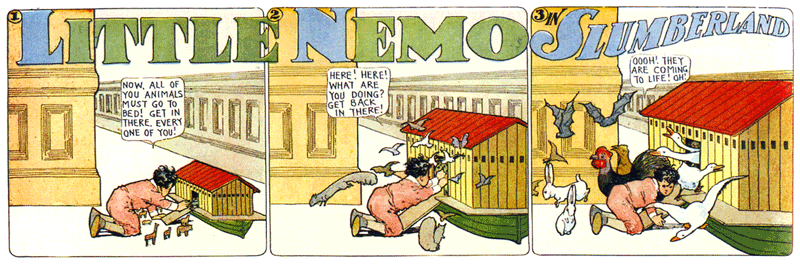
I’m a long time fan of the work of Winsor McCay, including his hand-lettered titles. Blogger “Morpheus” has posted a big collection of title panels from McCay’s Little Nemo comics on his “Meeting McCay” blog. Amazing stuff. (Via Boing Boing)
Total results: 100.
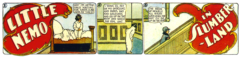
I’m a long time fan of the work of Winsor McCay, including his hand-lettered titles. Blogger “Morpheus” has posted a big collection of title panels from McCay’s Little Nemo comics on his “Meeting McCay” blog. Amazing stuff. (Via Boing Boing)
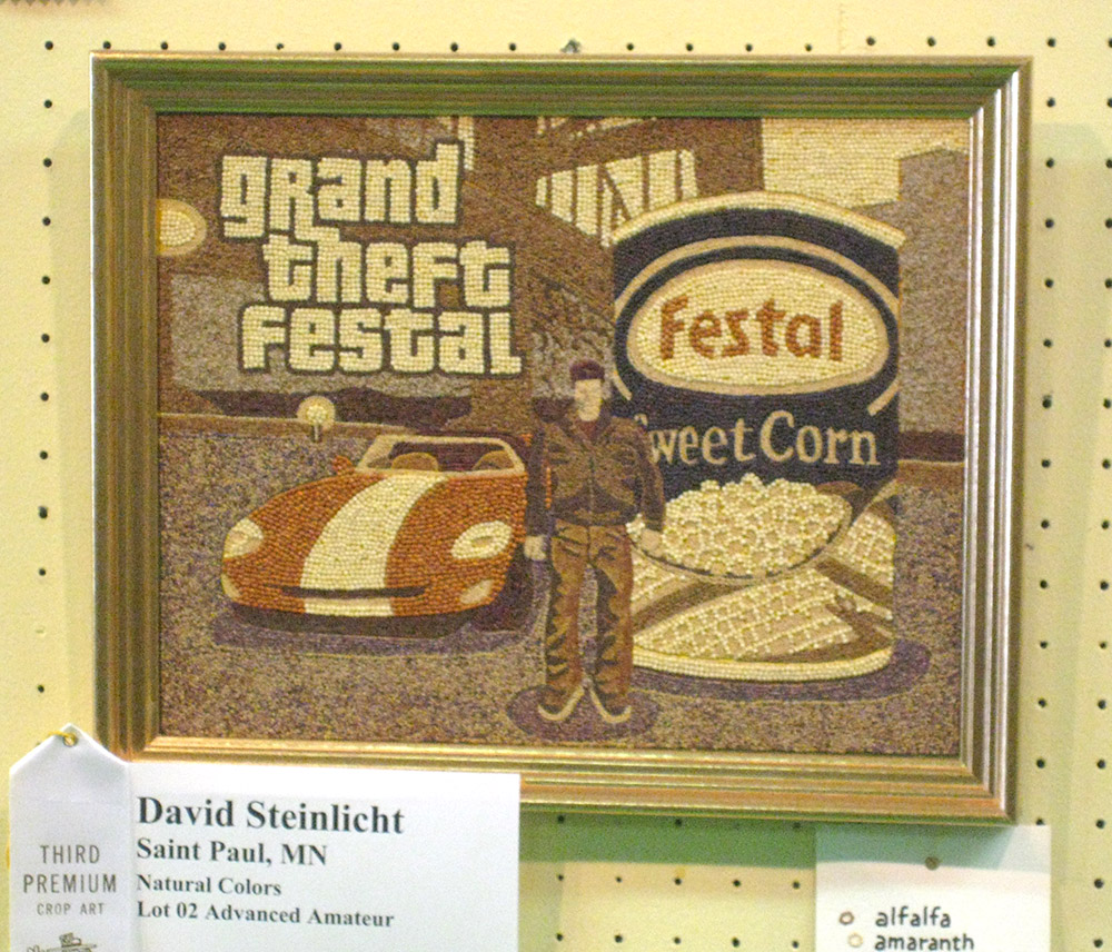
My friend David Steinlicht recently posted a time-lapse movie showing the day-to-day progress of his award-winning entry to the seed art competition at the 2008 Minnesota State Fair. It depicts a scene from the video game Grand Theft Auto (of which he is an avid player) with a can of Festal sweet corn. In seeds. Not your typical seed art subject, but David is not your typical seed artist.
The speed at which the work progresses is highly misleading. To put things into perspective, David includes video of the process in real time after the time-lapse part.
Here is an example of what designers used to have to do in the days before desktop publishing:

All this for a few blocks of text. In this case, for a client’s stationery. It’s from about 1986 or so. I was already starting to use PageMaker for some jobs, but high resolution output was not available quite yet in Minneapolis, and 300 dpi LaserWriter output would not do for a job like this.
Note the note at the bottom: “Tuesday A.M. if possible.” It was probably sent out on a Monday (delivered via courier), and would have been considered a “rush” job. The markings in blue and light red were made by the typesetter to themselves. The others are mine. I don’t remember exactly, but it probably cost $75-$100 to have this copy typeset, including delivery charges.
There was never any question that the spacing and quality would be anything but perfect. None of this had to be stated in the “specs” unless something unusual was called for, like the note near the bottom that says “K 1/2 U” meaning “kern one half unit.” The finished “repro” would still need to be cut up and pasted into position on illustration board before it could be printed.
We are so spoiled nowadays. We can set the type ourselves, right at our desks (or laps), and instantly see what it will look like. No more spec’ing, or waiting, or paying big typesetting bills. On the other hand, you do have to know a lot more about setting type than you did back then to get the same level of quality.
(A possibly interesting footnote: The copy was printed out on a dot-matrix printer, an Apple Imagewriter II, using bitmapped fonts I made myself on my Mac, including one that mimics the look of a typewriter.)
Almost forgot to mention: I did an interview with LetterCult, the new website devoted to the art and culture of making letters. It just went up today. Link.
The site’s been up less than a week, but there’s already a ton of great stuff on it about lettering and type design.

While I was off doing type things at TypeCon in Buffalo this last July, my partner was off seeing the city. She got a picture of this breathtakingly beautiful old sign. Wow.
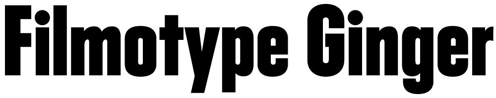
Ginger is the most recent Filmotype font I’ve digitized. (See also Zanzibar and Glenlake.) It’s the first in a range of Filmotype “G” series fonts—condensed sans serifs whose names all start with “G”—that have many Futura-like features that are unusual for the style. I was interested in this range of typefaces even before I knew about Filmotype. Few of them have ever been digitized before. I plan to do all of them eventually (sooner than later, I hope).
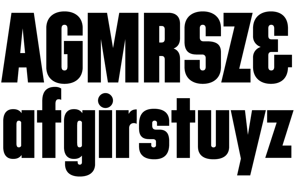
To bring Ginger into the 21st century meant designing dozens of new characters to expand its limited character set. Caps, lowercase, numbers and a few symbols and punctuation marks might have been okay back in the 1950s, but today’s fonts are global citizens and have to play as well in Prague as they do in Peoria. In designing the new characters, I tried to imagine how Ginger’s designer would have designed them. (We know who designed some of the Filmotype fonts, but not Ginger. Over the years many of the records of who did what were lost.)
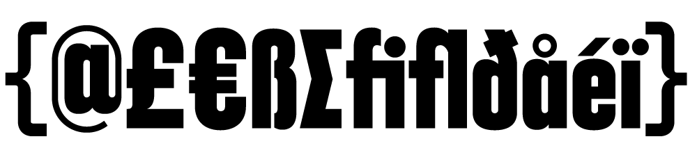
Like all the new Filmotype revivals (available from Font Bros), Ginger has been remastered to high standards and is a modern font in every way. It is available in OpenType format, which means you can use the same font on either Mac or PC, and includes many OpenType goodies, such as an alternate lowercase “a”, arbitrary fractions, case-sensitive forms, and extensive language support.

Page 32 of 61