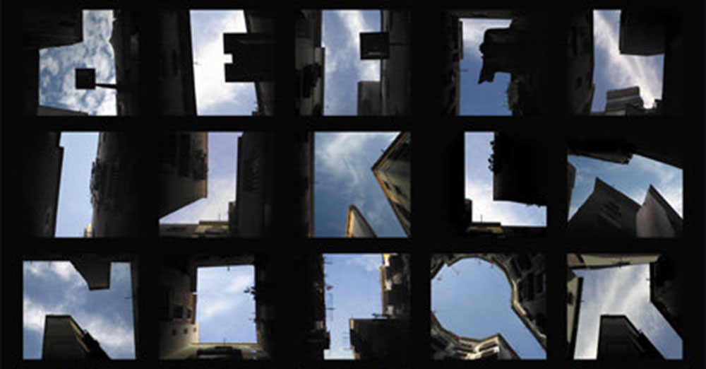
An alphabet made from the negative space between buildings as you look up at them. (From Slanted via Boing Boing.)
An alphabet made from the negative space between buildings as you look up at them. (From Slanted via Boing Boing.)
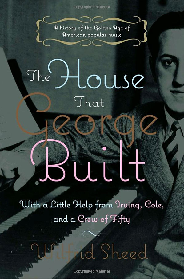
The cover of this book about George Gershwin is one of the nicer uses of Coquette that I’ve seen. (Thanks to Jeff.)
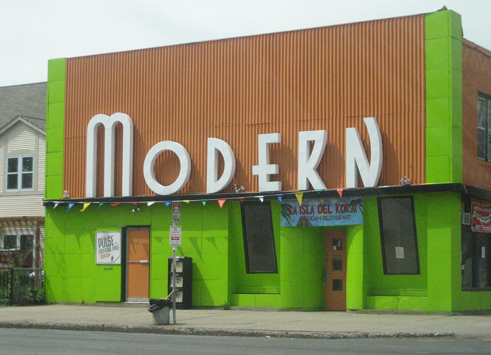
The “Modern” has seen many incarnations over the years. Originally it was a laundromat—The Modern Laundry. Back in the ‘80s it was The Modern Times Café. Now it’s a Mexican restaurant called La Isla Del Kora. Through it all, those giant art deco letters have always remained. It’s a monument to a “now” that has long passed. That it has survived this long makes me happy. (Photographed on April 29, 2007, in Minneapolis.)
Proxima Nova is now up to version 1.2 with a couple of new features:
Customers needing either of these new features who purchased Proxima Nova licenses from my site (www.ms-studio.com) may contact me at mark@marksimonson.com for a free upgrade. Please include your DigiBuy order number.
If you were or are a fan of Mystery Science Theater 3000 like me, this is pretty cool: RiffTrax. (Via Wired News this morning.)
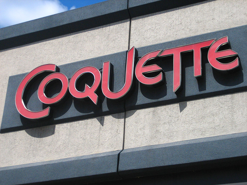
Not a font sighting. Seen in Cambridge, Massachusetts, on August 8, 2006.
Page 35 of 61