Poirot Déjà Vu
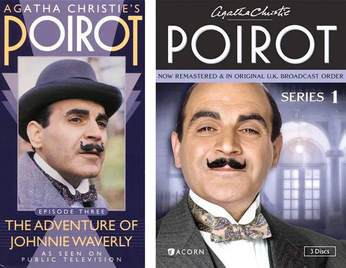
Back in 1991, I designed a series of packages for the American release of London Weekend Television’s Poirot series on VHS. (My design is above on the left.) As part of the design, I drew the name “POIROT” in a geometric Art Deco style, which I thought was fitting for the series.
The other day, I happened to see the latest incarnation of the series packaging (above on the right) and noticed that the designer had set the title in one of my fonts, Mostra, which I never noticed before is pretty similar to my 1991 lettering design.
I wonder if they knew?
Filed under: Font Sightings , Personal Archaeology