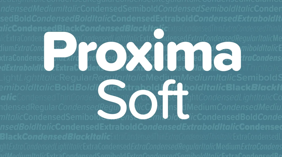
Introducing Proxima Soft

Proxima Soft is an expanded and remastered version of Proxima Nova Soft (2011). Both are rounded versions of my Proxima Nova (2005).

Proxima Nova Soft was originally commissioned by MyFonts in 2010 for use on its website. The following year, after numerous requests, I released it to the general font market. Because MyFonts needed only a few styles (Regular, Medium, Semibold, and Bold), that’s all I did at the time.
Soon, I got requests to do a full family. This was easier said than done. I began work on the full family in 2013. After several false starts, over three years later, it’s finished.
Although the old and new families look similar, there are many small improvements in the design, not just a wider range of styles and more features.

Proxima Soft has the same 48 weights and styles as Proxima Nova—eight weights (Thin to Black), three widths (Normal, Condensed, and Extra Condensed), and both roman and italic for all weights and widths. There is one small difference—no small caps or old style figures. I included these in Proxima Nova, but I’ve never seen them used, so I decided not to put them into Proxima Soft. (I may add them later if people actually do want them.)

A Proxima Nova feature I do see used a lot is the set of alternate characters—a, l, y, and G. Proxima Soft includes them, as well as other Proxima Nova features such as arbitrary fractions, ordinals, and both proportional and tabular figures.

Proxima Soft also contains the same wide language coverage, including support for most Latin-based writing systems as well as Cyrillic, and Greek.
I would have preferred to keep the name Proxima Nova Soft, but there were some problems with that idea. First, there are limits to how long a font name can be. Proxima Nova already pushes the limits in the Condensed and Extra Condensed ranges, and adding the word Soft to every style and weight was not going to work. By calling the new family Proxima Soft, the font names will be exactly the same lengths as in Proxima Nova. Problem solved.
The other perhaps more important reason is that the shared styles—Regular, Medium, Semibold, and Bold—are not identical in design and spacing between the new and old version, which means that documents created with Proxima Nova Soft would have reflow issues if the new fonts were installed in its place, not to mention differences in appearance, especially at larger sizes.
If you liked Proxima Nova Soft, you’ll love Proxima Soft. It’s got more of everything and makes a great companion to Proxima Nova.
Proxima Soft is available at all of my distributors. See the Proxima Soft page for a complete list.
