Indiana Jones and the Fonts on the Maps
In Indiana Jones and the Last Crusade, there is a funny scene in which Indy’s father breaks a vase over Indy’s head. As soon as he does it, he looks horrified—not because he’s mistakenly attacked his own son, but because he notices that it was a priceless Ming vase. Upon closer examination, he is relieved to discover the vase is a fake.
Now that the fourth (and last?) Indiana Jones movie is out, I made a similar examination of the use of type in the series, but I was not quite as relieved. For the most part, the type usage in each of the movies is correct for the period depicted. With one exception: The maps used in the travel montages.
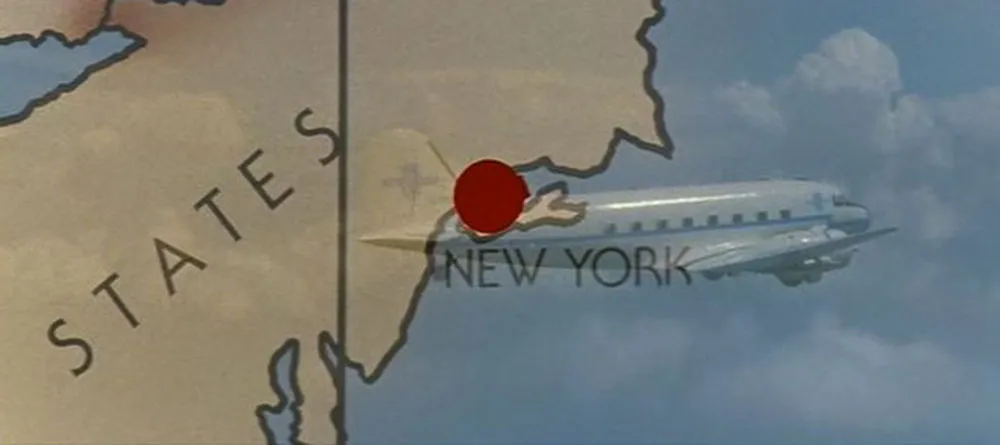
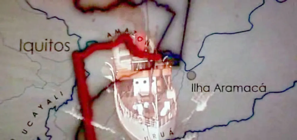
Whenever Indy is traveling great distances, which happens in all the films, there is a montage of the airplane or boat superimposed over an animated map showing the route. It’s an old-fashioned convention, an homage to the movies of the Thirties and Forties. Unfortunately, the typefaces would be more at home a few decades later.
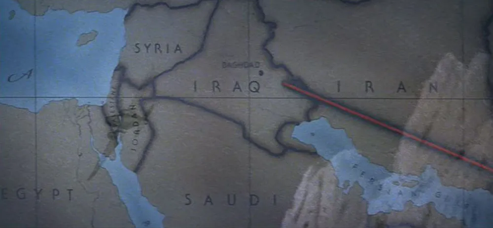
In Raiders of the Lost Ark (1981) which is set in 1936, we see ITC Serif Gothic (designed in 1972). The wide spacing feels right, and it does have an art deco feel, but it’s 1970s art deco.
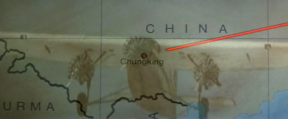
Indiana Jones and the Temple of Doom (1984) strays even further in the anachronistic type department by using Helvetica (1957), which looks even less plausible than Serif Gothic.
The third installment, Indiana Jones and the Last Crusade (1989), goes back to the formula used in the first film in many ways, including the use of ITC Serif Gothic again on the map. Not appropriate for a film set in 1938, either.
Did they finally get it right in the fourth film, Indiana Jones and the Kingdom of the Crystal Skull (2008)? Not quite. They didn’t use Serif Gothic this time, or even Helvetica (which would just have been released in 1957, the year in which the film is set). Instead, they used Century Gothic, a font that didn’t exist until 1989. This wouldn’t necessarily be a problem since Century Gothic’s caps are very similar to Futura, which would be perfectly appropriate for 1957. Unfortunately, Century Gothic is also a clone of Avant Garde (1970), a typeface with very large lowercase letters, a quintessentially Seventies characteristic. (More about Century Gothic here.) So, not the best choice.