First Public Use of What Became Proxima Nova
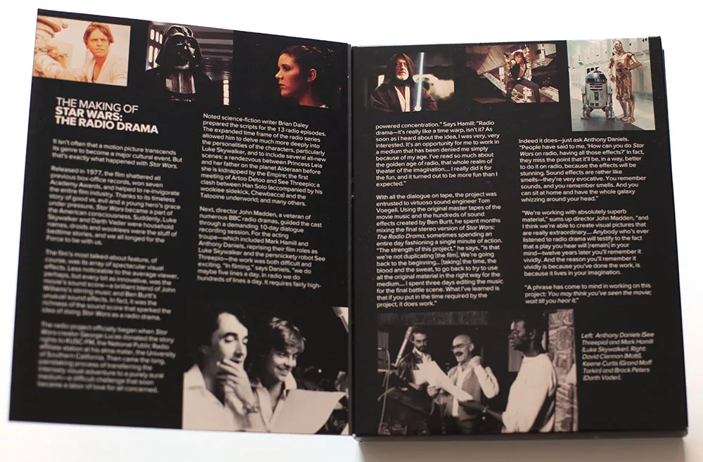
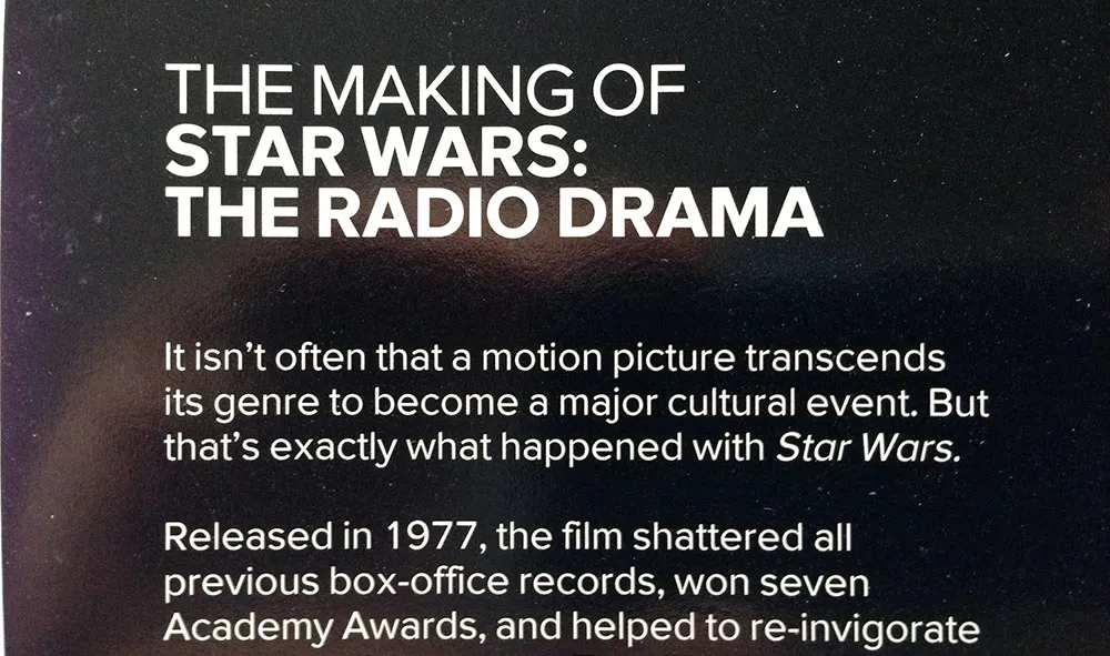
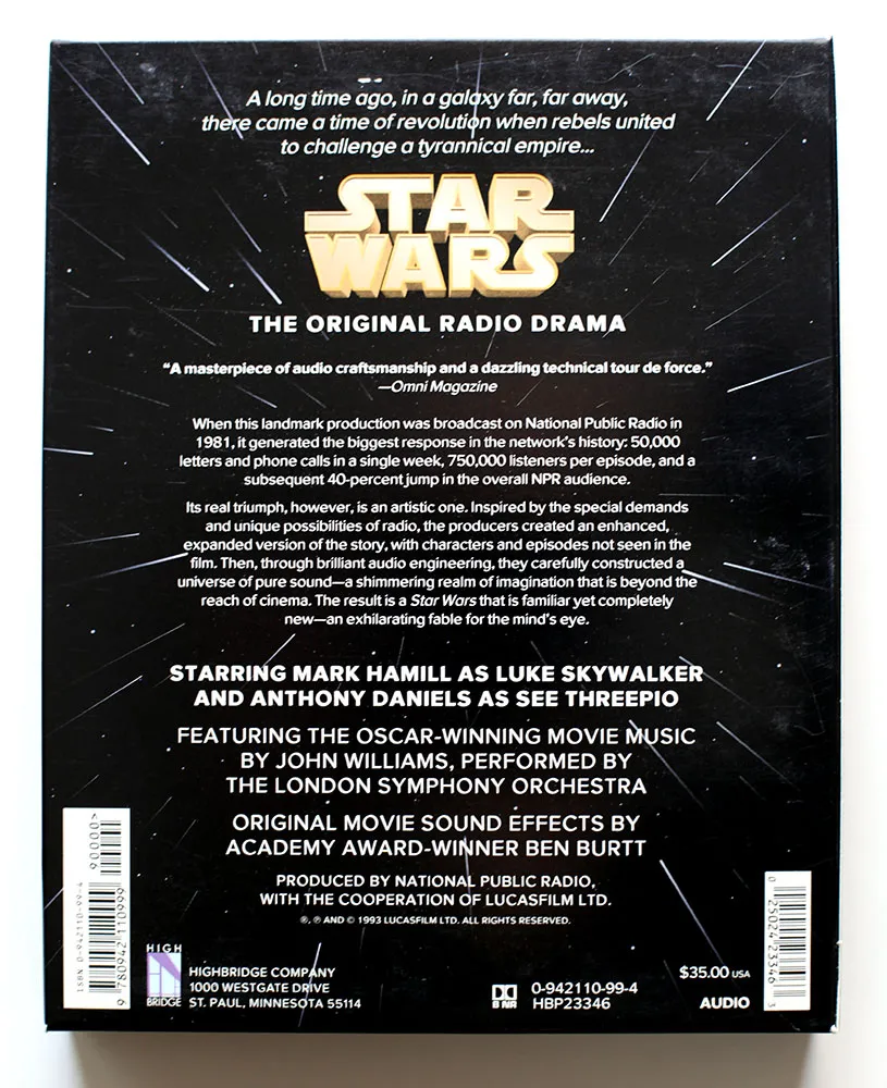
Back in 1993, I had just started a job at Rivertown Trading Company as a graphic designer. Part of that job was to design packaging for a division of the company called HighBridge Audio. One of the most interesting titles I got to work on was *Star Wars: The Original Radio Drama,*which had been broadcast on National Public Radio in the early eighties and was being released for the first time on audio cassette. (CD came later.)
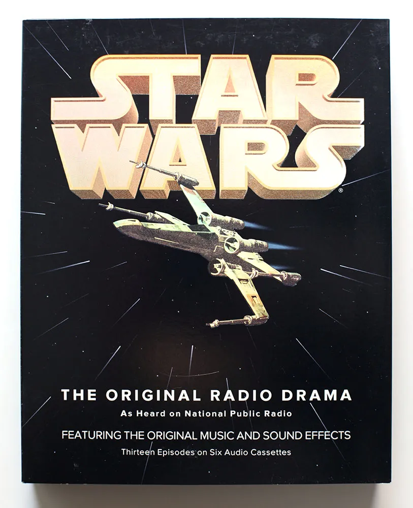
It was one of the most elaborate packaging projects I ever worked on, with complicated die cutting and holographic foil embossing on the cover.
While working on the project, I was flown out to Skywalker Ranch near San Rafael, California, home of Lucasfilm, to rifle through file drawers of 35mm slides for possible use on the packaging. (My flight was delayed, so I missed out on having lunch in the same room as George Lucas.) Considering the rich visual imagery of Star Wars, it was surprising how little suitable photography they had for us to use. The complex visual effects only existed in the film, not in the publicity shots, which were taken on the set for the most part. The “stills” of, say, an X-wing fighter flying over the Death Star only existed as crudely retouched photos.
Back then I was also working an early version of Proxima Nova, which at the time I was calling Visigothic. I had tried some different fonts for the Star Wars packaging, including ITC Avant Garde Gothic and News Gothic, but nothing looked quite like what I wanted. On a whim, I tried Visigothic. It was plain (like News Gothic) and also a bit geometric (like Avant Garde). It felt a little weird using my unfinished type design for the project, but it seemed to work. I showed it to the other people I was working with and they thought so, too. So I used it.
I released the fonts about a year later as Proxima Sans. The version on the Star Wars packaging is fairly close the final version, although you can see from some of these images that the kerning was not quite finished. Also, the italic was just a simple slant of the roman, but with a modified lowercase “a”. Some other differences: the lowercase “y” has a longer tail and I hadn’t done the ligatures yet.
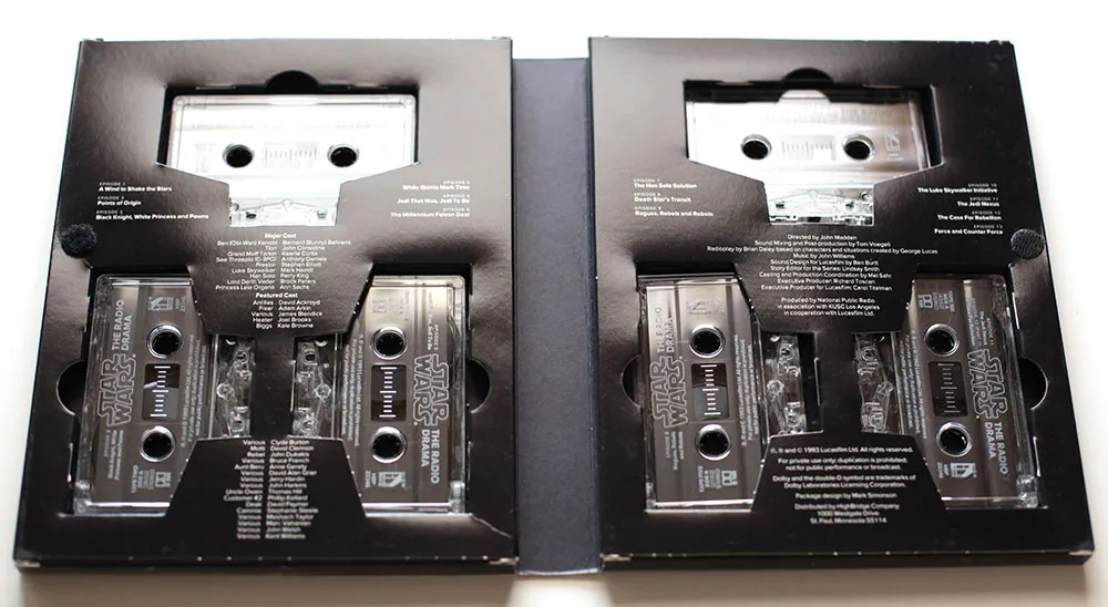
Someday, this font would become Proxima Nova, but this is the first time it was used publicly. It was exciting for me at the time to see how it performed in the real world, and it made me confident that it was worthy of releasing commercially.
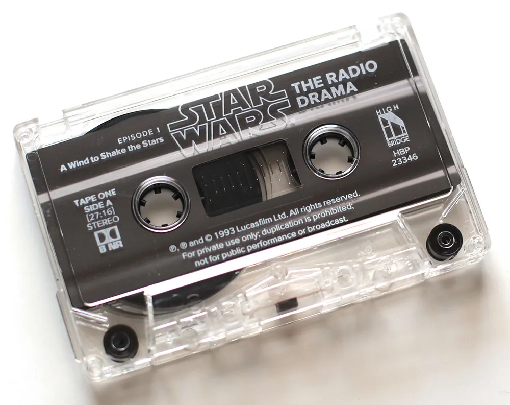
If you ever wondered why Proxima Nova includes a ℗, now you know. On the CD version of the series, which I did in the late nineties, I used Proxima Sans, and I believe HighBridge has used Proxima Nova for more recent incarnations.
I created the 3D version of the Star Wars logo and the “hyperspace” star pattern in Adobe Illustrator and a program called addDepth. What I remember most about working on this project was how excruciatingly long it took to preview the artwork on the primitive Mac IIcx I had to work with at the time.
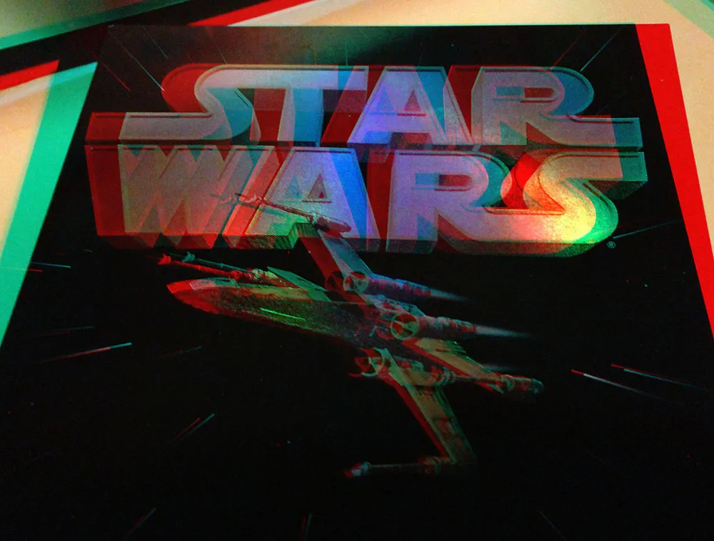
If you’ve got a pair of anaglyphic glasses (red/blue), this will give you a better idea how the holographic foil stamping looked.
Additional details If you’re interested in Proxima Nova and how it looks today, you can find more info, test and license the fonts, and download PDF specimens on the Proxima Nova page.