Yeah, But Those Two Guys Looked Just Like Steve and Bill
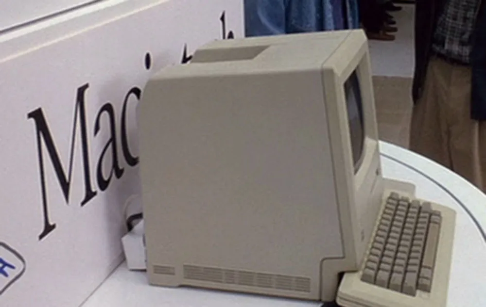
The 1999 made-for-TV movie The Pirates of Silicon Valley is a fictionalized account of the rise of Apple and Microsoft in the early days of the personal computer industry. In one scene, Steve Jobs and Bill Gates are in a heated match of ego-wrestling after Steve has given Bill a sneak peek at the Macintosh. It’s 1983, a year before it will be introduced. The top-secret prototype is shown housed in a typically Apple, design-conscious white enclosure, which reveals and conceals the Mac at the push of a button—like one of those spinning secret doors in a Hollywood movie haunted mansion. On the panel behind the Mac, the Macintosh logo is displayed—or is it?
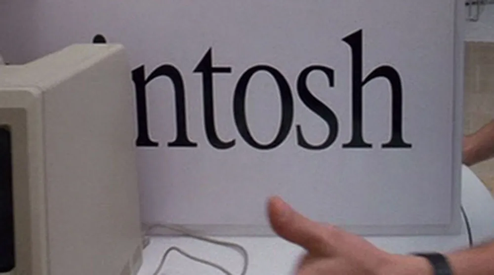
Eagle-eyed typophiles will be appalled to note that this is not the ITC Garamond Light (condensed 80%) that Apple used for 20-odd years on the Macintosh logo, but is, in fact, New York (also condensed 80%), one of the Mac system fonts—the TrueType version, to be exact, which was released in 1991. See if you can spot the differences here:
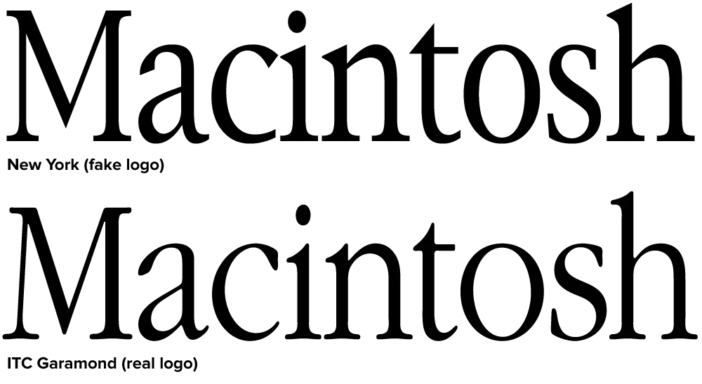
Clearly, New York is indirectly related to ITC Garamond. The bitmap version of New York, which was included on the original Mac, bore a strong resemblance to ITC Garamond, the typeface Apple used as a central part of its corporate identity. The TrueType version of New York, done by Bigelow and Holmes, differs in almost every detail with ITC Garamond, but shares a similar look and feel. So similar that it fooled the people who made Pirates.