31 Days of Horror
This was a fun one. Rumsey Taylor of Not Coming to a Theater Near You asked me to create lettering for a splash page graphic for the site’s fourth annual horror film festival.
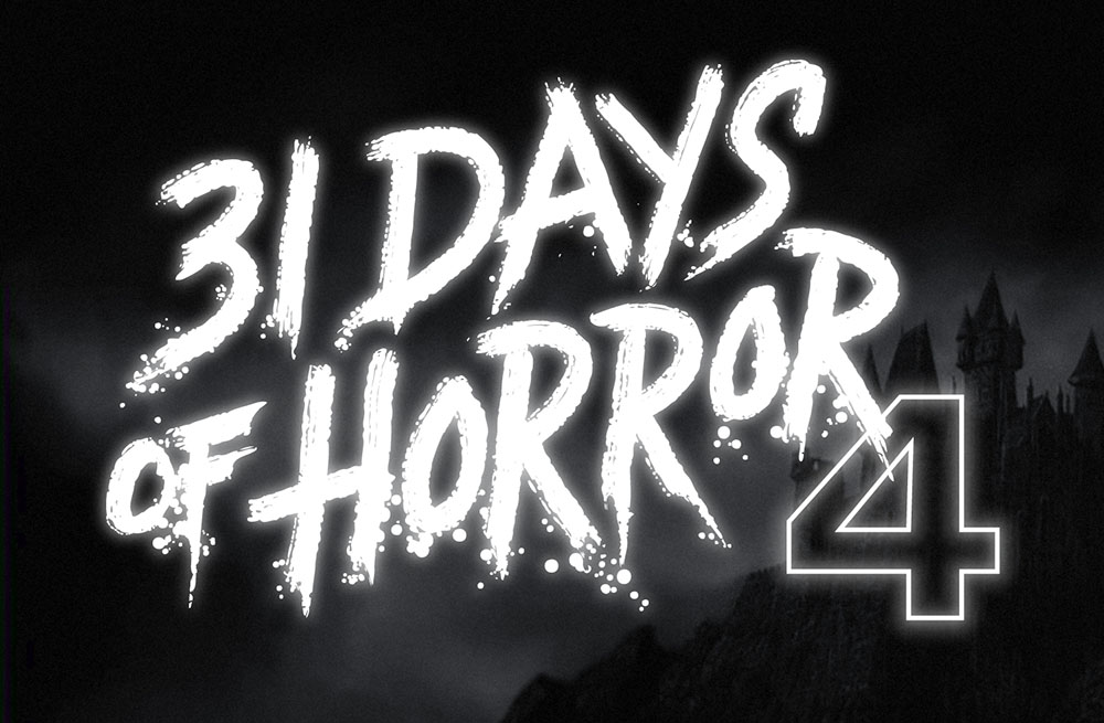
The idea was to emulate classic horror film title screens. Thanks to Steven Hill’s Movie Title Screens Page I was able to find loads of reference. At first I was thinking I would use some kind of blackletter style, but it turns out almost no horror films use that style, unless they involve Dracula or Frankenstein. (More often it’s used for pirate movies.)
In the end I decided to go with the classic scrawled-in-blood look. To get the effect, I wrote out the letters freehand using a Wacom Cintiq and Corel Painter. It took a lot of experimentation and “takes” to get the right look. Once I had the basic lettering, I enhanced it in Illustrator and Photoshop to get the look of an old black and white movie title, complete with light-spill on the brightest areas.